Makeover Monday – Week 13

This week’s MakeoverMonday looked at pizza preferences in the UK:

gdp-vs-happiness.png

What I like:

  • Looks tasty (except for the corn…who on earth puts corn on their pizza?!?!)
  • Numbers are clear

What could be improved:

  • The #2 item (onions) didn’t even make the picture! (Neither did #5 chicken)
  • Initial view of the (pizza) pie chart infers part to whole, but I’ve never heard of a 485% whole pizza…
  • Hard to really compare level of popularity amongst the toppings

What I built:

My first impression was to do a dumbbell chart showing male and female, but I felt like I’ve leaned on those fairly heavily in my MMs of late, so I pushed myself to think of something else. So I settled upon a bikini chart variation, which would show which toppings leaned male or female, while still showing overall popularity for each topping. After I was done, I realized it’s like a slice of pizza!

I went through a couple different variations as I built. I started with a dual axis of Male and Female ratings, but I wanted the overall and topping label to be in the middle, and the only way I could think to do that was to have that label be on a circle or line mark in a dual axis, which would mean I would need my Male/Female measures on the same axis using Measure Values. But using Measure Values made it so I couldn’t have the Female label on the left end of the bar and Male label on the right end. So I went back to the dual axis, which allowed me to label Male/Female on each end, and created a separate sheet for the labels. Then I used transparent sheets to float the label sheet on top of the bar sheet.

To show which toppings were highly preferred by men over women, or women over men, I created a calc to identify which toppings had a difference in gender percentage greater than 5%:

I dropped that on color, picked some from my custom palette, and pulled together the headers and formatting.

Click here to view on Tableau Public


Workout Wednesday – Week 13

Meera‘s first challenge  was a great practice with date calculations. At first glance I also thought “oh, easy layout” but then I read the second requirement to only use 3 sheets. Not quite so easy, but still doable.

I started with the Sales bar chart. MONTH(Order Date) on columns, SUM(Sales) on rows. I filtered the YEAR(Order Date) to 2018/2019. Then I added YEAR(Order Date) to color and size, and matched the color to the requirements. In order to get the bars to be in front of each other instead of stacked on top you have to turn stack marks off in the Analysis menu:

As I formatted the axis, I realized that my sales value in the tooltip would be formatted the same way, which would be contrary to the requirements (50K vs $50,000). So I duplicated Sales and placed SUM(Sales (copy)) on tooltip. I had the same kind of issue with the date in the tooltip after formatting the axis to be the first letter. So I created a custom date on Order Date and added it to my tooltip:

I finished up the tooltips before the end of the process today, I was feeling wild and crazy.

The last thing I needed was to filter through Mar 24 for the current year. So I created a boolean filter:

That finishes off my sales chart. I duplicated it, switched Profit with Sales, adjusted the tooltip, and the bar charts are done!

Now to figure out how to put two separate KPI sections in one sheet…I needed five calcs  for MTD, PMTD, MoM, Run Rate, and YTD. In order to make those, I created Current Month and Prior Month:

Here’s each of those for Sales:

MTD

PMTD

MoM

Run Rate (Divide MTD sales by number of days, and multiply by number of days in the month, found by adding one month to today’s truncated month, and subtracting one day)

YTD

Once I had all these calcs (and the accompanying Profit ones) I added Sales and Profit to rows, which gave me Measure Names. Then I did a dual axis with MIN(0.0) and added all of the calcs to the label. The dual axis allowed me to put the profit calcs in one mark card and the sales calcs in the other. Formatting, adjusting axis, and drop them in to the dashboard.

I’m all about containers (I think I’ve mentioned that before) in dashboards. I think the easiest way to show the build is with the item hierarchy:

In this case, I do have a floating blank object. That’s for the dividing line between the Sales KPIs and the Profit KPIs, to match the dividing line between the two bar charts. I played around with the column borders, but that left some borders at the top and bottom that just didn’t quite match up. So I floated a blank in the right spot.

And that’s it!  As I took a look at Meera’s, there were a few differences in how we did things, but in the end, we arrive at the mostly same result. (I did recognize she probably did a dual axis in the bar charts in order to achieve some transparency of the PY bars, but I had already gone down my path and didn’t feel like changing it)

Click here to view on Tableau Public


Workout Wednesday – Week 12

Lorna‘s challenge this week was a good mix of parameters, set actions, date manipulation, and container magic.

To start I set up the period selector parameter:

Then I created a date calc that would dynamically change the date grain based on the parameter selection, using DATETRUNC:

I dragged Date to the columns shelf, selected DAY(Date) [Continuous], and made sure Show Missing Values was checked. Then changed the mark type from Automatic (line) to a Bar. Add SUM(Profit) to color, and we have the basic workings of the bar chart.

I created another parameter for the number of years to display. This was an integer parameter with a range of 1-4:

Then I created a calc to compare my date calc to the difference between 2020 and the number of years selected:

Date Filter = True on the filter shelf, and we’re moving along. To adjust the size of the bars (which I admittedly put off until last, but will include here with everything else from this sheet), I used another case statement based on the Select Period parameter:

I played around with the numbers here until they looked about like Lorna’s. (A slightly more dynamic solution by Rody Zakovich can be found here)

Drop Size onto Size (and changed aggregation to MIN, rather than SUM), and we’re done with the bar chart! (assuming axis formatting and tooltip adjusting)

Then I needed the Subcategory list to run the set action on. This is kind of second nature at this point after all the workouts this year. Subcategory to Rows, MIN(0.0) to columns, axis range set to -0.05 and 0.5, Shape mark type (that gives me blue open circles). Changed the color to black, and then created the Subcategory Set so I could put that on Shape:

Then I created the set action (Worksheet>>Actions):

If you select the data source under Source Sheets, rather than the sheet you’re on, you won’t have to recreate the action when you apply it to your dashboard. Then, in order to deselect the shape when it’s clicked on, I used my now tried and trusted TRUE/FALSE method from Yuri Fal. A quick edit of shapes to change the IN to filled circle rather than open square shape, and we’re ready for dashboarding.

When I build dashboards, I always use containers. ALWAYS. But, where I might deviate from others, I leave one Tiled container at the top. Otherwise every time I add a chart to the dashboard, it seems like Tableau adds another Tiled container to put the legends in. So I keep one, and then run Vertical container inside of it. Here I put my Bar chart, the dashboard title (with Select Period parameter so it’s dynamic), and my footers (which are all inside a Horizontal container at the bottom of the main Vertical).

My new favorite thing is the super easy menu functionality. I’ve done other workarounds where you have two dashboards, and it’s a big pain. This is seriously so simple, I can’t get over it. When my legends/parameters popped up to the side of the bar chart, I pulled in a floating Vertical and added the two parameters and the Subcategory sheet. Then you just click Add Show/Hide button in the container dropdown:

Fine tune the placement of the icons and the container. Add a white background for the overall Vertical container, as well as the dashed border. Final testing and we’re all set!

Click here to interact on Tableau Public

Workout Wednesday – Week 11

Ann’s challenge this week was a bit of a respite from the last few weeks, but still packed plenty of little punches.

The challenge revolved around a selected date, so I started with that parameter.

Then I needed to figure out which weekday that day fell on.

With the weekday identified, we need two filters. One to identify the previous 11 weeks and another to identify the dates within those 12 weeks.

Once I verified these got me the right dates, it was time to create the rank tables. First, I did a RANK on SUM(Sales). However, later on, I realized that didn’t match up with Ann’s viz, particularly on orders and quantity where there were ties. So I went with RANK_UNIQUE instead of just RANK. Then to find the average line, WINDOW_AVG on SUM(Sales). In order to create the Above/Below Average categories, I needed to compare the sales to the average:

For the color, I needed to identify the top and bottom as well as whether it was above average:

The last thing needed for the table is the arrow to identify the chosen week. At first I thought it could be a shape, but then realized I wouldn’t be able to put a shape in the dimension grouping. So I copy/pasted one for the calc:

With SalesColor on Color, the nice colored boxes turn to little squares. 🙁 So I played around with a Gantt chart. I added MAX(1) to columns, and MIN(-1) to size, and fixed the axis to 0 to 1. With everything in place (including the SalesHeader, which I’ll get to shortly), here’s what it looks like:

(The Sales Rank header is hidden, and you have to right click on the SalesAbove/Below header to rotate the label. Format for row banding at the SalesAbove/Below level. )

In order to include the rank for the chosen week in the table header, I needed to identify just that rank value:

With the Sales table in place, I copied each of the calculations for order and quantity, duplicated the worksheet, and replaced accordingly.

With all three tables ready, I dropped them each into a vertical container with a blank below for the gray shadow. Turn off the outer padding, and fix the height at 2 pixels. I then dropped all three verticals into a horizontal container.

One thing I ran into when I tried to get the titles for the tables to be white despite the gray background. Doing so left a sliver of a gray line between title and the table. However, clicking on the sheet and setting the background color to white from the dashboard layout pane worked like a charm.

I started to add the title for the dashboard, and realized in order to include the weekday in the title it needed to be a worksheet (hence Ann’s requirement for no more than 4 worksheets). So I used a trick I picked up in week 4 just just add ” to columns and text for a blank sheet. In order to get the weekday to be in uppercase, I needed one more calc with UPPER(Weekday). Then my worksheet title looked like this:

Once again I put the sheet in a vertical container with a blank underneath. In order to not show the big blank worksheet, I fixed the height at 34. I had to play around with the padding and height a bit after I published to Tableau Public because it rendered a little differently than in Desktop.

Then I put this vertical on top of the horizontal container with the three tables in one more vertical.

The finishing touch was the calendar icon showing the date parameter entry. I learned this last week, just add the parameter in a floating vertical container, right click and select Add Show/Hide button. Added the icon Ann linked to for Show, left the X for Hide. And we’re finally finished!

Click for Tableau Public

Workout Wednesday – Week 10

Sean‘s Week 10 challenge (despite calling it week 9) was a great opportunity to play with some new features in Tableau 2020.1, and reinforce some of the functionality I’ve picked up from some previous #WOW2020 challenges. I was able to complete the Intermediate challenge in our live session today, and got started on the Jedi challenge, which I then figured out the rest of the way tonight. This challenge was kind of fun, since I don’t often use maps at work, so I got to play around with something different. My ability to finish the intermediate challenge in a little over 30 minutes speaks to the amazing work by the Tableau devs in making BUFFER, MAKEPOINT, and DISTANCE such easy functions to use, since I never used them before. (Also, the blogs Sean shared from Zen Master Marc Reid and Tableau developer Filippos Lymperopoulos were great intros on how to apply these functions, and directly led to my being able to do the following work)

Intermediate Challenge

I started off just testing out a BUFFER calculation on the London Hotels data source. Pretty easy when you have Latitude/Longitude for your data points.

The MAKEPOINT converts your Lat/Lon into a point on the map, and then you tell the BUFFER how big of a radius you want (500) and what unit of measure (in this case meters, or ‘m’). Once I saw how that worked I went back into the data source viewer and joined the London Pubs csv using an Intersects join:

Here we’re basically joining points on the map where pubs exist within any buffer areas around the hotels. By doing an Inner Join we remove the hotels that don’t have any pubs within the 500m radius.

**SIDENOTE: New sometime around 2019.4 is a whole slew of additional background maps. Here’s the list of options in 2019.2:

And here’s 2020.1:

Great options for those of us who have yet to dip our toe in the pool of Mapbox. **

When I went back to my map, I was trying to play around with getting the pubs to show, and struggled for a minute until I realized I was only showing the Hotels LAT/LON in the view. After I joined Hotels and Pubs, the Latitude (generated) and Longitude (generated) showed up in Measures. Once I dropped those into Columns/Rows, I was in business. In order to get the buffer for hotels and the circle marks for pubs, you have to use a dual axis. This is easily done in maps by Ctrl+clicking on Latitude (generated) and dragging it next to the current one, then selecting dual axis from the pill dropdown:

In order to apply the buffer to your view, you just drag your Buffer calc to Detail on the marks card. I also added Hotel Name to Detail, and COUNTD(Pub Name) to Label, which gave the bold numbers within the buffer (once I adjusted the font size and made it bold).

I then needed to calculate the distance between each hotel and pub within the radius. This is just DISTANCE between two points, and the unit of measure:

Once I had the distance calculated, I could create the points on the map for the pubs:

(I created a Radius parameter, which in this case is set to 500) I then added this calc to Detail, along with Pub Name. I switched the mark type to Circle, but the circles weren’t as big as Sean’s were, and wouldn’t change as I adjusted the size. So I hacked it with MIN(1) on Size. That still gave me some trouble so I adjusted the size settings:

This allowed me to adjust the size of the circles to match Sean’s. Then I matched the colors and opacity. That just left me with the tooltip.

The tooltip was just a basic table with Pub Name and distance from hotel. But since it was showing up on the buffer around the hotels, Pub Name wasn’t an option for the tooltip filter. So I added Hotel Name to the detail, and filtered the viz in tooltip on that:

Drop everything into the 700×700 dash, and we’re done!

Jedi Challenge

I was excited to combine this newly found “skill” with some others I had gained previously when I looked at what the Jedi challenge was, so I jumped into it.

I started with the table just because I knew it would be fairly straight forward. After adding Name, Yelp Rating, Price Rating, and SUM(Yelp # of Ratings) to the view, I realized I would need something to sort the hotels based on the selected option. So I started with the parameter:

Then I created my case statement:

The Price Rating was kind of weird, because the Null for Great Scotland Yard Hotel was showing up at the top, rather than the bottom, plus the other two ratings needed to sort Descending, while the Price Rating needed to sort Ascending. So I turned the Null into 5 using the IFNULL function, and made Price Rating negative. Then I added Sort to the far left of the Rows shelf, and sorted by Sort and Name (Descending for both).

I also added the Yelp # of Ratings to label for the Min/Max at the Table scope. In order to keep the axis label of #of Ratings, but not have the axis, I just formatted the axis to be a white font, and then adjusted the title format to be black.

I also created a set on Name. Then created a Set Action to change the set to the selected hotel:

Once I had that, I could drag Set 1 to color, change the blue to red, and my table was ready to go.

Then I jumped into the map. I used the same basic dual axis principles from the intermediate challenge, but this time, in order to just get the selected hotel, my buffer calc looked like this:

Hotel Location was kind of tricky, because I needed it to be kind of a constant in order to calculate the distance from the pubs. So first I found the individual Latitude and Longitude for the hotel in the set:

And then I used an LOD to make the point for each data row:

I could then use that in conjunction with Pub Location:

To find the distance between the selected hotel and each pub:

So one marks card had the Buffer in Detail and Name on Label. The other had Pub Location and Name on Detail (I forgot Name, and the distance calc wasn’t working for me and I couldn’t figure out why the heck not…til I realized I wasn’t giving it a pub to calculate the distance for…oops!), with AVG(Distance) on Color and Size. I adjusted the color and played with size to match Sean’s viz, but needed one more calc in order to include the selected Hotel in the tooltip:

With map and table in hand, all I had left was the selector sheet and some actions. The selector sheet was very similar to Week 4, so I won’t belabor it here. I made one calc for the three options:

and another for the shape:

Throw in TRUE and FALSE for the auto deselect and min(0.0) [(both previously mentioned here various times)], and we’re ready to hit the dashboard.

I had no idea how to do the appearing/disappearing container for the selector/table other than it would be a floating vertical container with the Selector and Table sheets. But I knew Lindsey Poulter blogged about how she did a similar thing in her Iron Viz. And the magic is remarkably simple…click the dropdown arrow on the container you want to show/hide, and then:

That brings up this nifty little window where you can choose an image or a text button, and what they look like when it’s shown or hidden:

I really was expecting this part to be more complicated, but it wasn’t!

Added the legends and buffer radius parameter entry, some final testing, and we’re all done!

I’ve really loved Sean’s challenges as a guest host the last couple months. They’ve really helped me dig into and learn great new functionalities in Tableau that are directly applicable in my work projects. Well done Sean!

Tableau Public link here

Thankful Thursday – Mark Jackson

As I neared the end of my first year using Tableau, I was starting to feel more comfortable with building vizzes and dashboards, but they were all pretty static. Everything was white background and tiled (I hadn’t had the container enlightenment yet). Then I came across Mark Jackson‘s Quantified Self / Career Bio on Tableau Public.

This was kind of a revelation to me. I had been following Viz of the Day on Tableau Public and got to see some really cool examples, but the combination of viz elements with the graphics and how they all intertwined was kind of mind-blowing to me. But I thought it would be a great learning experience to figure out how Mark built it, so I decided to make my own version.

This project helped me really cement a few things in my use of Tableau. One of the first was identifying how data should be best organized to build a viz. All of this data was self-quantified, so I had to think through how it should be structured and went through a few iterations as I developed. This was also the first time (I think) I had ever built a whole dashboard with floating elements. I think it was also my first experience really using shapes, particularly custom shapes and identifying that I can just drop images into the Shapes folder of My Tableau Repository and they are available to use in a viz.

As I think about these things now, they all seem very basic in comparison to many of the things I’ve learned in the 4 years since that time. But early in my Tableau journey, building my own iteration of Mark’s viz helped me really broaden my understanding of what could be done in Tableau and laid a foundation for future growth.

So thanks, Mark, for the inspiration early on in my journey.

Here’s my viz (admittedly a bit out of date):

Workout Wednesday – Week 7

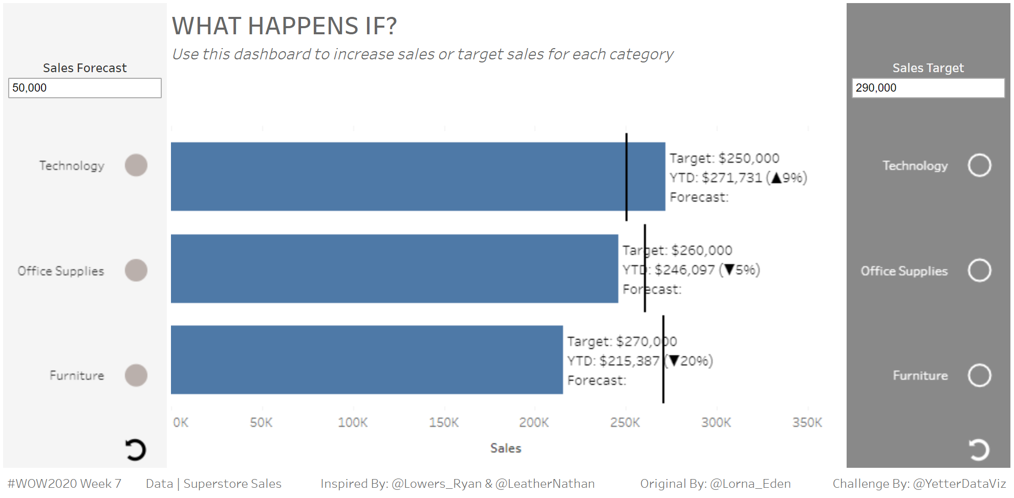
This week’s challenge by Lorna was a crash course in Parameter Actions. And by crash course I mean this was the second week in a row I was bumbling around with my screen shared for others while I tried to figure out what the heck I was doing. Rather than peek at Lorna’s workbook this week (like I did last week on Ann’s challenge), I started scrolling through Lindsey Poulter’s Twitter feed knowing that I would surely find something that would be applicable. I found it in her Makeover Monday Matching Game. So everything in this post about how to accomplish the parameter actions I learned from Lindsey’s viz.

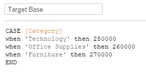
I started out just building the bars with the target lines to get warmed up. At first I just kind of plugged some numbers for the target to get set up until I had the parameters all figured out.

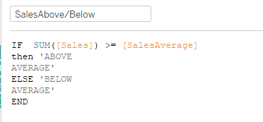
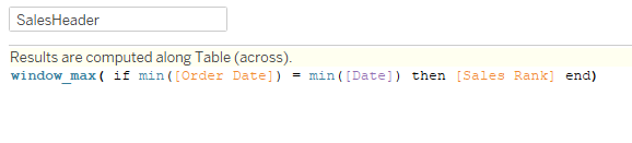
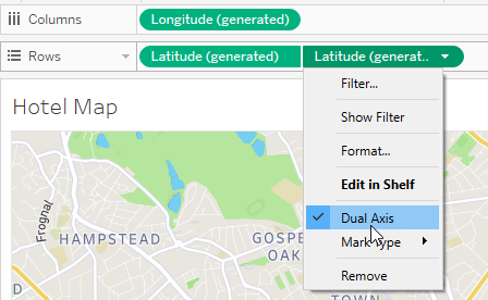
So in order to get the bars with the Gantt bars, I had SUM(Sales) and the Target value on dual axis, with Category on the rows.

With that base set, I built the Forecast and Target Labels. Once again, Category on rows for each, and then I just pulled category onto detail and changed the mark type to Circle for Forecast and Shape for Target (since they were empty/filled circles).

(Ok, I totally breezed through that…mostly because I’m afraid of how long it’s going to take me to go through the parameter actions, but also I feel like most of that is fairly self-explanatory, and I’ll get back to it more with the actions stuff)

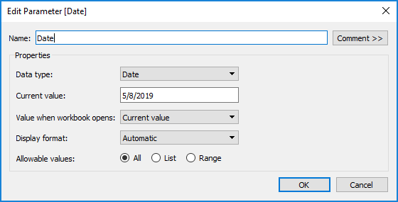
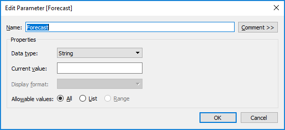
Parameters!  First I created the Sales Forecast parameter:

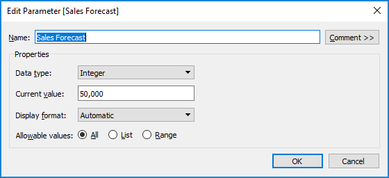
Then the Sales Target parameter:

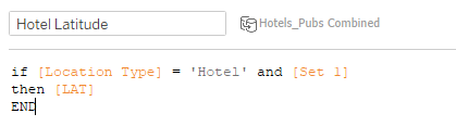
I decided, as I looked over Lorna’s viz, that I would need to build parameter values adding each category and value as the category was clicked on. Due to the nature of parameters, I knew I would need two, one for the category, and one for the value of the forecast/target. As I thought threw it, I figured they all needed to be strings, so I created four string parameters with an empty value (Forecast, Forecast Value, Target, Target Value):

On to Lindsey’s wizardry…(I’ll discuss Forecast, and Target is pretty much mirror image) In order to add values to a parameter as you click on things, you need a calculation to check if that value is already there, and if not, add it. Here’s what that calc looks like:

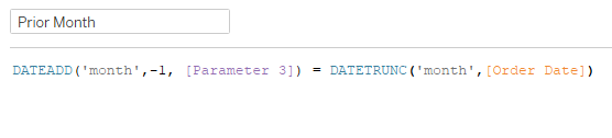
That one builds my Forecast parameter with the categories that have been selected. But per Lorna’s requirements, we also need to capture the amount typed in the forecast box when each category is selected. That requires a similar calc:

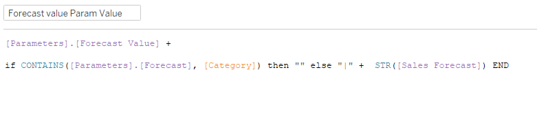
Notice that I’m starting with the [Forecast Value] parameter, checking if the [Forecast] parameter contains [Category], then adding the [Sales Forecast] parameter value (in string form) to the [Forecast Value] parameter.

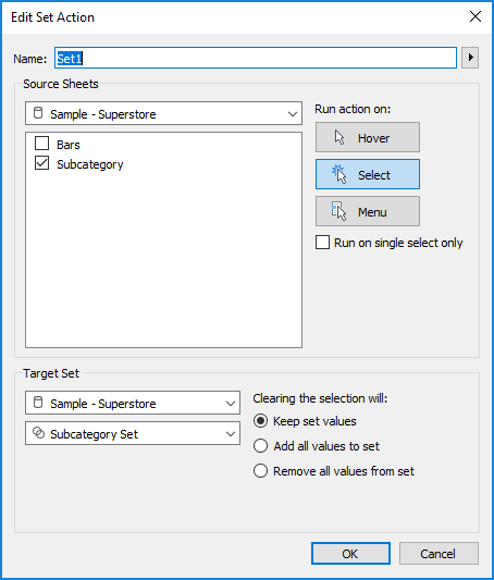
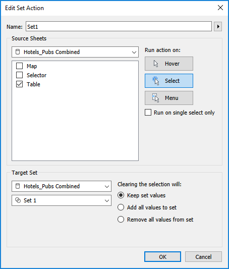
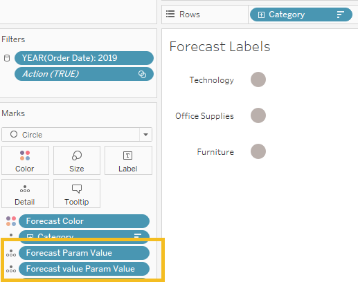
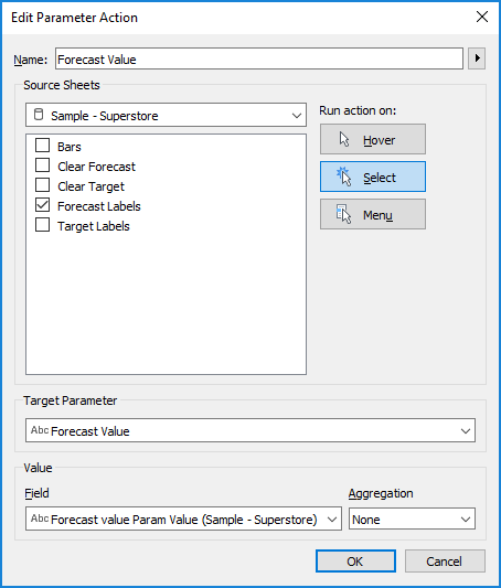
Now we need the Parameter Actions to pump this data in. In order to make it work, we need the above calculations in the detail of the Forecast Labels sheet:

Then on the dashboard, we add the action:

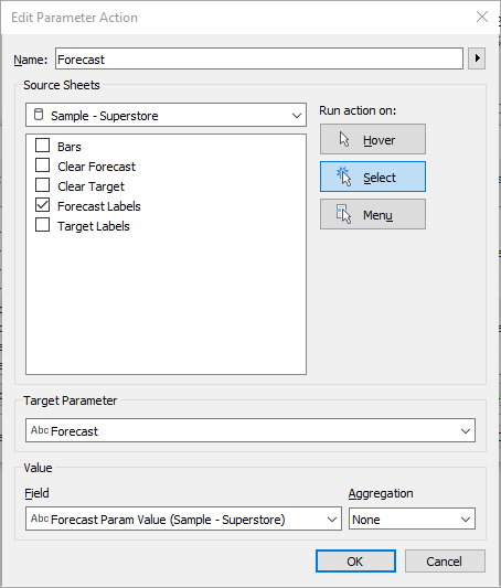
This says on Select in Forecast Labels, pass the [Forecast Param Value] into the [Forecast] parameter. The Forecast Value action is similar:

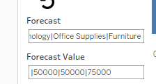
At this point I chose to show the parameter control for Forecast and Forecast Value so I could see what was happening. And it worked!

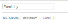
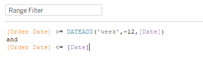
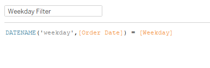
Now that we’re capturing these values, we have to turn them into the thin bars on the bar chart. But how do we tie the category in [Forecast] to the value in [Forecast Value]? I started by identifying the 1st, 2nd, and 3rd values of each parameter, like this:

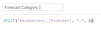
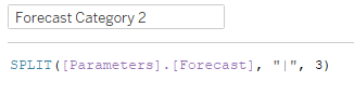
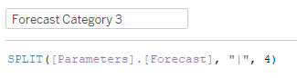
(Forecast Value 1,2,& 3 were similar, just with INT in front of the SPLIT in order to turn them into numbers)

With each of the values split out, I can now create the forecast value based on Category:

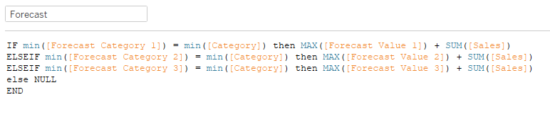
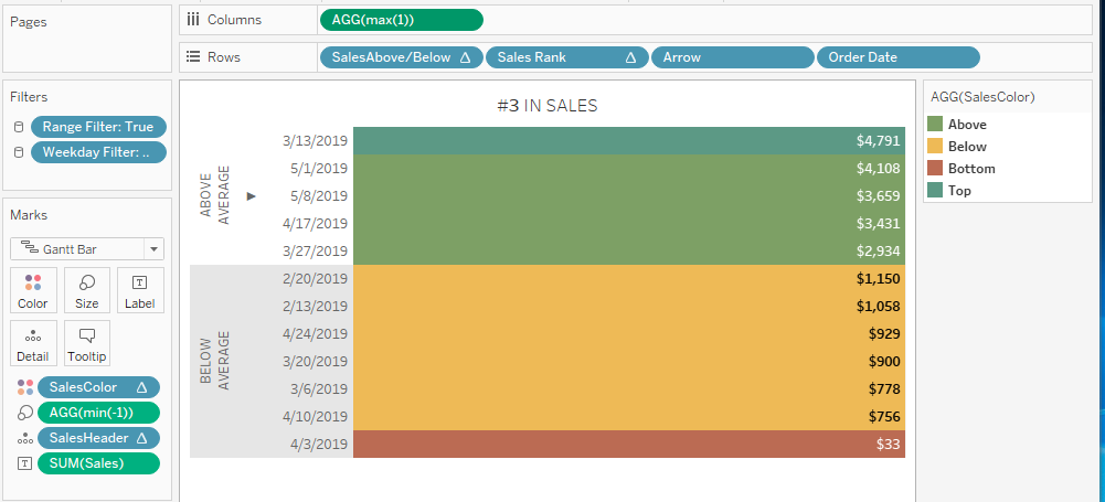
Basically, I’m checking to see if the [Category] is in [Forecast Category 1], and if it is, add the [Forecast Value 1] to SUM[Sales]. (I’m adding to SUM[Sales] because that’s what the forecast is doing per Lorna’s requirements) Same thing for the 2nd and 3rd calcs. If the [Category] isn’t in any of the 3, then NULL so the bar doesn’t show up.  Drag the [Forecast] onto the SUM(Sales) axis in the bar chart, and move [Measure Names] to Color and Size, making sure to turn Stack Marks “Off” in the Analysis menu. Another round of testing showed appearing bars!

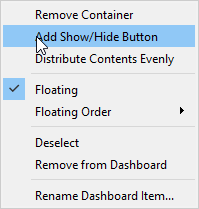
Along the way I needed to build the clearing mechanism. So I created a Clear Forecast and Clear Target worksheet, with a [Clear] calc consisting of “” (yep, just two quotes). With [Clear] in the detail, I chose the Shape mark, then added an Undo icon for the Shape.

(SIDENOTE: Need icons? I usually do a Google search, but then you have to figure out if you need to attribute or what, and is it transparent, etc. I realized I could just open up PowerPoint, pick the icon, make one black and one white (since the Target version needed to be white), and save it as a PNG. Then you save them into the Shapes folder of My Tableau Repository, and you’re all set!)

After adding that sheet to the dashboard, I created another Parameter Action:

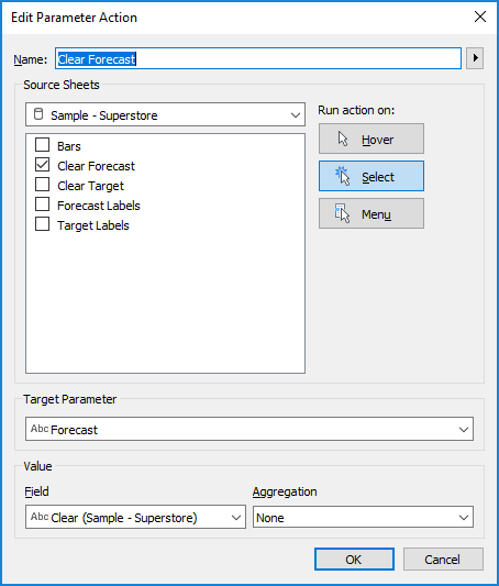
So this will just pass “” into the [Forecast] parameter, making it start fresh.

One of the extra items in the challenge was to make selections automatically deselect. I’ve talked about that here before, using Yuri Fal‘s TRUE/FALSE method. I applied this to Forecast Labels, Target Labels, Clear Forecast, and Clear Target.

For the bar labels, I created a [vs Target] calc:

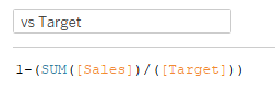
Then to get the up/down triangles to show, I remembered a formatting trick I think I first learned from Curtis Harris. If you set your regular number format, you can then select Custom and tell Tableau what you want to show for positive, negative, or zero values.

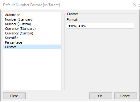
In this case, my positive number is down, because those are my values less than 100% since I did 1-(sales/target). If you want another format for a zero value, you would just add another semi-colon and then the value you want.

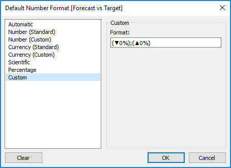
This worked fine for my sales vs target, since it was always appearing. But when I did the same for my forecast vs target, I realized I could just hardcode the parentheses in the label, or it would just look like this () if there wasn’t a forecast. So I decided to throw the parentheses in this custom format, and it worked!

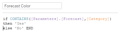
At this point, I did all the same Parameter Action work on the Target side, and created a calc for the Forecast Color (with a similar one for Target Color):

After adding those to the Forecast Labels and Target Labels sheets, I checked the tooltips, got everything sized, padded, and colored correctly in the dashboard, and tested like crazy (seriously, I think I clicked around those circles at least a hundred times). With that, we did it!

Here’s the link to Tableau Public

Once again, a shoutout to Lindsey Poulter whose work I reverse engineered to get to this point. Great challenge Lorna!

Thankful Thursday – Jeffrey Shaffer

In previous #ThankfulThursday posts, I’ve mentioned how Andy Kriebel‘s blog was first on my favorites, and Cole Knaflic‘s was second. Well, a very close third on that favorites list is Data + Science, Jeffrey Shaffer‘s blog.

Within the first few months of my Tableau experience, when I was googling how to do everything, I came across Jeff’s Tableau Reference Guide. As of today, this reference guide contains 737 curated links (737!!!!) to content created by Jeff and many, many others ranging from basic chart how-to to Level of Detail and heavy duty calculations (and much more).

Jeff also worked with Steve Wexler and Andy Cotgreave to author The Big Book of Dashboards. As I’ve noted previously, I love having this book as a reference to identify what works in dashboards and why, and be able to implement those principles in a work setting.

Some of my favorite Tableau Conference sessions over the past few years have been Jeff and Andy Kriebel‘s speed tipping sessions. (TC16, TC17, TC18) Jeff continued the tips tradition (with a twist) at TC19 with Luke Stanke, as they did Two-Minute Tableau Tips and Tricks with longer form tips. All of these sessions have been so valuable in identifying faster/better/more efficient ways to do things in Tableau.

So thanks, Jeff, for all you’ve done (and continue to do) for the Tableau Community.

Workout Wednesday – Week 6

I don’t know what it was about Ann’s challenge today that made it so difficult, but I S-T-R-U-G-G-L-E-D. I changed course multiple times, spent 20 minutes just trying to figure out a course of action in the first place, and thankfully got some ideas/assistance from the people in the room (all of this happens while I’m sharing my screen with several colleagues).

My first struggle was just figuring out the general layout. Ann’s hint to not use Measure Names/Measure Values just obliterated every idea I had initially of how to get these rectangles. And that was likely my problem, I thought of them as rectangles. (More on this later)

Since I was struggling with the layout so much I finally just decided that I would need the performance comparison calc, so I just as well create it. My initial thought was to do SUM([Sales])/LOOKUP(SUM([Sales]),-1), and that totally worked fine throughout the entire building process, until I got to the tooltips late in the game and realized I was going to make life difficult for myself. That’s when Yu Dong piped up and said she just created a current month and prior month calc based on a parameter. So much cleaner, no need for table calcs, creating indexes to hid the prior month, etc. So the rest of this walkthrough will incorporate that process.

So, to identify our current/prior month (and allow for someone to change the dates, per Ann’s requirements), we start with a basic date parameter:

Current value here is 11/1/2019 because Ann’s viz was based on November.

(Sidenote: You can tell how ready to be done I was at this point, after having built everything but the tooltips and needing to “start over”, I didn’t even name the parameter. Always name your parameters and calcs, kids!)

Now we need to identify the current and prior month. Current month just compared the parameter value with the first day of the month of Order Date:

Prior month does the same thing, just comparing the month prior:

Then, in order to filter the view to these two months, just need a quick combination calc to drop on the filter:

(Yep, another unnamed calc, it was bad)

Now that we have the current/prior month, we need the measures. This is another one Yu helped me clean up. I usually lean to something like IF min(Current Month) then SUM(Sales) END kind of thing, but it wasn’t really working with my boolean Current Month calc. So this is where we landed, with the aggregation outside of the IF statement:

Prior month calcs were the same, just with Prior Month in place of Current Month. Then for the performance comparison, just Current over Prior:

With all of the metrics complete, had to figure out how to get the aforementioned rectangles. Somewhere in the 20 minutes of stupor, I finally just had to download Ann’s workbook to get an idea of how she went about it. One look, and I realized they weren’t rectangles, they were bars. Once I had that insight, I jumped back into my workbook, threw some min(1)’s onto the columns shelf, and had myself some bars.

To get the color, I created a calc for each metric to check if the performance comparison was greater than 100% and set the color accordingly:

With each of the colors in place, I needed to figure out the KPI label. Since I was already identifying if current month was greater than prior in the color calcs, I plugged those in:

That gave me the proper percentages, but I needed to get the red indicator. At first I tried to incorporate it with the Overall value calc, but decided against that. I ended up copying a bullet point and throwing it in a calc:

Then I changed the mark type to text, and added Indicator and Overall to the label:

When I got to the tooltips, I realized I needed to get the month name for the current and prior month for the labels:

Finish up the tooltips and formatting, and we’re all set!

Click here to view the workbook in Tableau Public.


Makeover Monday – Week 5

This week’s #MakeoverMonday challenge put a twist on this viz about Brits’ preference for the character James Bond:

The twist was that the data was broken down by whether they voted to leave or remain in the EU during Brexit voting, rather than the population dichotomy above.

What works:

  • I actually think the stacked bars work fairly well in this case, since Acceptable and Unacceptable both start with a common baseline on each end of the bar. You can see the difference between the two groups fairly easily.
  • Sections are clearly labeled so you know what’s being measured

What could be better:

  • The population labels (which are fairly wordy) get kind of repetitive
  • By the time I get to the bottom, I’ve forgotten which side is Acceptable/Unacceptable

For my viz, I played around for about 30 minutes with different column/row combinations with the category, response, measures, etc. For a while I was starting to think the stacked bars were the best option (and a case could probably be made that they work just fine in this case). Eventually, I decided to just focus on the Acceptable responses, since the don’t knows were similar for both sides and fairly small, so Unacceptable was just a mirror image. Doing so allowed me to reduce the noise and really hone in on a comparison between REMAIN and LEAVE groups for each of the four questions. Here’s what I finished with:

Here’s the link on Tableau Public