Workout Wednesday – Week 34

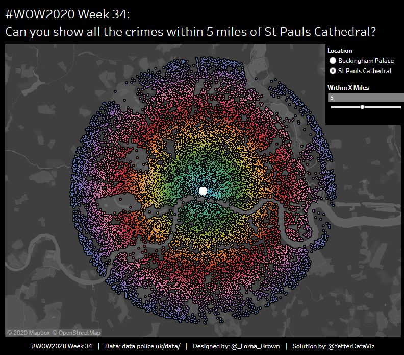
This week’s challenge from Lorna changed it up a bit with some mapping stuff. I don’t get much of a chance to use mapping at work, so it was kind of fun to play with something new.  Since I haven’t used the functionality much, I used a couple posts from Jeff Shaffer and Sean Miller that helped a bunch to figure out the radius setup.

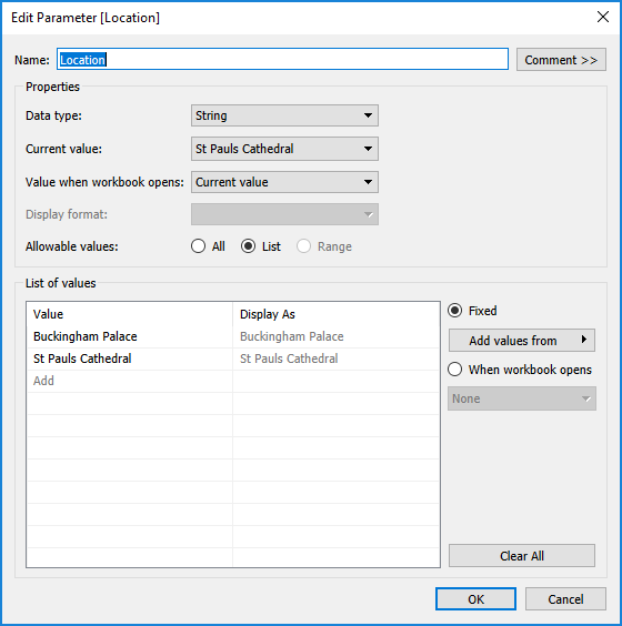
I started with a parameter for the location selector for Buckingham Palace or St Paul’s Cathedral:

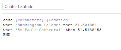
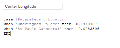
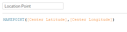
Then I created a couple calculations to set Latitude and Longitude for the center point based on the parameter selection:

Last step is use MAKEPOINT to create a point for the center location:

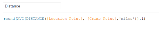
With both points, I can now measure the distance from the chosen point to the crime point:

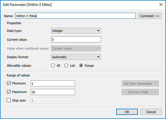
Next I created a parameter for the number of miles radius:

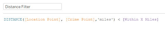
With that, I can create a boolean to filter the items to only within the radius:

Now we can put the map together. Double-click on Latitude (generated) and Longitude (generated), and that inserts them on Rows and Columns. In order to get each dot, we add Crime ID and Crime Point to detail. I also added Distance to Color. Initially, when it was continuous, I couldn’t get the Hue Circle color scheme. So I tried changing it to Discrete, and selected Hue Circle palette, and Assigned palette. That matched up with what Lorna’s looked like. I wasn’t quite sure what her note about color bands in 10 meters meant, as I was unable to create bins or anything from the Distance field.

In order to get the larger dot, we need a dual axis. Ctrl+click on Latitude(generated) and drag it next to the original. Then right click and select Dual Axis. Then on this second Marks card, you replace Crime Point with Location Point. Remove Distance from Color, and set it to White. Then you can increase the size.

Last thing we need for the map is to adjust the map settings. From the Map menu, click on Map Layers. Set Style to Dark, and then I set Washout to 25%:

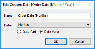
Now on to the Tooltip. Add Month to Columns, and COUNTD(CrimeID) to Rows. Make sure the Distance Filter is applied to this sheet as well.

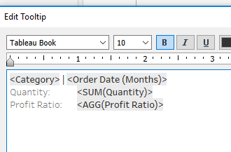
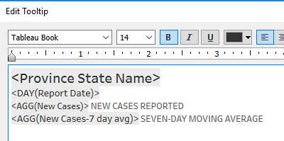
Back on the Maps sheet, we need to add COUNTD(CrimeID) to Tooltip, and then setup the tooltip:

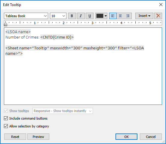
The important thing when adding the Tooltip sheet is to make sure it only filters on LSOA name.

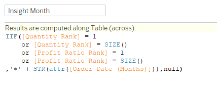
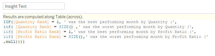
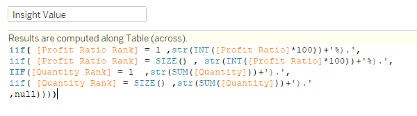
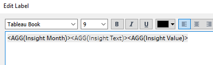
On the dashboard, we pull in a Vertical container, and add the Map to it. For the title, we need to include the two parameters:

We can then add the two parameters to a floating Vertical container, and place them in the top right of the view. And we’re done!

Click here to view in Tableau Public

Workout Wednesday – Week 33

Ann‘s challenge this week was to create a connected scatterplot with some automatic insights. I totally went down the wrong path, so it took me a bit longer than it should have. But we figured out two different ways to do things!

I started with the scatterplot. I placed SUM(Quantity) on Columns, and Profit Ratio on Rows. Then I added Category to Color, set the colors per Ann’s viz, and set the mark type to Circle. Next, I created a custom date from Order Date:

This just made it easier to use in the Detail and calculations. So I dropped that on Detail, and now I have all the dots I need.

For the connected part of the scatterplot, I did a quick search and found Ryan Sleeper’s blog post about how to build one. The variant here is I only need it to connect when something is selected. So first I created a set from Category, and then created a calc to give me the value if the set was true:

Now I can take this calc and add it as a dual axis on Rows (since I set it to be Profit Ratio). Then I want that mark to be a Line, with Category on Color again, and then the Order Date (Months) on Path and Label. The last thing we need here is the Set Action to make it work:

At least I thought that was the last thing. But when I clicked on dots, while the line would show up, only the dot was highlighting. So in addition to the Set Action, I needed a Highlight Action:

With these actions in place, just need to clean up the tooltip, and this sheet is complete:

As I was starting down the Insights path, I started out using LODs. But I kept running into issues with aggregation or something. So we decided to go down the table calculation route. And we got it to work, with the exception of the INSIGHTS title. So I’m going to go through what we did, just as a learning exercise, even though it didn’t quite match close enough to Ann’s version for my liking.

I started with ranking the Profit Ratio and Quantity:

Then used these ranks to identify the desired month values:

So if the rank is 1 (top) or equal to SIZE (bottom), then give me the bullet point plus the string of the month.

Then we did a similar thing for the text in between the month and the value:

This time instead of OR, I needed nested IIFs because each text line is different.

Lastly, we need the value for each one:

To get a clean percentage on the Profit Ratio, we multiply the PR by 100, then take the INT, and add the percentage in our ending string.

Now we add all three of these to Text, and setup the label:

Each of the table calcs needs to be set to process on the Order Date (included the nested rank calcs in each):

In order to get only the 4 items we want to show up, we can create a Rank Filter:

Then we can create a variant on this calc to create a ranking order to get them to appear in the correct order:

When we add this to Rows, it has a Null followed by 1,2,3,4. So I excluded the Nulls, unchecked Show Header, and we have our insights:

The issue with this solution is that we couldn’t get INSIGHTS to follow the color scheme without adding it to the Label, but then that messed up the spacing for each of the rows. But aside from that, this solution gather the information we were looking for. (I didn’t bother formatting the dates in this portion)

Now for the other solution, which actually did use LODs. I think I’ve gotten so used to having to figure out Table Calcs for WOW that I just dismissed my LOD solution prematurely. So once I stepped back and thought through it (see also: peak at Ann’s sheet), it made total sense.

We start with the Profit Ratio and Quantity by Category and Month:

Then you add the MIN and MAX of each to Text. Next we need four different calcs for each of the four months we need. These calcs check to see if the Category Profit Ratio or Quantity equal the MIN or MAX fixed on the Category, and return the Order Date (Months) if they do:

Then we add all of those to Text,add Category to Color, and the Category Set to filter, and set up the Label:

This was definitely the more simple solution for this Insights, even though it involved a few more calcs.

In the dashboard, I set things up in a Vertical Container (title, black bar, sub title, scatterplot, footer):

Because of the location of the Insights sheet, it needed to float. (I also floated Sheet 2, in case anyone wanted to see how that sheet worked. But in order to hide it, it has to be on the dashboard. So I set it to 1 x 1 size floating in the left corner.)

And we’re done!

Click to view in Tableau Public

Makeover Monday – Week 32

This week’s Makeover Monday looked at survey results of the top benefits for remote working:

benefits-of-remote-working.png

The interesting thing about this week’s makeover, is that it’s actually a makeover of a makeover.  Here’s the original chart from the Buffer survey report:

When you look at it this way, the chart given for the makeover is much improved of this non-aligned, not-quite-sorted, confetti donut chart.

Given this clarification, here’s what I like about the chart:

  • Clearly labelled, easy to see which section of the bar is what thanks to alignment and color matching
  • It adds up to 100%. So often it seems a donut or stacked bar won’t add up to 100%, which means it was definitely not the right choice. But this one does, so that’s a positive.

What could be improved:

  • Even though the stacked bar can give you the proportion, it’s hard to see how those top three items really compare with each other. How much more of a benefit is the flexible schedule than the lack of commute?
  • If we take it out of the stacked bar, we don’t need all the colors.

In our MM get together this afternoon, my colleague Yu Dong was trying to brainstorm what was even possible with such a small data set. And she said, “I don’t want to just do simple bars.” Challenge accepted!  So I set out to do “simple” bars, but with a little more pop than just some blue bars on the white background.

Here’s what I built:

Click to view in Tableau Public

Workout Wednesday – Week 32

I was excited to start Luke‘s challenge this week because at first glance I thought I had the solution pretty much in mind. That thought always betrays me. Always.

Thankfully he provided the calculations needed for the rows/columns of the cartogram. That was an easy start. Then I added Report Date to Columns, and People Positive Cases Count on Rows. With Province State Name on Detail, the cartogram started to come together. But per the challenge, we need new cases from that field, so I added a table calc of Difference From, and selected from Previous. I knew I would end up nesting that calculation for a 7 day average, so I ctrl+click and dragged it to the Tables pane on the left, which gave me the calculation:

To get the 7 day average, I used a WINDOW_AVG of New Cases:

After adding this to rows in place of New Cases, I set the chart type to Area, and added the 7 day average to Label, and set it to show on Maximum Value. Then I noticed that the peaks weren’t matching up with what Luke had. So I had to normalize it. In order to normalize, I need to divide the 7 day average by the maximum new cases value for each state:

Things were looking pretty good at this point. But then when I did my usual labelling mechanism for these kinds of charts (multiplying the value * 1.4 and putting it on a dual axis), I was unable to get the line underneath the trend to work. I played around with that and a bunch of other attempts, until I finally just took a peak at Luke’s workbook. Even with that it took me a solid 10 minutes to figure out what he did. I had identified from the tooltip on the state label there was a separate date, and I needed to put that on a dual axis with Report Date. Based on it being a center date (the state label is centered), I created a calculation to make it the center of the date set:

This one finds the difference (in days) between the earliest and latest report date in the data set, divides that by two, and adds that to the earliest date in the data set. So when I add that date as a dual axis with the report date, and synchronize the axis, it puts a point right in the middle of the axis. So when I added a label, it put the label at the bottom of the chart. No matter how I aligned it. I finally looked at the calculation Luke had on rows, and it was a different way of doing my 1.4 value:

This one took me a minute of talking through it to figure it out. But then I realized, for the Center Date axis, there will be more than one Report Date, so it puts those points at 1.4. For the values on the Report Date axis, there’s only one, so it does the normalized value. Once I saved that calc, the state label popped right up to the top. With that in place, I needed to update the tooltips:

Setup the title and caption, and drop the worksheet into the dashboard, and we’re done!

Click to view in Tableau Public