Workout Wednesday – Week 44

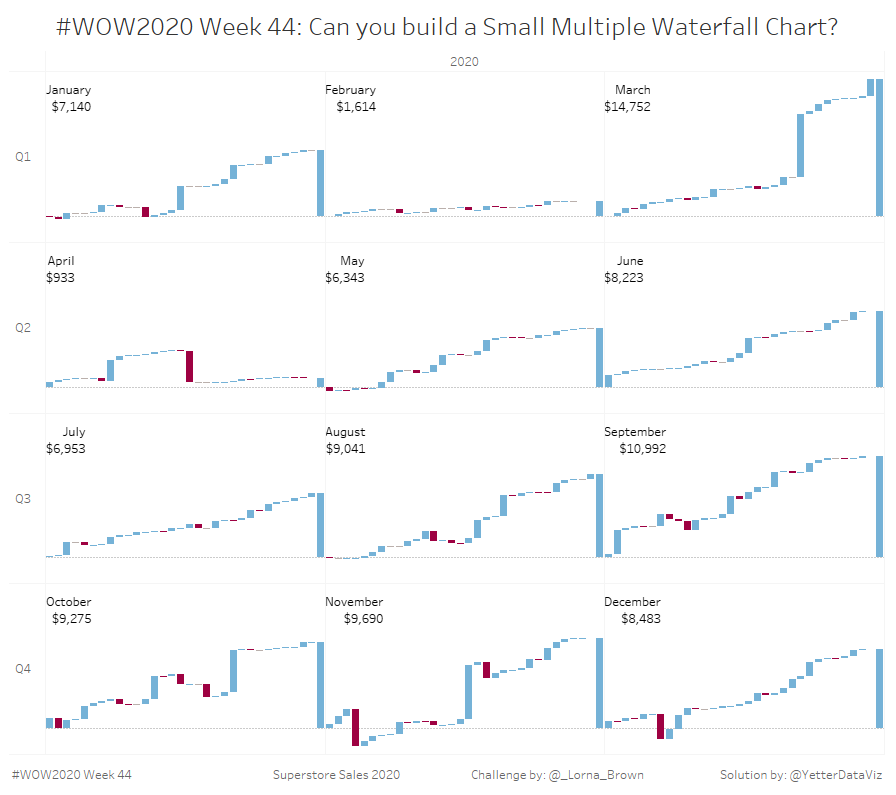
This week’s challenge from Lorna was a bit of a respite from recent weeks. Thankfully, I’m familiar with building waterfall charts, so it was pretty straightforward.

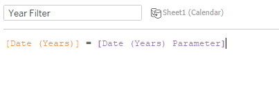
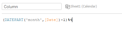
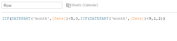
I started by filtering YEAR(Order Date) = 2020, and also added YEAR(Order Date) to Columns in order to get the 2020 header. Then I added QUARTER(Order Date) to Rows. The hard part was getting the month. Initially when I put MONTH(Order Date) it still put all 12 months horizontally with a bunch of gaps where the quarter and month didn’t match. So I went back to my Week 42 post and found the calc that put the months into 4 columns, and adjusted it to be 3 columns.

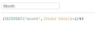
This gives me the remainder when the month value (1-12) is divided by 3. I subtract 1 so March doesn’t end up in front of January (3/3 = 0 remainder). Putting that on Columns then got the months in the right place, so it was time to get the waterfall.

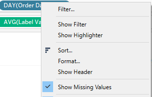
I added DAY(Order Date) to Columns, and set the mark type to Gantt Bar. There were some days missing, and Lorna’s requirements were to have something for every day. So we have to check Show Missing Values:

I added SUM(Profit) to Rows and created a quick table calc of Running Total.

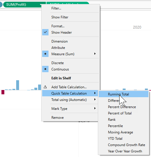
In order to get some bars, I added SUM(Profit) to Size. But that gave me a bar going up from the running total value, rather than up to the running total value.

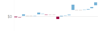
So I edited the SUM(Profit) on Size, and added a – in front of it, and that fixed the bar direction.

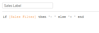
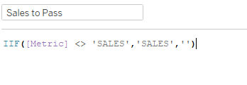
You may be thinking, “how’d you get those colors, Kyle?” Normally I probably would’ve done something like IIF(SUM(Profit)>0,’Blue’,’Red’). However, I recently read a blog post about using booleans instead of creating values like that for better performance. So I tried it:

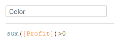
This gave me three values, True, False, and Null. I added it to Color and set the colors to match Lorna’s, with gray for Null.

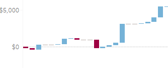
I also needed to get the monthly total on the far right, so I went to the Analysis to Add All Subtotals:

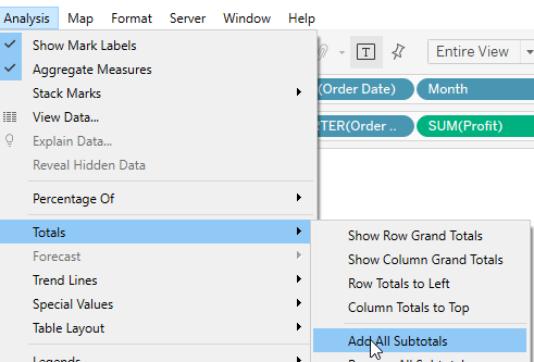
…and hallelujah it did exactly what I was expecting/hoping it would.

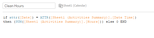
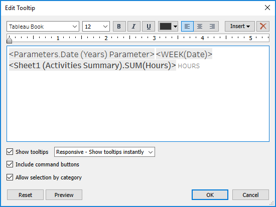
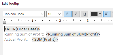
As I checked the tooltip, I realized we needed the actual Order Date, so I added that to the Detail. But then it screwed up my running total table calc. So I then tried adding ATTR(Order Date) instead, which allows you to exclude it from a table calc, and that worked! I also needed to add SUM(Profit) to the Tooltip, since I only had a running total or a -SUM(Profit) in the view. Here’s what the final tooltip looked like:

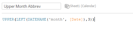
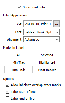
The hardest part of this week’s challenge was figuring out how to get the month labels in the top left. I tried reference lines and a couple other things, but finally settled on an LOD:

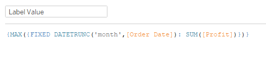
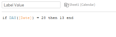
I needed something to give me the highest monthly profit. So I used a FIXED on the month DATETRUNC, but then I also needed a FIXED MAX to get the largest monthly profit value. That also meant I needed to add the year filter to Context. Once I had this value, I added AVG(Label Value) to Rows, and made it a Dual Axis. Then I set that mark type to Line, and turned the Size all the way down along with setting opacity to 0%. After I created the Label Value calc, I realized I needed the monthly profit value for the label.

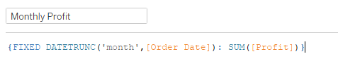
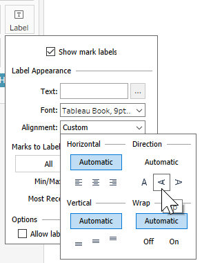
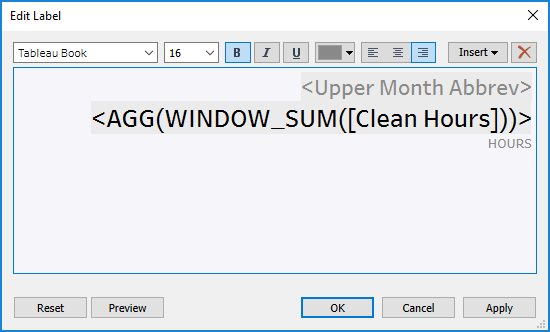
Then I added that to Label, along with MONTH(Order Date).

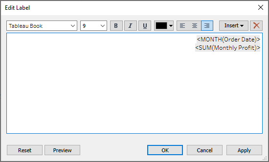
Then set that to be on Line Ends, and Label start of line:

With the monthly profit labels in place, we’re done!

Click to view in Tableau Public

Workout Wednesday – Week 43

If there’s one thing I’ve learned doing Workout Wednesday, it’s that I can look at something and think, “oh, that should be easy, I know just how to do it” and be COMPLETELY wrong. This week’s challenge from Luke was no exception. The main guts of the challenge was pretty straightforward, but there were a couple little formatting things that just didn’t quite work as I expected.

I started with the bar charts. I placed MONTH(Order Date) on Columns, and SUM(Sales) on rows. I added the mark labels and rotated them:

My problem came when I tried to format the axis to match Luke’s, with the tick marks every 2 months and in the center. I tried making it continuous and that got the tick marks in the middle, but I couldn’t get them every other. Then I tried using a custom date instead, but that worked about the same. Even when I could get the every other tick mark, I had an extra D in front of January. It was really bothering me, so I checked out what my other WOW friends came up with, and came across Annabelle Rincon‘s solution:

This took care of the extra D before January. Then I duplicated the sheet and changed the metric to each of the other three. With the bar charts out of the way, time for the KPIs.

I knew I would need a parameter to get the KPIs to show the bar chart. At first I created a String parameter with a list of the four metrics, but then I realized that if I’m passing a value into the parameter, I don’t need to set a list.

I started with a MIN(1) in Columns to get a bar, then added a MIN(0) on a dual axis. That allowed me to add SUM(Sales) as a label on one bar, and the metric label on the other. I needed a calculation for the + and – based on whether the KPI was selected. I noticed that  the + and – were bold, while the metric name was not, so they needed to be separate.

For the other part of the label I just created a calc with ‘SALES’ (or the other respective metrics). Then I setup the parameter action, passing ‘SALES’ to the parameter, and Set value to ” when the selection is cleared. However, once I got things setup in the dashboard, my unhighlighting made it so there was no selection to clear, so it wouldn’t deselect. It was doing some crazy things, with the labels disappearing or turning to null, and I couldn’t figure out what was going on. So I changed MIN(1) to AVG(1) and that seemed to fix the labels from disappearing. After 30 minutes of messing with the actions, I went back out to the WOW friends, and found Samuel Epley‘s solution via Donna Coles. Instead of using the parameter action to clear the value, it uses a calc to set the blank value if the parameter already equals ‘SALES’.

So I added that to Detail, and adjusted the parameter action to use that field, and that magically fixed the actions.

I mentioned previously the unhighlighting in the dashboard. I added a calc with ‘FALSE’ to the detail, and set a filter action in the dashboard (I’ve mentioned this method various times previously):

In the dashboard, I needed a vertical container with a white background for the title, and then I added another vertical container with a gray background for all the KPIs. I set the inner padding on the gray container to 15 px. For the KPIs other than Sales (Sales already had top padding with the container padding), I added 10 px to the top outer padding. For the bar charts I added 20 px of inner padding for everything except for 10 on the bottom.

To get the bar charts to only show when their KPI is selected, I just created a boolean for each metric and added to the filter shelf:

The last little thing I noticed in Luke’s challenge was a gray line dividing the white title background and the lower gray background. For that it’s a quick blank object into the vertical container, set with no outer padding, a darker gray background, and edit the height to 1 px. And with that we’re done, with all the little tiny formatting intricacies and all.

Click here to view on Tableau Public

Workout Wednesday – Week 42

September was kind of a crazy month for me, which meant my Workout Wednesday solutions and/or blog posts didn’t happen. But I’m back at it this week, and what better way to come back than have a challenge from the original Workout Wednesday master, Andy Kriebel.

Right off the bat I knew we were in for some fun when the requirements said no LODs and it would have to be blended data sources. Blending seems to always screw up the way I want to do things, so that’s fun… :oÞ  But I got it started setting up the individual data sources.

The first thing I worked on was the daily view. In order to make sure we have all the dates even if there was no activity, we need to use the Date field from the Calendar dataset. So I added DAY(Date) to Columns. Then SUM(Hours) to Rows and set the mark type to Bars, and that gave me a general starting point.

I knew I would need a parameter for the year, so I started by created a custom date for the year:

Then I clicked on the custom date >> Create>>Parameter. After that, I needed one more calc to compare that parameter value to the custom date value for a T|F filter:

I tried a few things to get the columns and rows working to get the months spread into the calendar-like view. I even went back to a method I got from Andy a few years ago that’s usually how I setup a trellis/small multiple. But then I realized it used an LOD, so that was a no-go. I finally settled on this:

For the columns, I took the month value (integer 1-12) and took the remainder when dividing by 4. That’s the ‘%’, and it has a name, but I don’t remember what it is! That got me close, so I needed to subtract 1 from the month value, and that got the months into the right columns.

For the rows, I tried to use division to do it a bit more dynamically, but ended up doing something a little less complex:

So if the month value is less than 5, set it to 0, if it’s less than 9 (but greater than 4), set it to 1, otherwise set it to 2.

Once I add that to Columns and Rows, that gave me the general structure. I made some adjustments to the size of the bars, turned off borders and set them to Black. I noticed after I finished everything else, that I had failed to figure out how to show 0 hours when there was no activity. Because we’re blending the data and activity data sources, it took a slightly different calc than I would otherwise do:

I decided to compare the Date to the Date Time from the Activities data set, and if that’s present, give me the SUM(Hours), otherwise give me 0. I actually didn’t have a ton of hope that this would work, but it did!

For the month labels with monthly hours, I felt like I needed a dual axis of some sort, but couldn’t put my finger on how to do it. I was thinking it would be on the date axis, but that didn’t really work. I was pretty stumped, so I took a gander at Sam Epley‘s solution for this week, and had an “aha!”

At first I used LAST()=0, but then realized that put the text horizontally in a different place depending on which month it was (28, 29, 30, or 31). So then I just went with DAY(Date) = 28 so it would be consistent. I picked 13 just based on the spacing I saw in Andy’s viz. So I added that to Rows, set the Dual Axis and Synchronize Axis. Then you set that mark type to Text and add the month and hours. Except the month abbreviations were in uppercase on Andy’s, but not mine. So I created this one:

We also need the sum of total hours for the month. So I added a WINDOW_SUM(Clean Hours) to text, and that gave me what I needed. With those to pieces in place, here’s what my text looked like (being sure to right align):

I also noticed as I compared mine to Andy’s that my bars were right up against the dividing lines (which I formatted to the widest setting and white), while Andy’s had space on both ends. Once I changed the DAY(Date) from Discrete to Continuous, I magically had space! With that we’re finally done with the main part of the workout.

Moving on to the weekly bars, it was pretty straightforward. With the Year Filter on, I added WEEK(Date) to Columns and SUM(Hours) to rows. After changing the mark type to Bar, I just needed to remember to set the tooltip:

*** I noticed that my bars didn’t quite match Andy’s. As I dug in, it looked like Andy’s might’ve been looking at weeks starting Monday where mine were weeks starting Sunday. I tried creating a DATETRUNC to set it on the week starting on Monday, but that gave me the actual date, and formatting the week number gave me week 53 instead of week 1. So I’m thinking it’s a situation of Andy being in the UK with a Tableau setting of weeks starting on Monday. At least, that’s what I hope is the difference. ***

The last worksheet (requirements said max of 3 sheets) had the BANs. I went with ol’ reliable…MIN(1) (x3) I added MIN(1) to Columns three times. Then set all mark types to Text, and added SUM(Hours) to the first, SUM(Miles) to the second, and COUNTD(Activity ID) to the third. Then set the text for each one with their metric label (hours, activities, miles) and changed hours to blue. Turn off the tooltips, and we’re set with this one.

It’s always hard to go through setting up the dashboard, so here’s what the final layout organization looks like:

And we’re done!  After struggling through the last few weeks, it felt really good to get this one done!

Click here to view in Tableau Public