This week’s challenge collaboration by Ann and Jami was all about table calcs. I really like doing table calc challenges (even though I struggle through them) because it really helps me improve my mastery of them. This week had a ton of little things that I didn’t really see working through it for the first while. It’s funny, I sat down Thursday night to work on this blog post, but I had “a couple things” I needed to finish, namely the days streak calculation. A couple hours later I had found like 5 different little formatting things I hadn’t even noticed on Wednesday. But I really enjoyed this one, and it was very interesting to see how things look in my area.
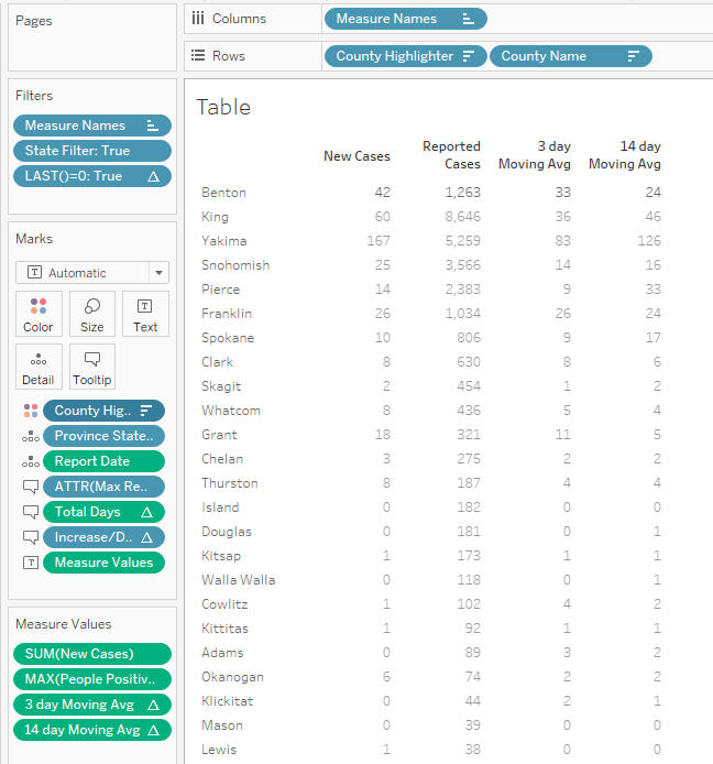
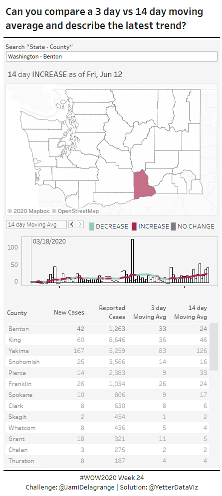
I started out like Ann suggested, with the table. (At first, I manually set the state to Tennessee so I could compare with the original. After I got further along, I took that off and replaced it with the dynamic filter I needed.) I started by making a calc for New Cases that would give me the last date’s value:
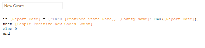
Yes, I realize I just went on for a paragraph about how this challenge had table calcs, and I went straight to an LOD solution instead. Looking at things now from the end, I did not need to do this. But I did it anyway.
Then I grabbed the MAX(People Positive Cases Count), and dragged it into the view to give me Measure Values on Text.
Next we need the 3-day and 14 day moving average calcs:

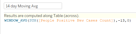
These calcs are telling Tableau, “I want the average sum of new cases for two (or 13) rows before my current row to my current row. In order to do this based on date, we have to add Report Date to Detail. But that gives us a bunch of data for every report date for each county:
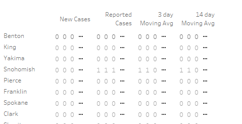
In order to get just the last date, I made a calc of LAST() = 0 and added it to the filter shelf where it equals True.
All three of these table calcs…the two averages and the LAST need to be computed using the Report Date:

That gives the most recent data for all of the Measure Values. This is why I didn’t need to use the LOD I started with, because having the LAST filter would’ve done the same thing for me.
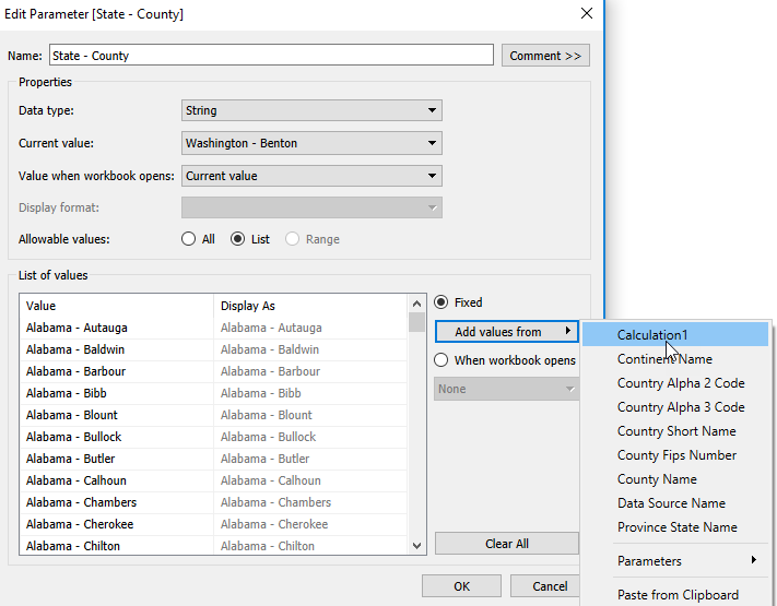
One of the little things I noticed later on was that the table was showing the selected county at the top, followed by the rest of the counties sorted by reported cases descending. Also, the text for the selected county was darker than the rest of the counties. I’ll jump into the parameter I created to select the State/County.
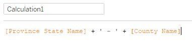
At first I thought I could just create a combined set, and it would’ve been so smooth. But for some reason, it wouldn’t let me combine the State and County sets I created. I could combine those with other test sets, but not with each other. It was weird. So instead, I created a calc that combined the two:
Then I created a parameter, and added the values from this calculation:
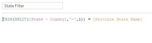
Then I created my state and county filters:
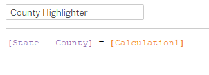
To get the selected county to the top, I added County Highlighter to Rows, sorted to get True to the top, and unchecked Show Header. Then I added County Highlighter to color, and set the dark and light gray. Here’s the end result of the table sheet (I’ll get to the tooltips later):
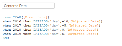
For the map, we just need to add state and county to the detail, add a copy of the County Highlighter (since we’re using different colors than the text table, we need a separate dimension), and we need the increase/decrease calculation. We need to compare the 14 day avg to the 3 day avg:
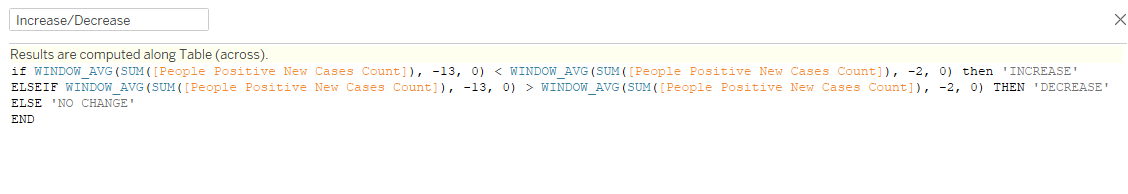
In hindsight, I could’ve just used my 14 day and 3 day calcs I already had, but this helped cement how to build window calcs manually (vs doing so from the pill menu). Then we add this to color as well (you can add it to Detail, then click on the Detail icon and change it to Color). Then all the false values get set to white, and you need to select a county that has each of the increase/decrease/no change values to set those colors properly.
We also need to have Report Date in this view and LAST()=0 in the filters, in order to calculate the Increase/Decrease properly.
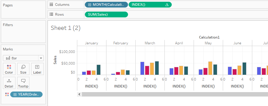
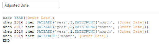
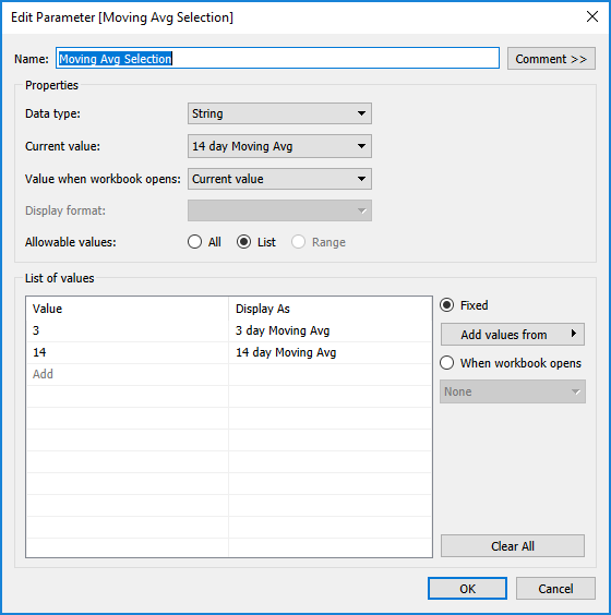
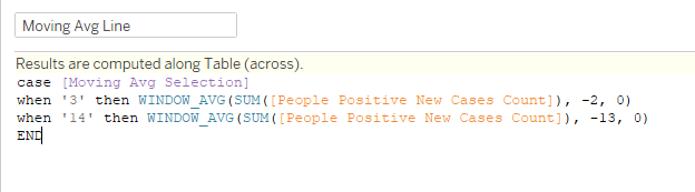
For the bar chart, I started with SUM(People Positive New Cases Count) on Rows and DAY(Report Date) on Columns. Set it to bar, with white color and a black line border. Then the line needs to be dynamic based on the selection of 14 day or 3 day. So I created another parameter:
And then my case statement to use the chosen calculation:
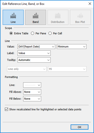
Add that to Rows on the dual axis, and synchronize the axis, along with adding Increase/Decrease to color. Because this needs to be on the county level, I added County Highlighter to filters. In order to get the reference line to show the date of the first reported case, I added People Positive Cases Count to filters, with a minimum value of 1. Then I could add a reference line and use the Minimum Report Date:
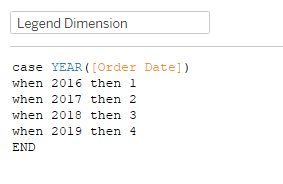
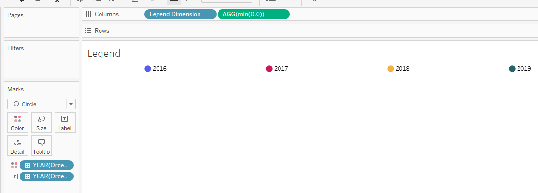
Once I had these sheets done I started putting together the dashboard layout. A little thing I noticed was the gray background for everything between the two black lines at the top and the bottom, so I noted that I needed a vertical container within a larger vertical container that had a gray background. The Search “State-County” is a Type-in Parameter Control of the State-County parameter. It was this point I noticed the legend wasn’t really a legend. I thought it might be a sheet, but then it wasn’t acting like a sheet either. By this point, I was just in it for figuring out how the heck they did all this stuff, so I took a look at Jami’s workbook…
IT’S A TEXT BOX!!! How have I never seen this before? It’s literally just a box character, with the font changed for each box to match the color. I can copy/paste it here (the color doesn’t transfer from Tableau): █ DECREASE █ INCREASE █ NO CHANGE. This was kind of mindblowing, and had nothing to do with table calcs.
I saved the hardest for last, and I knew it would be the hardest. I thought through it a bunch of different ways, did all kinds of searches, and kind of had an idea of what I might need to do, but at this point I think I was going on 3+ hours of working on this (which is way more than I usually try to spend). So once again, I was in it for the learning, so I took a look at Jami’s calculation. And it made no sense. I was literally looking at these calcs thinking, “how in the heck is that working??? That seems backwards…” I finally had to pull a worksheet together with the calcs to see what they were doing over time, rather than just the last day’s value, so I’ll walk through that here. First we need the Tally Count:
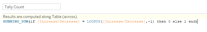
So this is saying if the Increase/Decrease value is the same as the one before, then 0, else 1. Then take the running sum of this value. And we’ll compute using Report Date. Here’s what that looks like in chart form:
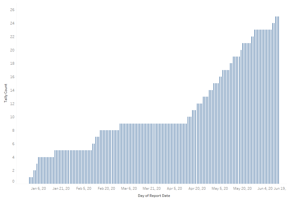
So whenever the Increase/Decrease is the same, it stays at the same level. So then we can follow up with Total Days:
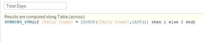
Similar concept here, but if the tally count value is equal to the LAST tally count value, then give us 1, and a running sum. This really is an amazing calculation combo, and putting it in chart form really helped me grasp what was going on, because the 1’s and 0’s seemed backwards to me as I was just trying to picture it in my head. With this calc complete, I could then fix all the tooltips that needed this value. Pretty much every calc in the whole workbook are computed on Report Date, which at least made that part of the table calcs easy.
And with that, three days late…we’re done!
Click here to view in Tableau Public