Thankful Thursday – Lindsey Poulter

I think my first exposure to Lindsey Poulter‘s work was a March Madness viz I found when I was doing some research for my own viz in early 2017. It was simple, clean, and packed a lot of data in a fairly small space. My first go at a March Madness viz the year before was an explosion of every type of metric I could think of, so the clean simplicity of Lindsey’s viz was very eye-opening for me. I think it was also when I realized I could use a different font and/or and image in the title to spice things up a bit. My resulting viz was a much more focused, cleaner take on March Madness than my first.

Lindsey’s take on the Washington Metro Scorecard was the inspiration behind Andy Kriebel’s new way to visualize an income statement, which I have often used when talking about visualization in the Finance dept I work in. Once again, clean, focused, and full of information in a small space without feeling cluttered.

Lindsey didn’t really publish much for a year and a half, but when she started up again, she blew my mind. When Set Actions became a thing in Tableau, I had kind of a hard time wrapping my head around what they could really do. Then tweet after tweet (after tweet) from Lindsey allowed me to really understand the true power and possibilities created through Set Actions. When I started our internal Ancestry TUG last year, we were getting ready to upgrade our Server, so I decided to show some of the things possible in 2019.1. I basically just downloaded Lindsey’s whole Set Actions workbook  and picked 5 or 6 examples to demonstrate the power of what was possible to our group.

Kent Marten, me, and Lindsey (she apparently missed the memo that there’s no smiling when you take pictures with Kent)

At TC19, in addition to watching her get oohs and ahhs  during Iron Viz, I had a couple opportunities to chat with her for a bit. For as amazingly good at Tableau as she is, and the “celebrity” that she is now in the Tableau Community, she is one of the most humble and unassuming people you could ever meet. She lets her work speak for itself.

So thanks, Lindsey, for everything you contribute to this community.

Workout Wednesday – Week 5

This week’s challenge from Luke was pretty simple, at least from a requirements standpoint. “All” we had to do was replicate the step-ranked chart with different labels on each end of a line with only one calculation on labels. Luke also included an “advanced” option to not use the square or shapes mark type.

Since I do the challenge live with a group at work, I started with a basic version. First, I created a Rank calculation on total sales:

After adding MONTH(Order Date) to columns, I added Rank to rows as a dual axis (and reversed the axis). Just to make sure the rank was calculating properly, I checked the table calculation:

In Andy Kriebel’s plain sentence version: For each Month of Order Date, calculate the rank of sales by region. For this basic version, I stuck with the Square mark for the boxes. I added Region to color, set the colors based on Luke’s viz using Pick Screen Color. Then adjusted the opacity of the squares to 45%.

For my label, I used FIRST() and LAST() to create a different label for each end of the line. In the basic version, I did a little hardcoding based on region:

Format the labels and the months, and all finished (with the basic version):

After finishing this round, we still had plenty of time, so we attacked the advanced version.

After duplicating the sheet, I looked at the options on the Squares marks card, and decided to try a Gantt chart. It showed promise, but I needed something to give it a size. So I added min(1) to size, but that made the boxes all run together. After playing around with the value, I settled on min(.9).  Then I noticed that put the lines at the bottom of the box:

I realized the Gantt bars were starting on the rank value, so I subtracted .45 so the rank integer would be in the middle:

That took care of the height of the boxes, so I tried adjusting the size on the marks card, and it widened the boxes without adjusting the height. Perfect!

I decided to also level up my label, rather than hard coding based on the region. First I created a label value to turn the rank value to 1st, 2nd, etc.

Then I dropped that calc into a copy of my prior label calc:

Initially when I added this calc to the label, things weren’t appearing correctly, so I had to play with the table calculation a bit. Here’s what those needed to be (Label (copy) and Rank as a Nested calculation):

One final hiccup I ran into was that the South label wasn’t showing up. Desireé offered a simple solution:

And with that, we’re done with the advanced chart. The spacing actually works quite a bit better with this one than with the squares, I thought.

Here’s the link to the interactive viz.


Thankful Thursday – Ben Jones

My first interaction with Ben Jones was at Fanalytics at TC16, of which he was the MC/host. I really didn’t know much about Tableau Public at the time, but was excited to learn more. I also didn’t really talk to anyone outside of my table, as I was still getting used to the whole “it’s ok, just talk to people” mentality.

Fast forward to TC17, and I went to a little Community meetup in the Data Village. I talked to a couple people, wandered aimlessly for a bit, and then happened to run into Ben. We talked for probably 10 minutes (a long time for my first conversation with someone), about my TC experience so far, Tableau experience, certification, my work at Ancestry and how we had a Tableau Public presence in prior years, and various other things. When I ran into Ben again at Fanalytics, I wasn’t really sure with all the people he meets at TC if he would remember me. Instead, he asked how my certification exam went, and we kind of picked up where the other conversation left off. I don’t recall, but hope that I actually asked some more questions about his work with the Tableau Public team. But some people are so good at making the conversation about you that you don’t realize (or at least I don’t) until after the conversation is over that you basically talked about your experiences the entire time with perhaps only the occasional (or nonexistent) return question. Ben is one of those people.

TC18 was much the same. I ran into Ben, happened to be with a couple Ancestry colleagues, so I introduced them. During the conversation, Ellie Fields (currently VP, Product Development at Tableau) happened to be walking by. Ben could’ve easily just said hi to her as she passed and let her continue on. Instead, he stopped her and said (paraphrasing here), “hey, Ellie, these are some of the folks from Ancestry, and they’re doing X,Y,and Z with the product.” A very small thing, but also once again making you feel like you (and what you do) matter, and helping you connect and feel a part of the community.

Last year, through his new venture, Data Literacy, and his book, Avoiding Data Pitfalls, Ben has begun sharing even more of what he’s learning with the greater data community in helping overcome some of the big hurdles that we run into as data people. I’m still working on his book, but as I thumbed through, the example that I happened to stop on (the banana ripeness survey) was so enlightening and told so clearly I can still recall the main takeaways, now more than 2 months later (even though I feel like half the time I forget what I’ve read in the last 15 minutes). I was able to catch a few minutes with Ben at TC19 (which is getting harder and harder to do, with so many people who, like me, have made the connection, and just want to say hi), and was finally able to reciprocate a little of what he so often gave me in our conversations as we discussed the effect cancer can have on our lives (and wives).

Ben and I (with Cesar Picco, Anna Foard, Brittany Fong, and Ryan Sleeper) at TC19

Ben has been instrumental in my feeling comfortable, welcomed, and belonging in the Tableau community. I’m positive I’m not the only such person. If you haven’t checked out Data Literacy or Avoiding Data Pitfalls, I encourage you to do so. They are excellent opportunities to learn from one of the great contributors to the dataviz community.

So thanks Ben, for making me feel welcome.

Workout Wednesday – Week 4

Sean Miller’s first challenge this week as a guest host was a great one! I actually finished this one this morning and immediately started talking to people about having this as an option in some of our dashboards. Here we go!

I started with the KPI BANs to kind of get warmed up. I just dropped the three measures into the view on top of each other, moved Measure Names to Columns and copied it to Label, and edited the text for size and color (which, thankfully, Sean gave us the hex code for).

Next I moved on to the area chart. I gathered from the weight of the line that it was a dual area and line chart. So I setup the dual axis chart, made one a line, one an area, reduced the opacity of the area to match Sean’s, and called it good. So far, pretty straight forward stuff.

Now on to the meat of the challenge…all the parameters needed. I started with the selector. I set up a string parameter with the four options Sean created:

I passed it through in a calculated field to use later. Then I created the parameter to be used for the Last N Days. This one was an integer:

The last two parameters needed were Start Date and End Date for the custom dates option. Here’s what the End Date looked like:

With all my parameters set up, time to make some calculations. The first one I started with the easy ones, Last 14/30 Days. I decided to try a Datediff to find the first day of the dates to show, and it worked! So then I added the Last N days, but instead of hard coding the number of days to subtract from the Max Date, I put the parameter in instead. Here’s what that final calc looked like:

Note: the Max(OrderDate) is in {} to make sure that it was the Max(OrderDate of the whole dataset (Fixed LOD), not just the individual row in question.

Now I could use this calculation to filter the view by saying Order Date > Date Chooser for these three options. The custom dates would be a little different, since it had a start and end date, so I made this calc for my filter:

Dropped this boolean onto the filter shelf in the area chart and started playing with the parameters in different combinations, and everything worked great! So I applied it to the BANs sheet as well. On to the selector sheet.

I took inspiration from Ann’s hack in the Superstore data in Week 2, and found a field I wasn’t using that had four values (it happened to be Region). So I whipped up this “renaming” calc:

Note: I tried just creating Aliases in the Region field, but it didn’t really work when I tried to do some conditional stuff. So I went with the calc instead.

So I added this Date Choice to Columns and Label, but I needed something to determine whether to use a filled or empty circle for the shape. Enter the Shape calc:

Pretty easy, if it’s what’s selected in the parameter, it will be True (filled circle), otherwise it’s False (empty circle). But my labels wouldn’t really align. That’s when I remembered I had already been through this in Week 2’s challenge, so I looked at my blog post  on it, and remembered Luke’s Min(0.0) trick. Played with the axis and found that -.2 to 1 worked great for spacing of the text and circles.

Now time to throw everything in the dashboard and setup the required Parameter Action.

A little testing, and everything works great! (I cleaned up tooltips and formatting as I went through each sheet) But wait…Sean’s version doesn’t show the N days box or the Start Date/End Date. I racked my brain for a bit trying to think through how to put something in a container and make it go away based on something being selected. I do Workout Wednesday live in a demo session at work, and had five minutes left before the hour was up, so I cheated and downloaded Sean’s workbook to give some closure on how to do it. Shoutout to Sean, great idea. Basically, he created a couple sheets (one for N days, one for custom dates) that had “” on Text and Columns, and a filter to only show the sheet when the respective option was NOT selected. Then you put that in a horizontal container with the parameter entry box to the right of it in the container. Then when the respective parameter option is selected, the sheet “disappears,” moving the parameter box to the left. Float a blank box (colored the gray of the background) where the parameter box sits when the sheet is there, and you have a “hiding” parameter.

And just like that, we’re done! Thanks for following along.

Tableau Public link here


Thankful Thursday – Andy Cotgreave

My first introduction to Andy Cotgreave was watching a session he did on the TC15 livestream. It’s been long enough I don’t recall what his session was about, though I do remember thinking it was super insightful (and that his kids were watching him and sent him a picture as he was getting started and it threw him off his groove a little bit ;).

So when I went to TC16 in Austin, I made sure I attended Andy’s session, even though it was in the furthest hotel from the convention center. He spoke about New Ways to Visualize Time and it was a great exercise in looking at things differently than the usual line chart, with a look at the history of visualizing time.

Andy’s was another blog I followed from early on in my Tableau journey. One of the images that I’ve remembered most from Andy’s work is this one:

Andy’s post about this (and the many times he’s discussed in his various talks) makes a great point about how there is a sense of bias in everything we do, and it’s something to keep in mind as we build visualizations.

As I reviewed the scheduled for TC19, I was sad to see no session from Andy (since he was hosting Iron Viz and moderated a panel with the Iron Viz contestants at Fanalytics, and that was plenty of work and preparation without trying to do another session).  His sessions have always been very thought provoking in understanding how we’re presenting data, he shares some great insights into how to make it work in the business setting, and very entertaining. His presentation at TC18 was a perfect example of this.

Another example of Andy’s providing insights into dashboard and visualization best practices is his co-authorship of The Big Book of Dashboards with Jeffrey Shaffer and Steve Wexler. I love having this book as a reference to identify what works in dashboards and why, and be able to implement those principles in a work setting.

Andy has truly lived up to his role as Tableau Evangelist, helping so many people identify and make better decisions when visualizing their data. So thanks, Andy, for all the work you do.

Workout Wednesday – Week 3

Lorna’s challenge this week felt like a good mix of familiar and unfamiliar for me. I continue to be amazed (though no longer surprised) how each week I can complete the same challenge in a different way. This week was no different, and I even downloaded Rosario Gauna‘s viz for this week and it’s even different still. A testament to the flexibility of Tableau.

So I started off getting the grid/small multiple setup figured out before I cluttered everything up with dots. My usual go-to is to create a columns and rows calc based on the number of items, but they are table calcs. (I pulled them from a Workout Wednesday by Andy Kriebel a couple years ago, and just saved the file and open it up whenever I need them. If memory serves, it’s a variation on calcs developed by Chris Love and/or Jeff Shaffer.) Lorna’s challenge SPECIFICALLY stated, “No hard coding of months or table calcs.”  BOO!

Ok, no biggie, a quick search gave me a quick intro to the Modulo function. There’s a great post on the forums about it. Basically, it divides a number by another and gives you the remainder. In this case, I need to make 3 columns, so I’ll divide by three.

When I initially created the calc things weren’t lining up with what Lorna’s looked like. Then I realized the months were out of order because 3/3 has a remainder of 0, so March was in the first column, followed by January and February. By subtracting one before the Modulo function, it solved that problem.

Once I had my grid in place, I added the day number, [DAY(Order Date)], to columns. Now I needed the hours of the order. Per Lorna’s instructions, I joined Order Times to the Superstore data, so I had the Time of Order field. I found that Lorna’s view was just using the hours, so I just built a calc to give me the left two characters:

This is one where there were lots of ways to do it. Rosario did a Dateparse of the 00:00:00 string, then a Datepart to get the hour:

Lorna used MakeDateTime with [Order Date] and [Time of Order], then created a Custom Date to get the Datepart of hours:

All three of these gets you the same thing, two-digit hours. I pulled hours into Rows, and reversed the axis as Lorna did. With both axes and the small multiples all setup, it was time to add the order count, [COUNTD(Order ID)], to the view. I added it to size and color, and played around with both until they matched up with Lorna’s.

To get the range of hours orders were placed, I decided to try a Gantt  chart on dual axis. So I started with an LOD to get the minimum/maximum hour for each day:

One more calc to get the length of the Gantt bar:

From there, I brought the Min Order Hour to a dual axis with Hours, added Hours Length to size, synchronized the axis, and played with the size to get the bar to match up with the dots. The last thing on Lorna’s sheet was a trend line, added on the hour axis.

After finishing the Days sheet, I duplicated the sheet to make adjustments for the weekday view. I replaced DAY(Order Date) with WEEKDAY(Order Date) and needed to adjust my calcs for the Gantt bar. I added a Month Datetrunc and changed the Day Datetrunc to Weekday, but it wasn’t working right. I played around with it for about 10 minutes before I finally figured out that I needed the Weekday Datepart, rather than truncating based on the day. The difference was like looking at a date level based on a weekday, rather than Monday, Tuesday, etc.  Here’s what that final calc looked like (just doing the Min Order Hour here, the other two are the same Fixed portion as this, with the aggregation the same as the prior calcs):

After replacing the Gantt calcs with these new ones, it’s time to setup the sheet switcher. I did this in last week’s challenge (and actually a good chunk of this afternoon at work), just a string parameter with two options:

Then you just create a calc to pass through the parameter and use that as a filter on each sheet. Add the sheets to a vertical container on your dashboard, hide the titles, and as you change the parameter, the other sheet collapses so only one sheet is visible.

The last (almost) curveball was that the gif on the challenge page looked like it might have been another sheet with shapes:

Once I opened up the workbook on Tableau Public, I realized it was just the parameter formatted to a larger font, and the radio buttons increase in size accordingly.

With that, challenge complete!

Click here to view it on Tableau Public.

Makeover Monday 2020 – Week 2

This week’s Makeover Monday looked at the use of pesticides in US agriculture.

What works:

  • Bar chart makes it easy to see the large number of pesticides banned in the EU
  • Bar labels make for easy reference

What could be better:

  • Took a minute to figure out what the chart is showing
  • Y axis not as necessary with the bar labels

It seems like small datasets are some of the most difficult for MakeoverMonday. They don’t leave many options for analysis, so the question becomes how to focus the visualization. In this case there was a slight difference in the data provided and the original visualization, where the data contained the pounds of pesticide used rather than the count of pesticides. I actually prefer this, as it identifies what percentage of pesticides used is banned in the other locations, rather than just a count of them.

I started out with some bars, grouped them by the country or count, and used horizontal bars to allow for aligned headers. I decided to focus on the amount of pesticides used that are banned in the EU, so made that bar red and the others gray. I felt like there was a little something missing, so I tried a brushed bar to show the relative size of the EU banned pesticides to the overall pesticides used. I liked the look, so I ended up adding it to my full set of bars. Added a color-coded title and subtitle calling out the high percentage of pesticides used that are banned in the EU.

Here’s how it turned out:

Click here to view the interactive on Tableau Public

Thankful Thursday – Desireé Abbott

Every once in awhile we find a colleague at work with whom we find a greater connection. While I don’t recall when exactly we became Tableau buddies, I realized early on when I started at Ancestry that when I had a perplexing problem in Tableau, Desireé Abbott was the coworker most likely to be able to help me find a solution.

As we closed out 2017, talking about what some of our goals were for the coming year, we had both been thinking about participating in #MakeoverMonday in earnest. So we decided to do it together, and invite anyone else who wanted to join. This hour together (via Zoom) each week helped us both improve our visualization style and technique, and also how quickly we are able to review the data and find the story we want to tell. Later that year (2018) I took the Tableau Desktop Certified Professional exam. Because of the yearlong preparation I had doing #MakeoverMonday every week with Desireé (and colleague Yu Dong, who has completed every #MakeoverMonday in 2018 and 2019 and blogged about them all!) the exam was manageable, and I was confident in my ability to complete it in a timely fashion and with good choice of best practices.

Me, Desireé, and Kevin Flerlage at TC19 (pretty sure Kevin and I were both taking a pic on our phone at the same time)

In 2019, I started an internal Tableau User Group at Ancestry. Coming up with topics for a TUG can be difficult, and Desireé was happy to assist, either in presenting with me in tip battle format, or helping to identify what topics or speakers would be useful. As I was coming back to work in early October after my wife passed away, I realized that October was TUG time, but I had hundreds of emails I had ignored for a couple weeks. After successfully getting things going through the year with three consecutive meetings, I didn’t want to lose momentum for something I was working so hard on all year. This is all the conversation I needed to have:

As we move into 2020, we are co-leading the Ancestry TUG, we continue #MakeoverMonday (with a few new participants), we co-host a viz office hours every week to help analysts with any struggles they’re having (i.e. Tableau Doctor sessions), and work on internal Tableau training together. Also, based on feedback from some people who started coming to #MakeoverMonday but wanted to learn more about how we built what we did, we’ve started doing #WorkoutWednesday live sessions where we try to build the challenge in an hour, talking through how we’re doing things. In short, Desireé is my partner in crime for building and maintaining the data culture at Ancestry; and without her help, that task would be much more difficult.

If you don’t already follow Desireé, find her on Twitter and Tableau Public!


Workout Wednesday – Week 2

I’m not sure if it’s that I was trying to move quickly (since we started doing #WorkoutWednesday live at work with a few colleagues so they can see some of the methods to make things work in Tableau) or what, but Ann’s challenge this week had me flustered for a bit. By the end, I realized I could’ve done it like Ann in only two sheets, but the path I started down (and was too lazy to get off of and start over) used a few more sheets. Thankfully, “# of sheets, up to you” was the second item in the requirements!

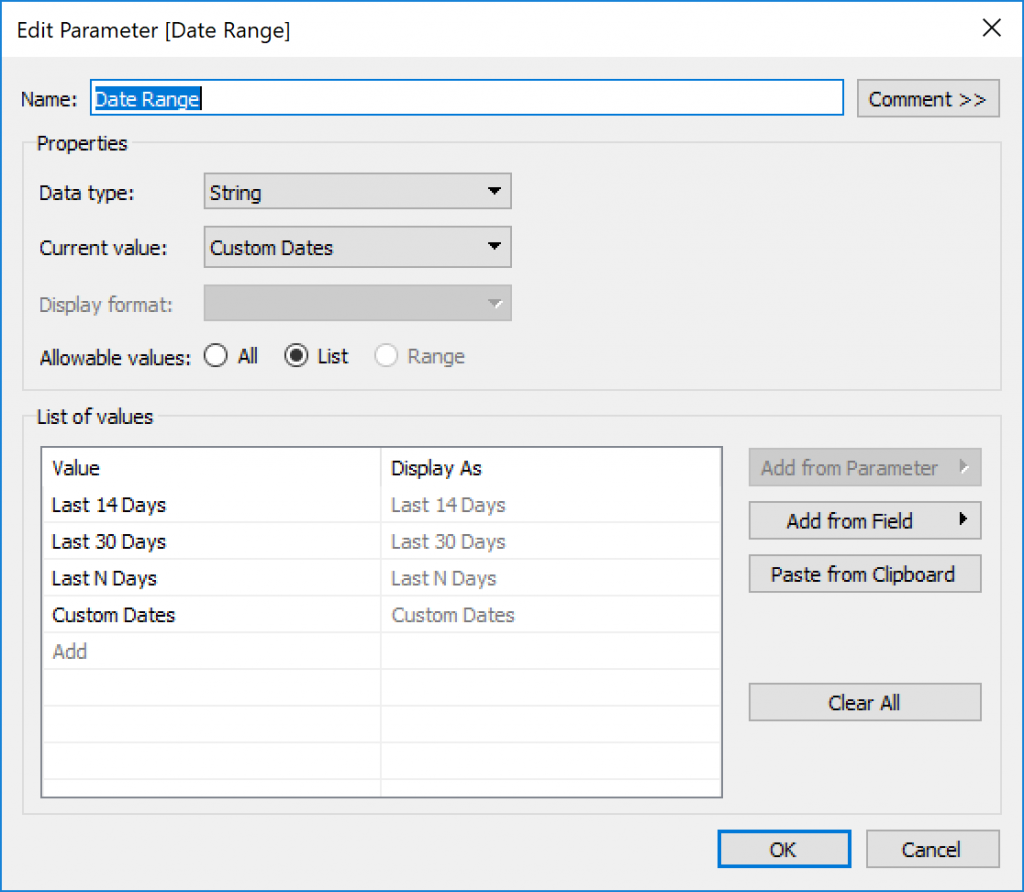
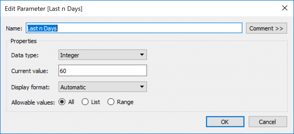
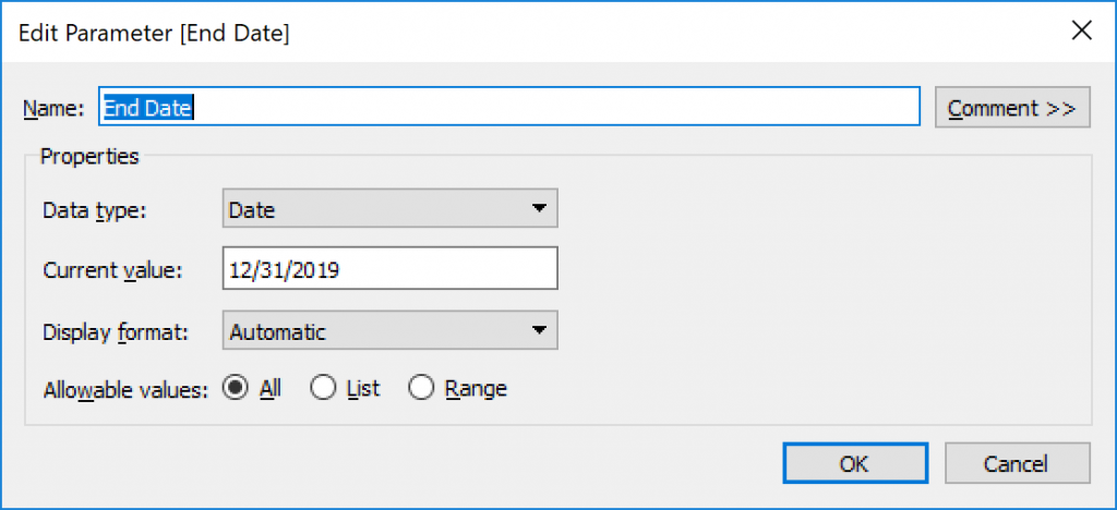
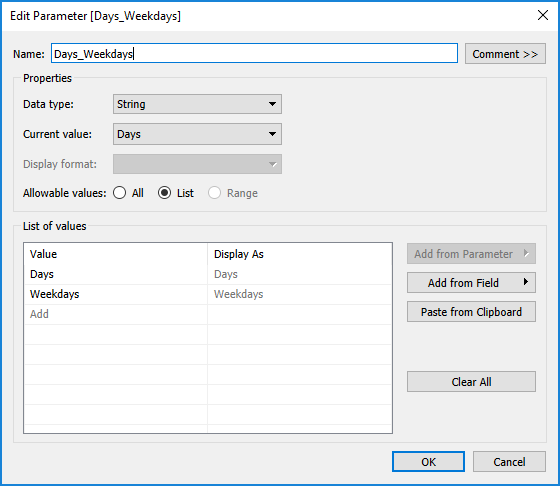
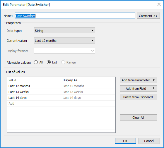
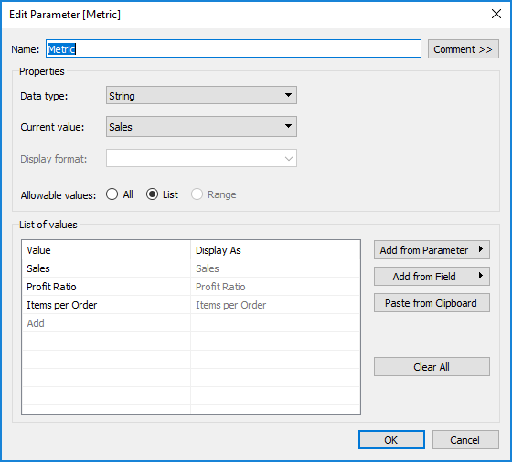
Ok, so I started with building two parameters. One for the Metric, and one for the date range. These were just basic string parameters with 3-item lists.

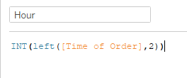
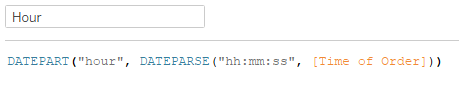
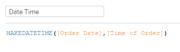
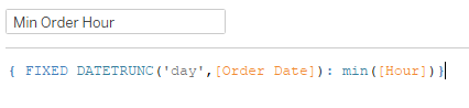
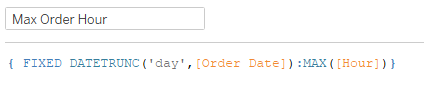
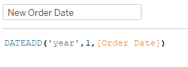
Once I had the parameters set up, I started working on the dates. Oddly, Ann’s data went through 2019, but mine only went through 2018. So I made a quick calc to add a year to the Order Date:

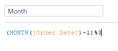
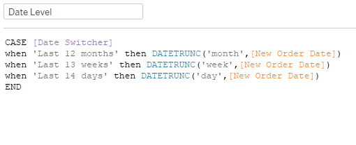
Then I created a calc to dynamically set the date level based on the parameter:

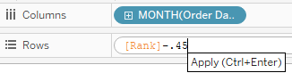
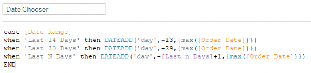
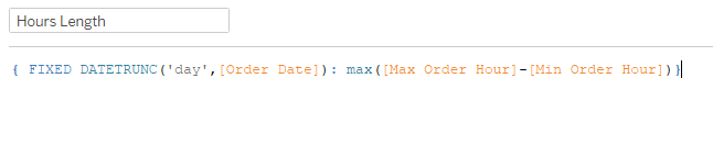
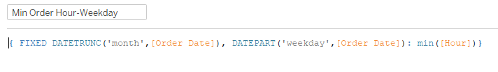
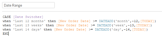
I also created a calc that filters the date to the desired duration:

When I first added Date Level to the view, I set it as a Continuous Date. So then I realized I would have trouble adjusting the formatting of the axis, so I decided to make a sheet for each parameter option (Daily, Weekly, Monthly) and just switch which sheet was shown on the dashboard by the parameter. I needed one more calc that just brought the value of the parameter in to filter the sheets.

(*Sidenote: I realized as I went forward that I didn’t want the date to be continuous, it needed to be discrete. This is the thing where I was so far down the path, I didn’t want to bother changing everything. With a discrete date dimension, I could’ve just made them strings, formatted in the manner we needed them to be in. That’s the way Ann did it.)

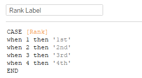
For the metrics, I used a similar case/when calc:

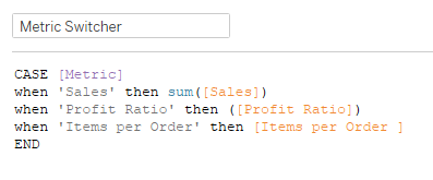
[Items per Order] was just SUM([Quantity])/COUNTD([Order ID]). This case statement adjusts the measure based upon which parameter option is selected. I added another calc that passes through the parameter value in order to set the colors. I formatted the date axis in each of my sheets as follows: Monthly – mmm ‘yy, Weekly – \Week ww, Daily – mm/dd. The week was a hard one because when I typed the W for Week it put the week number in it. So I picked one of the formats that showed weeks, and saw that there was a backslash in front of the w that showed as text. Plugged it in, and it worked!

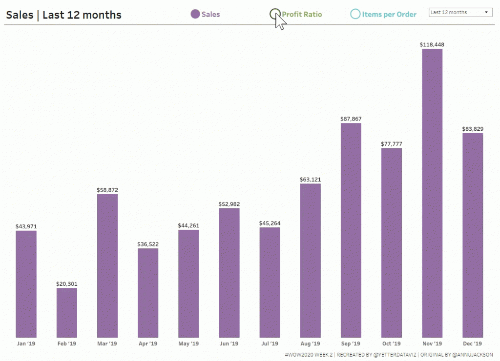
I skipped the labels at this point and just pulled my Daily/Weekly/Monthly sheets into a dashboard to feel like I was making progress. The key to sheet switching is to bring all three (or however many) sheets into a horizontal container, hide the titles, and set the sheet filter for each. For example, with the Date Switcher set to Last 12 Months, I added the Date Switcher Filter (which is just the parameter value), checked Last 12 Months, and that’s it. Then you change the parameter to weeks, set the filter on that sheet to Last 13 weeks, and so on for the Last 14 days. Now each sheet only appears when that respective parameter has been selected. And when there is no data in a sheet within a horizontal (or vertical) container, it minimizes to a couple pixels wide.

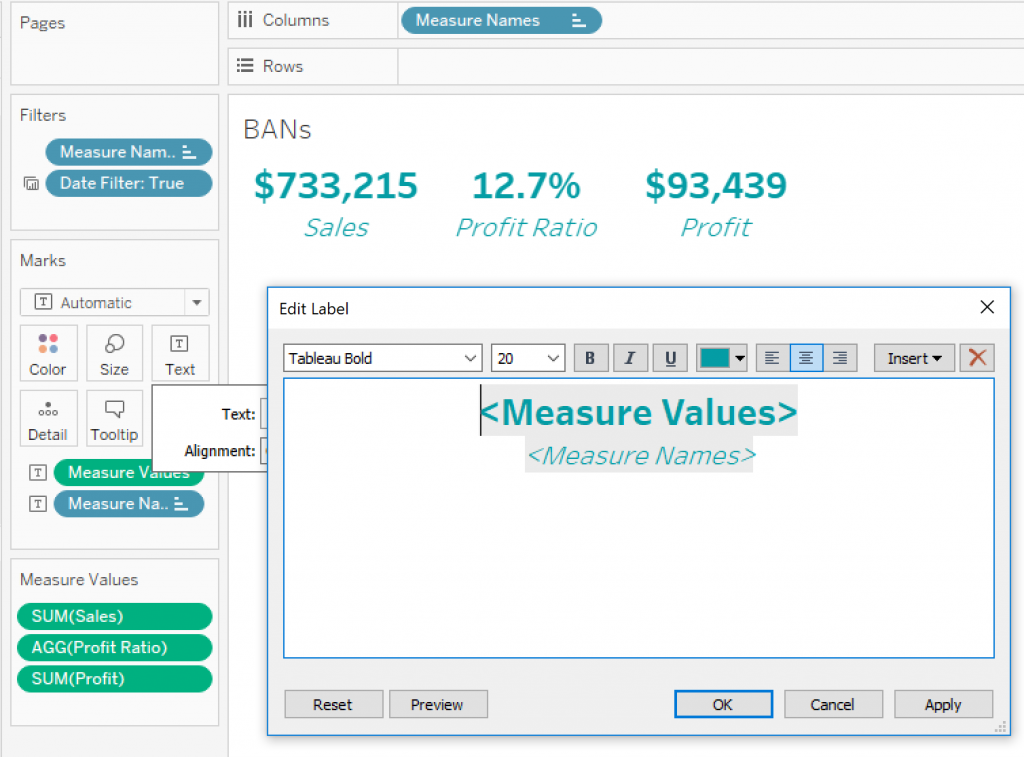
Now for the legend. I tried quite a few things trying to figure out how to get the shapes so neatly aligned with the text. I knew I needed to use shapes, with an open circle when the item wasn’t selected and a filled circle when it was. I tried to figure out how to get them all in one sheet, and eventually just bailed for the three sheets version, one for each metric. So I created three boolean calcs, one for each metric, that just had [Metric] = ‘Sales’ (or Profit Ratio or Items per Order…for this description, I’ll use Sales; the other two used the same process). I dragged that onto shape, and had to switch the parameter to set both True and False values. Then I double-clicked in the Marks card and added ‘Sales’ for the label and also the color.  I aligned the label to the right, and the alignment was still kind of funky. I tried adding MIN(0) to the columns, and that made the text align really well with the circle. However, when I put them all together on the dashboard, there was too much extra space to the left of each one. Then I remembered something I watched Luke do in his solution video for week 1. If you make it MIN(0.0) instead of just MIN(0), you can set the axis at a decimal level. So I played with the axis a bit, and setting the low end to -0.1 and the high end at 0.5 worked like a charm.

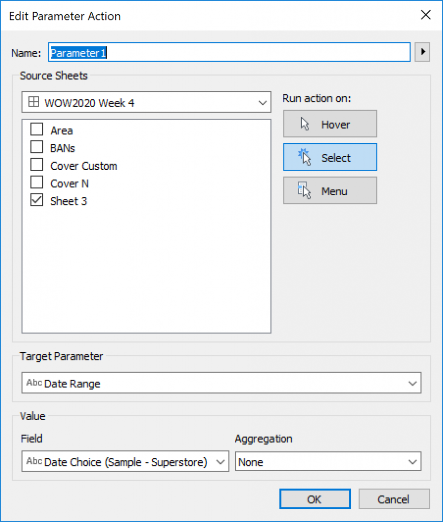
With the legends in place, it was time to add the parameter actions. Amazingly, this was almost the easiest part (especially after struggling through the legend stuff for about 30 minutes). Here’s what that looked like:

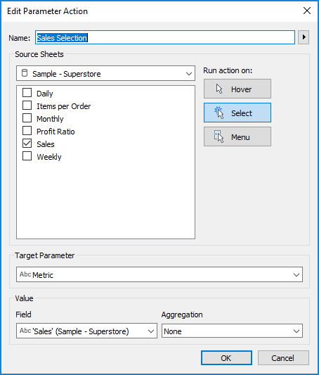
This worked because what I typed in the marks card matched exactly what the parameter values were, so I could use that as the Field in this case.

Another thing I saw Luke do in that video was automatically deselect when an item is clicked on for a parameter action. Compared to the workarounds I’ve done in the past (Joshua Milligan’s technique is the one I’ve used the most), this one is super simple. (I believe it can be attributed to this tweet from Yuri Fal)  Create a calc named TRUE, with calc TRUE. Then create a calc named FALSE, with FALSE. Add both of these fields to the detail (in this case, I added them to the three legend sheets). Then create a Dashboard Filter action like this:

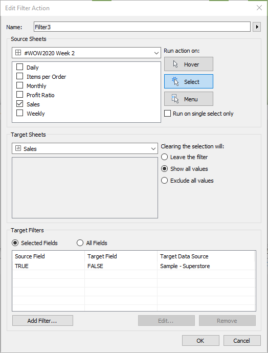
And you magically have items that deselect the moment after you select them, so you get the magic of the parameter action without the lack of magic of having to click twice on the next one you want to change (or having highlighting that you don’t want).

Now the only thing left was the labels. I cringed a little when Ann’s requirements said to use REGEX for the number formatting. While I’m aware of what REGEX is, I have very little experience with it. But I decided that this is why I do Workout Wednesday, so I started searching. I found a great regex cheat sheet posted by Ken Black here. This didn’t really help me solve the problem, but it helped me make a little more sense of the solution once I found it, and thought it was a great resource to share. Then I found this gem in the forums that was doing almost exactly what I needed to do:

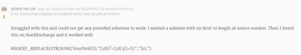
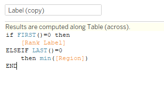
Here’s where I ended up on my label calc:

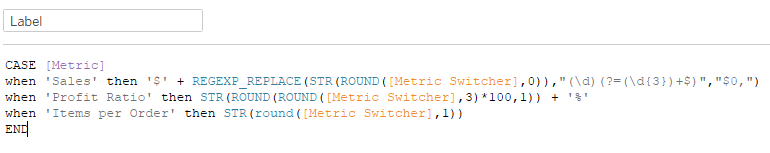
I don’t have much explanation of the REGEX…total copy/paste aside from rounding the value. I had to round the profit ratio twice in order to get the three decimal places of the original value for the two digits + one decimal place of the final desired value.

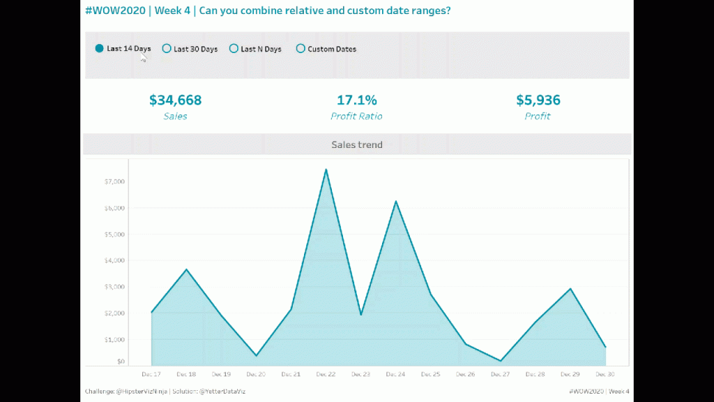
Quick touchups on the tooltips and checking all the formatting, and we made it to a solution!

To view in Tableau Public, click here. Thanks for following along!