Lorna’s challenge this week felt like a good mix of familiar and unfamiliar for me. I continue to be amazed (though no longer surprised) how each week I can complete the same challenge in a different way. This week was no different, and I even downloaded Rosario Gauna‘s viz for this week and it’s even different still. A testament to the flexibility of Tableau.
So I started off getting the grid/small multiple setup figured out before I cluttered everything up with dots. My usual go-to is to create a columns and rows calc based on the number of items, but they are table calcs. (I pulled them from a Workout Wednesday by Andy Kriebel a couple years ago, and just saved the file and open it up whenever I need them. If memory serves, it’s a variation on calcs developed by Chris Love and/or Jeff Shaffer.) Lorna’s challenge SPECIFICALLY stated, “No hard coding of months or table calcs.” BOO!
Ok, no biggie, a quick search gave me a quick intro to the Modulo function. There’s a great post on the forums about it. Basically, it divides a number by another and gives you the remainder. In this case, I need to make 3 columns, so I’ll divide by three.
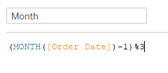
When I initially created the calc things weren’t lining up with what Lorna’s looked like. Then I realized the months were out of order because 3/3 has a remainder of 0, so March was in the first column, followed by January and February. By subtracting one before the Modulo function, it solved that problem.
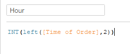
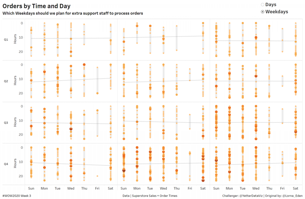
Once I had my grid in place, I added the day number, [DAY(Order Date)], to columns. Now I needed the hours of the order. Per Lorna’s instructions, I joined Order Times to the Superstore data, so I had the Time of Order field. I found that Lorna’s view was just using the hours, so I just built a calc to give me the left two characters:
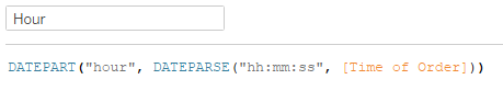
This is one where there were lots of ways to do it. Rosario did a Dateparse of the 00:00:00 string, then a Datepart to get the hour:
Lorna used MakeDateTime with [Order Date] and [Time of Order], then created a Custom Date to get the Datepart of hours:
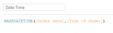
All three of these gets you the same thing, two-digit hours. I pulled hours into Rows, and reversed the axis as Lorna did. With both axes and the small multiples all setup, it was time to add the order count, [COUNTD(Order ID)], to the view. I added it to size and color, and played around with both until they matched up with Lorna’s.
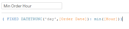
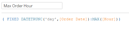
To get the range of hours orders were placed, I decided to try a Gantt chart on dual axis. So I started with an LOD to get the minimum/maximum hour for each day:
One more calc to get the length of the Gantt bar:
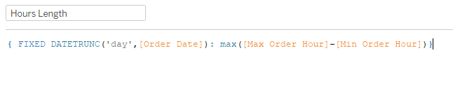
From there, I brought the Min Order Hour to a dual axis with Hours, added Hours Length to size, synchronized the axis, and played with the size to get the bar to match up with the dots. The last thing on Lorna’s sheet was a trend line, added on the hour axis.
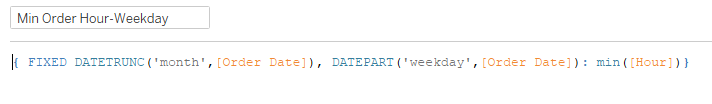
After finishing the Days sheet, I duplicated the sheet to make adjustments for the weekday view. I replaced DAY(Order Date) with WEEKDAY(Order Date) and needed to adjust my calcs for the Gantt bar. I added a Month Datetrunc and changed the Day Datetrunc to Weekday, but it wasn’t working right. I played around with it for about 10 minutes before I finally figured out that I needed the Weekday Datepart, rather than truncating based on the day. The difference was like looking at a date level based on a weekday, rather than Monday, Tuesday, etc. Here’s what that final calc looked like (just doing the Min Order Hour here, the other two are the same Fixed portion as this, with the aggregation the same as the prior calcs):
After replacing the Gantt calcs with these new ones, it’s time to setup the sheet switcher. I did this in last week’s challenge (and actually a good chunk of this afternoon at work), just a string parameter with two options:
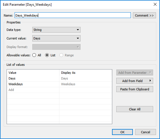
Then you just create a calc to pass through the parameter and use that as a filter on each sheet. Add the sheets to a vertical container on your dashboard, hide the titles, and as you change the parameter, the other sheet collapses so only one sheet is visible.
The last (almost) curveball was that the gif on the challenge page looked like it might have been another sheet with shapes:
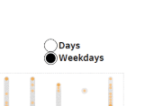
Once I opened up the workbook on Tableau Public, I realized it was just the parameter formatted to a larger font, and the radio buttons increase in size accordingly.
With that, challenge complete!
Click here to view it on Tableau Public.