This week’s Makeover Monday looked at the use of pesticides in US agriculture.
What works:
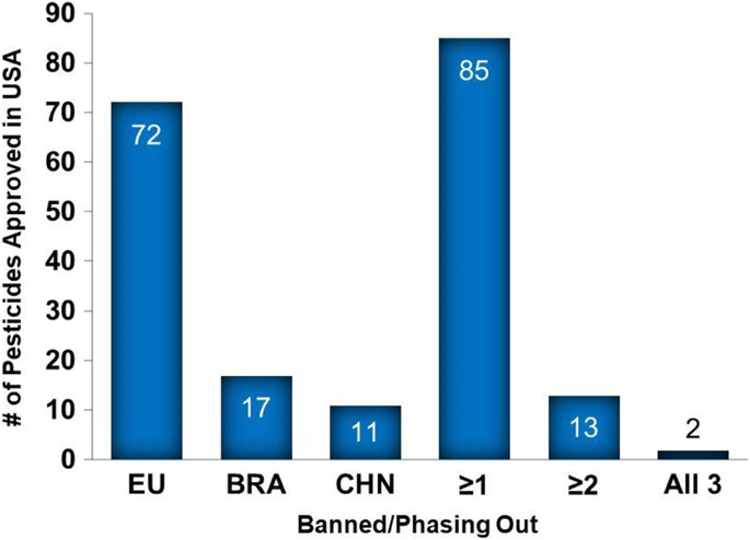
- Bar chart makes it easy to see the large number of pesticides banned in the EU
- Bar labels make for easy reference
What could be better:
- Took a minute to figure out what the chart is showing
- Y axis not as necessary with the bar labels
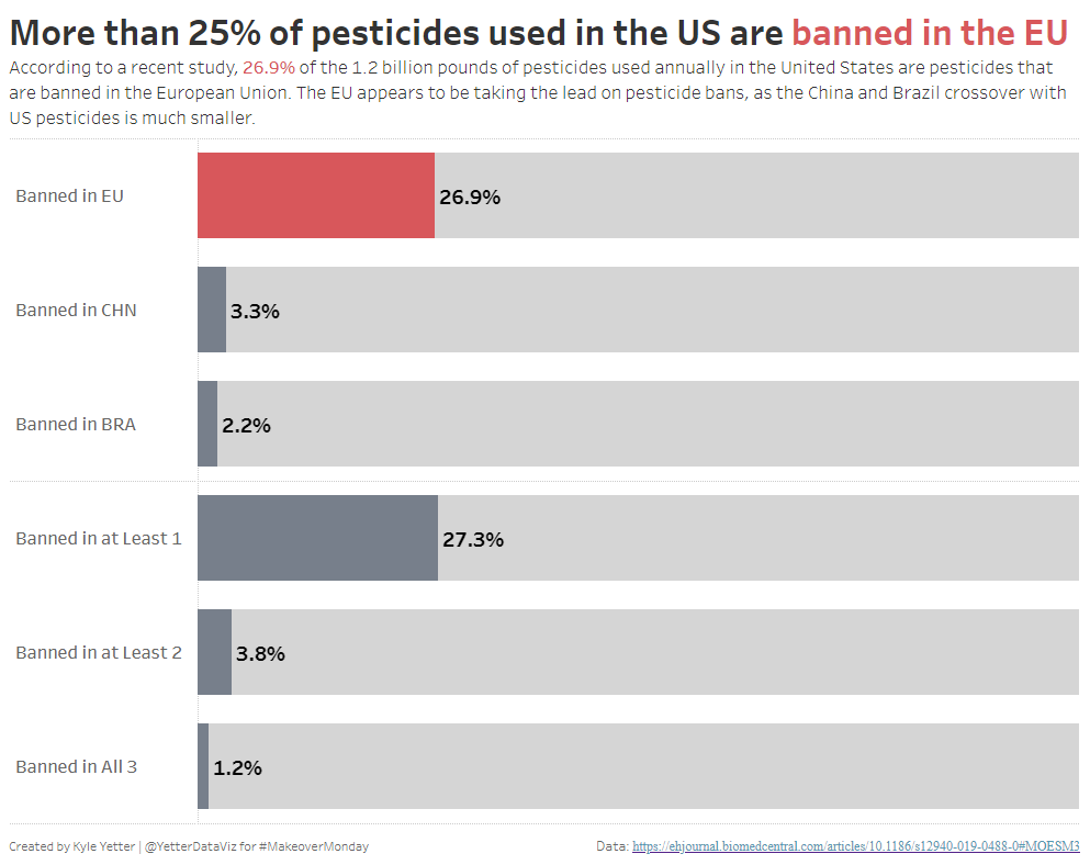
It seems like small datasets are some of the most difficult for MakeoverMonday. They don’t leave many options for analysis, so the question becomes how to focus the visualization. In this case there was a slight difference in the data provided and the original visualization, where the data contained the pounds of pesticide used rather than the count of pesticides. I actually prefer this, as it identifies what percentage of pesticides used is banned in the other locations, rather than just a count of them.
I started out with some bars, grouped them by the country or count, and used horizontal bars to allow for aligned headers. I decided to focus on the amount of pesticides used that are banned in the EU, so made that bar red and the others gray. I felt like there was a little something missing, so I tried a brushed bar to show the relative size of the EU banned pesticides to the overall pesticides used. I liked the look, so I ended up adding it to my full set of bars. Added a color-coded title and subtitle calling out the high percentage of pesticides used that are banned in the EU.
Here’s how it turned out:
Click here to view the interactive on Tableau Public