Thankful Thursday – Mark Jackson

As I neared the end of my first year using Tableau, I was starting to feel more comfortable with building vizzes and dashboards, but they were all pretty static. Everything was white background and tiled (I hadn’t had the container enlightenment yet). Then I came across Mark Jackson‘s Quantified Self / Career Bio on Tableau Public.

This was kind of a revelation to me. I had been following Viz of the Day on Tableau Public and got to see some really cool examples, but the combination of viz elements with the graphics and how they all intertwined was kind of mind-blowing to me. But I thought it would be a great learning experience to figure out how Mark built it, so I decided to make my own version.

This project helped me really cement a few things in my use of Tableau. One of the first was identifying how data should be best organized to build a viz. All of this data was self-quantified, so I had to think through how it should be structured and went through a few iterations as I developed. This was also the first time (I think) I had ever built a whole dashboard with floating elements. I think it was also my first experience really using shapes, particularly custom shapes and identifying that I can just drop images into the Shapes folder of My Tableau Repository and they are available to use in a viz.

As I think about these things now, they all seem very basic in comparison to many of the things I’ve learned in the 4 years since that time. But early in my Tableau journey, building my own iteration of Mark’s viz helped me really broaden my understanding of what could be done in Tableau and laid a foundation for future growth.

So thanks, Mark, for the inspiration early on in my journey.

Here’s my viz (admittedly a bit out of date):

Thankful Thursday – Jeffrey Shaffer

In previous #ThankfulThursday posts, I’ve mentioned how Andy Kriebel‘s blog was first on my favorites, and Cole Knaflic‘s was second. Well, a very close third on that favorites list is Data + Science, Jeffrey Shaffer‘s blog.

Within the first few months of my Tableau experience, when I was googling how to do everything, I came across Jeff’s Tableau Reference Guide. As of today, this reference guide contains 737 curated links (737!!!!) to content created by Jeff and many, many others ranging from basic chart how-to to Level of Detail and heavy duty calculations (and much more).

Jeff also worked with Steve Wexler and Andy Cotgreave to author The Big Book of Dashboards. As I’ve noted previously, I love having this book as a reference to identify what works in dashboards and why, and be able to implement those principles in a work setting.

Some of my favorite Tableau Conference sessions over the past few years have been Jeff and Andy Kriebel‘s speed tipping sessions. (TC16, TC17, TC18) Jeff continued the tips tradition (with a twist) at TC19 with Luke Stanke, as they did Two-Minute Tableau Tips and Tricks with longer form tips. All of these sessions have been so valuable in identifying faster/better/more efficient ways to do things in Tableau.

So thanks, Jeff, for all you’ve done (and continue to do) for the Tableau Community.

Thankful Thursday – Lindsey Poulter

I think my first exposure to Lindsey Poulter‘s work was a March Madness viz I found when I was doing some research for my own viz in early 2017. It was simple, clean, and packed a lot of data in a fairly small space. My first go at a March Madness viz the year before was an explosion of every type of metric I could think of, so the clean simplicity of Lindsey’s viz was very eye-opening for me. I think it was also when I realized I could use a different font and/or and image in the title to spice things up a bit. My resulting viz was a much more focused, cleaner take on March Madness than my first.

Lindsey’s take on the Washington Metro Scorecard was the inspiration behind Andy Kriebel’s new way to visualize an income statement, which I have often used when talking about visualization in the Finance dept I work in. Once again, clean, focused, and full of information in a small space without feeling cluttered.

Lindsey didn’t really publish much for a year and a half, but when she started up again, she blew my mind. When Set Actions became a thing in Tableau, I had kind of a hard time wrapping my head around what they could really do. Then tweet after tweet (after tweet) from Lindsey allowed me to really understand the true power and possibilities created through Set Actions. When I started our internal Ancestry TUG last year, we were getting ready to upgrade our Server, so I decided to show some of the things possible in 2019.1. I basically just downloaded Lindsey’s whole Set Actions workbook  and picked 5 or 6 examples to demonstrate the power of what was possible to our group.

Kent Marten, me, and Lindsey (she apparently missed the memo that there’s no smiling when you take pictures with Kent)

At TC19, in addition to watching her get oohs and ahhs  during Iron Viz, I had a couple opportunities to chat with her for a bit. For as amazingly good at Tableau as she is, and the “celebrity” that she is now in the Tableau Community, she is one of the most humble and unassuming people you could ever meet. She lets her work speak for itself.

So thanks, Lindsey, for everything you contribute to this community.

Thankful Thursday – Ben Jones

My first interaction with Ben Jones was at Fanalytics at TC16, of which he was the MC/host. I really didn’t know much about Tableau Public at the time, but was excited to learn more. I also didn’t really talk to anyone outside of my table, as I was still getting used to the whole “it’s ok, just talk to people” mentality.

Fast forward to TC17, and I went to a little Community meetup in the Data Village. I talked to a couple people, wandered aimlessly for a bit, and then happened to run into Ben. We talked for probably 10 minutes (a long time for my first conversation with someone), about my TC experience so far, Tableau experience, certification, my work at Ancestry and how we had a Tableau Public presence in prior years, and various other things. When I ran into Ben again at Fanalytics, I wasn’t really sure with all the people he meets at TC if he would remember me. Instead, he asked how my certification exam went, and we kind of picked up where the other conversation left off. I don’t recall, but hope that I actually asked some more questions about his work with the Tableau Public team. But some people are so good at making the conversation about you that you don’t realize (or at least I don’t) until after the conversation is over that you basically talked about your experiences the entire time with perhaps only the occasional (or nonexistent) return question. Ben is one of those people.

TC18 was much the same. I ran into Ben, happened to be with a couple Ancestry colleagues, so I introduced them. During the conversation, Ellie Fields (currently VP, Product Development at Tableau) happened to be walking by. Ben could’ve easily just said hi to her as she passed and let her continue on. Instead, he stopped her and said (paraphrasing here), “hey, Ellie, these are some of the folks from Ancestry, and they’re doing X,Y,and Z with the product.” A very small thing, but also once again making you feel like you (and what you do) matter, and helping you connect and feel a part of the community.

Last year, through his new venture, Data Literacy, and his book, Avoiding Data Pitfalls, Ben has begun sharing even more of what he’s learning with the greater data community in helping overcome some of the big hurdles that we run into as data people. I’m still working on his book, but as I thumbed through, the example that I happened to stop on (the banana ripeness survey) was so enlightening and told so clearly I can still recall the main takeaways, now more than 2 months later (even though I feel like half the time I forget what I’ve read in the last 15 minutes). I was able to catch a few minutes with Ben at TC19 (which is getting harder and harder to do, with so many people who, like me, have made the connection, and just want to say hi), and was finally able to reciprocate a little of what he so often gave me in our conversations as we discussed the effect cancer can have on our lives (and wives).

Ben and I (with Cesar Picco, Anna Foard, Brittany Fong, and Ryan Sleeper) at TC19

Ben has been instrumental in my feeling comfortable, welcomed, and belonging in the Tableau community. I’m positive I’m not the only such person. If you haven’t checked out Data Literacy or Avoiding Data Pitfalls, I encourage you to do so. They are excellent opportunities to learn from one of the great contributors to the dataviz community.

So thanks Ben, for making me feel welcome.

Thankful Thursday – Andy Cotgreave

My first introduction to Andy Cotgreave was watching a session he did on the TC15 livestream. It’s been long enough I don’t recall what his session was about, though I do remember thinking it was super insightful (and that his kids were watching him and sent him a picture as he was getting started and it threw him off his groove a little bit ;).

So when I went to TC16 in Austin, I made sure I attended Andy’s session, even though it was in the furthest hotel from the convention center. He spoke about New Ways to Visualize Time and it was a great exercise in looking at things differently than the usual line chart, with a look at the history of visualizing time.

Andy’s was another blog I followed from early on in my Tableau journey. One of the images that I’ve remembered most from Andy’s work is this one:

Andy’s post about this (and the many times he’s discussed in his various talks) makes a great point about how there is a sense of bias in everything we do, and it’s something to keep in mind as we build visualizations.

As I reviewed the scheduled for TC19, I was sad to see no session from Andy (since he was hosting Iron Viz and moderated a panel with the Iron Viz contestants at Fanalytics, and that was plenty of work and preparation without trying to do another session).  His sessions have always been very thought provoking in understanding how we’re presenting data, he shares some great insights into how to make it work in the business setting, and very entertaining. His presentation at TC18 was a perfect example of this.

Another example of Andy’s providing insights into dashboard and visualization best practices is his co-authorship of The Big Book of Dashboards with Jeffrey Shaffer and Steve Wexler. I love having this book as a reference to identify what works in dashboards and why, and be able to implement those principles in a work setting.

Andy has truly lived up to his role as Tableau Evangelist, helping so many people identify and make better decisions when visualizing their data. So thanks, Andy, for all the work you do.

Thankful Thursday – Desireé Abbott

Every once in awhile we find a colleague at work with whom we find a greater connection. While I don’t recall when exactly we became Tableau buddies, I realized early on when I started at Ancestry that when I had a perplexing problem in Tableau, Desireé Abbott was the coworker most likely to be able to help me find a solution.

As we closed out 2017, talking about what some of our goals were for the coming year, we had both been thinking about participating in #MakeoverMonday in earnest. So we decided to do it together, and invite anyone else who wanted to join. This hour together (via Zoom) each week helped us both improve our visualization style and technique, and also how quickly we are able to review the data and find the story we want to tell. Later that year (2018) I took the Tableau Desktop Certified Professional exam. Because of the yearlong preparation I had doing #MakeoverMonday every week with Desireé (and colleague Yu Dong, who has completed every #MakeoverMonday in 2018 and 2019 and blogged about them all!) the exam was manageable, and I was confident in my ability to complete it in a timely fashion and with good choice of best practices.

Me, Desireé, and Kevin Flerlage at TC19 (pretty sure Kevin and I were both taking a pic on our phone at the same time)

In 2019, I started an internal Tableau User Group at Ancestry. Coming up with topics for a TUG can be difficult, and Desireé was happy to assist, either in presenting with me in tip battle format, or helping to identify what topics or speakers would be useful. As I was coming back to work in early October after my wife passed away, I realized that October was TUG time, but I had hundreds of emails I had ignored for a couple weeks. After successfully getting things going through the year with three consecutive meetings, I didn’t want to lose momentum for something I was working so hard on all year. This is all the conversation I needed to have:

As we move into 2020, we are co-leading the Ancestry TUG, we continue #MakeoverMonday (with a few new participants), we co-host a viz office hours every week to help analysts with any struggles they’re having (i.e. Tableau Doctor sessions), and work on internal Tableau training together. Also, based on feedback from some people who started coming to #MakeoverMonday but wanted to learn more about how we built what we did, we’ve started doing #WorkoutWednesday live sessions where we try to build the challenge in an hour, talking through how we’re doing things. In short, Desireé is my partner in crime for building and maintaining the data culture at Ancestry; and without her help, that task would be much more difficult.

If you don’t already follow Desireé, find her on Twitter and Tableau Public!


Thankful Thursday – Cole Nussbaumer Knaflic

I don’t recall exactly how I found the storytellingwithdata.com blog, but it was one of the first five that I found right after I started using Tableau (I spoke of Andy Kriebel’s being the first two weeks ago). One of the first posts I recall was this one, which included a whiteboard note sketch from someone who was attending a meetup where Cole spoke. Here’s that sketch:

Cole_Nussbaumer_scribe_large.jpg

I actually printed this out and pinned it up on my cubicle to have as a reference. It came in really handy whenever someone would come ask me to make a pie chart, and I would just point up to my cubicle wall where they could read “DEATH to PIE CHARTS.” 🙂

Christmas 2015, I put Storytelling with Data (the book) on my Christmas list. When I got it, and was excited about it, some of my family gave me some strange looks. (“wait, what is it?  you’re excited about data?”) Historically, I’ve not been a big reader. However, I inhaled this book. Cole is able to so clearly explain concepts, and it just flowed from one section to the next. I think I read it in a couple days, and it changed how I looked at my visualizations.

Storytelling with Data (the book and the blog) has probably had the most influence of anything on my general visualization style: focusing on getting rid of the clutter, using color only when necessary to communicate the story, using color-coded text to remove the need for a separate legend, and much more.

So thank you, Cole, for telling and sharing your data stories, and helping improve the visual communication skills for numerous member of the dataviz community, myself included.


Thankful Thursday – Mark Bradbourne

I started dabbling in the Tableau community on Twitter in 2017, so when I went to Tableau Conference that year, I made the goal to connect with a few of the people whom I recognized. Mind you, as a card-carrying introvert, this was no small goal. I’m making myself talk to someone, so I kind of need to carry on the conversation for at least 30 seconds. (Insert sweaty palms here) But I wanted to become more involved in the community and connect with people, so I told myself to suck it up and deal with it for a week.

So I start out at Makeover Monday Live, and there are 3-4 tables up front with all these faces I recognize from Twitter. Did I do the easy thing and go sit at one of those tables to let natural conversation flow during the hour-long session? Nope. I think I sat smack dab in the center of the room. So now I’ve given myself only one option, approaching someone after the session. (This is my only option at this point because I know if I wimp out on this opportunity, the rest of the week is shot, at least as it pertains to this crazy goal I had.)

I sauntered up to the front of the room where, thankfully, Mark Bradbourne and Ken Flerlage were speaking to each other mostly side-by-side, rather than face-to-face. It was like they were saying “please, come complete this circle of conversation.” I walked up, introduced myself, and we chatted for a few minutes. I don’t really recall what we talked about, but it could have very easily ended with “well, Kyle, it was nice to meet you” and going on their way. Instead, Mark said “I think we’re going to go grab some lunch, do you want to come?” (or something to that effect, it was two years ago) Within 30 minutes I proceeded to meet a large chunk of the VizItPhilly crew and various other people from the Twitterverse. And it made it so much easier to talk to other people throughout the rest of the week when I ran into them, because I had that early win.

Me, Anna Foard, and Mark at TC19 Data Night Out

Mark is all about the #datafam, but more importantly he takes action on the great ideas that come up. After a great discussion we (our table) had at TC18 Fanalytics about mentoring, Mark started MentoringMeetup.com, a site to connect willing mentors with hopeful mentees. Fast forward to a couple weeks ago, Mark and Chris McClellan announced this DatafamNetwork blog opportunity as they thought about all the people who contemplate starting a blog after the TC high. I’ve been toying with the idea of doing a dataviz blog for years, but never found the right time to investigate the different options for hosting or the myriad other things that I “needed” to have in place to start a blog. That roadblock was removed for me. That, coupled with a life event that helps to have a distraction, was the push I needed to get started.

So thanks, Mark, for being that great first experience with the #datafam, and continuing to reach out and help those in the Tableau Community.

Thankful Thursday – Andy Kriebel

As I thought about how to begin on this blog, with Thanksgiving so recently passed, I decided that instead of one “thankful post” for Thanksgiving, I will try to do a Thankful Thursday post each week about someone in the Tableau/visualization community who has made an impact on my journey. My first Thankful Thursday post is about Andy Kriebel.

The first time I used Tableau was in a 3-hour intro “seminar” at Brigham Young University, where I was working at the time. Russ Lyman, a consultant at Interworks and BYU alum, talked for about an hour about data visualization in general, and then walked us through building things in Tableau for the next two hours. As he finished up, he mentioned VizWiz.com as a great resource for learning the ropes with Tableau.  I didn’t take many notes that day, but I wrote that blog down, and the rest is history.

I’m not sure how many of Andy’s blog posts I’ve read in the nearly five years since that day, but it has to be in the hundreds. When I was first starting in Tableau, his blog was a daily read for me. He had just moved to London to start at the Data School, so I followed along with their Dear Data Two project as he and Jeffrey Shaffer swapped hand-drawn postcards each week (modeled after the Dear Data project Giorgia Lupi and Stefanie Posavec were doing at the time). Makeover Monday and Tableau Tip Tuesday were also staples of his blog back then as well. Over time I created a favorites list of 30 or so blogs, but Andy’s was always at the top, because it consistently had new content that was useful and insightful.

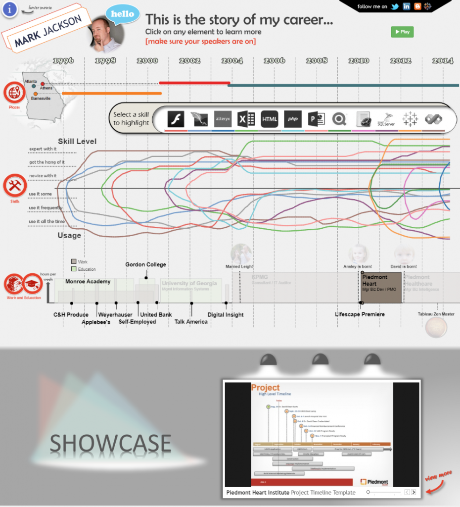
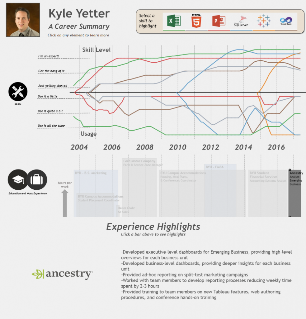
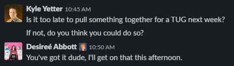
With his announcement this week that he’ll no longer be hosting Makeover Monday, I started to think about what that project has meant to me. As I said, I read his Makeover Monday posts each week before he even started the community project with Andy Cotgreave in 2016. I followed along from the sidelines for a year and a half before I ever did one myself, but I learned each week from both Andy’s. It wasn’t until 2018, when Desireé Abbott and I decided to do Makeover Monday at work together as a way to prepare for the Certified Professional exam that I truly got into Makeover Monday on a consistent basis. Thankfully, when I said I wanted to get certified, and my preparation would be about an hour each week doing Makeover Monday with a small group, my manager was fully on board. While I was not a member of the 100% club (though the third member of our MM crew has become one for the last two years), that weekly exercise made me much more comfortable in reviewing a chart, identifying what worked and what didn’t, and improving upon it…quickly. When the time came at the end of TC18 to take the certification exam, I felt like it was just a longer version of Makeover Monday. The confidence and speed I gained from weekly participation was invaluable. I’d like to think my vizzes have improved over that time as well, though I still feel like there’s another level I want to get to.

Next to the Tableau Blogs folder in my Bookmarks bar is a Tableau Tricks folder. A quick peek in that folder finds three posts of Andy’s that were either extremely helpful at the time or completely changed how I looked at something. I want to share them here:


The Greatest Tableau Tip EVER: Exporting Made Simple!

When I started using Tableau, I was working with a bunch of accountants. While I was baby-stepping them onto visualization, being able to give them an Excel icon to click on and get exactly the data they needed in exactly the format I wanted them to get it was invaluable. Technology has moved on a bit since then, but at the time, this was huge for me.

Tableau Tip Tuesday: Table Calculations Overview

Until March 2017 (almost two years into my Tableau journey), whenever I used more advanced table calcs I would often just end up clicking stuff and moving things around until Tableau did what I was hoping it would do. Then Andy posted this image:

Lightbulb…my understanding of table calcs increased exponentially overnight. I still refer back to this when I’m struggling to get a table calc to do what I want (though, thankfully, that’s not as often anymore).

A New Way to Visualize an Income Statement

At Ancestry, I am part of the Finance org, so this one spoke to me. Similar to Andy’s experience mentioned in the post, I had looked all over to find intuitive financial dashboards to integrate into our team, and had stumbled upon the same dashboard Andy did, and experienced many of the same thoughts. I’m still trying to figure out how to implement something along these lines in our org (and get the data to do so in a format that works, but that’s another story), but as we discuss ways to improve and increase visualization in our org, I often come back to this one.


These are just a few examples of the many posts that I have referenced or learned from in the last 5 years. I’m sure I am preaching to the choir when I say that much of what I can do in Tableau I’ve learned from Andy and his blog. So thank you, Andy, for so willingly sharing your knowledge with this community, including me.

–If, somehow, you’re reading this and have never been to vizwiz.com, go now! Over 1000 blog posts are waiting for you to read them!–