Makeover Monday – Week 51

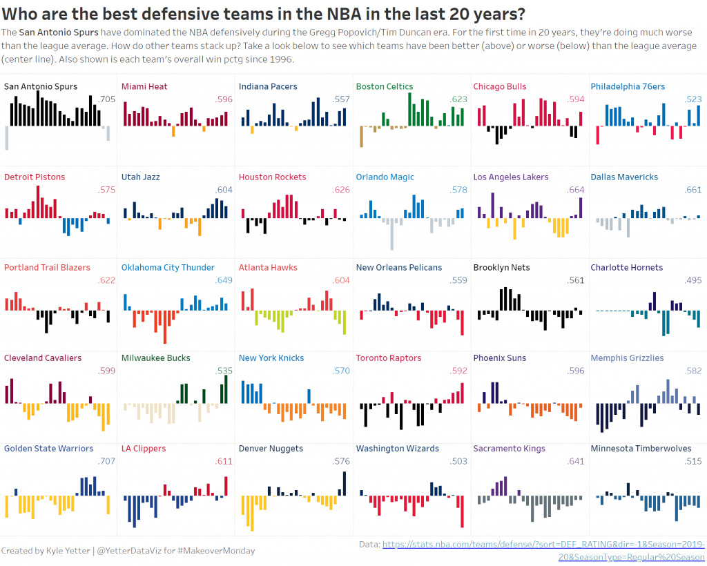
I work pretty hard to NOT look at any Makeover Monday submissions before I dig into the data on Monday afternoon with my Ancestry crew. I found early last year that if I saw the data presented in a given way, I couldn’t get it out of my head. Well, this week, I didn’t even have to see it. Desiree just said “lots of small multiples this week” as we got started and I couldn’t get it out of my head! I may have landed on it anyway, but we’ll never know.

(Sidenote: VERY intimidated to do a makeover of something from FiveThirtyEight. I hold their work in the highest regard both statistically and visually.)

Anyway, so I started down the path of small multiples, and started a love/hate (more hate than love) relationship with the Charlotte/New Orleans franchises. For those not familiar with the NBA, the Charlotte Hornets turned into the New Orleans Hornets, who were then the Oklahoma City Hornets for a couple years after Hurrican Katrina, then back to the New Orleans Hornets, then the New Orleans Pelicans. Meanwhile, after the Hornets left for New Orleans, the Charlotte Bobcats became the 30th team in the NBA. When the Hornets became the Pelicans, Charlotte wanted the Hornets name back, so they changed from the Bobcats back to the Hornets. So in the data set, the Charlotte Hornets go from 96-97 to 01-02, then pick back up from 14-15 to present. However, those are actually two different teams, each with the same name. So getting that all sorted was a project in and of itself.

But then as I started working on the small multiples, the fact that the Bobcats didn’t start play until 2004 messed me up again. Because everything would go along fine until the Bobcats/Hornets organization showed up, then I would get eight years of Cleveland followed by the rest of Charlotte, and in the next one I had eight years of Milwaukee followed by the rest of Cleveland. So then I began to wonder, how did all of these other people do it?  Well, some people made a different sheet for each team and placed them all on the dashboard, others would filter 5 at a time for a row, then placed six rows on, and others that did it like me but unfortunately didn’t catch that the latter half of teams were split halfway through the season list.

After trying to figure out some magic way to make the row/column table calcs to work without data points for the first 8 Charlotte seasons, I finally just opened the data in Excel and added the first 8 seasons with a rating of 1 so it would show the bars at 0 (or league avg).

Often, if I don’t finish in my scheduled hour, I just don’t get it finished. But this was sports data (I love sports) and I had identified a gotcha that I could blog about. So, I poked at it throughout this week and finally finished it tonight. I wanted to do a bit of branding, so I added the team colors.  They could be slightly overwhelming, but for people who know the NBA, I think it also helps to identify each team, rather than just scanning through all the names. This is an issue since I sorted by overall defense for the time period, but I wanted to show which teams have been the best/worst over that time.

That said, here are my key takeaways this week:

  • Make sure you understand what’s going on with the data. The Charlotte/New Orleans fiasco muddied up those waters a bit, but it’s definitely not accurate from an NBA historical perspective to have the original Hornets (pre-2002) in the same grouping as the Bobcats and Hornets (post-2014)
  • Make sure your table calcs are doing what you expect them to. One of the reasons I noticed the issue was I added Team to the color shelf, because I wanted to make sure they were all together. That made it very apparent when I had half Cleveland, half Charlotte. Sometimes there are missing pieces in the data, so we need to make sure we’re accounting for them properly, and that’s particularly important when doing table calcs.
  • Transparent sheets are awesome!  While I was looking through people who had done small multiples, I came across Mohit Panse‘s viz where he used three different sheets on top of each other that made the labeling for each team much easier than the workarounds I’ve used in the past. (Incidently, while I was looking for this viz on Twitter, I came upon this thread where they discussed the exact issue I had noticed. They were able to solve it with a calc, so I wanted to share that here as well.)

Here’s the final product:
Click here to view on Tableau Public
 

Thankful Thursday – Cole Nussbaumer Knaflic

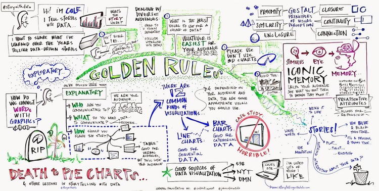
I don’t recall exactly how I found the storytellingwithdata.com blog, but it was one of the first five that I found right after I started using Tableau (I spoke of Andy Kriebel’s being the first two weeks ago). One of the first posts I recall was this one, which included a whiteboard note sketch from someone who was attending a meetup where Cole spoke. Here’s that sketch:

Cole_Nussbaumer_scribe_large.jpg

I actually printed this out and pinned it up on my cubicle to have as a reference. It came in really handy whenever someone would come ask me to make a pie chart, and I would just point up to my cubicle wall where they could read “DEATH to PIE CHARTS.” 🙂

Christmas 2015, I put Storytelling with Data (the book) on my Christmas list. When I got it, and was excited about it, some of my family gave me some strange looks. (“wait, what is it?  you’re excited about data?”) Historically, I’ve not been a big reader. However, I inhaled this book. Cole is able to so clearly explain concepts, and it just flowed from one section to the next. I think I read it in a couple days, and it changed how I looked at my visualizations.

Storytelling with Data (the book and the blog) has probably had the most influence of anything on my general visualization style: focusing on getting rid of the clutter, using color only when necessary to communicate the story, using color-coded text to remove the need for a separate legend, and much more.

So thank you, Cole, for telling and sharing your data stories, and helping improve the visual communication skills for numerous member of the dataviz community, myself included.


Thankful Thursday – Mark Bradbourne

I started dabbling in the Tableau community on Twitter in 2017, so when I went to Tableau Conference that year, I made the goal to connect with a few of the people whom I recognized. Mind you, as a card-carrying introvert, this was no small goal. I’m making myself talk to someone, so I kind of need to carry on the conversation for at least 30 seconds. (Insert sweaty palms here) But I wanted to become more involved in the community and connect with people, so I told myself to suck it up and deal with it for a week.

So I start out at Makeover Monday Live, and there are 3-4 tables up front with all these faces I recognize from Twitter. Did I do the easy thing and go sit at one of those tables to let natural conversation flow during the hour-long session? Nope. I think I sat smack dab in the center of the room. So now I’ve given myself only one option, approaching someone after the session. (This is my only option at this point because I know if I wimp out on this opportunity, the rest of the week is shot, at least as it pertains to this crazy goal I had.)

I sauntered up to the front of the room where, thankfully, Mark Bradbourne and Ken Flerlage were speaking to each other mostly side-by-side, rather than face-to-face. It was like they were saying “please, come complete this circle of conversation.” I walked up, introduced myself, and we chatted for a few minutes. I don’t really recall what we talked about, but it could have very easily ended with “well, Kyle, it was nice to meet you” and going on their way. Instead, Mark said “I think we’re going to go grab some lunch, do you want to come?” (or something to that effect, it was two years ago) Within 30 minutes I proceeded to meet a large chunk of the VizItPhilly crew and various other people from the Twitterverse. And it made it so much easier to talk to other people throughout the rest of the week when I ran into them, because I had that early win.

Me, Anna Foard, and Mark at TC19 Data Night Out

Mark is all about the #datafam, but more importantly he takes action on the great ideas that come up. After a great discussion we (our table) had at TC18 Fanalytics about mentoring, Mark started MentoringMeetup.com, a site to connect willing mentors with hopeful mentees. Fast forward to a couple weeks ago, Mark and Chris McClellan announced this DatafamNetwork blog opportunity as they thought about all the people who contemplate starting a blog after the TC high. I’ve been toying with the idea of doing a dataviz blog for years, but never found the right time to investigate the different options for hosting or the myriad other things that I “needed” to have in place to start a blog. That roadblock was removed for me. That, coupled with a life event that helps to have a distraction, was the push I needed to get started.

So thanks, Mark, for being that great first experience with the #datafam, and continuing to reach out and help those in the Tableau Community.

Workout Wednesday – Week 50

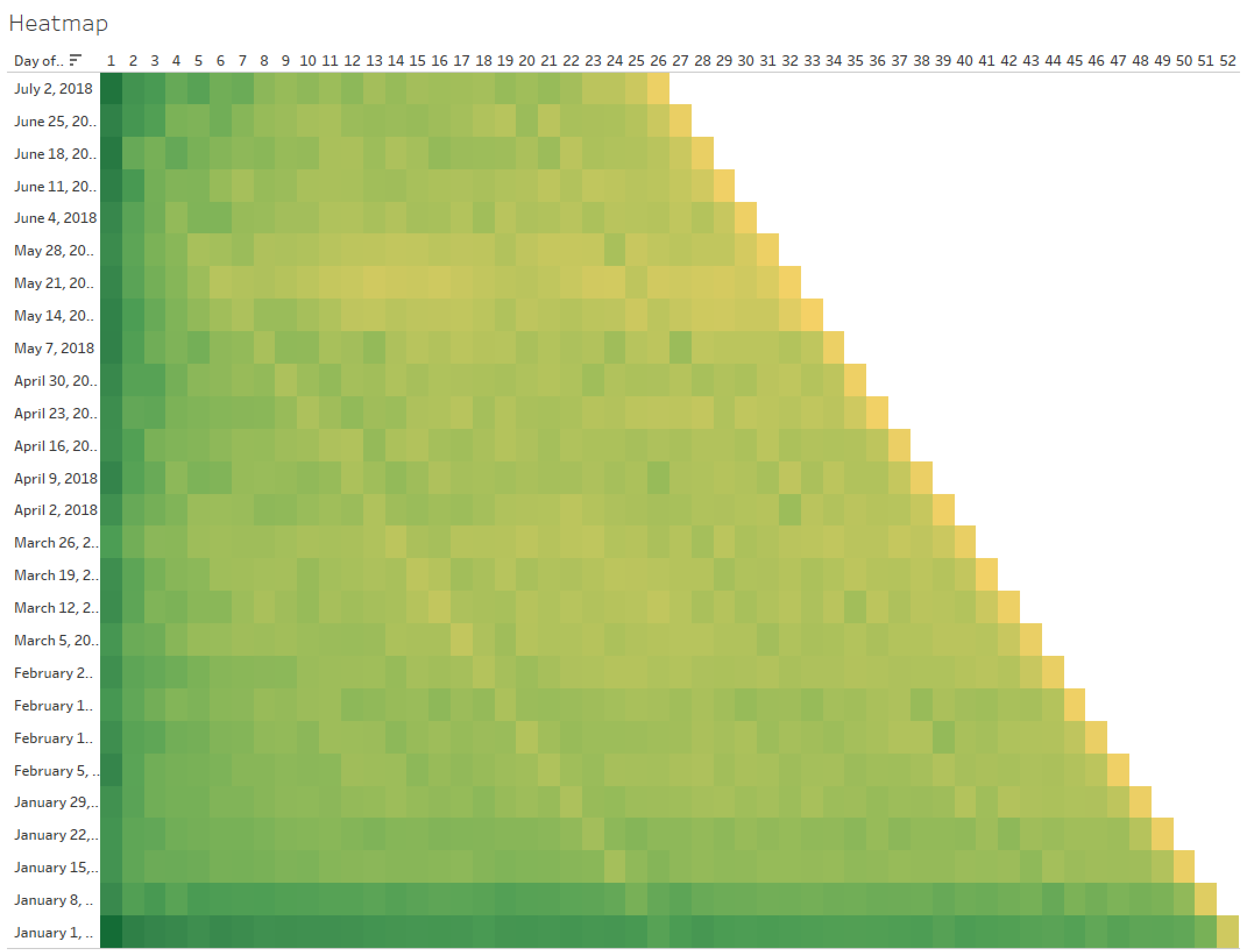
This week’s #WorkoutWednesday2019 challenge was by Curtis Harris. We needed to build a heatmap of cohort retention, with a marginal histogram and parameter-based selector. Here’s the goal:

Image

I decided to just work my way from left to right. I first started with a Datetrunc calc to get the cohorts into weekly bins starting on Monday.

But then when I compared this date to the Order Week values, I noticed they were already in Monday weeks…so I moved on to identifying the first week each customer made an order. I used an LOD to find the earliest week for each Customer ID:

Then, in order to find the number of customers per cohort, I checked to see if the Cohort week matched Order week and populated Customer ID:

Then I just pulled in my cohort week and a COUNTD of [New Customers] and I got customers by cohort. I stopped there for now and moved on to the heatmap. The heatmap needed to show a retention rate for each week and cohort, so I started with a DATEDIFF for the weeks:

This gives me the week numbers for the columns across the top. Then I built the retention calc:

Again, I used an LOD here. When I reviewed Curtis’ workbook after I finished, he uses a Lookup function. I’ve struggled whenever I use a Lookup to get it to do what I want, and I find I can more accurately define what I want with my LOD calcs (not sure how I did anything before LODs came along).

Drop Cohort Week to Columns, DAY(Cohort ) to rows, sort desc, and I get the start of things.

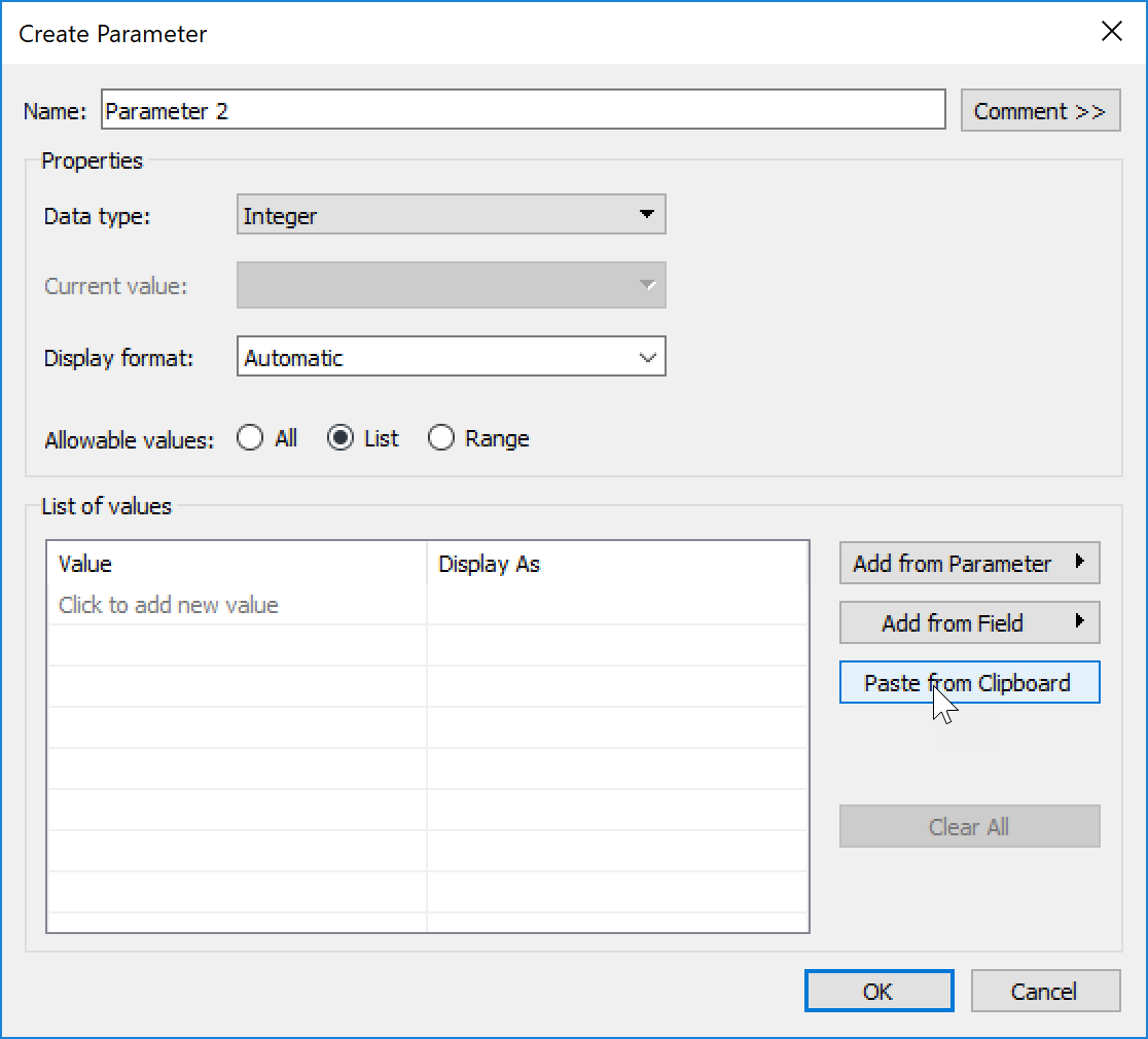
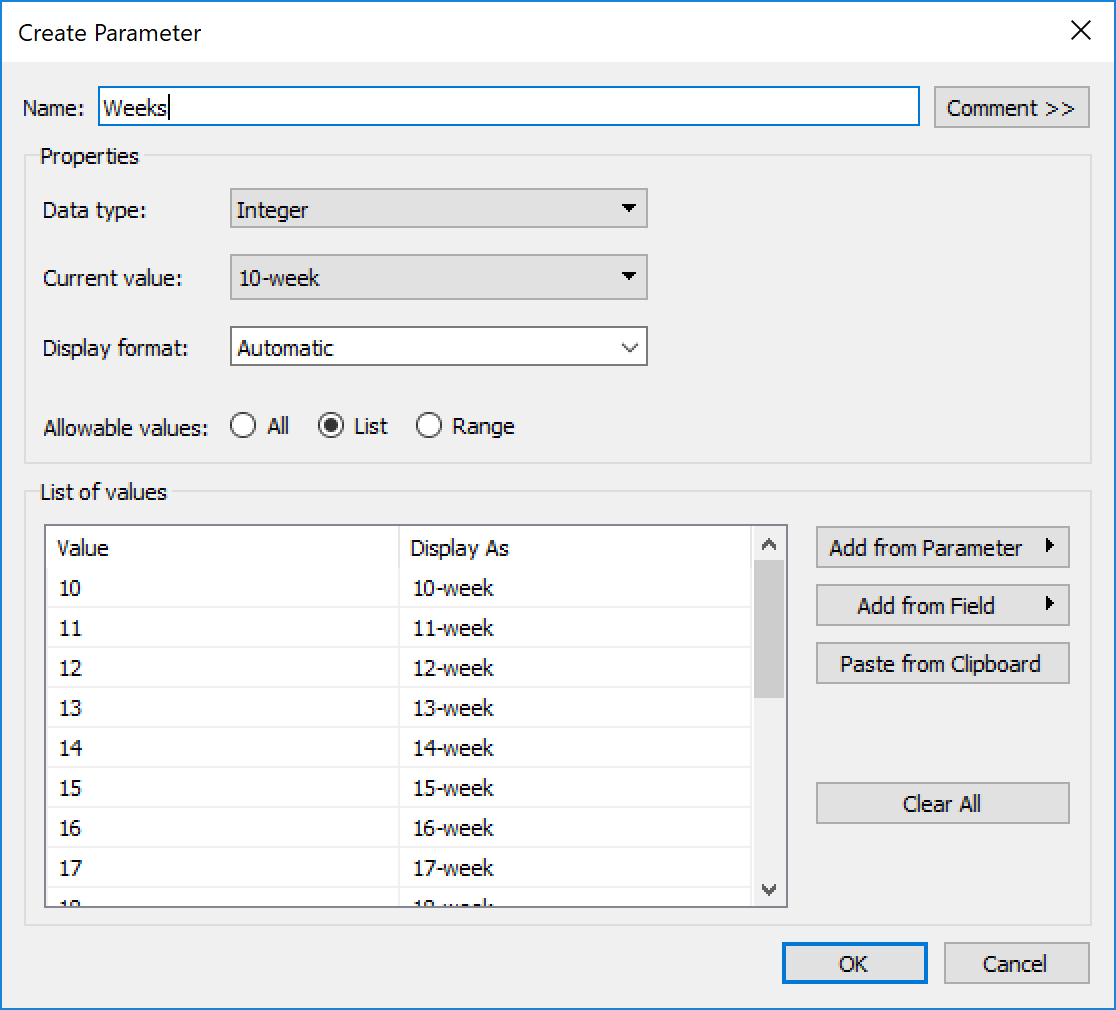
Now I needed to create the parameter for selecting 10-26 weeks. I noticed that Curtis’ parameter wasn’t just a number, it showed “26-week.” I didn’t want to type that 17 times, so I decided to try something new. I opened Excel, put 10-26 in one column, then concatenated the number with “-week.” Then I copied that and clicked Paste from Clipboard in the parameter list area:

This brings all the values in, and allowed me to keep it as an integer instead of a string value:

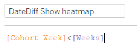
Next we need to use this to filter what shows in the view.  I decided upon two filters, one to display the right Cohort Weeks (columns) and another to show the Cohort date (rows). First, to show only the Cohorts with completely mature data:

Back to my trusty LOD, I found the Max Cohort Week by Cohort and return True for any that are larger than the parameter value. That got me here:

Now I need to have it only show columns 1-26. That’s easy enough:

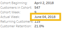
I picked a Yellow/Green Sequential color scheme, not sure where Curtis found his Vidris palette, but I felt like this did the job, and the requirements said any sequential scheme was fine. Uncheck Show Header on the DAY(Cohort) and we just have the tooltips left. This part was pretty straightforward, until I was watching a bit of Andy Kriebel and Lorna Eden‘s head-to-head WW Live webinar. Andy had the eagle eye and noticed that the Actual Week date had leading zeros on the day.

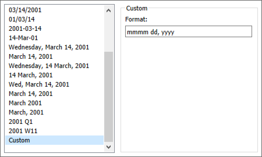
This requires some custom date formatting. So I right clicked on that date on the marks card and adjusted (make sure you’re in the Pane, not the Header in the format pane):

The dd here adds the leading zero if the day is only one digit. (mmmm is the full month name)

And with that, on to the marginal histogram. I kept my Show in Heatmap filter to keep the Cohort rows, and created another calc to filter just to the selected parameter value:

Then I pulled DAY(Cohort) into Rows, Customer Retention into Columns, and added a MIN(.5) to the columns shelf. Make it a Dual Axis, Synchronize the Axis, and now I have my requisite 50% bars with the retention for each cohort shaded.  In order to match the grays I just did a Pick Screen Color in Edit Colors. I added a Constant Line at .25 to match Curtis’, but then needed to add “Week 26” to the top of the chart. So I created a quick calc and dragged it onto columns (then hid field labels for columns and aligned left).

I think I started the histogram from duplicating the heatmap, so my tooltips were already in place, just had to make sure they were complete (hovering on the light gray didn’t have the retention rate for some reason).

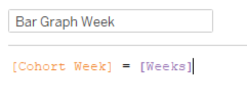
On to the BAN…which proved to be more difficult than I expected, but more on that in a minute. I kept the Bar Graph Week filter, moved Customer Retention to Text, and voila!  21.2% for week 26….except Curtis has 14.2%. No matter how I tried, I couldn’t get 14.2%, so I reached out to Curtis. He explained that I need to remove the cohort from the view so it was sum(current week customers)/sum(all week zero customers).  While that made the math work and I got 14.2%, it didn’t really make sense to me why we would count cohorts in the denominator that didn’t have the chance to mature to the week we’re viewing. Andy mentioned the same thing on their webinar, so I at least didn’t feel like I was barking up the wrong tree.  So I followed up with Curtis, and he confirmed that he just forgot to add a filter. 21.2% should be the Week 26 value.

I bring this up not to point out that Curtis was wrong and I was right, but rather that it’s very easy to forget to apply filters and sometimes we need to step back and think about what the numbers are saying. (Aside coming…feel free to skip to the next paragraph for the final dashboard assembly) As an example, a few months ago I was putting together a dashboard at work looking at how often people saved items to Ancestry from one of our sister sites. I shared it to the stakeholders, and got the following response (give or take, with numbers changed to protect the guilty): “Wow! I realize it’s in the Sandbox,” (thankfully, I’ve trained my stakeholders to understand that if something’s in the Sandbox, I’m still working through the numbers, and they should question any and all conclusions)” but a median of 45 items saved per customer, that means that 50K users are saving 45 things to Ancestry! If these numbers hold true, that’s incredible!” Yeah, that gave me pause.  So I dug in, and realized I was missing one filter, and forgot to add another to the context in order to properly render an LOD. 45 changed to more like 7, which was still good, but definitely not 45. So, don’t forget to double-check your filters.

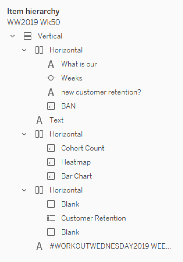
Ok, it’s late now, so I’m going to shortcut.  Here’s how I arranged things on the dashboard:

If you’re not familiar with using containers for everything, check out Curtis’ post on that very thing. (Although I shortcut and don’t add the floating Vertical, I just drag the vertical on and then remove the Tiled container from the item hierarchy)

And that’s it!  Hopefully this was helpful. There were definitely several differences between how Curtis did his and how I did mine, so take a look at both of them!  (Curtis used one worksheet for the customer count and heatmap, while I did separate ones; he used Lookup rather than LOD; I’m sure there are more)  Here’s mine if you want to check it out. And thanks for following along!

Makeover Monday – Week 50

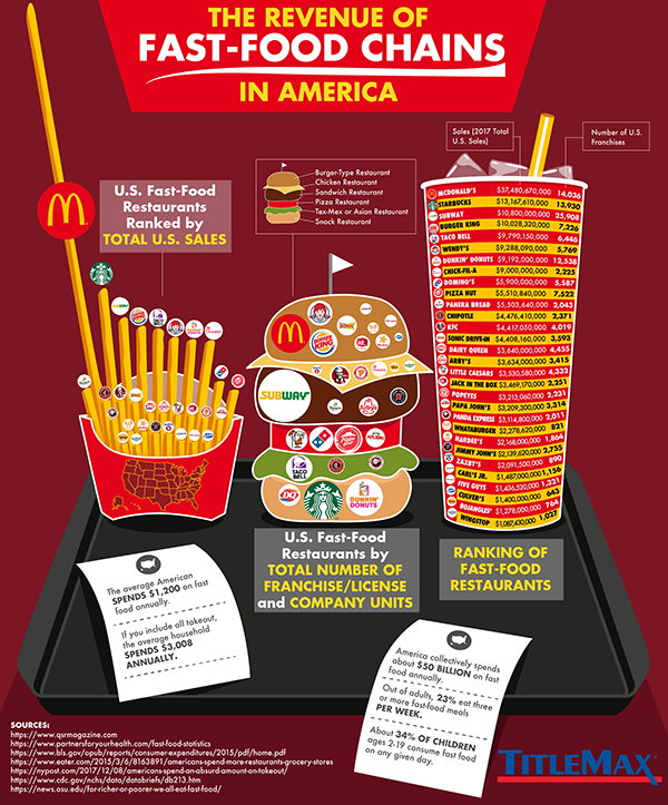
Makeover Monday this week looked at a Fast Food Chain Revenue viz from Title Max.

What I like:

  • Easy to see how much more revenue McDonald’s has than the rest
  • Interesting combination of menu items as the viz

What could improve:

  • Logos hard to read on the location burger, especially if they’re logos you’re unfamiliar with due to primary geographic region
  • Why combine Tex-Mex and Asian group, other than ran out of space?
  • Very busy across the board

As I dug into the data, I looked at restaurant types (burgers, chicken, pizza, etc), thought about practicing some set actions to expand the restaurant type to show each of the individual restaurants from that category, and looked at a scatterplot of sales revenue and location count.  None of those really spoke to me.

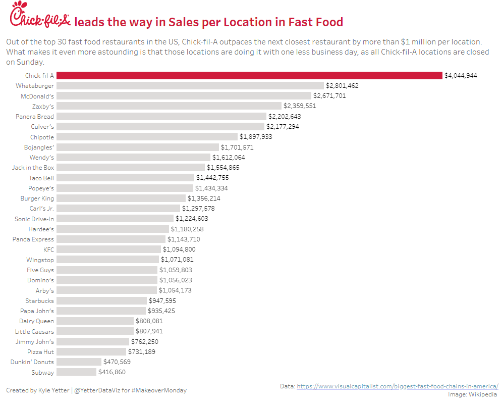
After about 20 minutes, I realized I could do sales by location (not sure why it took me that long), and that popped out a really interesting point, which became the focal point for my final viz.

On a per location basis, Chick-fil-A brings in over $4M per store, more than $1M more than the next closest chain.  It’s almost 10X what Subway brings in per store!  And then I had the additional realization, that Chick-fil-A only opens 6 days a week. They’re doing that with roughly 50 fewer business days in the year. Incredible.

Since Chick-fil-A was the story, I grabbed the red from the logo, and made that bar the only one with color to focus the attention there, trying to follow principles I’ve learned from Cole Knaflic‘s book, Storytelling with Data.  Kept it pretty basic this week, but it was a pretty basic dataset.

Click here to view on Tableau Public

Thankful Thursday – Andy Kriebel

As I thought about how to begin on this blog, with Thanksgiving so recently passed, I decided that instead of one “thankful post” for Thanksgiving, I will try to do a Thankful Thursday post each week about someone in the Tableau/visualization community who has made an impact on my journey. My first Thankful Thursday post is about Andy Kriebel.

The first time I used Tableau was in a 3-hour intro “seminar” at Brigham Young University, where I was working at the time. Russ Lyman, a consultant at Interworks and BYU alum, talked for about an hour about data visualization in general, and then walked us through building things in Tableau for the next two hours. As he finished up, he mentioned VizWiz.com as a great resource for learning the ropes with Tableau.  I didn’t take many notes that day, but I wrote that blog down, and the rest is history.

I’m not sure how many of Andy’s blog posts I’ve read in the nearly five years since that day, but it has to be in the hundreds. When I was first starting in Tableau, his blog was a daily read for me. He had just moved to London to start at the Data School, so I followed along with their Dear Data Two project as he and Jeffrey Shaffer swapped hand-drawn postcards each week (modeled after the Dear Data project Giorgia Lupi and Stefanie Posavec were doing at the time). Makeover Monday and Tableau Tip Tuesday were also staples of his blog back then as well. Over time I created a favorites list of 30 or so blogs, but Andy’s was always at the top, because it consistently had new content that was useful and insightful.

With his announcement this week that he’ll no longer be hosting Makeover Monday, I started to think about what that project has meant to me. As I said, I read his Makeover Monday posts each week before he even started the community project with Andy Cotgreave in 2016. I followed along from the sidelines for a year and a half before I ever did one myself, but I learned each week from both Andy’s. It wasn’t until 2018, when Desireé Abbott and I decided to do Makeover Monday at work together as a way to prepare for the Certified Professional exam that I truly got into Makeover Monday on a consistent basis. Thankfully, when I said I wanted to get certified, and my preparation would be about an hour each week doing Makeover Monday with a small group, my manager was fully on board. While I was not a member of the 100% club (though the third member of our MM crew has become one for the last two years), that weekly exercise made me much more comfortable in reviewing a chart, identifying what worked and what didn’t, and improving upon it…quickly. When the time came at the end of TC18 to take the certification exam, I felt like it was just a longer version of Makeover Monday. The confidence and speed I gained from weekly participation was invaluable. I’d like to think my vizzes have improved over that time as well, though I still feel like there’s another level I want to get to.

Next to the Tableau Blogs folder in my Bookmarks bar is a Tableau Tricks folder. A quick peek in that folder finds three posts of Andy’s that were either extremely helpful at the time or completely changed how I looked at something. I want to share them here:


The Greatest Tableau Tip EVER: Exporting Made Simple!

When I started using Tableau, I was working with a bunch of accountants. While I was baby-stepping them onto visualization, being able to give them an Excel icon to click on and get exactly the data they needed in exactly the format I wanted them to get it was invaluable. Technology has moved on a bit since then, but at the time, this was huge for me.

Tableau Tip Tuesday: Table Calculations Overview

Until March 2017 (almost two years into my Tableau journey), whenever I used more advanced table calcs I would often just end up clicking stuff and moving things around until Tableau did what I was hoping it would do. Then Andy posted this image:

Lightbulb…my understanding of table calcs increased exponentially overnight. I still refer back to this when I’m struggling to get a table calc to do what I want (though, thankfully, that’s not as often anymore).

A New Way to Visualize an Income Statement

At Ancestry, I am part of the Finance org, so this one spoke to me. Similar to Andy’s experience mentioned in the post, I had looked all over to find intuitive financial dashboards to integrate into our team, and had stumbled upon the same dashboard Andy did, and experienced many of the same thoughts. I’m still trying to figure out how to implement something along these lines in our org (and get the data to do so in a format that works, but that’s another story), but as we discuss ways to improve and increase visualization in our org, I often come back to this one.


These are just a few examples of the many posts that I have referenced or learned from in the last 5 years. I’m sure I am preaching to the choir when I say that much of what I can do in Tableau I’ve learned from Andy and his blog. So thank you, Andy, for so willingly sharing your knowledge with this community, including me.

–If, somehow, you’re reading this and have never been to vizwiz.com, go now! Over 1000 blog posts are waiting for you to read them!–