I work pretty hard to NOT look at any Makeover Monday submissions before I dig into the data on Monday afternoon with my Ancestry crew. I found early last year that if I saw the data presented in a given way, I couldn’t get it out of my head. Well, this week, I didn’t even have to see it. Desiree just said “lots of small multiples this week” as we got started and I couldn’t get it out of my head! I may have landed on it anyway, but we’ll never know.
(Sidenote: VERY intimidated to do a makeover of something from FiveThirtyEight. I hold their work in the highest regard both statistically and visually.)
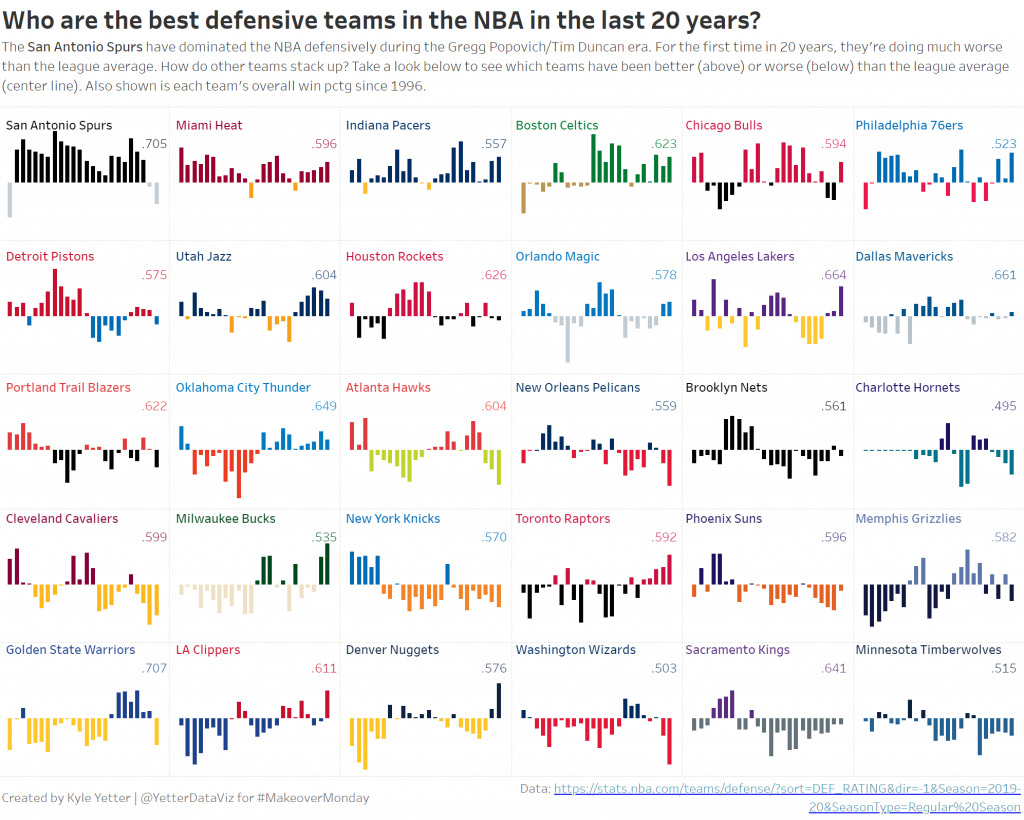
Anyway, so I started down the path of small multiples, and started a love/hate (more hate than love) relationship with the Charlotte/New Orleans franchises. For those not familiar with the NBA, the Charlotte Hornets turned into the New Orleans Hornets, who were then the Oklahoma City Hornets for a couple years after Hurrican Katrina, then back to the New Orleans Hornets, then the New Orleans Pelicans. Meanwhile, after the Hornets left for New Orleans, the Charlotte Bobcats became the 30th team in the NBA. When the Hornets became the Pelicans, Charlotte wanted the Hornets name back, so they changed from the Bobcats back to the Hornets. So in the data set, the Charlotte Hornets go from 96-97 to 01-02, then pick back up from 14-15 to present. However, those are actually two different teams, each with the same name. So getting that all sorted was a project in and of itself.
But then as I started working on the small multiples, the fact that the Bobcats didn’t start play until 2004 messed me up again. Because everything would go along fine until the Bobcats/Hornets organization showed up, then I would get eight years of Cleveland followed by the rest of Charlotte, and in the next one I had eight years of Milwaukee followed by the rest of Cleveland. So then I began to wonder, how did all of these other people do it? Well, some people made a different sheet for each team and placed them all on the dashboard, others would filter 5 at a time for a row, then placed six rows on, and others that did it like me but unfortunately didn’t catch that the latter half of teams were split halfway through the season list.
After trying to figure out some magic way to make the row/column table calcs to work without data points for the first 8 Charlotte seasons, I finally just opened the data in Excel and added the first 8 seasons with a rating of 1 so it would show the bars at 0 (or league avg).
Often, if I don’t finish in my scheduled hour, I just don’t get it finished. But this was sports data (I love sports) and I had identified a gotcha that I could blog about. So, I poked at it throughout this week and finally finished it tonight. I wanted to do a bit of branding, so I added the team colors. They could be slightly overwhelming, but for people who know the NBA, I think it also helps to identify each team, rather than just scanning through all the names. This is an issue since I sorted by overall defense for the time period, but I wanted to show which teams have been the best/worst over that time.
That said, here are my key takeaways this week:
- Make sure you understand what’s going on with the data. The Charlotte/New Orleans fiasco muddied up those waters a bit, but it’s definitely not accurate from an NBA historical perspective to have the original Hornets (pre-2002) in the same grouping as the Bobcats and Hornets (post-2014)
- Make sure your table calcs are doing what you expect them to. One of the reasons I noticed the issue was I added Team to the color shelf, because I wanted to make sure they were all together. That made it very apparent when I had half Cleveland, half Charlotte. Sometimes there are missing pieces in the data, so we need to make sure we’re accounting for them properly, and that’s particularly important when doing table calcs.
- Transparent sheets are awesome! While I was looking through people who had done small multiples, I came across Mohit Panse‘s viz where he used three different sheets on top of each other that made the labeling for each team much easier than the workarounds I’ve used in the past. (Incidently, while I was looking for this viz on Twitter, I came upon this thread where they discussed the exact issue I had noticed. They were able to solve it with a calc, so I wanted to share that here as well.)
Here’s the final product:
Click here to view on Tableau Public