Sean Miller’s first challenge this week as a guest host was a great one! I actually finished this one this morning and immediately started talking to people about having this as an option in some of our dashboards. Here we go!
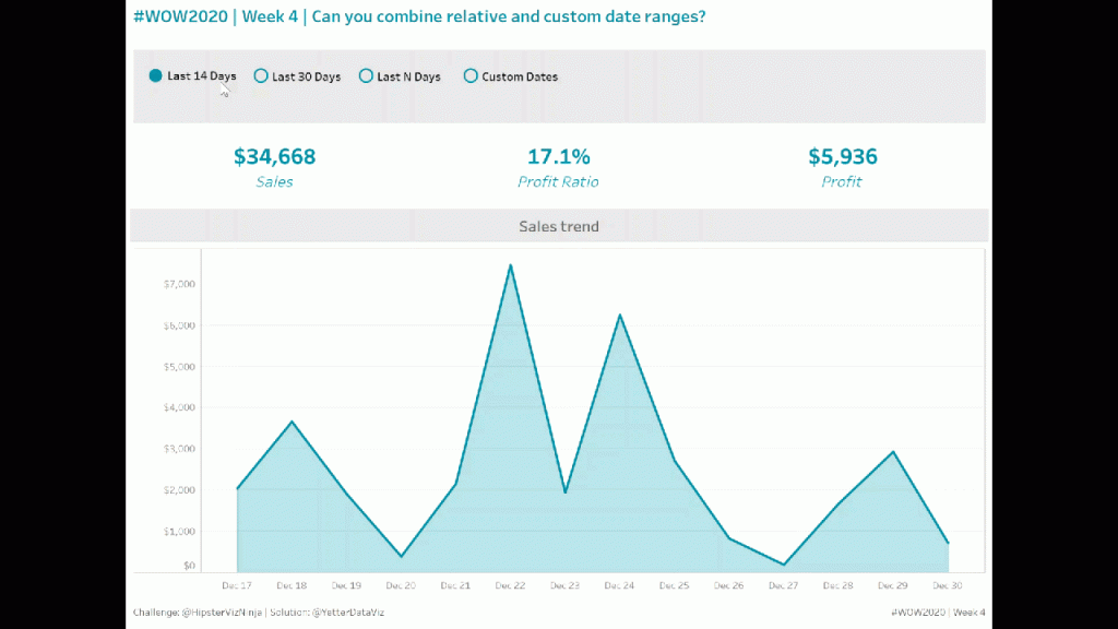
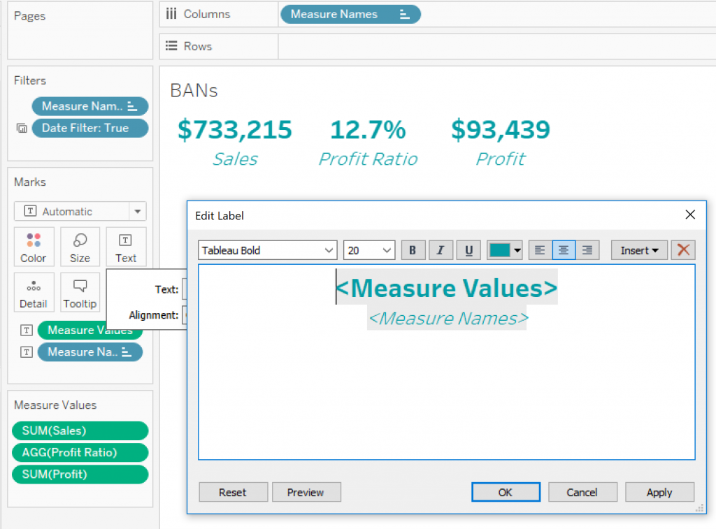
I started with the KPI BANs to kind of get warmed up. I just dropped the three measures into the view on top of each other, moved Measure Names to Columns and copied it to Label, and edited the text for size and color (which, thankfully, Sean gave us the hex code for).
Next I moved on to the area chart. I gathered from the weight of the line that it was a dual area and line chart. So I setup the dual axis chart, made one a line, one an area, reduced the opacity of the area to match Sean’s, and called it good. So far, pretty straight forward stuff.
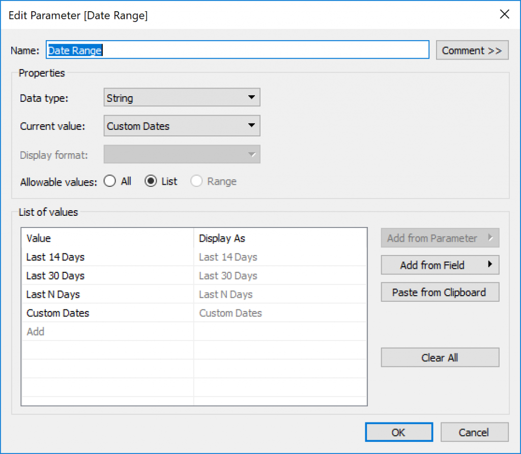
Now on to the meat of the challenge…all the parameters needed. I started with the selector. I set up a string parameter with the four options Sean created:
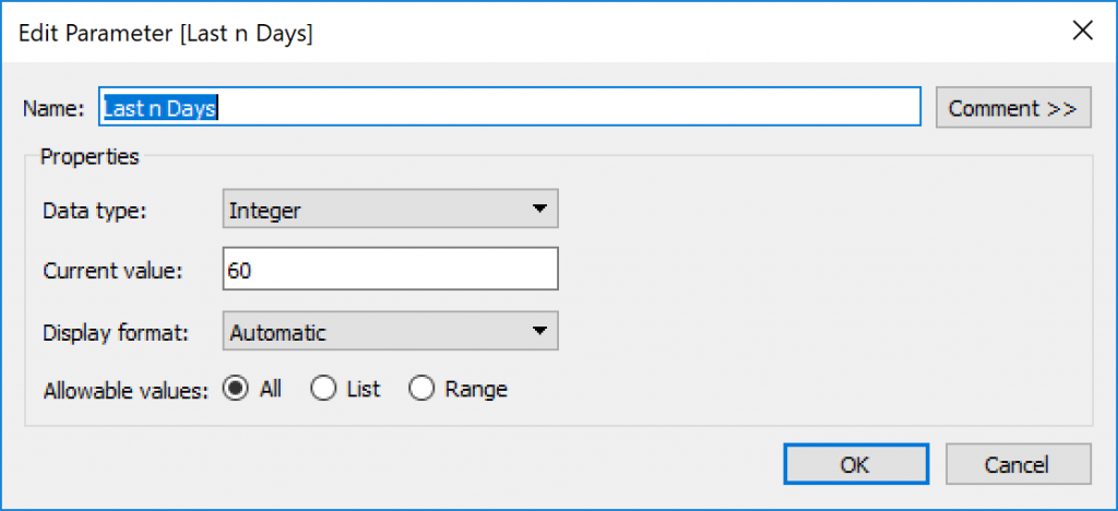
I passed it through in a calculated field to use later. Then I created the parameter to be used for the Last N Days. This one was an integer:
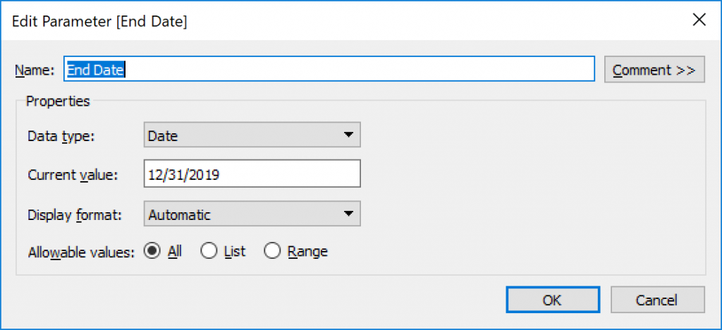
The last two parameters needed were Start Date and End Date for the custom dates option. Here’s what the End Date looked like:
With all my parameters set up, time to make some calculations. The first one I started with the easy ones, Last 14/30 Days. I decided to try a Datediff to find the first day of the dates to show, and it worked! So then I added the Last N days, but instead of hard coding the number of days to subtract from the Max Date, I put the parameter in instead. Here’s what that final calc looked like:
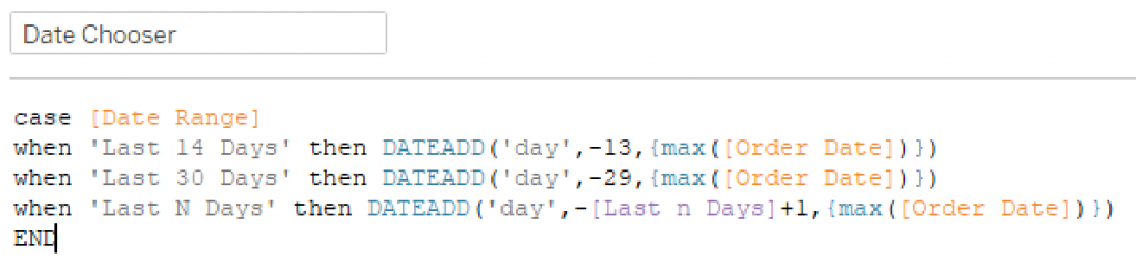
Note: the Max(OrderDate) is in {} to make sure that it was the Max(OrderDate of the whole dataset (Fixed LOD), not just the individual row in question.
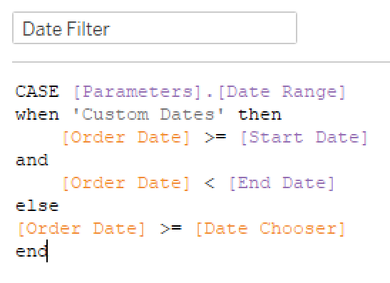
Now I could use this calculation to filter the view by saying Order Date > Date Chooser for these three options. The custom dates would be a little different, since it had a start and end date, so I made this calc for my filter:
Dropped this boolean onto the filter shelf in the area chart and started playing with the parameters in different combinations, and everything worked great! So I applied it to the BANs sheet as well. On to the selector sheet.
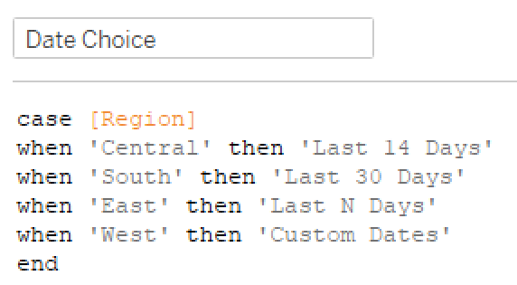
I took inspiration from Ann’s hack in the Superstore data in Week 2, and found a field I wasn’t using that had four values (it happened to be Region). So I whipped up this “renaming” calc:
Note: I tried just creating Aliases in the Region field, but it didn’t really work when I tried to do some conditional stuff. So I went with the calc instead.
So I added this Date Choice to Columns and Label, but I needed something to determine whether to use a filled or empty circle for the shape. Enter the Shape calc:
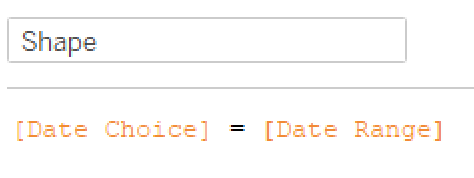
Pretty easy, if it’s what’s selected in the parameter, it will be True (filled circle), otherwise it’s False (empty circle). But my labels wouldn’t really align. That’s when I remembered I had already been through this in Week 2’s challenge, so I looked at my blog post on it, and remembered Luke’s Min(0.0) trick. Played with the axis and found that -.2 to 1 worked great for spacing of the text and circles.
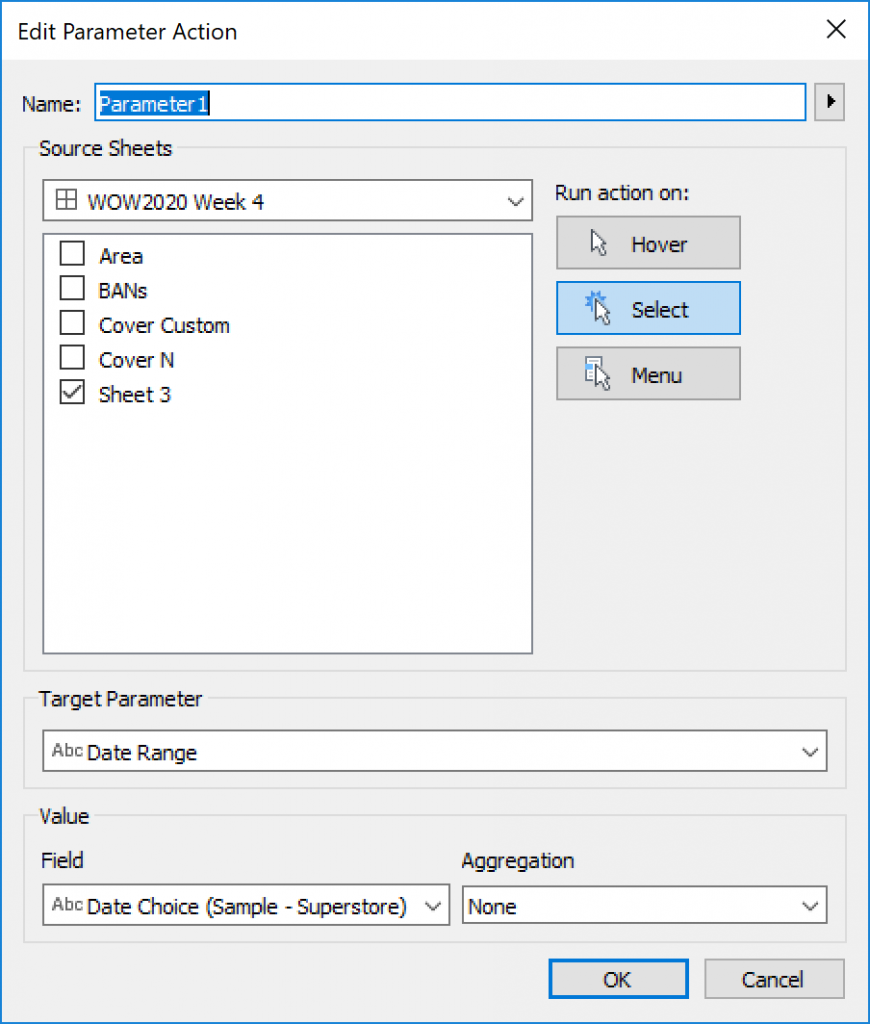
Now time to throw everything in the dashboard and setup the required Parameter Action.
A little testing, and everything works great! (I cleaned up tooltips and formatting as I went through each sheet) But wait…Sean’s version doesn’t show the N days box or the Start Date/End Date. I racked my brain for a bit trying to think through how to put something in a container and make it go away based on something being selected. I do Workout Wednesday live in a demo session at work, and had five minutes left before the hour was up, so I cheated and downloaded Sean’s workbook to give some closure on how to do it. Shoutout to Sean, great idea. Basically, he created a couple sheets (one for N days, one for custom dates) that had “” on Text and Columns, and a filter to only show the sheet when the respective option was NOT selected. Then you put that in a horizontal container with the parameter entry box to the right of it in the container. Then when the respective parameter option is selected, the sheet “disappears,” moving the parameter box to the left. Float a blank box (colored the gray of the background) where the parameter box sits when the sheet is there, and you have a “hiding” parameter.
And just like that, we’re done! Thanks for following along.