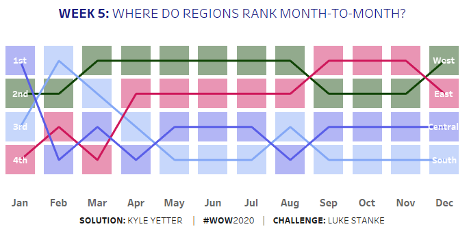
This week’s challenge from Luke was pretty simple, at least from a requirements standpoint. “All” we had to do was replicate the step-ranked chart with different labels on each end of a line with only one calculation on labels. Luke also included an “advanced” option to not use the square or shapes mark type.
Since I do the challenge live with a group at work, I started with a basic version. First, I created a Rank calculation on total sales:
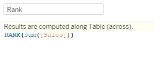
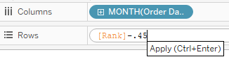
After adding MONTH(Order Date) to columns, I added Rank to rows as a dual axis (and reversed the axis). Just to make sure the rank was calculating properly, I checked the table calculation:
In Andy Kriebel’s plain sentence version: For each Month of Order Date, calculate the rank of sales by region. For this basic version, I stuck with the Square mark for the boxes. I added Region to color, set the colors based on Luke’s viz using Pick Screen Color. Then adjusted the opacity of the squares to 45%.
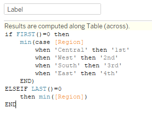
For my label, I used FIRST() and LAST() to create a different label for each end of the line. In the basic version, I did a little hardcoding based on region:
Format the labels and the months, and all finished (with the basic version):
After finishing this round, we still had plenty of time, so we attacked the advanced version.
After duplicating the sheet, I looked at the options on the Squares marks card, and decided to try a Gantt chart. It showed promise, but I needed something to give it a size. So I added min(1) to size, but that made the boxes all run together. After playing around with the value, I settled on min(.9). Then I noticed that put the lines at the bottom of the box:
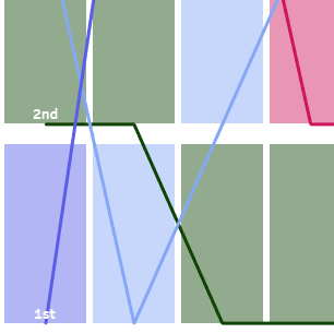
I realized the Gantt bars were starting on the rank value, so I subtracted .45 so the rank integer would be in the middle:
That took care of the height of the boxes, so I tried adjusting the size on the marks card, and it widened the boxes without adjusting the height. Perfect!
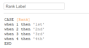
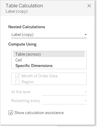
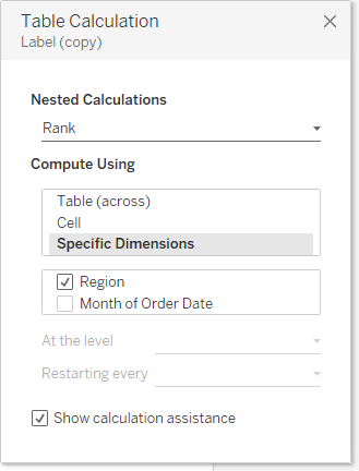
I decided to also level up my label, rather than hard coding based on the region. First I created a label value to turn the rank value to 1st, 2nd, etc.
Then I dropped that calc into a copy of my prior label calc:
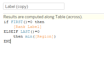
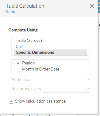
Initially when I added this calc to the label, things weren’t appearing correctly, so I had to play with the table calculation a bit. Here’s what those needed to be (Label (copy) and Rank as a Nested calculation):
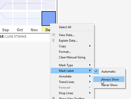
One final hiccup I ran into was that the South label wasn’t showing up. Desireé offered a simple solution:
And with that, we’re done with the advanced chart. The spacing actually works quite a bit better with this one than with the squares, I thought.
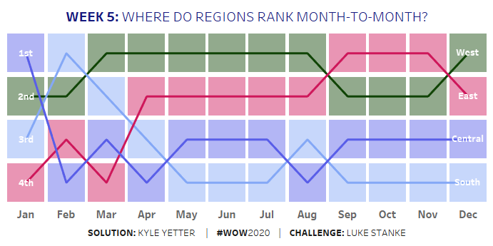
Here’s the link to the interactive viz.