Luke has this crazy ability to build stuff that you think should be pretty easy, and then unless you know the exact trick, you’ll spend 30+ minutes getting close but not quite there. That was my experience with this week’s challenge.
I felt kind of ridiculous this morning as I was dragging different combinations of month, year, index, adjusted date calcs, and other things around for about 30-40 minutes while a couple colleagues watched on. I had a couple inklings of how I needed to get stuff to happen, but couldn’t step back far enough to think it all the way through. My closest attempt for a bit was setting all dates to the month + 1/2019:

When I added that to columns, and added INDEX(), I could get the bars the way I wanted with spacing we wanted:
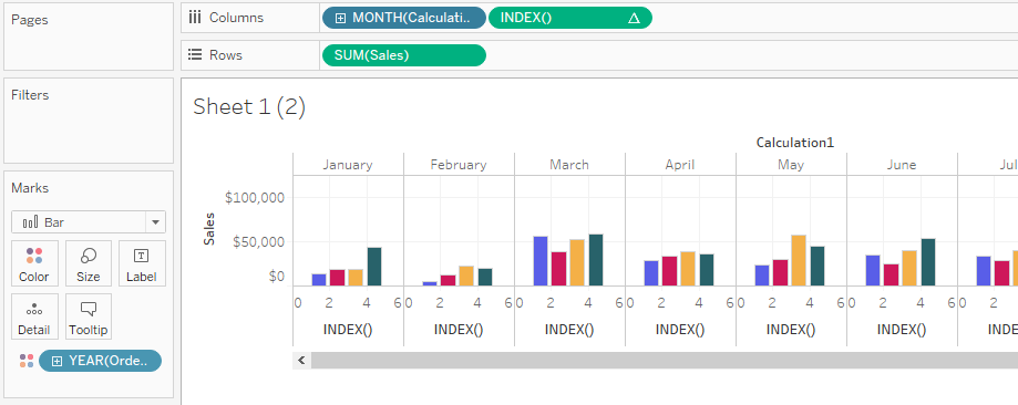
The problem was I couldn’t figure out how to get the month to the bottom axis. No matter how I tried to outsmart Tableau, it didn’t want to do it.
As I was talking through what we needed to do, I touched on how it seemed like it was just mapping the bars on the timeline, but I couldn’t wrap my head around that.
After a couple tries, I found someone whose workbook I could take a look at (since Googling got me nowhere today). Katharine Rosacker was the lucky winner. She had two calculations I ended up basing mine on. One to set all of the Order Dates to the same year, truncated at the month level. Here’s what mine looked like:
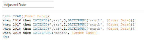
This got all of the data points to be in the same year. Then the other calc adjusted each year to a different day according to the spacing requirements:
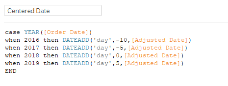
Effectively what this does is move January 2016 from 1/1 to 12/21, January 2017 to 12/26, leaves January 2018 on 1/1, and moves January 2019 to 1/6. Then the same concept for each month. Once you add this Centered Date to Columns, with YEAR(Order Date) on color, it’s magic! Then a quick adjustment to the size to set the bars to 4 days wide (leaving 1 day in between):
I added MONTH(Order Date) [continuous] to the Detail so I could use that in the tooltip, since the Centered Date showed the month before for 2016 and 2017.
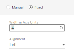
I noticed that Luke’s Sales axis didn’t show the 0 value on the tick mark. Try as a might, I couldn’t figure that one out, unless I set the axis to start at 1 instead of 0 (which he didn’t do). I’ll be curious to see how he did that.
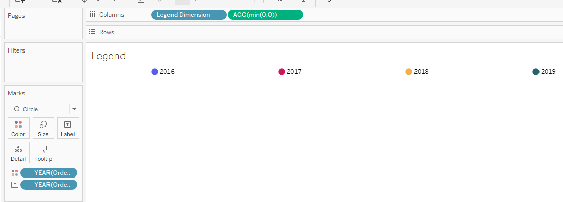
For the legend at the top, I created a dimension:
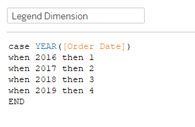
Add that to columns, along with min(0.0), with YEAR(Order Date) on Color and Label, and you have a little legend.
Throw it all in a dashboard, and we’re finally done! My thanks again to Katharine for the calc inspiration this week. I was S-T-U-C-K.