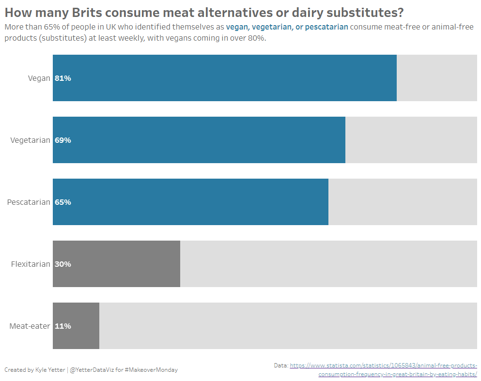
This week’s Makeover Monday looked at consumption of animal-free products consumption in Great Britain:
What I like:
- You can see clearly over half of meat-eaters don’t eat animal-free substitutes
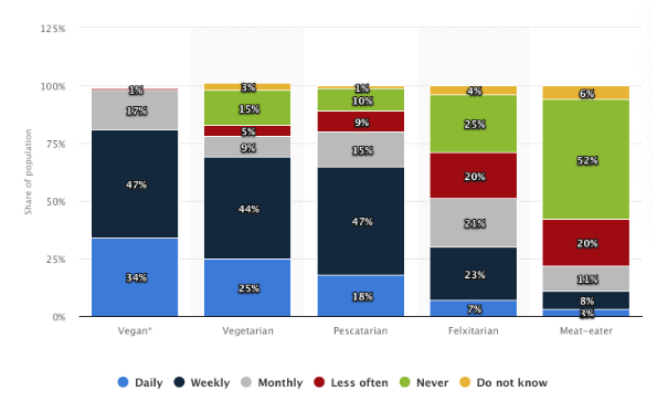
- Stacked bars build on the timing group (daily fits in weekly, etc)
What could be improved:
- Why does a share of population axis need to go to 125%?
- Lots of colors make it kind of difficult to keep track of the categories
I wanted to do something that created more focus on the consumption of alternative products. I played around with a few combinations, but settled on looking at weekly consumption (which included the daily group) by those who are self-declared not meat eaters. I put the color focus on that, and left the rest in grays.
Here’s what I built: