If there’s one thing I’ve learned doing Workout Wednesday, it’s that I can look at something and think, “oh, that should be easy, I know just how to do it” and be COMPLETELY wrong. This week’s challenge from Luke was no exception. The main guts of the challenge was pretty straightforward, but there were a couple little formatting things that just didn’t quite work as I expected.
I started with the bar charts. I placed MONTH(Order Date) on Columns, and SUM(Sales) on rows. I added the mark labels and rotated them:
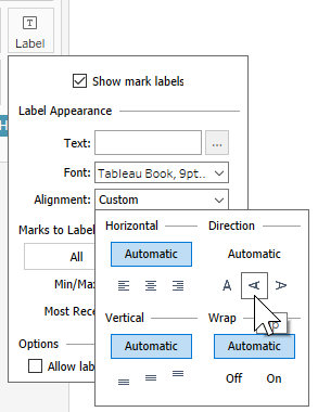
My problem came when I tried to format the axis to match Luke’s, with the tick marks every 2 months and in the center. I tried making it continuous and that got the tick marks in the middle, but I couldn’t get them every other. Then I tried using a custom date instead, but that worked about the same. Even when I could get the every other tick mark, I had an extra D in front of January. It was really bothering me, so I checked out what my other WOW friends came up with, and came across Annabelle Rincon‘s solution:
This took care of the extra D before January. Then I duplicated the sheet and changed the metric to each of the other three. With the bar charts out of the way, time for the KPIs.
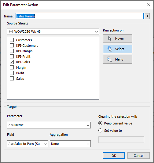
I knew I would need a parameter to get the KPIs to show the bar chart. At first I created a String parameter with a list of the four metrics, but then I realized that if I’m passing a value into the parameter, I don’t need to set a list.
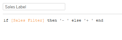
I started with a MIN(1) in Columns to get a bar, then added a MIN(0) on a dual axis. That allowed me to add SUM(Sales) as a label on one bar, and the metric label on the other. I needed a calculation for the + and – based on whether the KPI was selected. I noticed that the + and – were bold, while the metric name was not, so they needed to be separate.
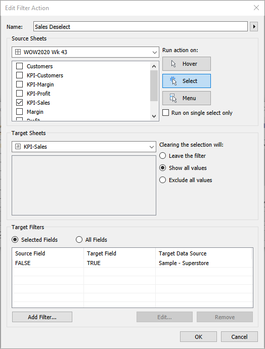
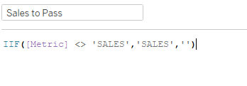
For the other part of the label I just created a calc with ‘SALES’ (or the other respective metrics). Then I setup the parameter action, passing ‘SALES’ to the parameter, and Set value to ” when the selection is cleared. However, once I got things setup in the dashboard, my unhighlighting made it so there was no selection to clear, so it wouldn’t deselect. It was doing some crazy things, with the labels disappearing or turning to null, and I couldn’t figure out what was going on. So I changed MIN(1) to AVG(1) and that seemed to fix the labels from disappearing. After 30 minutes of messing with the actions, I went back out to the WOW friends, and found Samuel Epley‘s solution via Donna Coles. Instead of using the parameter action to clear the value, it uses a calc to set the blank value if the parameter already equals ‘SALES’.
So I added that to Detail, and adjusted the parameter action to use that field, and that magically fixed the actions.
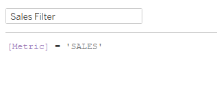
I mentioned previously the unhighlighting in the dashboard. I added a calc with ‘FALSE’ to the detail, and set a filter action in the dashboard (I’ve mentioned this method various times previously):

In the dashboard, I needed a vertical container with a white background for the title, and then I added another vertical container with a gray background for all the KPIs. I set the inner padding on the gray container to 15 px. For the KPIs other than Sales (Sales already had top padding with the container padding), I added 10 px to the top outer padding. For the bar charts I added 20 px of inner padding for everything except for 10 on the bottom.
To get the bar charts to only show when their KPI is selected, I just created a boolean for each metric and added to the filter shelf:
The last little thing I noticed in Luke’s challenge was a gray line dividing the white title background and the lower gray background. For that it’s a quick blank object into the vertical container, set with no outer padding, a darker gray background, and edit the height to 1 px. And with that we’re done, with all the little tiny formatting intricacies and all.
