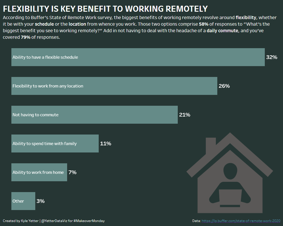
This week’s Makeover Monday looked at survey results of the top benefits for remote working:

The interesting thing about this week’s makeover, is that it’s actually a makeover of a makeover. Here’s the original chart from the Buffer survey report:
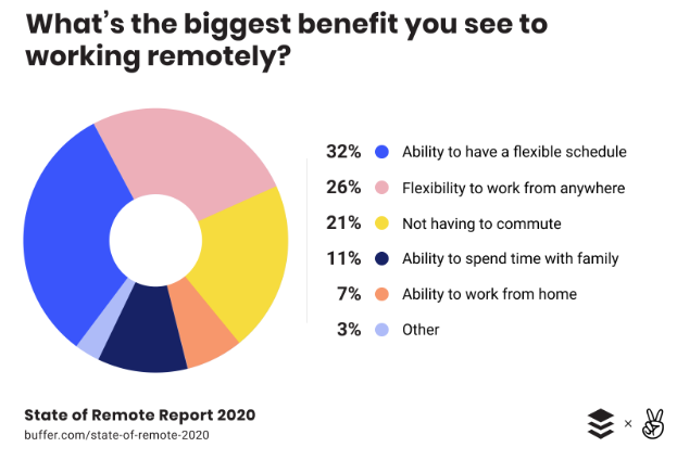
When you look at it this way, the chart given for the makeover is much improved of this non-aligned, not-quite-sorted, confetti donut chart.
Given this clarification, here’s what I like about the chart:
- Clearly labelled, easy to see which section of the bar is what thanks to alignment and color matching
- It adds up to 100%. So often it seems a donut or stacked bar won’t add up to 100%, which means it was definitely not the right choice. But this one does, so that’s a positive.
What could be improved:
- Even though the stacked bar can give you the proportion, it’s hard to see how those top three items really compare with each other. How much more of a benefit is the flexible schedule than the lack of commute?
- If we take it out of the stacked bar, we don’t need all the colors.
In our MM get together this afternoon, my colleague Yu Dong was trying to brainstorm what was even possible with such a small data set. And she said, “I don’t want to just do simple bars.” Challenge accepted! So I set out to do “simple” bars, but with a little more pop than just some blue bars on the white background.
Here’s what I built: