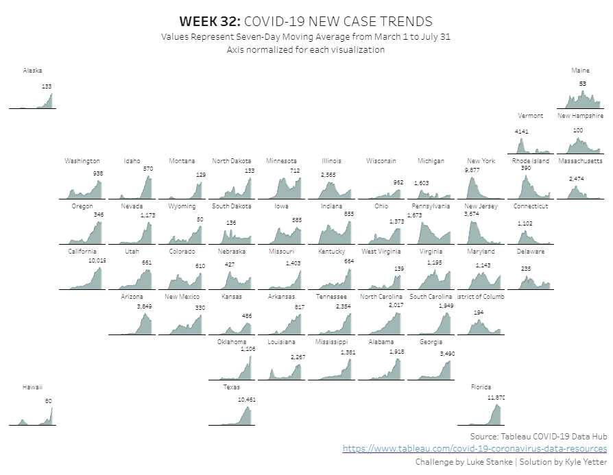
I was excited to start Luke‘s challenge this week because at first glance I thought I had the solution pretty much in mind. That thought always betrays me. Always.
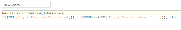
Thankfully he provided the calculations needed for the rows/columns of the cartogram. That was an easy start. Then I added Report Date to Columns, and People Positive Cases Count on Rows. With Province State Name on Detail, the cartogram started to come together. But per the challenge, we need new cases from that field, so I added a table calc of Difference From, and selected from Previous. I knew I would end up nesting that calculation for a 7 day average, so I ctrl+click and dragged it to the Tables pane on the left, which gave me the calculation:
To get the 7 day average, I used a WINDOW_AVG of New Cases:

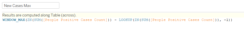
After adding this to rows in place of New Cases, I set the chart type to Area, and added the 7 day average to Label, and set it to show on Maximum Value. Then I noticed that the peaks weren’t matching up with what Luke had. So I had to normalize it. In order to normalize, I need to divide the 7 day average by the maximum new cases value for each state:
Things were looking pretty good at this point. But then when I did my usual labelling mechanism for these kinds of charts (multiplying the value * 1.4 and putting it on a dual axis), I was unable to get the line underneath the trend to work. I played around with that and a bunch of other attempts, until I finally just took a peak at Luke’s workbook. Even with that it took me a solid 10 minutes to figure out what he did. I had identified from the tooltip on the state label there was a separate date, and I needed to put that on a dual axis with Report Date. Based on it being a center date (the state label is centered), I created a calculation to make it the center of the date set:
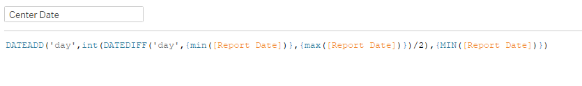
This one finds the difference (in days) between the earliest and latest report date in the data set, divides that by two, and adds that to the earliest date in the data set. So when I add that date as a dual axis with the report date, and synchronize the axis, it puts a point right in the middle of the axis. So when I added a label, it put the label at the bottom of the chart. No matter how I aligned it. I finally looked at the calculation Luke had on rows, and it was a different way of doing my 1.4 value:
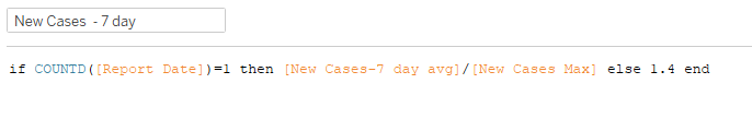
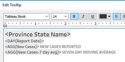
This one took me a minute of talking through it to figure it out. But then I realized, for the Center Date axis, there will be more than one Report Date, so it puts those points at 1.4. For the values on the Report Date axis, there’s only one, so it does the normalized value. Once I saved that calc, the state label popped right up to the top. With that in place, I needed to update the tooltips:
Setup the title and caption, and drop the worksheet into the dashboard, and we’re done!