This week’s challenge from Lorna and Sean was accompanied with a combined Preppin’ Data/Workout Wednesday Live Session. It was great, I got to meet some people I’ve only conversed with on Twitter, and it was nice having Lorna and Sean checking in, which got me through my biggest roadblock. I probably would’ve ended up checking Lorna’s workbook after banging my head against the wall.
This was the first Preppin’ Data I’ve done. I’ve used Prep fairly frequently, so I was able to work through it pretty well. It took some dual joining, manual grouping, pronunciation grouping, calculated fields, and aggregation. Fun stuff!
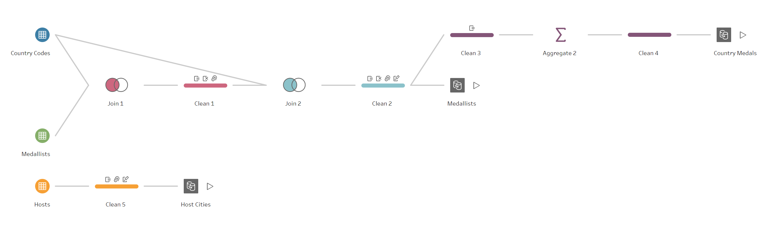
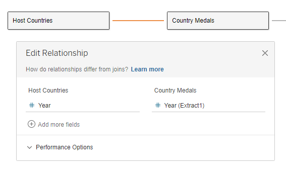
To start the WOW challenge, I connected the three data sources with noodle relationships. Lorna was kind enough to hint that it worked best to start with the Host Countries source, so I did. I connected Country Medals on Year:
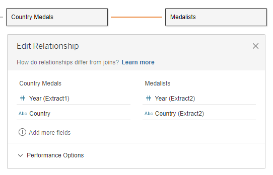
Then I connected Medalists to Country Medals on Year and Country:
The first thing I created was the Medal Score calculation:
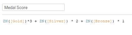
Initially when I created the calc, there were only 8 countries in 1896, when there should be 11. That’s when I realized I needed the ZN, since some countries had null values for one or more of the medal types. Next I needed a rank function based on the medal score:
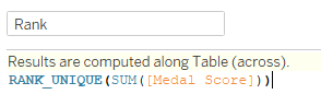
I used RANK_UNIQUE in order to have one country for each place, even if they have the same medal score.
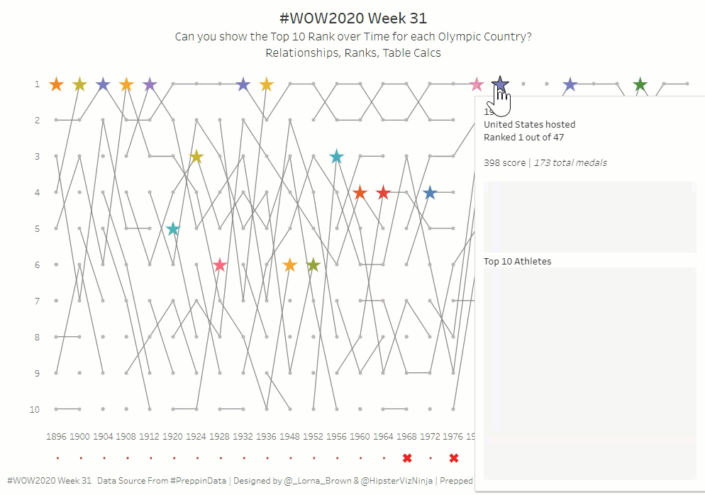
I brought Year from Country Medals to Columns, and put Rank onto Rows. After I tried filtering rank on top 10, to no avail, I played around for a while to get the lines to match up to what Lorna’s had. After a few minutes, Lorna checked in with our group, and had pity on me. She hinted that I needed to make items that weren’t top 10 NULL instead of filtering them out. So I created a calc to do so:
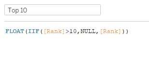
The FLOAT is there because I changed it to a decimal number. Then I added that to Rows, and computed using Country. Then in order to get the lines and dots, I made a dual axis. In order to get 1 at the top, I reversed the axis. And magic, it worked! Next I needed to figure out the hosted and participated to get the stars.
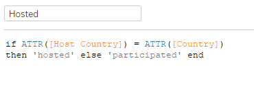
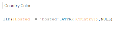
I had to use the ATTR because of an error I was getting that didn’t like something about the relationship setups. Then I changed the second mark type to shape, and added Hosted to Shape and Size. As I started with the color for the stars, I needed to find a way to only get the host countries instead of all the countries:
Then I assigned the Hue color palette (per instructions) and changed the Null to gray. That finishes up the bump chart. Now for the tooltips.
There are two vizzes in the tooltip. The first is total medals for the country by Gold, Silver, and Bronze. So I put those three values into Measure Values, added Measure Values to Columns and Label, and Measure Names to Rows and Color.
The second tooltip shows the Top 10 medalists for the country in that year. So Medal on Columns and Color, Athlete on Rows, COUNTD(Event) also on Columns and Label.
As I set up the tooltip, I needed two more numbers, total countries participating that year, and total medals for the country that year.
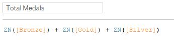
Total medals was pretty much like the Medal Score:
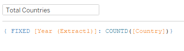
Total countries was my one LOD calc in this workout:
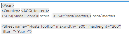
Now it’s time to put the tooltip together:
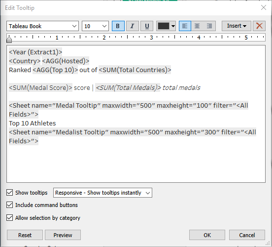
That finishes the bump chart with the tooltips.
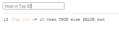
For the bottom chart, I needed a calc that checked whether the host country was in the top 10 countries that year.
In order for the Top 10 calc to work, I can’t filter on Hosted, so I had to add Hosted to Rows, and hide ‘participated’. Then I added Host in Top 10 to Shape and Size. Year on Columns, Country in Detail. Again the tooltip needs Medal Score and Total Medals, so I added those. The last thing we need is the viz in tooltip showing the top 10 countries and the host if they’re not in the top 10. Rank and Country on Rows, and SUM(Medal Score) on Columns. I need a filter to get the top 10 and the host:
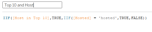
Added that to filter, and then added Host in Top 10 and Hosted to Color (you have to add the second one to Detail, then click on the Detail icon and change it to Color). Then with different years selected, I set the color for the hosted values. With that, I finished up the Hosts sheet tooltip:
Now that the sheets are done, it’s a pretty easy dashboard layout, with a Vertical container, the title textbox, Bump sheet, Hosts sheet, and footer textbox. In order to get the Hosts items to match up with the Year axis on Bump, I added internal padding of 55 px. And we’re done!