Lorna‘s challenge this week was a good mix of parameters, set actions, date manipulation, and container magic.
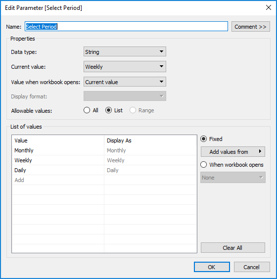
To start I set up the period selector parameter:
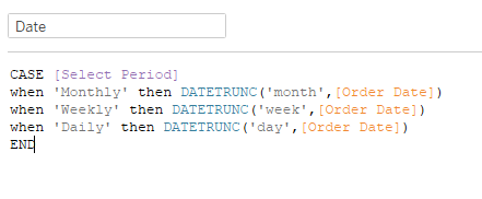
Then I created a date calc that would dynamically change the date grain based on the parameter selection, using DATETRUNC:
I dragged Date to the columns shelf, selected DAY(Date) [Continuous], and made sure Show Missing Values was checked. Then changed the mark type from Automatic (line) to a Bar. Add SUM(Profit) to color, and we have the basic workings of the bar chart.
I created another parameter for the number of years to display. This was an integer parameter with a range of 1-4:

Then I created a calc to compare my date calc to the difference between 2020 and the number of years selected:
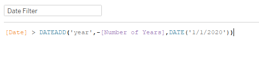
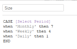
Date Filter = True on the filter shelf, and we’re moving along. To adjust the size of the bars (which I admittedly put off until last, but will include here with everything else from this sheet), I used another case statement based on the Select Period parameter:
I played around with the numbers here until they looked about like Lorna’s. (A slightly more dynamic solution by Rody Zakovich can be found here)
Drop Size onto Size (and changed aggregation to MIN, rather than SUM), and we’re done with the bar chart! (assuming axis formatting and tooltip adjusting)
Then I needed the Subcategory list to run the set action on. This is kind of second nature at this point after all the workouts this year. Subcategory to Rows, MIN(0.0) to columns, axis range set to -0.05 and 0.5, Shape mark type (that gives me blue open circles). Changed the color to black, and then created the Subcategory Set so I could put that on Shape:

Then I created the set action (Worksheet>>Actions):
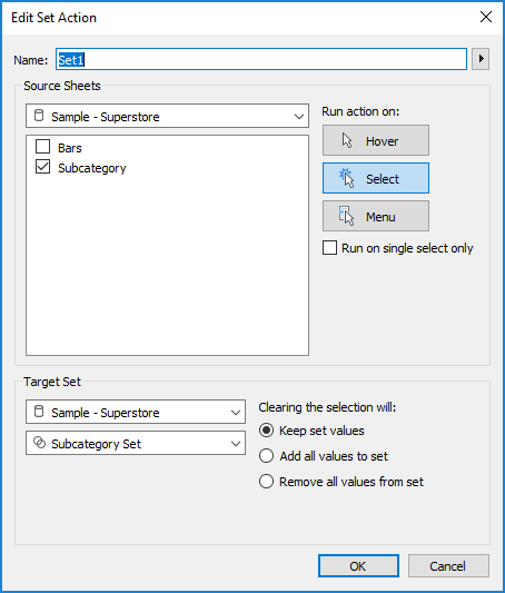
If you select the data source under Source Sheets, rather than the sheet you’re on, you won’t have to recreate the action when you apply it to your dashboard. Then, in order to deselect the shape when it’s clicked on, I used my now tried and trusted TRUE/FALSE method from Yuri Fal. A quick edit of shapes to change the IN to filled circle rather than open square shape, and we’re ready for dashboarding.
When I build dashboards, I always use containers. ALWAYS. But, where I might deviate from others, I leave one Tiled container at the top. Otherwise every time I add a chart to the dashboard, it seems like Tableau adds another Tiled container to put the legends in. So I keep one, and then run Vertical container inside of it. Here I put my Bar chart, the dashboard title (with Select Period parameter so it’s dynamic), and my footers (which are all inside a Horizontal container at the bottom of the main Vertical).

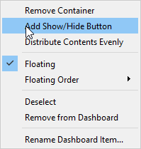
My new favorite thing is the super easy menu functionality. I’ve done other workarounds where you have two dashboards, and it’s a big pain. This is seriously so simple, I can’t get over it. When my legends/parameters popped up to the side of the bar chart, I pulled in a floating Vertical and added the two parameters and the Subcategory sheet. Then you just click Add Show/Hide button in the container dropdown:
Fine tune the placement of the icons and the container. Add a white background for the overall Vertical container, as well as the dashed border. Final testing and we’re all set!
