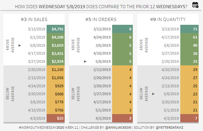
Ann’s challenge this week was a bit of a respite from the last few weeks, but still packed plenty of little punches.
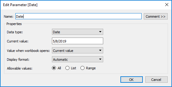
The challenge revolved around a selected date, so I started with that parameter.
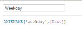
Then I needed to figure out which weekday that day fell on.
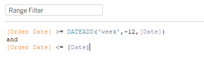
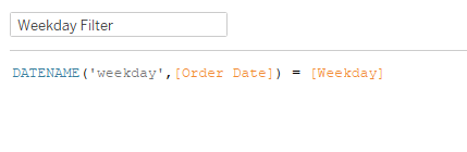
With the weekday identified, we need two filters. One to identify the previous 11 weeks and another to identify the dates within those 12 weeks.
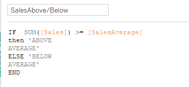
Once I verified these got me the right dates, it was time to create the rank tables. First, I did a RANK on SUM(Sales). However, later on, I realized that didn’t match up with Ann’s viz, particularly on orders and quantity where there were ties. So I went with RANK_UNIQUE instead of just RANK. Then to find the average line, WINDOW_AVG on SUM(Sales). In order to create the Above/Below Average categories, I needed to compare the sales to the average:
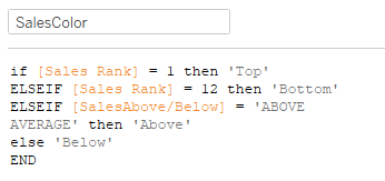
For the color, I needed to identify the top and bottom as well as whether it was above average:
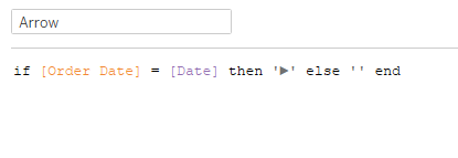
The last thing needed for the table is the arrow to identify the chosen week. At first I thought it could be a shape, but then realized I wouldn’t be able to put a shape in the dimension grouping. So I copy/pasted one for the calc:
With SalesColor on Color, the nice colored boxes turn to little squares. 🙁 So I played around with a Gantt chart. I added MAX(1) to columns, and MIN(-1) to size, and fixed the axis to 0 to 1. With everything in place (including the SalesHeader, which I’ll get to shortly), here’s what it looks like:
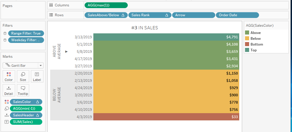
(The Sales Rank header is hidden, and you have to right click on the SalesAbove/Below header to rotate the label. Format for row banding at the SalesAbove/Below level. )
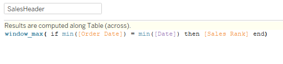
In order to include the rank for the chosen week in the table header, I needed to identify just that rank value:
With the Sales table in place, I copied each of the calculations for order and quantity, duplicated the worksheet, and replaced accordingly.
With all three tables ready, I dropped them each into a vertical container with a blank below for the gray shadow. Turn off the outer padding, and fix the height at 2 pixels. I then dropped all three verticals into a horizontal container.
One thing I ran into when I tried to get the titles for the tables to be white despite the gray background. Doing so left a sliver of a gray line between title and the table. However, clicking on the sheet and setting the background color to white from the dashboard layout pane worked like a charm.
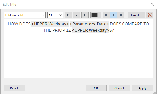
I started to add the title for the dashboard, and realized in order to include the weekday in the title it needed to be a worksheet (hence Ann’s requirement for no more than 4 worksheets). So I used a trick I picked up in week 4 just just add ” to columns and text for a blank sheet. In order to get the weekday to be in uppercase, I needed one more calc with UPPER(Weekday). Then my worksheet title looked like this:
Once again I put the sheet in a vertical container with a blank underneath. In order to not show the big blank worksheet, I fixed the height at 34. I had to play around with the padding and height a bit after I published to Tableau Public because it rendered a little differently than in Desktop.
Then I put this vertical on top of the horizontal container with the three tables in one more vertical.
The finishing touch was the calendar icon showing the date parameter entry. I learned this last week, just add the parameter in a floating vertical container, right click and select Add Show/Hide button. Added the icon Ann linked to for Show, left the X for Hide. And we’re finally finished!
very nice explanation, please keep same thing ahead