Meera‘s first challenge was a great practice with date calculations. At first glance I also thought “oh, easy layout” but then I read the second requirement to only use 3 sheets. Not quite so easy, but still doable.
I started with the Sales bar chart. MONTH(Order Date) on columns, SUM(Sales) on rows. I filtered the YEAR(Order Date) to 2018/2019. Then I added YEAR(Order Date) to color and size, and matched the color to the requirements. In order to get the bars to be in front of each other instead of stacked on top you have to turn stack marks off in the Analysis menu:

As I formatted the axis, I realized that my sales value in the tooltip would be formatted the same way, which would be contrary to the requirements (50K vs $50,000). So I duplicated Sales and placed SUM(Sales (copy)) on tooltip. I had the same kind of issue with the date in the tooltip after formatting the axis to be the first letter. So I created a custom date on Order Date and added it to my tooltip:

I finished up the tooltips before the end of the process today, I was feeling wild and crazy.
The last thing I needed was to filter through Mar 24 for the current year. So I created a boolean filter:

That finishes off my sales chart. I duplicated it, switched Profit with Sales, adjusted the tooltip, and the bar charts are done!
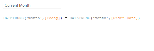
Now to figure out how to put two separate KPI sections in one sheet…I needed five calcs for MTD, PMTD, MoM, Run Rate, and YTD. In order to make those, I created Current Month and Prior Month:

Here’s each of those for Sales:
MTD

PMTD

MoM

Run Rate (Divide MTD sales by number of days, and multiply by number of days in the month, found by adding one month to today’s truncated month, and subtracting one day)

YTD

Once I had all these calcs (and the accompanying Profit ones) I added Sales and Profit to rows, which gave me Measure Names. Then I did a dual axis with MIN(0.0) and added all of the calcs to the label. The dual axis allowed me to put the profit calcs in one mark card and the sales calcs in the other. Formatting, adjusting axis, and drop them in to the dashboard.
I’m all about containers (I think I’ve mentioned that before) in dashboards. I think the easiest way to show the build is with the item hierarchy:

In this case, I do have a floating blank object. That’s for the dividing line between the Sales KPIs and the Profit KPIs, to match the dividing line between the two bar charts. I played around with the column borders, but that left some borders at the top and bottom that just didn’t quite match up. So I floated a blank in the right spot.
And that’s it! As I took a look at Meera’s, there were a few differences in how we did things, but in the end, we arrive at the mostly same result. (I did recognize she probably did a dual axis in the bar charts in order to achieve some transparency of the PY bars, but I had already gone down my path and didn’t feel like changing it)

Click here to view on Tableau Public