Workout Wednesday – Week 20

Sean came back  for one more week with a great challenge to try out the new set actions available in version 2020.2 this week. It’s funny because those actions were like the easiest part of building this week, which is a testament to the functionality itself, I think. Anyway, here we go!

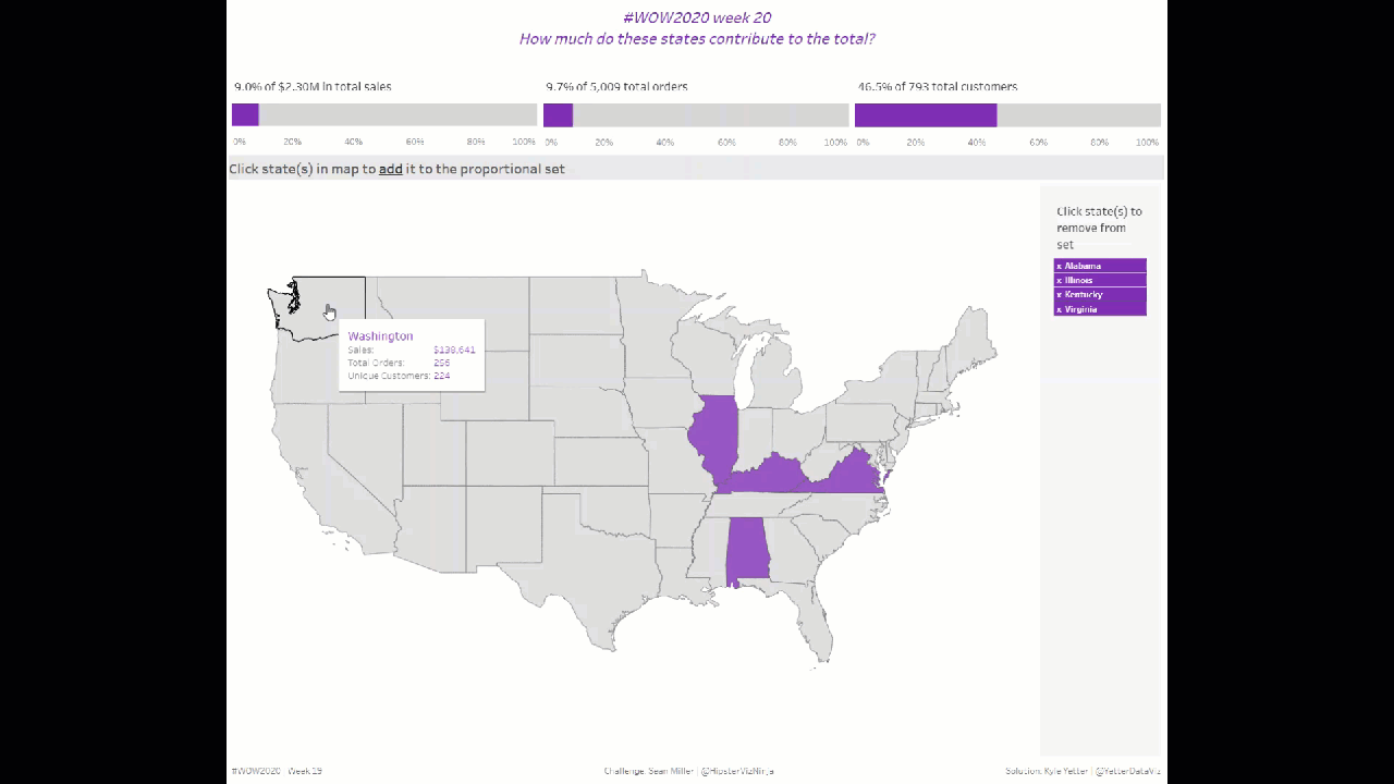
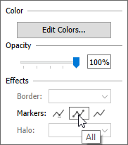
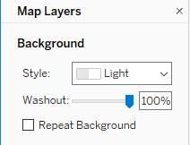
I started off with the map. Double-click Latitude/Longitude, add State to the Detail. Right away I noticed the background map needed to go away, so I opened up the Map Layers and washed out to 100%:

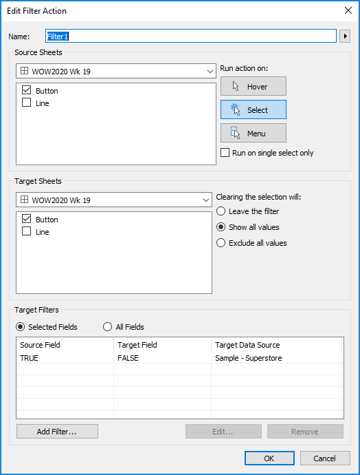
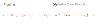
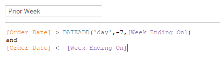
I then created the State Set, right-clicking on State>>Create>>Set… Then came the first set action:

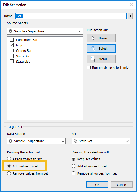
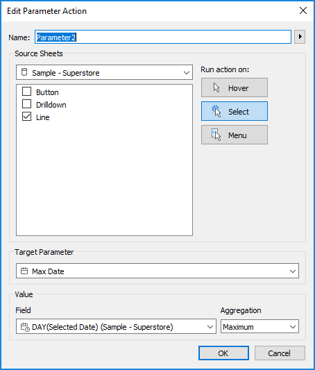
So by clicking on the Map, I will add that state value to the State Set. This is one of the new things. Before 2020.2, you could only assign values to the set. You couldn’t append or remove.

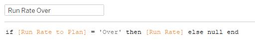
Once I tested that out, I realized that Sean’s was auto-deselecting. So I added TRUE and FALSE to Detail and set my filter action:

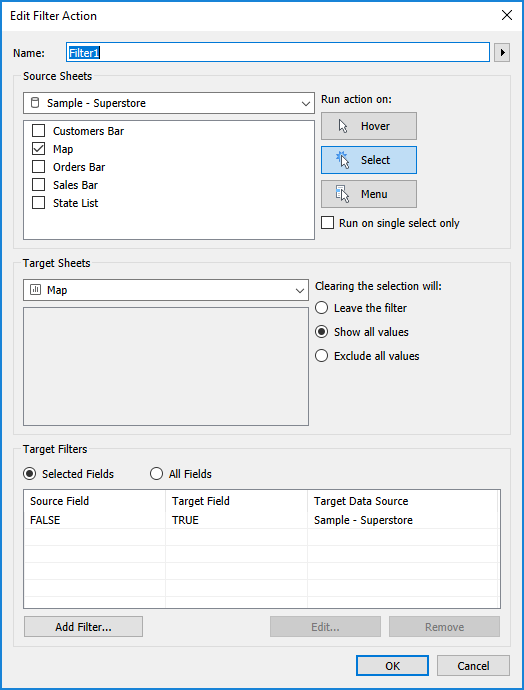
As discussed in prior weeks, this tries to filter where TRUE = FALSE (which it never will) so it automatically unselects everything, including what you just clicked on. Best tip ever from Yuri Fal!

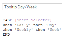
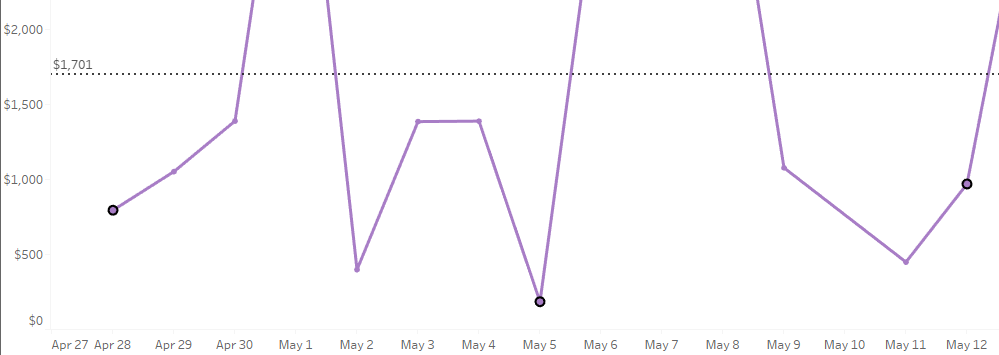
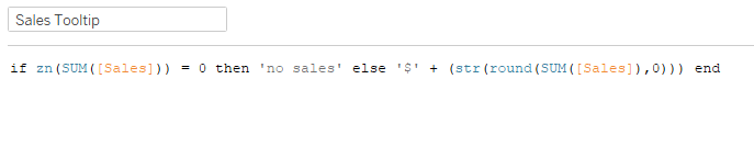
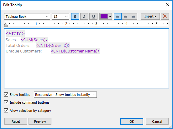
I’ve started trying to address the tooltips while I’m working on the sheet, instead of forgetting about them until I’ve published to Tableau Public, so here’s what this one looked like for the map:

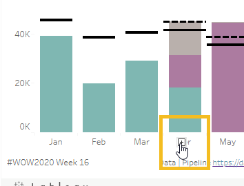
After setting colors for the set values, I moved on to the KPIs. I’ll discuss sales, and then I basically duplicated the sheet and calcs and replaced sales with order and customers.

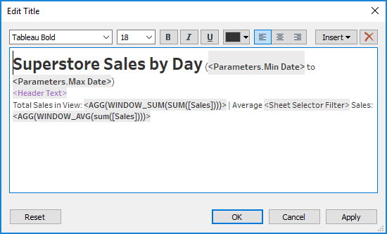
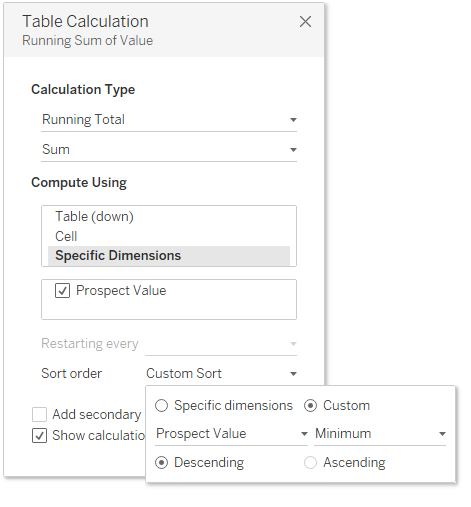
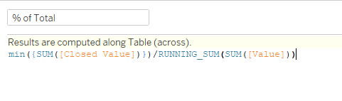
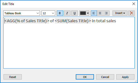
First, a table calculation Percent of Total on SUM(Sales) with State Set on Color. Then I worked on the title. But as it is, if you just take that table calc and add it in the title, it will give you the range of that value. I don’t want that, just the value of the states in the set. So I Ctrl+click+dragged the % of Sales from Columns into the fields pane (shortcut so I didn’t have to start from scratch), and adjusted the numerator to only give me sales when it’s in the set:

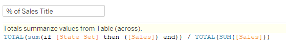
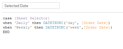
I needed the same kind of thing for the total sales, so I just did a Fixed LOD – {SUM(Sales)}. So then my title looked like this:

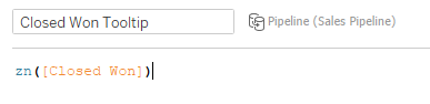
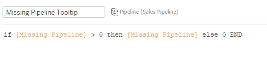
For the tooltip, in addition to those two values, I also needed the total sales for the states in the set:

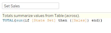
Initially I wasn’t using TOTAL in this, but then I realized my values were only showing up in the tooltip when I hovered on the purple, not the gray. Adding TOTAL fixed that.

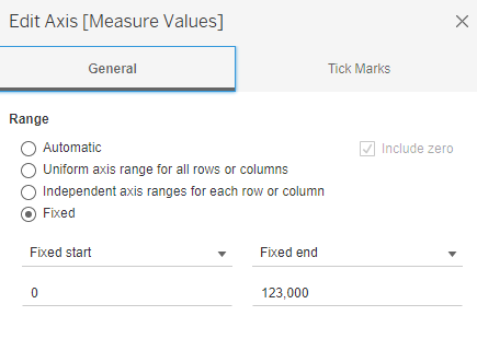
I fixed the axis range at 0 to 1, removed the axis label, and set the tick marks to every 20%. Then I duplicated that sheet and swapped out Orders and Customers calculations, but they’re all pretty much the same.

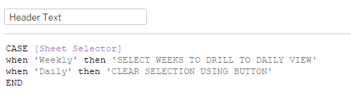
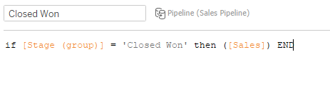
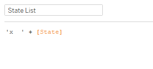
The last piece was the state list. I just added State to Rows and Label, and figured Sean had added ‘x’ to Rows as well. But then when I looked at his, I realized the whole state name was highlighting with the x, not separately like mine was. So I created a little concatenation:

Added that to Text, added State to Detail, and set the color of the pane to purple. I filtered that sheet on the IN/OUT of the State Set. Then I needed to add the Remove from Set action:

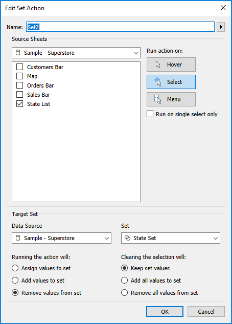
Same thing as the action on the map, just removing instead of adding. Truly, very simple to setup.

From there it was just setting up the dashboard, getting the proper padding and background colors (like in the state list with the gray background). And that’s it!

Click here to view in Tableau Public

Makeover Monday – Week 19

This week’s Makeover Monday looked at the World Happiness Report:

https://worldhappiness.report/assets/images/2020/whr-2020-ch-02-fig-2-1-part1.png

What I like:

  • It’s pretty easy to see the relative happiness between countries, thanks to the bar length
  • Stacked bars show that the different categories are contributing to the whole

What could be improved:

  • In the report, there are three pages of this in order to show all 150 countries
  • Hard to find a particular country in the list.
  • Hard to compare categories between countries, like generosity or perceptions of corruption.

As I started to think about how to view this data, I thought it would be interesting to see where each country stood in each of the categories, as well as the overall life evaluation score. I remembered a viz from Lindsey Poulter when she built a bunch of Set Actions examples that looked at comparable cities with a similar sales level. So I decided to use that kind of a layout, and even realized I could update it with a Set Control that allows the user to select a country from the dropdown rather than scrolling through the list (one of the things I said could be improved above).

Here’s what I built:

Click to view in Tableau Public


Workout Wednesday – Week 19

After Luke‘s challenge stumped me last week I’ve been looking forward to a little redemption this week. As always, Ann‘s challenge was pretty straight forward with plenty of little twists. Because of those twists, and what it meant for my solution, I’m probably going to bounce around all over the place in my walkthrough this week. Apologies in advance…

I started off building the weekly view. Pretty basic, SUM(Sales) on rows, Week(Order Date) on columns. I would later come to find this was wrong, but roll with me here. I added the average line, and even updated the tooltips early on instead of waiting until the end! One thing I realized was when I format the date on the axis (mmm d, yy), it makes that the format in the tooltip. So I created a custom date for the week of Order Date, which allowed me to format mm/dd/yyyy for the tooltip.

Since Ann said 2 sheets, I figured I would have one for the weekly, then one for the daily. So I built the daily sheet, similar to the weekly. As we (I do this live with a group at work) talked through how to set the dates, I started down the path with Sets. But as I started on that, I realized I didn’t have a great way to get the MIN or MAX date from the set values. It was just giving me TRUE/FALSE in calculations, and I wanted the MIN/MAX values that were IN the set. As I talk through it now, having looked at Ann’s solution, I realize I could have made it work. But, we didn’t see the path forward at the time, so we did it differently! (Hooray, always more than one way to accomplish things in Tableau!)

So we started down the path of parameters instead. I created a Min Date and Max Date:

Just basic date parameters here, open to any value.

I will jump back now to point out that when I got the soon to be mentioned Parameter Actions working, switching between two sheets in a horizontal layout container, I noticed that the animations were not matching how Ann’s viz was transitioning. As we moved further into how to create a button (thinking, oh, there are buttons in dashboards now! nope…), we began to realize that the button was the 2nd sheet, and the weekly/daily shift was within one sheet. So, I already had a Sheet Selector parameter I created in order to switch sheets, so I just repurposed that:

Then I created a date field to truncate the date on day or week based on the parameter value:

I added that to columns, at the DAY level, and created a duplicate field so I could format the tooltip date value different. Then I replaced the aforementioned custom date with this duplicated date.

I also realized I needed to call out Day vs Week in the tooltip, so created a little case calc for that:

Now, back to the Min Date/Max Date parameters. I needed to get these to dynamically set based on the selected dates, so I created two parameter actions, one for each, which populated the parameter with the Minimum or Maximum Selected Date:

I also needed to change the Sheet Selector value from Weekly to Daily. So I created a Daily calculation with ‘Daily’ and added it to the Detail in the Marks shelf. That gave me what I needed to update the parameter value:

I had created a calculated field called Sheet Selector Filter that contained the Sheet Selector parameter, but when I didn’t need to use it as a filter anymore I just dropped it onto Color so I could set the Weekly gray and Daily purple.

Now that I had it switching from Weekly to Daily, I needed to create the button to switch back to weekly. Based on previous challenges, I went with a Gantt Bar, with MIN(1) on columns, and MIN(-1) on Size, which gave me a bar from 0 to 1. I fixed the axis on 0 to 1, and adjusted the height of the bar by dragging the top of the axis down. I’m realizing now I could have also adjusted the Size slider, so that’s another option. To get the label, I just double clicked on the Marks shelf and added ‘CLEAR SELECTION’ then dragged to label. On the label I center aligned, white Tableau Bold 12 font, 73% opacity. Why 73%? I have no idea, it just looked about right. Totally eyeballed it.

Now in order to make the Sheet Selector value change back to weekly, I needed a Weekly calc just like my Daily one (literally just ‘Weekly’ in the calc). Place that on detail. Then I can create that action:

Now I needed to update my Min/Max date to be the overall Min/Max of the 52 weeks (which Ann said we could hard code, so I did…). LODs to the rescue! Apparently I was near the end, as I didn’t create calcs, just edited in shelf. So I did {MIN(Order Date)} and {MAX(Order Date)}, and I needed to add my Order Date filter to the Context. Once I had those in the detail shelf, I could use them to “reset” the parameters:

As I tested the actions, I noticed that I had to click on the Clear Selection button twice in order for it to clear. So I added TRUE and FALSE to the Detail, and added the filter action to automatically deselect:

I also needed the button to only appear when the Sheet Selector parameter was on Daily. So I dropped my Sheet Selector Filter onto Filters and selected Daily so it appeared and disappeared based on that parameter. I added it to the dashboard as a floating object in the top right of the view.

Similar to needing to click the button twice, I noticed that the weekly dates I was selecting were highlighted still in the daily view:

I tried the TRUE/FALSE deselect on there as well, but couldn’t get it to go away. :o( This is the one visual aspect where I did not match Ann, which probably has to do with my using parameters instead of sets for the date selection.

For the header, I needed the dynamic purple text:

Then I created the title of the worksheet:

You’ll notice a couple WINDOW calcs there. I just added them directly to the Detail.

And we’re done!

Click here to view in Tableau Public

Workout Wednesday – Week 17

Meera‘s second challenge was a very applicable one, as we often look at run rates to check on MTD progress. I’ll jump right in.

First I looked at the viz to identify the overall structure. I recognized a Bar plus a Gantt, as it highlighted when I hovered (whereas a reference line wouldn’t highlight). Since Meera said one sheet only, I realized we’d need to figure out how to get the text to the left of the bars.

Plan in hand, I started on the Run Rate…but then I realized that we had to figure out weekdays only. I didn’t have the faintest idea how to make that happen, so I did what I always do when I don’t know how to do something  in Tableau…I Googled it. Truly one of my favorite things about using Tableau is getting results from the KB or Forums for almost everything I ever search for. So I found this article in the KnowledgeBase which led me to a couple weekday calcs which required some nested calcs. So first, I needed to find the first and last date of the month:

The End of Month Date just finds the first day of the next month (via DATETRUNC then adding 1 month) then subtracting a day.

Then we need to find the first and last weekday of the month:

These are just checking to see if the first (or last) day is a Sunday (weekday = 1) or Saturday (weekday = 7), and then adding (or subtracting) 1 or 2 days to get them to a workday. Now we can get to the # of weekdays calc:

These are taking the number of days between start/end (and adding 1), then subtracting 2 times the number of weeks between start/end. I needed one for the total weekdays in the month, and one for the weekdays MTD.

After all that, we’re finally ready for the run rate:

Since we’ll need to know whether the run rate is over plan to color the bars/text, we need that comparison calc:

You’ll notice I compare to Fixed Plan…when I connected to the data, I joined the two tables, so I need the LOD to get the max(Plan) for each region:

Finally ready to pull things into the view! So I added Region to Rows, Run Rate and Fixed Plan to a dual axis on Columns, with Run Rate as a bar chart, and Fixed Plan as a Gantt Bar. Added Run Rate to Plan to color, and Run Rate to Label with left bottom alignment.

Now for the labels. For whatever reason, I prefer using MIN(0.0) with a Circle mark, size all the way down and opacity set to 0%. Meera used a Text mark, but the Circle does the trick for me. As I got to this part, I realized a needed two more calcs, one each for over/under plan in order to set the colors properly on the label:

Then I built the label (loved that Meera gave us the font/size so I didn’t have to play the guessing game for 5 minutes):

In order to get the latest date into the title, I decided to just use the worksheet title as the overall title:

With everything set, just had to pull it into a dashboard and make sure things were fitting properly for the phone layout. I decided to make the Desktop version be phone layout size as well so it would look consistent no matter the browsing experience. And we’re done!

Click to view in Tableau Public

Makeover Monday – Week 16

This week’s MakeoverMonday looked at Greenhouse Gas Emissions across supply chain:

What I like:

  • Legend is clear and provides brief explanation for each stage in the supply chain
  • Annotations provide additional insight
  • Bar lengths allow to clearly see which products create the most emissions through their full supply chain

What could be improved:

  • Seven different colors in the view makes it difficult to follow/compare
  • The point the source article was trying to make is that emissions from transportation of the food product make up such a small percentage of the total emissions that ‘Buying Local’ doesn’t really do much to help curb emissions

With so many dimensions for each product, I chose to hone in on the transport emissions and how small of a role it plays compared to which foods you choose to eat. While I think ‘Buying Local’ is great for many reasons (supports local farms, often fresher, etc), if one claims to be helping the environment by buying local meat, there really isn’t much of a claim to be had.

Here’s what I built:

At first I showed stacked bars with percent of total, sorted by largest percentage of transport emissions. But I felt like that hid which foods actually have the largest amount of emissions. So I switched to showing the overall bar, but only showing the transport highlighted, with the percentage of total on the label. The color coded subtitle helps to clarify the highlighted portion of the bar and the label.

Click to view in Tableau Public

Workout Wednesday – Week 16

Lorna‘s challenge this week was a head banger. Like I felt like I was trying to bang my head through a wall for most of it, brute forcing (or at least attempting to) my calcs to do what I wanted them to do. All the while Tableau just kept laughing in my face and saying “all fields in an LOD have to be from the same data source, dummy.”  “Didn’t you listen last time? Just because you put them in a sub-calc doesn’t make the LOD work any better. Maybe you should try something else?”  “Glutton for punishment, eh?  Well, I just leave that error right here…”

Anyway, today was a great reminder of what life was like before cross-database joins and LODs, and that those ways are still available and work just fine.  Throw that all on top of the humble pie I get by struggling my way through things with colleagues watching (and recording it).

***SIDENOTE: 4 months into this experiment of doing Workout Wednesday live with Ancestry colleagues as a training exercise, this is one of the best projects I’ve ever chosen to do. It’s a dedicated hour (or two today…) to work on it. It helps them see how to build some cool things, and see the step by step for it. It also makes me explain what I’m doing and why (which actually comes in handy for this blog). And it also reminds me (in a public setting), week in and week out, that there’s a lot I still don’t know about Tableau. Even after 5 years, there is always (tons) more to learn. ***

On to the challenge. I connected to the data (two sources) and created the relationship on MY:

Then I added MONTH(Closed Date) to columns, pulled SUM(Sales) to rows, and SUM(Target) to the dual axis. I made the Target a Gantt bar, and I had the basic structure for things. I grouped the Stage field so that Negotiating and Proposing were ‘Pipeline’, and filtered ‘Closed Lost’ from the view. Then I created a Closed Won calc to give me sales only for Closed Won:

Then I did the same for Pipeline:

Added those two to the SUM(Sales) axis which gave me Measure Values, and then I dropped SUM(Sales). (Obviously, I could’ve skipped SUM(Sales) completely, but I like to get a basic structure of things and then work through the calcs I need)

Now to find the difference between Jan-Mar sales and their targets. Through the events of the challenge, I realized I wanted to sum the target values for Jan-Mar in the Monthly Target data source:

(Name your calcs, kids…unless you’re at the end of your rope because you’ve been playing with calcs for thirty minutes and you’re just trying something to see if it will work…)

Then I created a  Monthly Sales calc to only give me Closed Won Sales through Mar:

Now with both of those calcs I can find the difference:

Now comes the point where I kept trying to trick Tableau into letting me use an LOD calc. I have gotten so comfortable using LODs over the years that I probably use them more than I should. Today that was very evident. I had a Target Diff, and I needed the FIXED Sum of that, but Tableau wouldn’t let me, no matter how hard I tried. Finally, after about 30 minutes of getting mad at the calc window, I think I remembered one of Luke’s challenges earlier this year that required a WINDOW_ calc. Lightbulb!

Just like that, without and LOD, I had a way to sum the values for Jan-Mar and divide them across the remaining 9 months. So easy, if not for spending 30 minutes trying to shove the square peg in the round hole.

Then the missing pipeline was quick:

So I added Missing Pipeline to the Measure Values, but I needed to figure out how to get the adjusted target line into the view. I noticed initially when I looked at the Tableau Public version that Lorna used a reference line, because it didn’t highlight the same way as all of the other bars/lines in the view. But there wasn’t a way I could see to get the Adjusted Target into the view to be able to use for a reference line. I finally settled on the SUM of the Measure Values, and that got it to work:

Great, almost there!  Wait…Lorna’s view doesn’t have the Adjusted Target on Jan-Mar. How do I get rid of those? Surely this was the way it had to be done?  Then right as someone was saying “did she use two sheets?” I noticed this:

That’s the plus that shows up on the FAR LEFT of a date axis. Of course, hence “3 or less” on the sheets requirement. So I duplicated my sheet, hid Apr-Dec on the first, and hid Jan-Mar on the second. Why hide instead of filter?  Well, I need the values from Jan-Mar in the view in order for my WINDOW_SUM to work. If I filter those months out, my WINDOW_SUM won’t have any Closed Won sales to sum.

Initially I had made my Missing Pipeline an IF > 0 then Missing Pipeline else 0…but that made my Adjusted Target not work. But without it, it showing Missing Pipeline as negative for a couple months. So I fixed the axis to start at 0:

I also had to fix the end of the axis, since without that, the Jan-Mar bars were way higher than they should be in relation to the other months. I picked 123K because that made the 120K tick mark show up like it did in Lorna’s.

My target lines weren’t as thick as Lorna’s, but I remembered seeing her #TableauTipTuesday from yesterday, so I gave that a watch and added AVG(1000) to my Gantt marks card. (I settled on 1000 after a lot of playing around and going back and forth to the dashboard)

To get the tooltips, I needed a couple more calcs for the Closed Won and Missing Pipeline. Closed Won had null values for May-Dec, so in order to show 0, I needed a ZN:

Then the previously mentioned Missing Pipeline needed to show 0 like I originally planned instead of the negative number:

Now all I need is the legend. I figured it was some sort of Gantt using the Measure Names, so I just started dragging stuff around and adding MIN(1) in different places until I got it to work. Finally ended up here:

Not shown is the MIN(1) axis fixed from 1 to 2 (since 1 on size added to 1 on the axis goes to 2). Changed the Column borders to be white and a little thicker, edited the Measure Names aliases, and we’re all set!  I did notice that Lorna’s weren’t highlighting when you hovered, so I stuck a floating Blank on top of the legend in the dashboard to do the same.

And with that, after probably an extra 45 minutes than what I should’ve needed had I not tried to brute force my LODs, we’re finished!

Click to view on Tableau Public

Makeover Monday – Week 15

This week’s Makover Monday looked at goals per game by Lionel Messi and Cristiano Ronaldo:

What I like:

  • Clear legends/axis labels

What could be improved:

  • Rounded lines make it difficult to identify where the actual points are
  • I.Don’t.Like.Grid.Lines

What I built:

Although these two players are known most for their goal scoring, when I looked at the dataset I wanted to look additionally at assists and how many games they played. But now I have five metrics (games, goals, assists, goals/game, assists/game) that I want to look at, but don’t want to clutter things. So I pretty quickly thought of Lindsey Poulter‘s Choose a Metric view in her Set Actions workbook. Once I got everything built I played around with the layout a bit, and finally settled on putting the metrics across the top rather than down the side, which allowed the large chart to be shorter/wider than a square. For me, seeing the assists in addition to the goals actually makes me lean more toward Messi as he’s been more productive overall. This thought helped cement the idea of showing the additional metrics in my mind.

Click to view on Tableau Public

Workout Wednesday – Week 15

I feel like Ann‘s challenges always end up reminding me of some little trick in Tableau that I try and solve with some elaborate calculation magic and it just a little formatting thing.  This week’s challenge was no different. I’ll go through the back-flippery I went through and then show the “easy way” (read: the right way), but I always like to document my thought process.

I started with the two parameters I would need. Pretty basic date and integer parameters:

I knew I would need to identify the prior week for highlighting as well as the number of weeks prior for filtering the view. For the prior week I just want the order date between the parameter value and 7 days prior to the parameter value:

For the filter, I tried doing a  DATEADD using ‘week’ but it took it back to the Monday of that week, which didn’t quite work. So I had to go by ‘day’ and multiply the number of weeks by 7:

I did some checking along the way with these to make sure the proper number of days were showing up. Then I dragged Order Date to columns and chose WEEKDAY as the date aggregation, and SUM(Sales) on the rows. That gave me a great view of Sunday-Saturday. But I needed to figure out how to get them to sort based on the ending date. I started trying to compare the weekday value of the ending date to the weekday value in the view, but then realized that just made numbers in the same order but some greater than 0 with others less than 0. Then Yu (who I decided should have just run the screen sharing in our session today, since she had most of the answers) suggesting using a modal, which gives you the remainder when dividing by a number. So we did a DATEDIFF between Order Date and the ending date, and subtracted that modal value from 7:

So we dragged that onto columns, and it put things right in the perfect order…but it wouldn’t draw a line because of the multiple dimensions!


I spent about 5 minutes trying to figure out different ways to get the numbers mashed up into the right calc to just return the days in the right order, and then I realized we just needed to sort the weekday by that Sort value:

Magic!  Lines!

**SIDENOTE: To get multiple lines in the view, I divided a DATEDIFF by 7 to get a week number:

and made it an integer. To get the colors, I added Prior Week to Color. While I was there, I turned on the point markers:

END OF SIDENOTE**

But my prior week is missing a value on Friday. Challenge requirements showed I needed to have 0, not NULL. So I threw a ZN around my SUM(Sales), and that gave me a 0 value on the chart. (ZN stands for Zero Null…this function will turn NULL values into 0, which works great for doing arithmetic when there are null values present so you don’t get a corresponding NULL in your calc)  This is where the back-flippery starts. I then needed to create a calc for the tooltip to say ‘no sales’ when it’s 0, otherwise show the dollar amount, with a comma. Great, no biggie…

Obviously, this one won’t give me a comma. I started to wonder if this was like a REGEX thing or something. Because I’m going through the challenge live with other team members, often if I’m really close I want to give them closure around how the thing actually gets done, so I’ll take a peek. In this particular case, I was looking to see if Ann had used REGEX.

Nope.

It was much more simple, and I’m hoping I will actually remember this trick after learning the hard way again. Back before using ZN, if you just format SUM(Sales) and click on Pane, there’s an oft-forgotten (at least by me) section at the bottom called Special Values:

Special Values allows you to identify text you want to appear instead of NULL (in this case, ‘no sales’). It also allows you to identify how to show the marks. This dropdown defaults to Show at Indicator (the little indicator that shows up in the bottom right of your viz). When I clicked Show at Default Value, it added them at 0. Boom, problem solved!  Almost…

The date doesn’t show up on the null values!! (Duh, Kyle, they’re NULL!) I started thinking through figuring out how to look at the next date or something like that, but again, wanted to provide some closure and at this point I already had Ann’s workbook open. If you’ve read this far I guess I’ll share it with you:

Yeah, I know…what the??? Here’s my plain English attempt:

If the Order Date is not null, use the Order Date – IFNULL(ATTR(Order Date),

If it is null, then if the previous Order Date value +1 is not null, give me that – IFNULL(DATEADD(‘day’,1,LOOKUP(ATTR(Order Date),-1)),

If that one is null two (ie two days in a row without sales), then lookup the next Order Date value and subtract 1 – DATEADD(‘day’,-1,LOOKUP(ATTR(OrderDate),1))

And turn whatever comes back into a date – DATE()

Got it?  Sweet, you’re now a wizard, Harry. Just add it to your Detail and pop it in your tooltip and you’re golden. When I got to the title and the tooltip I realized I needed to name the first and last weekdays. So I did two final little calcs for that:

Final formatting, throw everything on the dashboard, and we’re done!  (Normally I use a text box for my dashboard titles, but since this one need to incorporate these first/last day calcs, I edited the title of the worksheet so those could be included there.)

Click to view in Tableau Public


Makeover Monday – Week 14

This week’s Makeover Monday looked at allocation of time-use in cooperation with Operation Fistula:

What I like:

  • Easy to see how much of total work is composed of unpaid work

What could be improved:

  • Hard to see how countries compare to each other
  • Hard to see how women and men compare to each other

What I built:

I wanted to put something together that would allow for easy viewing of all the countries without scrolling up or down. I also wanted to see how different men and women were in both their paid and unpaid work. As I experimented with some different combinations, I settled upon this one with paid work on the left, unpaid on the right, and a slope chart showing the gender breakdown. I found it very interesting to see the different patterns in each country and similarities among regional areas. Benin jumped out, as women work more paid and unpaid hours than men!

Click to view on Tableau Public

Workout Wednesday – Week 14

Luke advertised his challenge as a 4/10 difficulty this week, so I jumped in thinking it would be a quick thing. But as I looked at the data and tried to process how to get it in the right shape it took me a solid 5-10 minutes to come up with something that would work. (which led to me briefly questioning 4/10…)

My first plan was to do a value measure for each of the stages, which I quickly realized wouldn’t work. Thinking about how I would need to calculate “up” I realized an integer dimension would probably work best, so I landed on this categorization calc:

Once I had that, I edited the aliases to show the name of the values:

(You could probably write another calc for this like Prospect Value but put the names instead of the numbers, and then add that calc to Rows and hide the header for Prospect Value. I chose the alias route)

Then I added SUM(Value) to columns, and the first bars match! (Then I realized that one wasn’t the table calc problem…) So I duplicated SUM(Value) in columns and created a running total table calc. In order to get it to calc on “Table Up” as Luke called it, I chose Specific Dimensions and did a custom sort:

This got my bars successfully calculating upward!  Great, 2 out of 3. On to the % closed. First, I needed a consistent value for the closed total dollar amount.

Then I used a Fixed LOD on the SUM(Closed Value) to get that consistent value, and divided it by the running sum of the value:

(Admittedly, I did not create an actual calc for this, I just duplicated the table calc’d SUM(Value) and edited inline to add the MIN({SUM(Closed Value)}) part)

That got me to the percentages, so to add the lighter green bar showing 100% I added a MIN(1) to a dual axis of the % of Total, synchronized the axes, and set the axis to 0 to 1.

From there it was just formatting:

  • Turn off tooltips
  • Remove gridlines
  • Remove column borders
  • Add row borders to the next level

  • Update colors (thank goodness for “Pick a Screen Color”)
  • Show Mark Labels
  • Update default number format to $ or %

In the dashboard for the headers I just added three text boxes (left aligned) to a horizontal container, and added 80 px of left inner padding.

And that’s it!  Once I got going, I did agree with Luke on his 4/10 rating, but it’s a good reminder to think about things in different ways.

Click here to view in Tableau Public