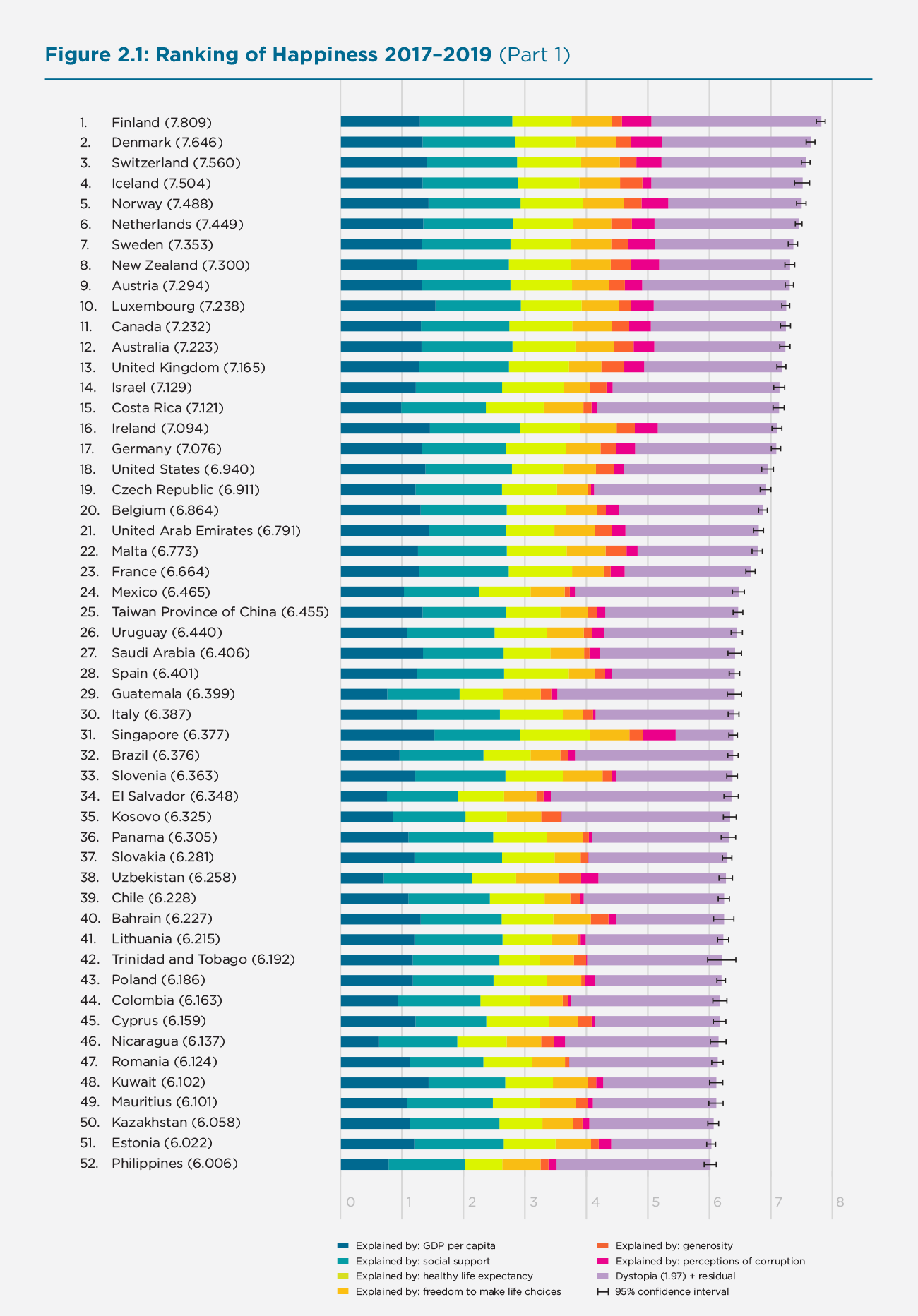
This week’s Makeover Monday looked at the World Happiness Report:
What I like:
- It’s pretty easy to see the relative happiness between countries, thanks to the bar length
- Stacked bars show that the different categories are contributing to the whole
What could be improved:
- In the report, there are three pages of this in order to show all 150 countries
- Hard to find a particular country in the list.
- Hard to compare categories between countries, like generosity or perceptions of corruption.
As I started to think about how to view this data, I thought it would be interesting to see where each country stood in each of the categories, as well as the overall life evaluation score. I remembered a viz from Lindsey Poulter when she built a bunch of Set Actions examples that looked at comparable cities with a similar sales level. So I decided to use that kind of a layout, and even realized I could update it with a Set Control that allows the user to select a country from the dropdown rather than scrolling through the list (one of the things I said could be improved above).
Here’s what I built:
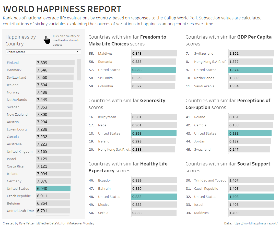
Click to view in Tableau Public