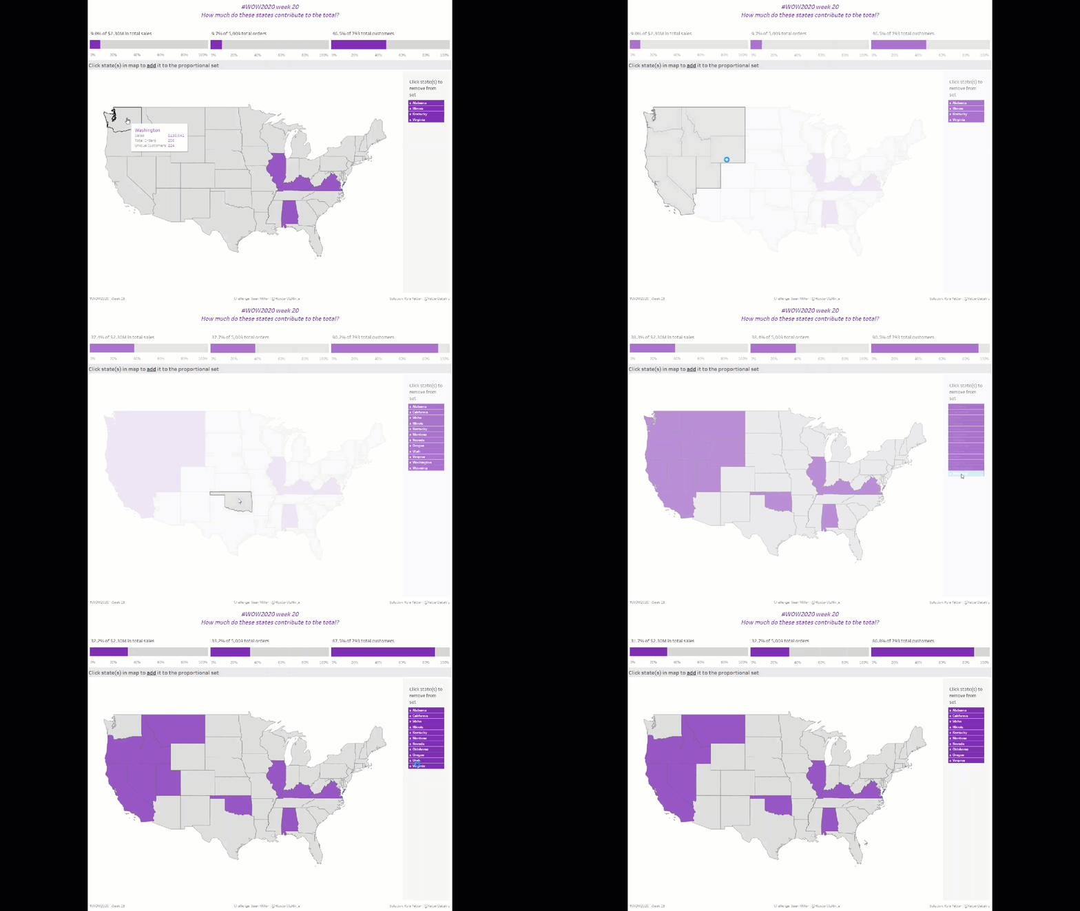
Sean came back for one more week with a great challenge to try out the new set actions available in version 2020.2 this week. It’s funny because those actions were like the easiest part of building this week, which is a testament to the functionality itself, I think. Anyway, here we go!
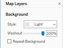
I started off with the map. Double-click Latitude/Longitude, add State to the Detail. Right away I noticed the background map needed to go away, so I opened up the Map Layers and washed out to 100%:
I then created the State Set, right-clicking on State>>Create>>Set… Then came the first set action:
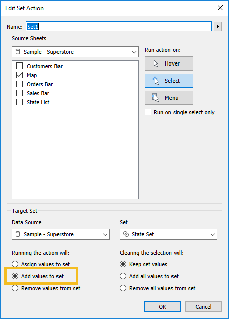
So by clicking on the Map, I will add that state value to the State Set. This is one of the new things. Before 2020.2, you could only assign values to the set. You couldn’t append or remove.
Once I tested that out, I realized that Sean’s was auto-deselecting. So I added TRUE and FALSE to Detail and set my filter action:
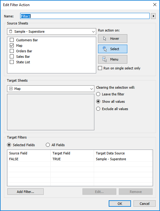
As discussed in prior weeks, this tries to filter where TRUE = FALSE (which it never will) so it automatically unselects everything, including what you just clicked on. Best tip ever from Yuri Fal!
I’ve started trying to address the tooltips while I’m working on the sheet, instead of forgetting about them until I’ve published to Tableau Public, so here’s what this one looked like for the map:
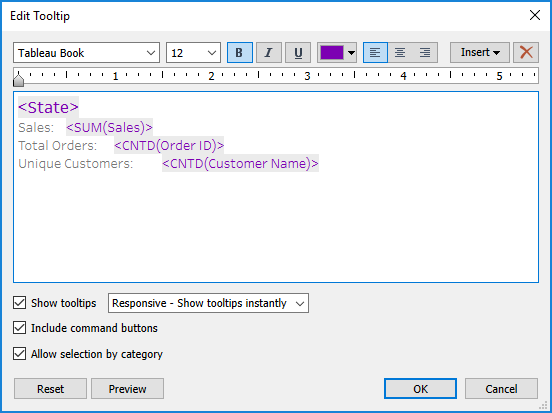
After setting colors for the set values, I moved on to the KPIs. I’ll discuss sales, and then I basically duplicated the sheet and calcs and replaced sales with order and customers.
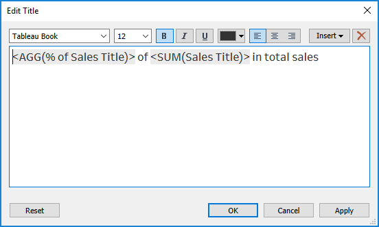
First, a table calculation Percent of Total on SUM(Sales) with State Set on Color. Then I worked on the title. But as it is, if you just take that table calc and add it in the title, it will give you the range of that value. I don’t want that, just the value of the states in the set. So I Ctrl+click+dragged the % of Sales from Columns into the fields pane (shortcut so I didn’t have to start from scratch), and adjusted the numerator to only give me sales when it’s in the set:

I needed the same kind of thing for the total sales, so I just did a Fixed LOD – {SUM(Sales)}. So then my title looked like this:
For the tooltip, in addition to those two values, I also needed the total sales for the states in the set:

Initially I wasn’t using TOTAL in this, but then I realized my values were only showing up in the tooltip when I hovered on the purple, not the gray. Adding TOTAL fixed that.
I fixed the axis range at 0 to 1, removed the axis label, and set the tick marks to every 20%. Then I duplicated that sheet and swapped out Orders and Customers calculations, but they’re all pretty much the same.
The last piece was the state list. I just added State to Rows and Label, and figured Sean had added ‘x’ to Rows as well. But then when I looked at his, I realized the whole state name was highlighting with the x, not separately like mine was. So I created a little concatenation:
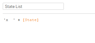
Added that to Text, added State to Detail, and set the color of the pane to purple. I filtered that sheet on the IN/OUT of the State Set. Then I needed to add the Remove from Set action:
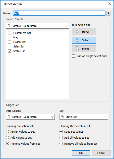
Same thing as the action on the map, just removing instead of adding. Truly, very simple to setup.
From there it was just setting up the dashboard, getting the proper padding and background colors (like in the state list with the gray background). And that’s it!
