This week’s challenge by Lorna focused on building with the automatic phone layout in mind. I’ve played with custom layouts in the past, but haven’t really worked with the automatic layout before. Lorna was kind enough to provide the hint that the layout processes in a z pattern. It just took me a few tries before I processed what I needed to do in the dashboard layout.
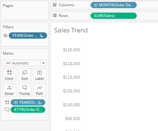
To start, I built the line chart. Here’s what that setup was:
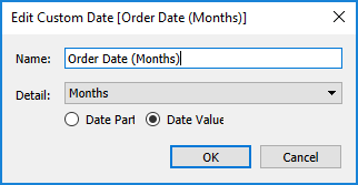
In order to get the date to format as the first letter in the axis and month + year in the tooltip, I created a custom date and added that one to the tooltip:
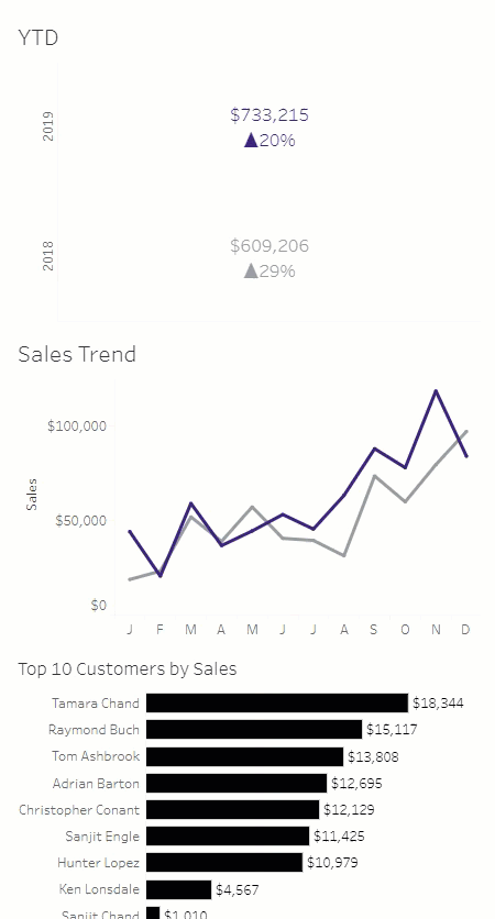
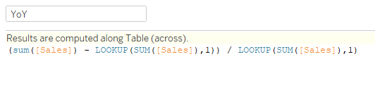
 Then I moved to the YTD sheet. I placed YEAR(Order Date) on Rows, added MIN(1) to columns, and SUM(Sales) to Text. For the YoY calc, I used a lookup function:
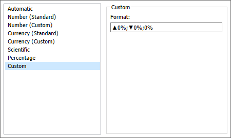
In order to have the lookup work properly (at least easily), I couldn’t filter to the last to years, so I hid them. This may have been a little more manual than Lorna did, but was something I chose not to spend a ton of time on as it was not the primary focus of the challenge. I added that to Text, and adjusted the number formatting to include the up/down arrows:
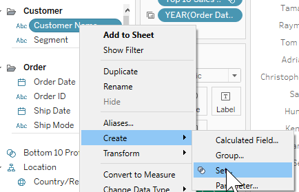
The next piece is the Top 10 customers by sales. Interestingly, Lorna’s shows Top 10 products by sales, but the requirements said customers, so that’s what I did. I right-clicked on Customer Name, then Create…Set:
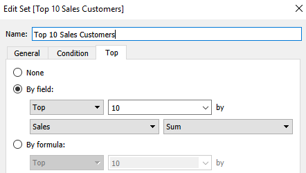
Then I selected Top, and did Top 10 by Sum of Sales:
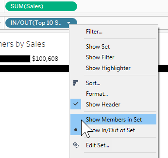
Then I added that to Rows, with SUM(Sales) on Columns. That gave me the In/Out of the Set, but I need the members of the Set. So a right-click on that pill, and you can pick Show Members in Set:
For the tooltip, I needed to add Customer Name in order to display that and the Top 10 label. (At least I was struggling with that, and this fixed the problem for me)
I duplicated the trend graph and YoY tables and replaced Sales with Profit. For the Top 10/Bottom 10, we needed to do something different. So I created a set for the Top 10 customers by profit similar to the sales one. Then I created a Bottom 10 set to match. In order to get them both to show up, I created a combined set:
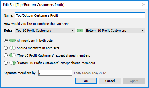
Then I added the combined set to Rows, showing members of set, and the Top 10 set, showing In/Out, and changed the alias of In/Out to Top 10 and Bottom 10. I also added the Top/Bottom set to Filters.
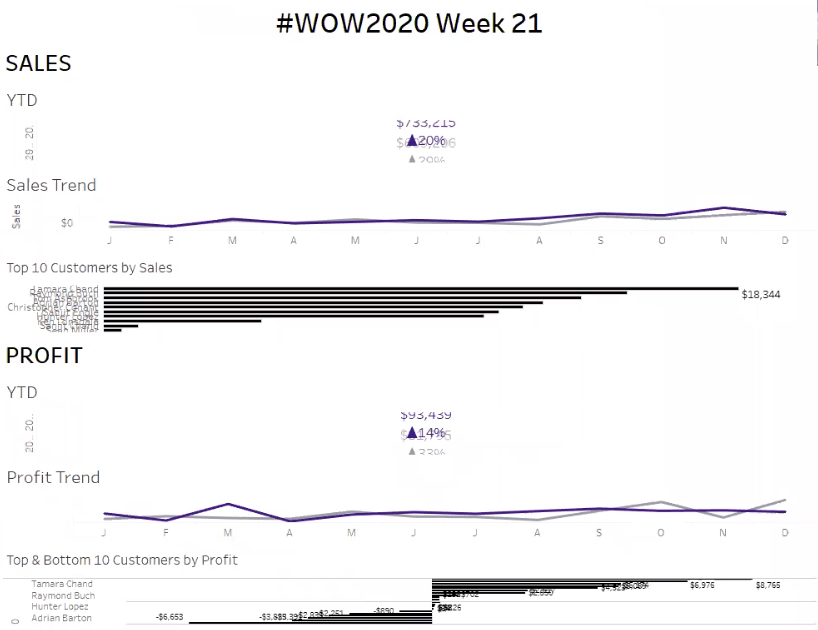
Now on to the dashboard arrangement. I started with the sales charts and profit charts vertically arranged next to each other. But, per Lorna’s note, it follows a Z pattern, so that didn’t work because it ended up putting the YTD views one on top of the other. Then I tried just stacking sales and profit stacks on top of each other. That worked as long as I made the dash 2000 pixels long. However, Lorna’s requirements said 1200 x 800. When I did that, it really looked weird and messed everything up:
So I was wrapping things up, deciding I would just need to make the height 2000 px, and it hit me…Z pattern. Left to right, then down and left to right again. If I arrange the sales charts left to right, then the profit charts left to right below that, it will do them in proper order on the phone layout. So I made that switch:
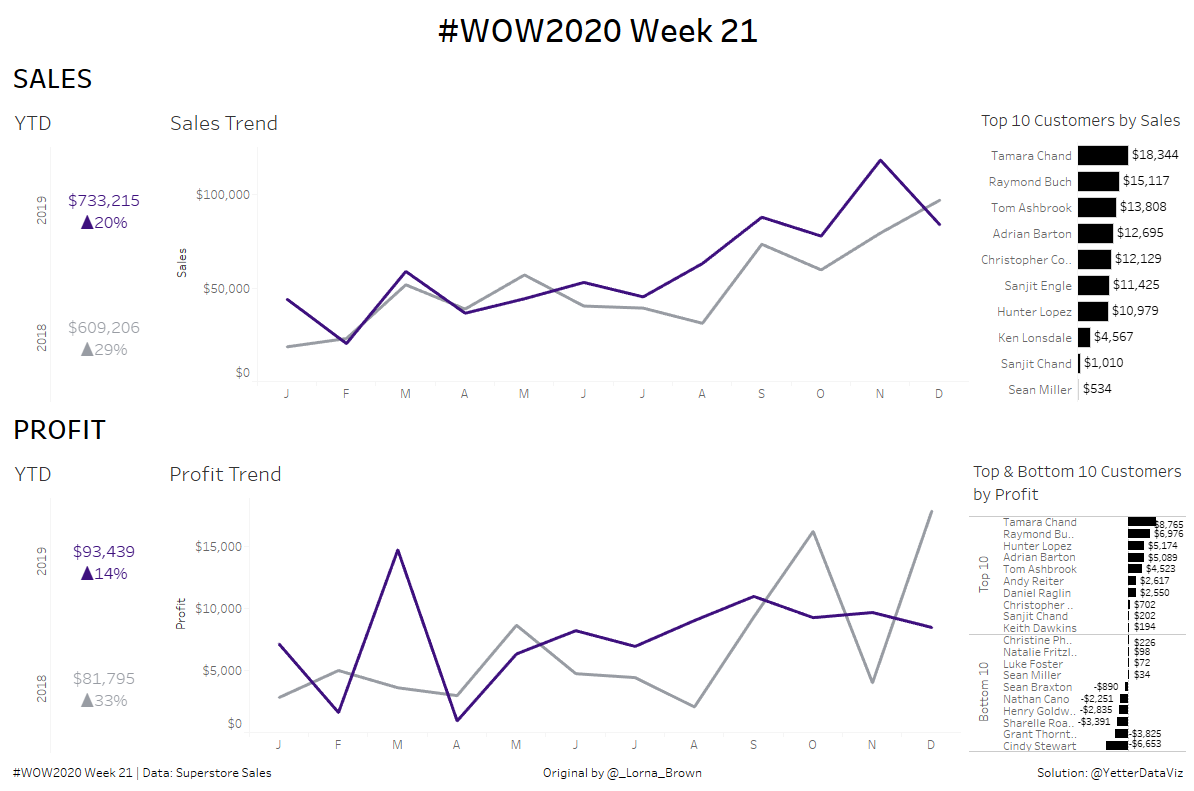
And it worked!