Luke advertised his challenge as a 4/10 difficulty this week, so I jumped in thinking it would be a quick thing. But as I looked at the data and tried to process how to get it in the right shape it took me a solid 5-10 minutes to come up with something that would work. (which led to me briefly questioning 4/10…)
My first plan was to do a value measure for each of the stages, which I quickly realized wouldn’t work. Thinking about how I would need to calculate “up” I realized an integer dimension would probably work best, so I landed on this categorization calc:
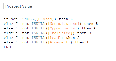
Once I had that, I edited the aliases to show the name of the values:

(You could probably write another calc for this like Prospect Value but put the names instead of the numbers, and then add that calc to Rows and hide the header for Prospect Value. I chose the alias route)
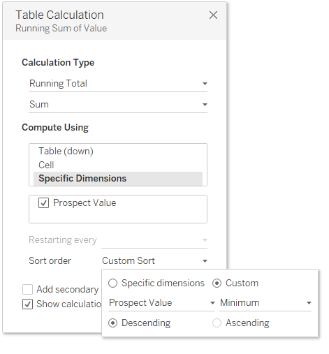
Then I added SUM(Value) to columns, and the first bars match! (Then I realized that one wasn’t the table calc problem…) So I duplicated SUM(Value) in columns and created a running total table calc. In order to get it to calc on “Table Up” as Luke called it, I chose Specific Dimensions and did a custom sort:
This got my bars successfully calculating upward! Great, 2 out of 3. On to the % closed. First, I needed a consistent value for the closed total dollar amount.

Then I used a Fixed LOD on the SUM(Closed Value) to get that consistent value, and divided it by the running sum of the value:
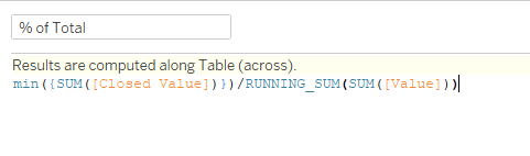
(Admittedly, I did not create an actual calc for this, I just duplicated the table calc’d SUM(Value) and edited inline to add the MIN({SUM(Closed Value)}) part)
That got me to the percentages, so to add the lighter green bar showing 100% I added a MIN(1) to a dual axis of the % of Total, synchronized the axes, and set the axis to 0 to 1.
From there it was just formatting:
- Turn off tooltips
- Remove gridlines
- Remove column borders
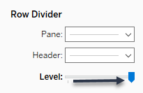
- Add row borders to the next level
- Update colors (thank goodness for “Pick a Screen Color”)
- Show Mark Labels
- Update default number format to $ or %
In the dashboard for the headers I just added three text boxes (left aligned) to a horizontal container, and added 80 px of left inner padding.
And that’s it! Once I got going, I did agree with Luke on his 4/10 rating, but it’s a good reminder to think about things in different ways.
Click here to view in Tableau Public
