Meera‘s second challenge was a very applicable one, as we often look at run rates to check on MTD progress. I’ll jump right in.
First I looked at the viz to identify the overall structure. I recognized a Bar plus a Gantt, as it highlighted when I hovered (whereas a reference line wouldn’t highlight). Since Meera said one sheet only, I realized we’d need to figure out how to get the text to the left of the bars.
Plan in hand, I started on the Run Rate…but then I realized that we had to figure out weekdays only. I didn’t have the faintest idea how to make that happen, so I did what I always do when I don’t know how to do something in Tableau…I Googled it. Truly one of my favorite things about using Tableau is getting results from the KB or Forums for almost everything I ever search for. So I found this article in the KnowledgeBase which led me to a couple weekday calcs which required some nested calcs. So first, I needed to find the first and last date of the month:
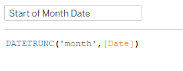
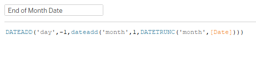
The End of Month Date just finds the first day of the next month (via DATETRUNC then adding 1 month) then subtracting a day.
Then we need to find the first and last weekday of the month:

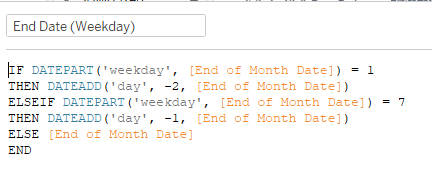
These are just checking to see if the first (or last) day is a Sunday (weekday = 1) or Saturday (weekday = 7), and then adding (or subtracting) 1 or 2 days to get them to a workday. Now we can get to the # of weekdays calc:
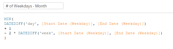

These are taking the number of days between start/end (and adding 1), then subtracting 2 times the number of weeks between start/end. I needed one for the total weekdays in the month, and one for the weekdays MTD.
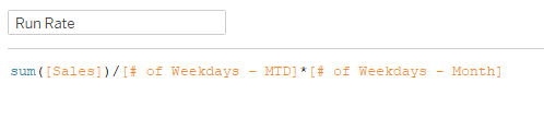
After all that, we’re finally ready for the run rate:
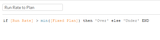
Since we’ll need to know whether the run rate is over plan to color the bars/text, we need that comparison calc:
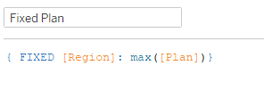
You’ll notice I compare to Fixed Plan…when I connected to the data, I joined the two tables, so I need the LOD to get the max(Plan) for each region:
Finally ready to pull things into the view! So I added Region to Rows, Run Rate and Fixed Plan to a dual axis on Columns, with Run Rate as a bar chart, and Fixed Plan as a Gantt Bar. Added Run Rate to Plan to color, and Run Rate to Label with left bottom alignment.
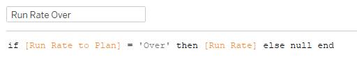
Now for the labels. For whatever reason, I prefer using MIN(0.0) with a Circle mark, size all the way down and opacity set to 0%. Meera used a Text mark, but the Circle does the trick for me. As I got to this part, I realized a needed two more calcs, one each for over/under plan in order to set the colors properly on the label:
Then I built the label (loved that Meera gave us the font/size so I didn’t have to play the guessing game for 5 minutes):

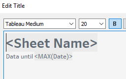
In order to get the latest date into the title, I decided to just use the worksheet title as the overall title:
With everything set, just had to pull it into a dashboard and make sure things were fitting properly for the phone layout. I decided to make the Desktop version be phone layout size as well so it would look consistent no matter the browsing experience. And we’re done!
