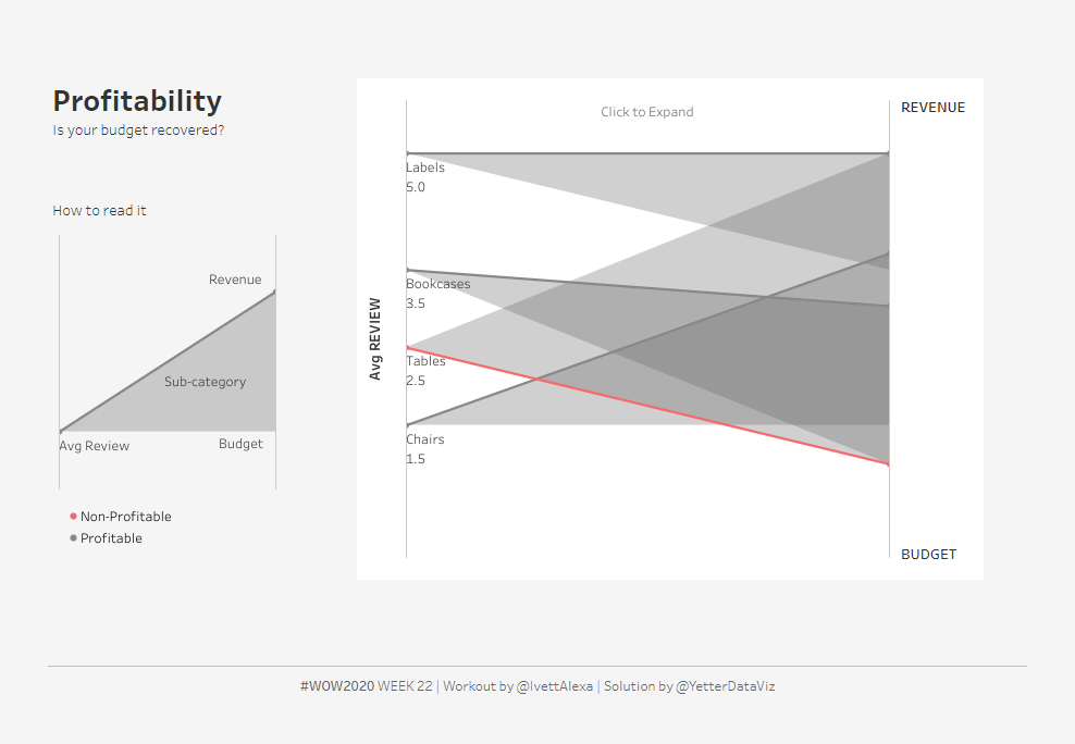
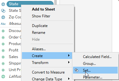
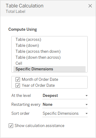
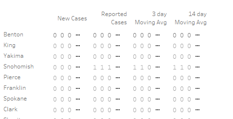
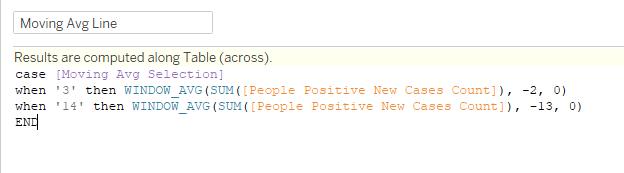
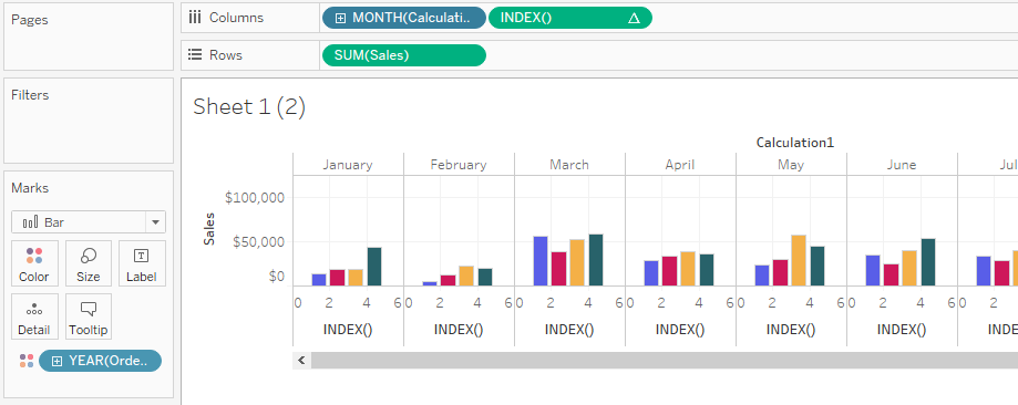
This week was our first challenge from Ivett Kovacs, and it involved something I’ve never actually done: polygons. I’ve seen them talked about, and understood the general concept of how they work, but it was definitely helpful that she shared her blog post about how to work with polygons. Because it was a new thing and took me a little longer than normal, there were a few things that weren’t quite a pixel perfect match for me because of my available time. However, I tried to focus on the key aspects: polygons, with the profitability line, and expansion from grouped view to subcategory view.
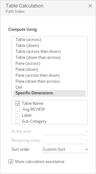
First, it took reading her blog post to understand what she meant by “use 3 tables as 1 source to plot the three different measures.” I needed to union the table to itself so I had three instances of each thing, in order to plot the three corners of each triangle. To do so, I created a Path Index calculation that just had INDEX(), and dropped it on Path in the marks card. Then I added Table Name and Sub-Category to the detail, and set the table calc to use Table Name:
At first I tried putting the Review values on one axis, and combining the Budget and Revenue values on the other axis, but realized that really wouldn’t work with the scale difference. Then I realized I just needed to figure out how to tell Tableau where to put the dots. So the X value was easy enough:
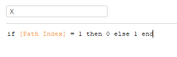
If it was the first value (the Review), then X should be 0, otherwise I wanted the other two at 1. The Y value was quite a bit trickier. I tried adjusting the values for all of the metrics to be out of 100, but that didn’t quite work for me. After a few minutes of trying to figure out how to get my shapes to look like Ivett’s, this is where I confess that I peeked. I didn’t actually end up doing everything like she did, which is probably why there are small differences, but I got the inspiration I needed to think through normalizing all of the metric values.
***SIDENOTE: I didn’t have to actually download Ivett’s workbook from Tableau Public in order to do this. I used the new Explore option, in Beta right now:

It’s basically like WebEdit, but for workbooks that you don’t own. It worked about the same, as well. Really handy when you just want to check a formula out real quick…***
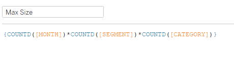
So I started with the Review metric:
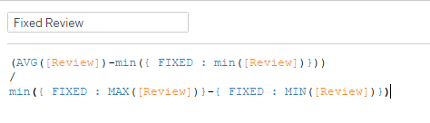
This takes the average of the Review values (by subcategory, because that’s in the detail), subtracts the smallest review score, and divides that by the difference between the Min and Max review scores. I did the same thing for the Budget and Revenue metrics. And then I created my Y value:
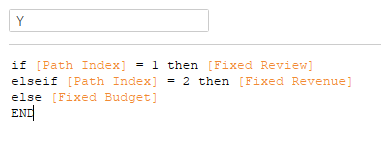
Similar to X, I just needed to tell Tableau where to plot each one, based on the Path Index value (1, 2, or 3).
IT DIDN’T WORK!
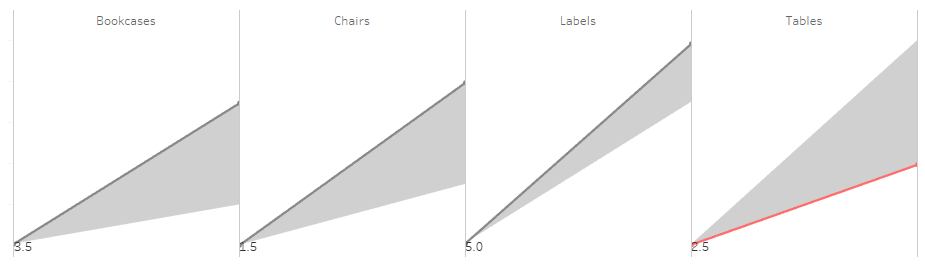
I went back through each calc, trying to figure out how on earth the Tables value was higher than Bookcases, why it didn’t look like Ivett’s, hoping I wouldn’t have to figure out some other crazy thing. I looked at the calc values they created, trying to figure out how a simple calculation could come up with something so wonky. Then the words that often came out of my dad’s mouth (he was a high school math teacher for 30 years) rang in my ears: Please Excuse My Dear Aunt Sally. You can make a wonderful Tableau calculation, but if you forget basic arithmetic, that calculation will lead you astray. Let’s look at that Fixed Review calc again:
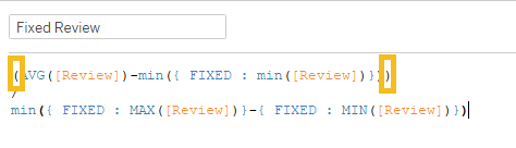
Initially when I created the calc, I had left that set of parentheses off. So while I thought I was subtracting the min from the average then dividing by the range, I was actually dividing the min by the range and subtracting that from the average. (I hope you enjoyed today’s arithmetic lesson, because I sure did. Especially because it meant my calcs worked and I didn’t need to figure something else out!)
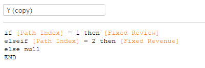
Next I needed the lines, so I just made a copy of Y and replaced the Budget value with null:
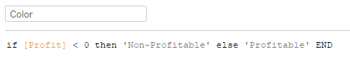
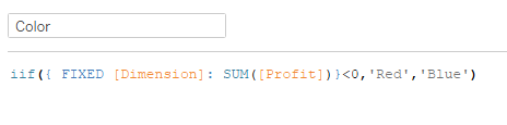
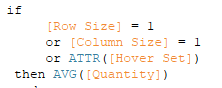
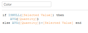
Then I needed to figure out if it was profitable or not, so I needed to calc Profit:

Because I had the values in the data 3 times, I often found myself using LODs to get that single number I needed, in this case Revenue and Budget for the Profit. Then I created another to use on Color:
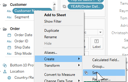
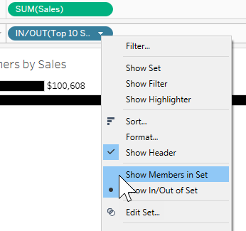
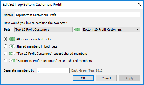
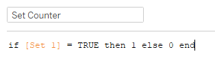
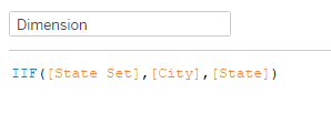
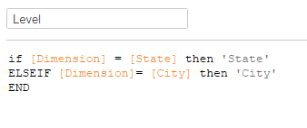
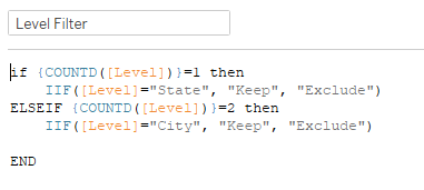
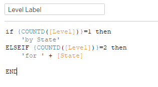
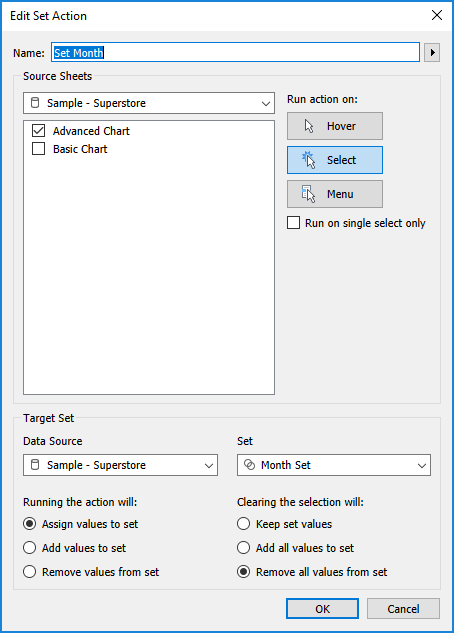
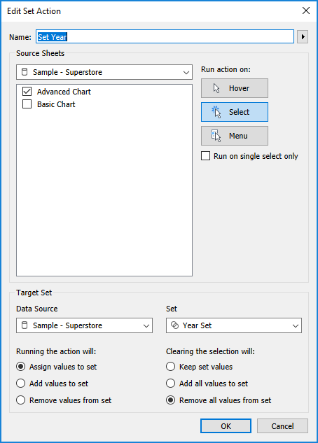
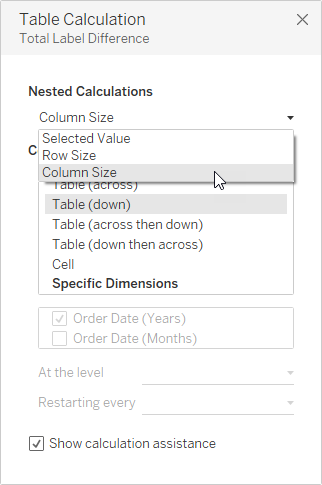
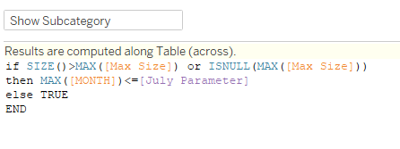
I was now to the point that I needed to setup the interactive part to expand to sub-categories, so I created a Set from Sub-category. Then I created a counter to tell me if there were any values selected in the set:
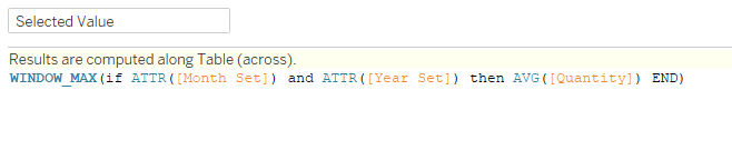
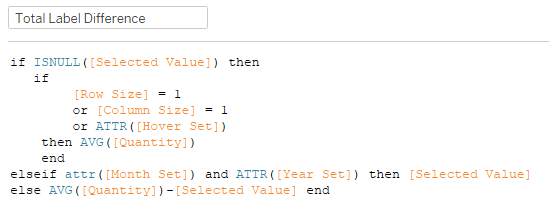
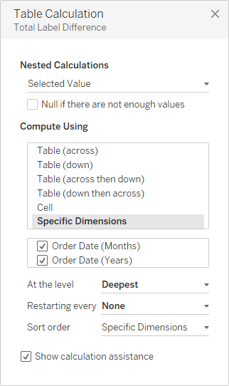
Then I created the dynamic label for the chart:

The key here is the inclusion of the LOD brackets ({}) around SUM(Set Counter). I did it without them first, and after I setup the action, it just showed whichever sub-category I had chosen, and the rest still showed as Click to Expand. So I needed to calculate the counter on an overall FIXED level, and then it worked like a charm with the action.
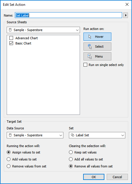
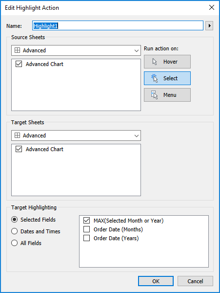
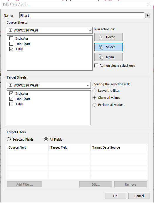
Speaking of Set Actions, here’s what that looked like:
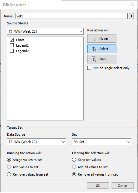
It was important that clearing the selection would remove all values from set, based on my counter calculation.
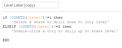
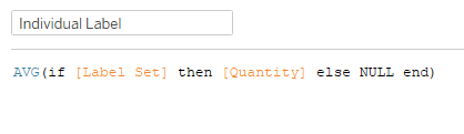
As I checked my functionality with Ivett’s, I noticed that the label for the sub-category went away and just had the Review value when the view expanded to sub-categories. So I used the same principle as my Label and created a copy:

Added that and AVG(Review) to Label on the Y (copy) marks card, and we were looking pretty good. I played around with the ‘Avg REVIEW’ axis label, but came to the conclusion that wouldn’t work for me since the fixed axis showed the thumbtack, and Ivett’s did not. So I added ‘Avg REVIEW’ to the Rows, rotated the label, and turned of Show Header for the Y value.
For the tooltips, I needed Margin in addition to Profit and Review metrics. For that, I needed the sub-category revenue:
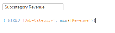
And then I just divided Profit by that:
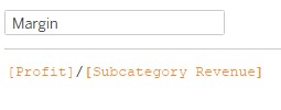
These values didn’t match Ivett’s, but I couldn’t figure out why. I was doing the math based on the values, and mine gave me what I expected a margin to look like, so I left that one alone. As I looked through Ivett’s after I was done, it seemed like she used SUM rather than AVG for one of the calcs, which would’ve been essentially double-counting one of the values (I don’t recall which).
For the legend, I duplicated the main worksheet, filtered to Chairs (since it looked most like her legend), and messed with the axis to get the spacing right. I switched the category label to be Avg Review, and used annotations to put the Revenue, Budget, and Sub-category labels on (best done after the chart is sized how you want it in the dashboard).
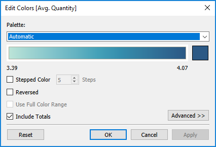
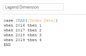
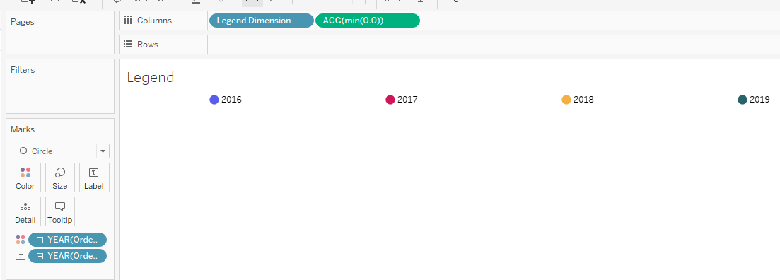
For the color legend, trusty ol’ MIN(0.0) to the rescue, yet again:

The dashboard layout took me a little while. I mostly used containers and padding. When I looked at Ivett’s afterward I noticed she used blanks for padding, which was my go-to until I started realizing I could just edit the padding, and that was easier to adjust than the height/width of a blank object. Here’s what that layout ended up looking like:
The floating Blank above the Tiled is the transparent blank I put over the top of the legend so it wouldn’t look like it was selectable when hovered over. And that’s it! This was definitely challenging, but it was great to figure out something different from the normal usage.
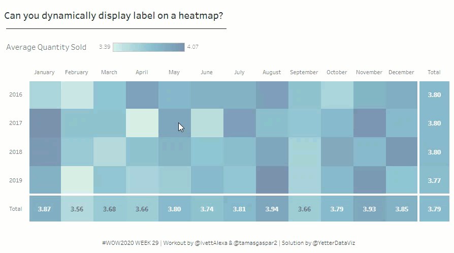
Click to view in Tableau Public

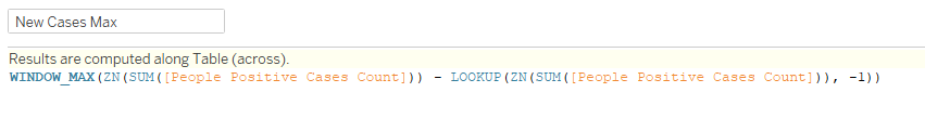


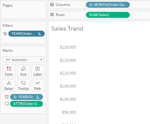
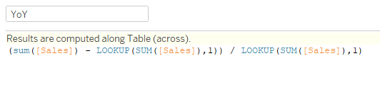
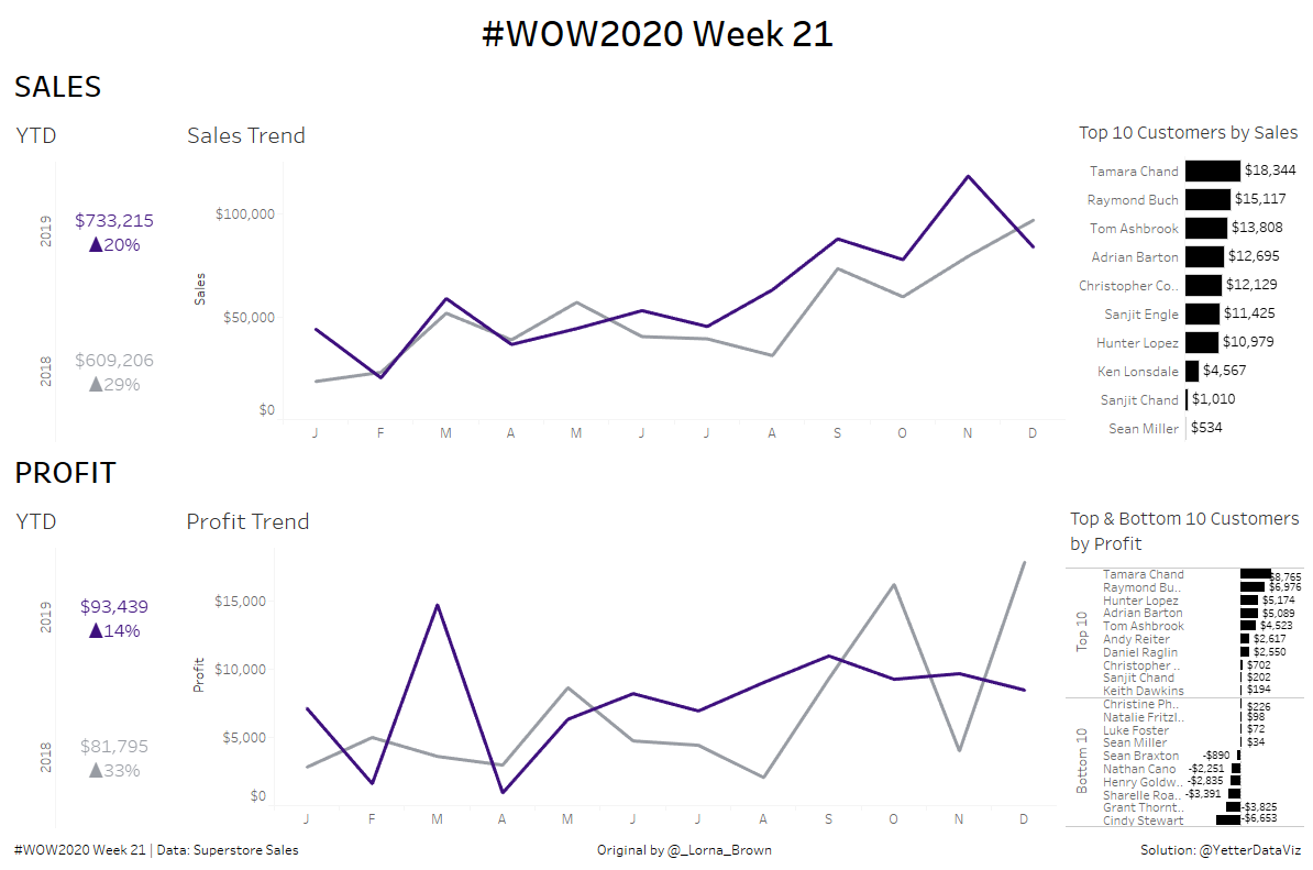
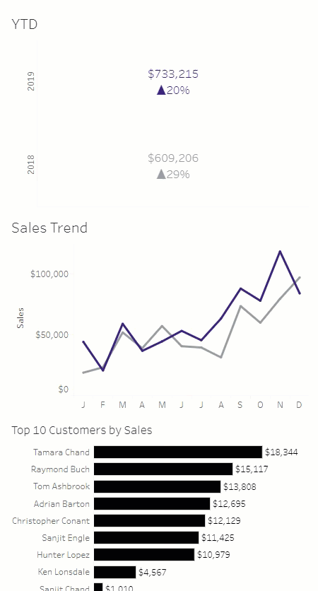
 Then I moved to the YTD sheet. I placed YEAR(Order Date) on Rows, added MIN(1) to columns, and SUM(Sales) to Text. For the YoY calc, I used a lookup function: