After 3 weeks of being out of town spending time with family, it’s time to get back to the WOW party. I left off with a challenge from Ann in Week 24, and came right back to another challenge from her this week. As always, much of this was pretty straightforward, and then I continued to find little things that are like, “what????”
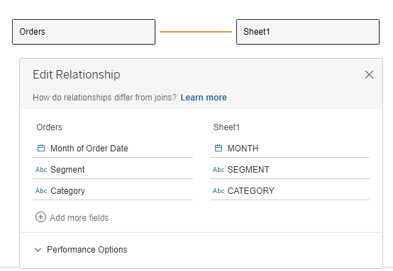
I’ll start this week with the data source. Due to the nature of the data, we wanted a noodle (relationship) instead of a join with Tableau’s new data model in 2020.2. So I set that relationship, tying together month, segment, and category:
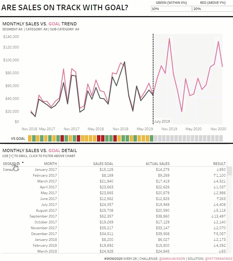
For the line chart, I started with a dual axis of SUM(Goal) and SUM(Sales). Then, in order to get sales to only show through July, I created a parameter set to July 1, then created an ACTUAL SALES calc:
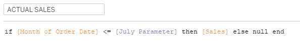
This gives me only the sales that occurred in July 2019 and before. I’ll come back to the Goal metric in a bit.
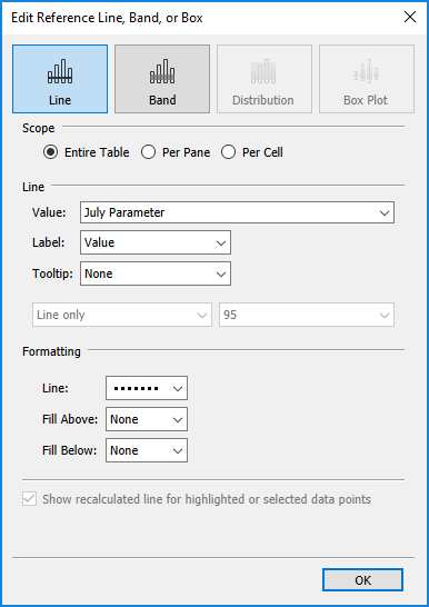
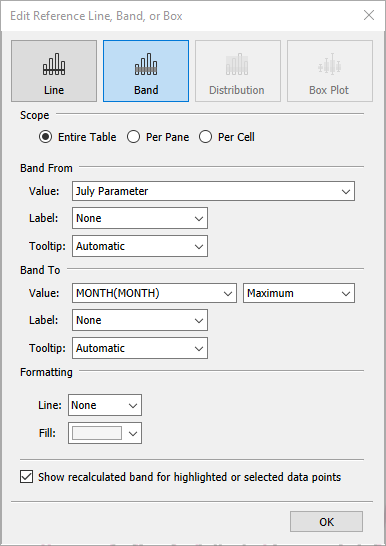
For the July 2019 dashed line, I added a Reference Line:
And for the gray shading after the reference line, I added a Reference Band:
I just matched the color of the lines by picking screen color from Ann’s viz. The tooltip here was pretty straight forward as well:

Next, I worked on the table. This was a little tricky to figure out how to get “NO GOAL” when expanding to the SubCategory. First, I created the hierarchy of SEGMENT, CATEGORY, and SUB-CATEGORY. (You may have noticed many of my fields are in CAPS this week…this table is the reason. The easiest way to get the headers to be in all caps is to rename to field to all caps. So there you go.) The hierarchy made it easy to expand and collapse. It took me a bit to figure out how to get the goal to go show “NO GOAL” rather than the goal for the category. And after trying several ideas (none of which worked, obviously), in the name of training for my live group, this was my first peek at Ann’s workbook:
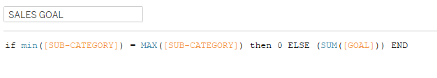
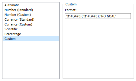
The Min and Max only match when the hierarchy is expanded all the way to SUB-CATEGORY, so when that happens, we want the goal to be 0, otherwise we want the SUM(Goal). In order to get “NO GOAL”, I set the 0 value in custom number formatting:
The next thing I noticed when expanding to Sub-Category was the future months with no sales got filtered out. This was another one I struggled with, so here comes peek #2:
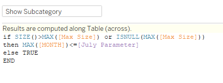
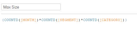
I forget quite often about the SIZE() function. It gives you the number of rows in the context of the view. So in this case, if the size is greater than the product of the items in Max Size (the number of rows we should have actual sales for segment and category), then we want to compare the month to the “current date” in the Parameter. Toss that on Filters, and select True, all future dates go away.
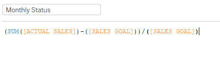
Last, I moved on to the Indicator. I played with a few ideas here, and finally landed on MONTH in Columns, and MIN(1) in Rows, with the Rows axis set at o to 1. For the colors, I needed to calculate the % difference:
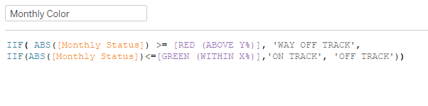
Then compared that difference to the parameters setup for the red and green colors:
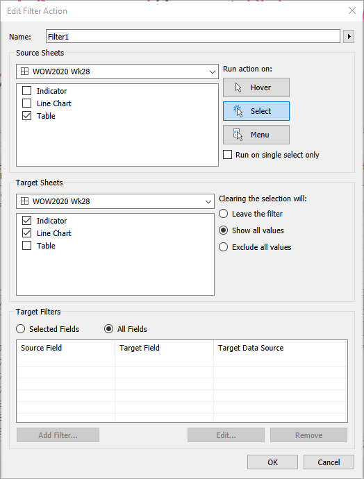
Once I got everything in the dashboard, I needed an action to filter the line and indicator charts.
And that’s it! This was a great solution to a fairly common scenario many of us run into.