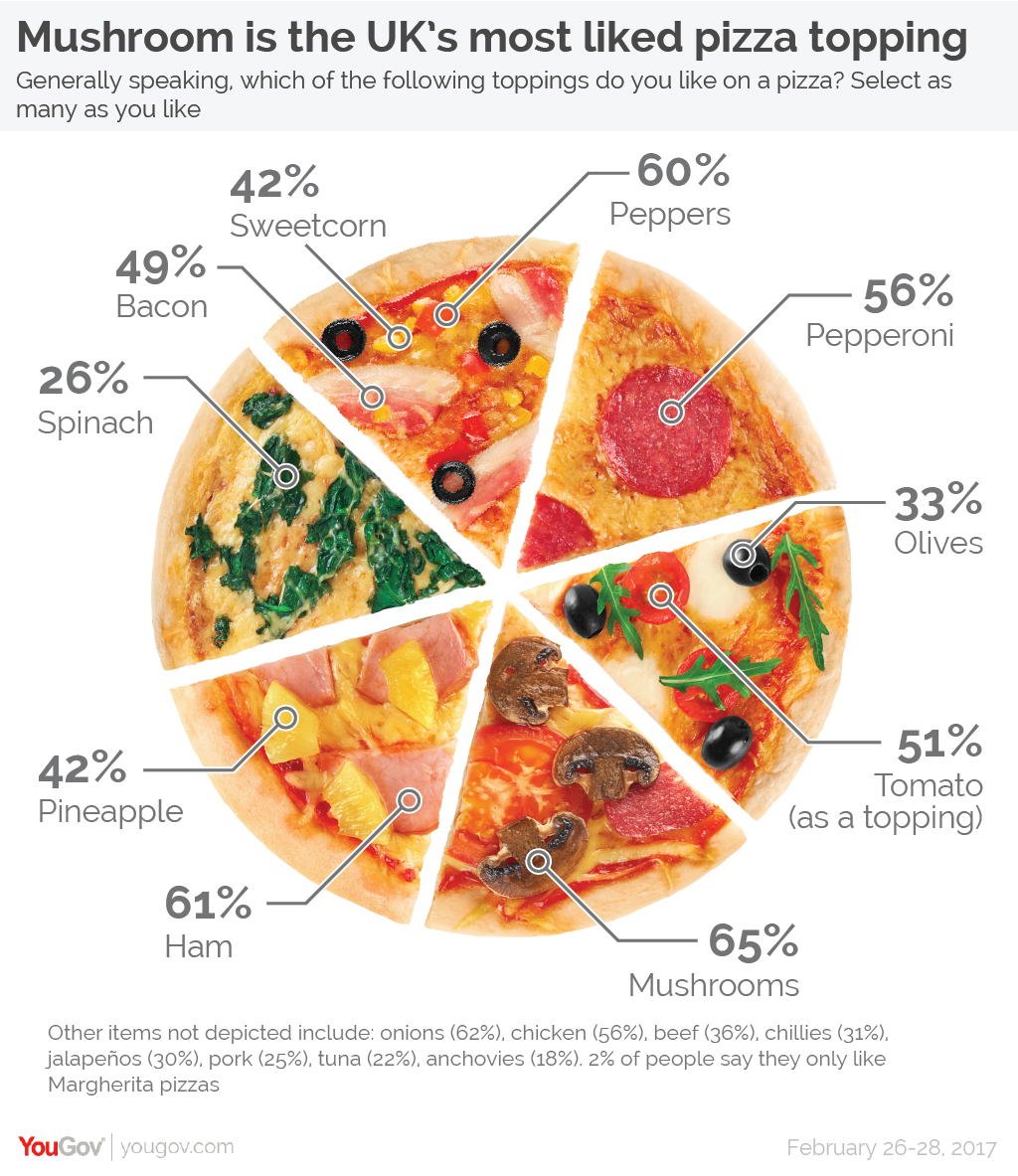
This week’s MakeoverMonday looked at pizza preferences in the UK:
What I like:
- Looks tasty (except for the corn…who on earth puts corn on their pizza?!?!)
- Numbers are clear
What could be improved:
- The #2 item (onions) didn’t even make the picture! (Neither did #5 chicken)
- Initial view of the (pizza) pie chart infers part to whole, but I’ve never heard of a 485% whole pizza…
- Hard to really compare level of popularity amongst the toppings
What I built:

My first impression was to do a dumbbell chart showing male and female, but I felt like I’ve leaned on those fairly heavily in my MMs of late, so I pushed myself to think of something else. So I settled upon a bikini chart variation, which would show which toppings leaned male or female, while still showing overall popularity for each topping. After I was done, I realized it’s like a slice of pizza!
I went through a couple different variations as I built. I started with a dual axis of Male and Female ratings, but I wanted the overall and topping label to be in the middle, and the only way I could think to do that was to have that label be on a circle or line mark in a dual axis, which would mean I would need my Male/Female measures on the same axis using Measure Values. But using Measure Values made it so I couldn’t have the Female label on the left end of the bar and Male label on the right end. So I went back to the dual axis, which allowed me to label Male/Female on each end, and created a separate sheet for the labels. Then I used transparent sheets to float the label sheet on top of the bar sheet.
To show which toppings were highly preferred by men over women, or women over men, I created a calc to identify which toppings had a difference in gender percentage greater than 5%:

I dropped that on color, picked some from my custom palette, and pulled together the headers and formatting.
Click here to view on Tableau Public