WOW2020 Week 27: What is the distribution of total orders by customer?
A fun little challenge this week from Luke. It was one of those where if you hadn’t already worked with certain concepts, it would be really difficult, but not too bad if you had. Fortunately, I had and when I saw the challenge, I knew I wouldn’t have too much trouble (in principle!) It also had the benefit, that the difficulty was in the concept, so it’s pretty quick to build if you already know the techniques.
In essence, this is a kind of Unit Chart. Usually these show a number of icons that are filled/coloured or not. A waffle chart (see here and here) is also a subset of this.
Challenge from Luke on Workout Wednesday
My solution on Tableau Public
My solution:

Challenges:
The main one this week was forgetting a key step to fill data along a padded data set. More on both of those later!
Tips, tricks and techniques:
● Bins. These were used in two different ways here, the “classical” method for creating histograms, the second for creating data points when they don’t exist in the data source.
● Plotting points as if on a graph, in this case along the x-axis
● Simply wrapping a calculation in curly braces, {} to find a value for the whole data set that stays the same where ever you use it (keeping in mind where FIXED sits in the Order of Operations!
● Data densification, in this case, domain padding. This is all about creating data to act as a scaffold that does not exist in the original data set.
● Completing a data series along a padded field using LOOKUP
The Journey
First I wanted to check that I had a correct understanding of the data that was to be plotted and that the numbers I was getting matched the final visualisation.
This involves creating a histogram of the number of orders per customer, split by segment. Classic histogram stuff, if on its side. To learn how to build histograms, you can’t do much better than Tableau’s on-demand training here
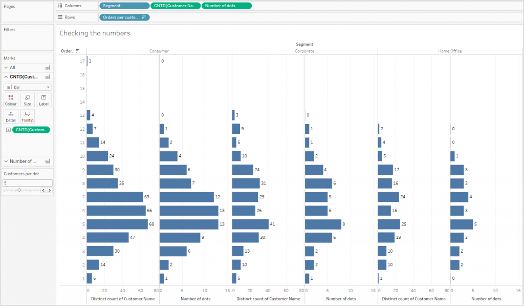
This is plotting a bin of the number of customer orders per customer against the number of customers in each bin. The calculation and bin for the number of orders per customer are:
[Orders per customer]
{ FIXED [Customer Name]: COUNTD([Order ID])}

This was plotted against COUNTD([Customer Name]) and split by [Segment] to give me:

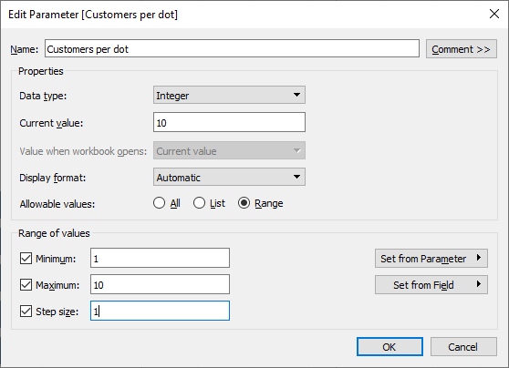
The number of customers represented by each dot was to be controlled by a parameter:
Based on this, I need to calculated how many dots each row should have:
[Number of dots]
{ FIXED [Orders per customer (bin)], [Segment]:
INT(COUNTD([Customer Name])/[Customers per dot])}
I added this to the same chart as before, added labels and checked that the number of dots matched Luke’s solution when I changed the value of the parameter:
It’s all Magic!
The next step was to create a virtual grid along which to plot the points. There are two main techniques for this:
- Create a new data source with all of the coordinates
- Create the data points out of thin air!
I went for the latter technique and used a technique that I learnt from Ivett Kovác when solving the WOW2020 Week 22 challenge.
First, I need to know how wide the grid should be. This varies according to the maximum number of dots to be displayed:
[Count Columns]:
{MAX({ FIXED [Segment], [Orders per customer (bin)]: MAX([Number of dots])})*2}
This is twice as wide as the largest number of dots.
I now need a calculation that gives me a grid that contains all integers from 1 to [Count Columns]. A bin is then created from this:
[Column Number for binning]
IF [State]=”New York” THEN 1 ELSE [Count Columns] END
The use of the [State] field is a bit strange, but all I need is a value that is sometimes this and sometimes something else. This field now has two values in the data set, 1 and the current number of columns. I now need to bin this and use “Show Missing Values” (note addendum in my week 23 challenge)

It’s kinda spooky how this works!
As the bin can’t be used in a calculated field, we need an INDEX() calculation. This is a table calculation that is calculated along [Binned Columns]
Plotting the number of Dots along the x axis gives:

No more NULLS!
The problem I was getting was that I was getting null values for [Number of Columns] at all but the first and last point. This one had me scratching my head for a while as the FIXED calculation I used should have made the value available across the whole of the data set.
Eventually I was reminded of the LOOKUP function that takes the value from the first entry in the table and copies is to the next. And the next…
[Number of dots with lookup] – Calculated along Binned Columns
IFNULL(SUM([Number of dots]), LOOKUP(SUM([Number of dots]),FIRST()))
Now I need to calculated the x values for each dot. This is just a starter to see if the principle works. I only want to plot a point if the index is less than the value for that customer bin:
[X for dots] (initial calculation)
IF [Column Index]<=[Number of dots with lookup]
THEN [Column Index] END

To get the centre-justified view needs a starting point, which is dependent on the number of dots. I worked out the calculation for this with pen and paper, working out the starting point for 1, 2 and 3 points (0, -.5 and -1 respectively). From this point on we need the number of dots for the particular column. The final X calculation comes out as:
[X for dots] (final version)
IF [Column Index]<=[Number of dots with lookup]
THEN
–[Number of dots with lookup]/2-0.5+[Column Index]
END
Plotting this gives me the wanted result.
The rest was just formatting and putting the dashboard together.