WOW2020 Week 23: Can you excel at bar charts?
Bar charts. Or are they?
Requirements on the WOW website
Luke’s solution on Tableau Public
My solution on Tableau Public
This week’s challenge from Luke looks at first blush to be a fool’s errand: why would you want to abuse lovely Tableau to create a chart that looks like an Excel chart? However, I’m sure, as ever, there’s more to this than meets the eye. Below are Luke’s chart and the standard equivalent in Tableau for comparison:

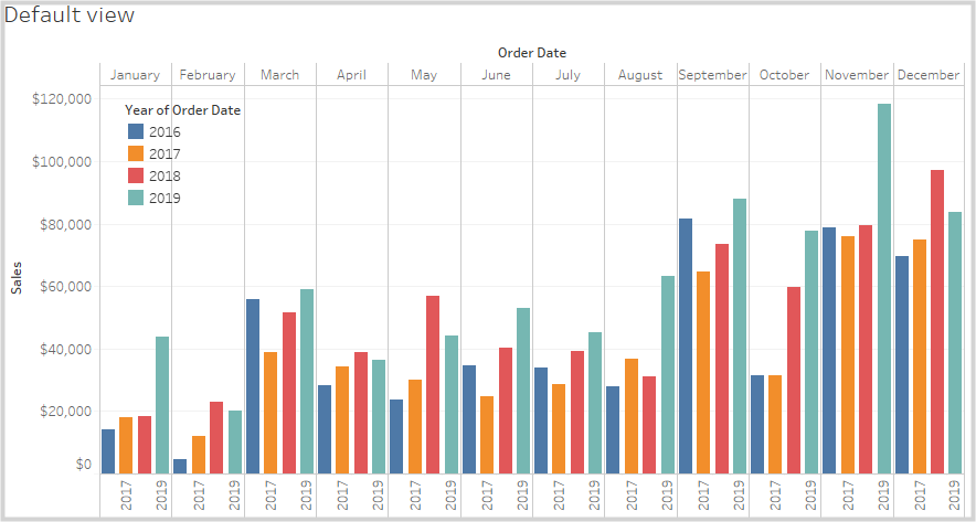
Note that the Tableau bars are all evenly spaced. The task here is to create grouped bars with a thickness of four units with one unit between them and a larger gap between the blocks.
My Solution:

Challenges:
Similar issues to last week with densification and getting all calculations to show, but I’m slowly learning! Another reason why I took this approach today.
The shock of the build pretty much going to plan as I had in my head.
The Journey
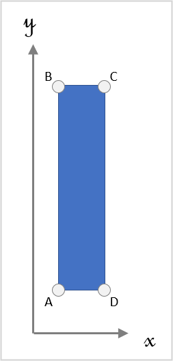
Just for fun and as an opportunity to practice, I’ve decided to approach this as an exercise in polygons. Here we have four points for each bar (5 if yo include the return to the starting point). The vertical axis (y) is given by SUM(Sales), the horizontal axis (x) will be given by a calculations based on Month and Year. Note that both month and year are discrete fields in this case as they are used to categorise the data.
To be able to add some interactivity to the final product, I’ll set various parameters instead of using fixed values (all integers):
| Name | From | To | Step | Default |
| p.Width of bars | 1 | 10 | 1 | 4 |
| p.Gap between the bars | 1 | 5 | 1 | 1 |
| p.Gap between month ticks | 30 | 100 | 5 | 40 |
| p.Bars to the right of the month tick | 0 | 4 | 1 | 2 |
I like to put a p. in front of my parameter names as it makes it quicker for me to recognise them in a calculation. The standard colouring in Tableau is a bit subtle for my screen.
The digram below shows how the parameters relate to each other and the desired output:

Then I need a couple of calculated fields. Firstly, I need to number the bars from 0 to 3:

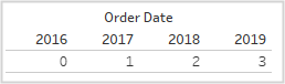
The second line could have simply been the value 2016, but I wanted to cover the generic case. This gives me:
Now I need the tick mark number. This will go from 1 for Jan to 12 for Dec. This is simple MONTH([Order Date])
Next I need to work out the coordinates of each of the four points of each bar:
The y coordinates are easy, being either 0 or SUM([Sales])
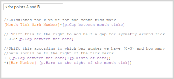
The x value for points A and B will be dependent on all of the parameters built earlier as well as the discrete year and month:
Dragging this to the view to check and it looks OK:

The x values for points C and D will simply be the above values plus p.Width of bars
Creating the path index
(data points out of thin air!)
I’ll use the same trick from Ivett as last week to generate the path index numbers from a single Union-based duplication of the data source. I now have two tables, Orders and Orders$ (why $ and not 1, I’m not sure!)
To generate the end points:

Then create a bin from this:

Dragging this to the view and selecting Show Missing Values* from the pill (see last week’s challenge) and you get the desired index for the nodes:
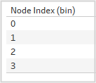
Note that there are only four points here, as Tableau seems to automatically fill from point 3 to 0, so a point 4 on top of point 0 is not needed to complete the polygon. I guess this might change with more complex forms.
Now to calculate the coordinates of the nodes themselves. Strangely, the bin values can’t be used in a calculation, so a table calc is needed for the coordinate calculations. It goes from 1 to 4:
Mind the Gap!
To be able to use the calculation in a table calculation, the x for points A and B calculation above needs to be densified so that it is available for all values of the path index.
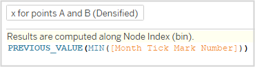
Without this densification values for x for points A and B did not appear for values 1 and 2 of the Path index. A similar trick was needed for SUM(Sales) for the y coordinates
This can now be used to build out the x and y coordinates:
For x:
IF [Path index]=1 THEN ([x for points A and B (Densified)])
ELSEIF [Path index]=2 THEN ([x for points A and B (Densified)])
ELSEIF [Path index]=3 THEN ([x for points A and B (Densified)]+[p.Width of bars])
ELSEIF [Path index]=4 THEN ([x for points A and B (Densified)]+[p.Width of bars])
END
For y:
IF [Path index]=1 THEN 0
ELSEIF [Path index]=2 THEN [SUM(Sales) Densified]
ELSEIF [Path index]=3 THEN [SUM(Sales) Densified]
ELSEIF [Path index]=4 THEN 0
END
Building up the bars
Dragging MONTH (Order Date) to Details, YEAR(Order Date) to Colour, Node Index (bin) to Path, x to columns, y to rows and checking that the table calculations are computed using Node Index (bin) gives us the following:
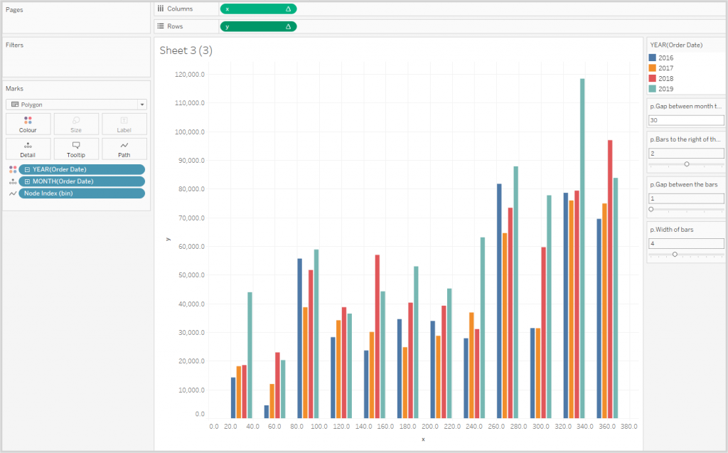
Issues to be resolved are:
- Colours
- Formatting of the y axis to show dollars and alias y to be “Sale”
- Change the tick marks along x to match whole months (this will mean that I’ll no longer be able to make the space between months user-controllable as tick marks can’t use parameters)
- Create a secondary chart to provide the month titles
- Tidy up lines and borders.
Note: I’m not entirely sure why the SUM(Sales) calculations work. I’d expected this to be double the required amount due to the duplication of the data source.
I couldn’t get the month name to be abbreviated in the tooltips. Very odd. I didn’t get to the bottom of it. I also needed to use a calculated field to get the abbreviated months for my x-axis headers: LEFT(STR(DATENAME(‘month’, [Order Date])),3)
Creating the legend with the dots was just a matter of dragging YEAR(OrderDate) to Columns, Colour and Label, selecting Circle as mark types and getting rid of the row dividers.
Building the Dashboard
I dragged the various parts to the dashboard. I wanted to use the buttons for the parameters, but they weren’t available. After a quick search, I discovered that you just need to specify a step size for each parameter.
Using PowerPoint, I created some small images to indicate what the various parameter controls do, tweaked the layout and was done!
Addendum
* Show Missing Values is not available on all pills, only “Range Aware” pills. This is a pill (dimension) which knows it’s MIN, MAX and increment. There are 2 of these Dates and Bins.
Thank you to Simon Runc for this tip from the Tableau Forums