WOW2020 Week 20: How much do these states contribute to the total?
First challenge using 2020.2 features! WOW 2020 Week 20, version 2020.2. As Sean said, lots of 2s and 0s.
This time it’s all about the new Set Controls feature which allows users to manually select members of a set in a very similar way to the current filter interface.
Sean’s Challenge here
And his solution on Tableau Public here
My Solution:
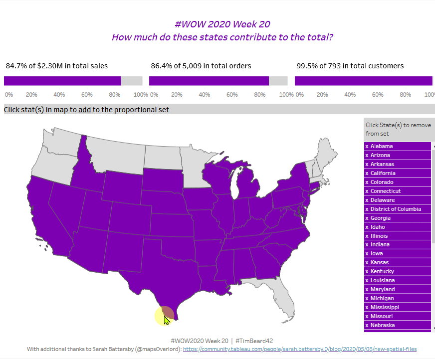
This challenge involves a map of the US where a user can click on a state to add members to the set, then clicks on a list of states to remove them. The selected sets are then used to show what contribution they make to the whole in terms of sales, orders and customers using a technique called proportional brushing. I’ve used this before, so don’t expect any great problems. It’s not immediately obvious how Sean displays the list of states to remove. I suspect it’s just a sheet with a table showing all set members.
Background Map with alternative projection
I remembered seeing something about alternative projections recently on twitter that linked to Sarah Battersby’s blog post here. Conveniently, she has saved the results of her work in handy packages, so I just grabbed the Hyper file for her States shapes.
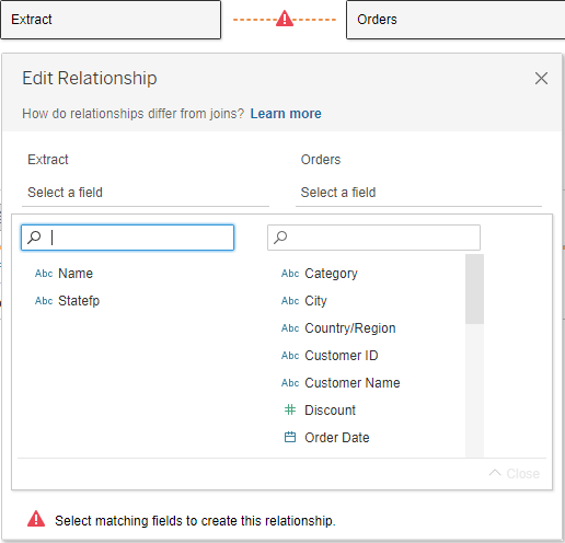
Double clicking on this open Tableau in the all new, Relationships-based, data window:

I just hit Add and connected to the superstores data located in the Tableau Repository. Dragging the orders table to the Relationships area produced an error due to different field names. Entering Name from the map file to State from Superstores fixed the issue.
Double-clicking on the Geometry pill added all states to the map. The background doesn’t fit, so Setting washout to 100% under Map Layers gave me a good starting point.

Adding sales to the map didn’t do much until I also added Names from Sara’s file:

The Supersales data set does not include data for Alaska, Hawaii or the various Caribbean islands, so I simply filtered these out.
With that, I think we’re good to go for the main challenge. First up sets, set actions and set controls
Sets
First job, create a set from States. Right click States / Create / Set:

I’ve just picked a couple of states to start with, but this will be controlled later by set actions. To test the functionality, I dragged the set to colour and set the colours as per Sean’s challenge. #7C00B2 Purple for in and #D5D5D5 Grey for out. Borders made black to match Sean’s
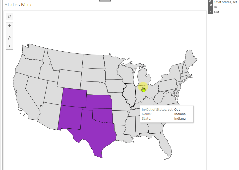
Once both Name and State were in Details, the error message went away and the selection worked as desired:
Next step is to add Set Controls, just to see them in action for the first time:
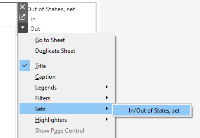
Nor surprises. Works as expected. Deleted the Set “filter panel” again.
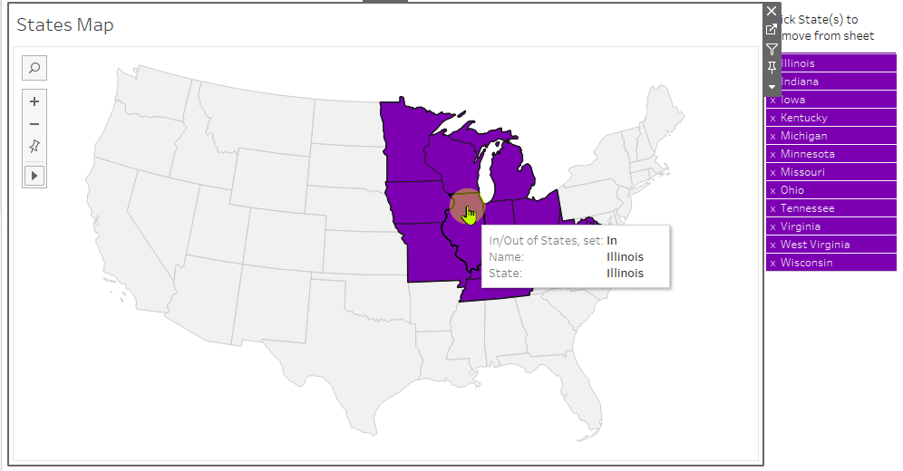
Adding Remove From Set Control
It looks like Sean uses a second sheet for this, so let’s give it a go. State to Rows and Text, State Set to filter. Looking good. Edited the label to add an “x” and a space before the State name, added the formatting and the title and dragged it into the dashboard:

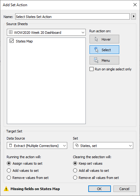
So far so good. Added a new Set action on the dashboard to remove the states from the set:
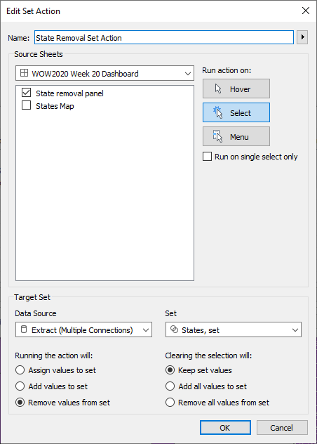
Blimey! Both actions seem to work!
Adding the Proportionally Brushed Bars
I’ve always thought proportional brushing was a strange name, but what is means here is that we want to calculate what percentage of, say, total sales are made up by the sales from the states in the set.
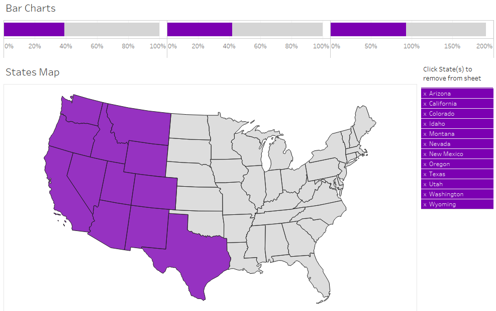
Three bar charts are needed, showing how much the selected states contribute to total sales, orders and customers.
Drag SUM([Sales]), CNTD([Order ID]), CNTD([Customer ID]) to Columns, drag the State Set to Colour, reorder In/Out by dragging in the Colour Legend, then for each pill in Columns, use the dropdown to select Quick Table Calculation, Percent of total.
Looking good:
Calculations
The text labels above Sean’s bar charts look like a further sheet. In any case, I need some calculated fields for amount, percent of total and total for sales, customers and orders. I’ll need these for the various tooltips too. Examples below for sales
[Sales, Total]: {SUM([Sales])}
[Sales, Contribution by set]: SUM(IF [States, set] THEN [Sales] END)
[Sales, % Contribution from set]: [Sales, Contribution by set]/MIN([Sales, Total])
The MIN was needed in the last calculation because of the good old can’t mix aggregates and non-aggregates error. I dragged these to the view in a new chart to check the results against Sean’s. All good. Format numbers and duplicate for for Customer Names and Order IDs (with COUNTD instead of SUM).
I later needed to add {} around each of the calculations so that the tooltip also showed up on the grey part of the bar charts. this also meant that I had to adjust for aggregation errors.
Titles for the Bar Charts
Graphically, the titles are built up as three bar charts.
Type MIN(1.0) directly into Columns to get a green pill. CTRL-drag to the right twice and select chart type as bar chart. I used MIN(1.0) instead of the usual MIN(1) as the extra decimal give a bit more control over the axis.
Drag the appropriate calculations from above to Label for each chart and edit he chart labels appropriately to get:
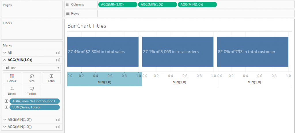
Now I just need to adjust the colours and other formatting, remove the axis and we should be OK.
The Catch
I thought I’d get away without one this time, but the keen-eyed of you might have noticed that the Customers bar chart added up to around 200%, so clearly something was going wrong. I only noticed this at the end.
The problem was that most customers are represented in multiple states. This meant that the customers that had already been counted in the In group were counted again in the Out group.
The calculations for customers are now:
[Is customer represented by one of the In states?]:
{ FIXED [Customer Name]:
MAX([States, Set])
}[Customers, Total]:
{COUNTD([Customer Name])}[Customers, Contribution by set]:
{SUM(
{ FIXED [Customer Name]:
IF MAX([Is customer represented by one of the In states?]) THEN 1 ELSE 0 END
})}[Customers, % Contribution from set]:
{MAX([Customers, Contribution by set])/MIN([Customers, Total])}
I then needed to adjust the Customer Count bar chart by colouring using the new [Is customer represented by one of the In states?] calculation instead of just the set.
Finishing off
The rest was just creating the various tooltips using the calculations above or just dragging standard measures to the view, formatting and building the dashboard.
I think I may have discovered a bug! If I don’t use an extract, Tableau goes off in an endless loop of trying to execute the query after a couple of selection actions, even though the amount of data is very low and all local. I had to build the whole thing twice!