WOW2020 Week 22: Profitability spotlight – is your budget recovered?
A challenge involving a new chart type, described as “a bi-dimensional chart (alternative parallel chart)”.
Requirements on the WOW website
Ivett Kovács’s solution on Tableau Public
My solution:

Challenges:
Understanding how to read the chart
First experience with creating polygons from scratch (in the end, pretty easy)
Mind boggling frustrations with densification and a lot of Tableau’s behaviour which just made no sense to me.
Thinking I was getting to grips with the software and realising what a long way to go I have.
The Journey
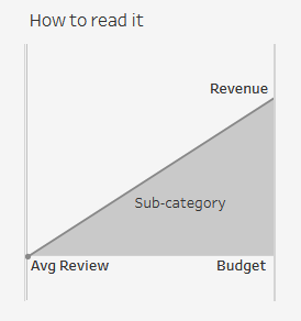
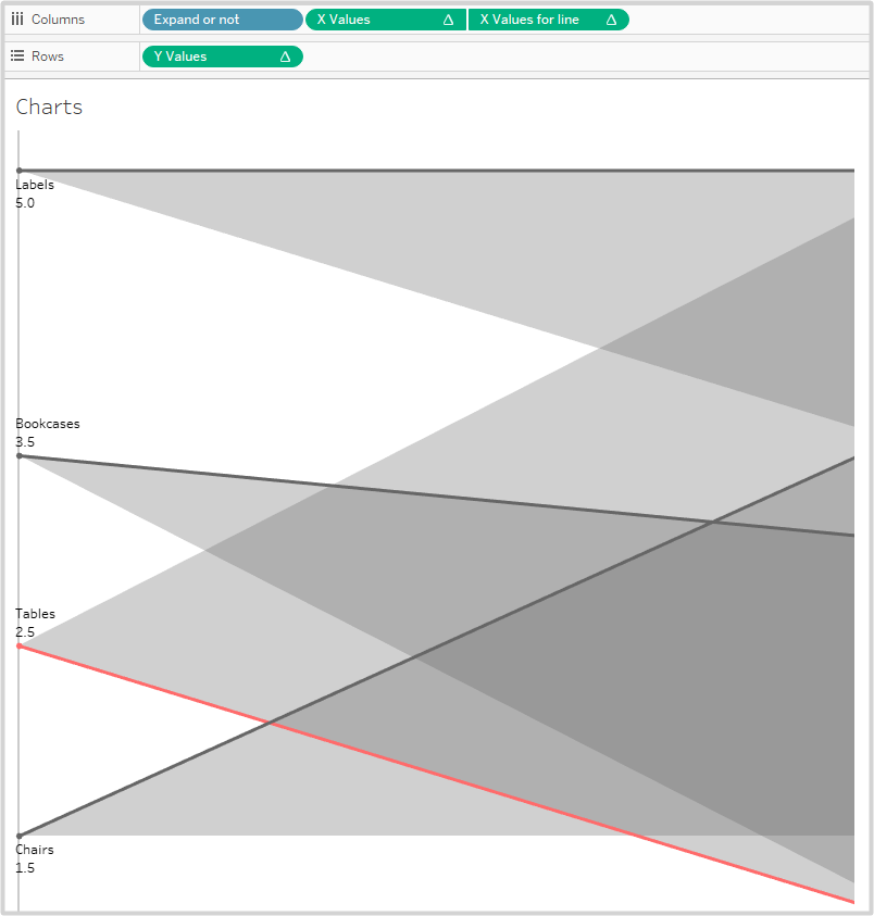
The first challenge is working out what the chart is supposed to show and how to read it. Certainly not a chart type for the casual user, more something that succinctly shows information to regular users of the dashboard.
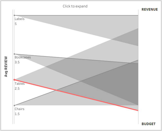
The solution looks like this:

If you understood that straight away, then you’re better than me! The scale on the left looks like it goes from 1-5, representing customer feedback on the products.
The right-hand axis covers two measures. Somehow or other. Looking at the tooltips doesn’t help to read the chart:

The questions is what values do the top and bottom of the axis represent for each of revenue and budget. Grabbing the source data makes it much easier to see what’s going on, Revenue and Budget range simply from 0 to 100. I guess these might be percentages in a real world example.
| Customer ID | Sub-Category | Revenue | Budget | Review |
| CG-12520 | Bookcases | 70 | 20 | 4 |
| CG-12520 | Chairs | 80 | 30 | 2 |
| DV-13045 | Labels | 99 | 70 | 5 |
| SO-20335 | Tables | 40 | 100 | 3 |
| SO-20336 | Tables | 40 | 100 | 2 |
| CG-12522 | Bookcases | 70 | 20 | 3 |
| CG-12527 | Chairs | 80 | 30 | 1 |
| DV-13041 | Labels | 99 | 70 | 5 |
Just to get to get a feel, I decided to build another, simpler viz including all measures: Review, Budget, Revenue.
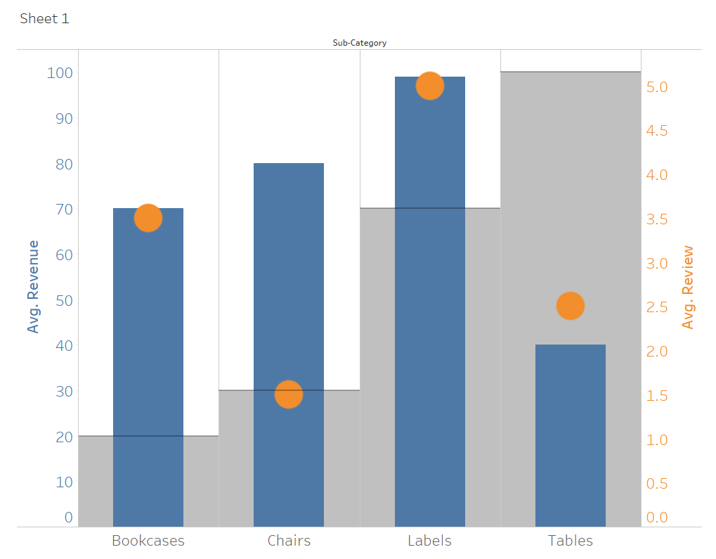
Whilst budget and revenue sit together nicely in a bullet chart, the orange review data doesn’t really sit well , even if the scale on the right is highlighted with the axis in the same colour on the right. I guess this is the problem that this week’s challenge dashboard is looking to fix.
The Build
As it’s based on a polygon, I guess the challenge is just a matter of calculating x and y coordinates. As I loved maths at school, this doesn’t sound too bad. On top of that, the shapes need to be defined along a four-point path. Maybe an extra data source is needed? This would be simple a list node numbers 1, 2, 3 and 4 and would also serve as the path index. The axes are bare, so an extra level of complication is avoided there.
As I’m new to this, I’m going to read Ivett’s article that she linked to in the challenge, so please give me a minute to do that.
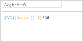
Back again. I also had a look at her bar chart dashboard. The key calculations are as below:

Instead of adding an extra data source for the nodes on the path, Ivett used a nice little trick for the path which avoided the need for an extra data source. This was based on a calculated field for the endpoints:
Endpoints for binning:
// This is just so we have enough points to draw the bars (we are going to bin this dimension)
IF [Table Name]=”Orders” OR [Table Name]=”Orders2″ THEN 0
ELSE 3
END
She used this calculation to create a bin:
So, the theory doesn’t look too bad.
Proof of Concept
I’ll try building the “Key” just using fixed values:
To get the node index needed (0,1,2,3), I used Ivett’s technique:
- In the data panel, drag the WW data table from the connection to the existing WW table in the view and create a union. This duplicated the whole data set and adds an additional field, “Table Name”, which now has two values “WW” and “WW1”
- Use a similar calculation above, “Endpoints for binning” to create the values 0 and 3
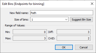
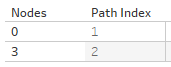
- Right-click this new field / Create / Bin, “Nodes”. Set the bin size to 1
- Create new field “Path Index”, which just uses INDEX(), a table calculation calculated along Nodes.
Not knowing how long the X-axis should be, I set this as a parameter, so that I can change it as needed, p.Length of x axis
Just for the key, I used fixed nodes as below
For X:
IF [Path Index]=1 THEN 0
ELSEIF [Path Index]=2 THEN [p.Length of x axis]
ELSEIF [Path Index]=3 THEN [p.Length of x axis]
ELSEIF [Path Index]=4 THEN 0
ENDFor Y:
IF [Path Index]=1 THEN 0
ELSEIF [Path Index]=2 THEN 100
ELSEIF [Path Index]=3 THEN 0
ELSEIF [Path Index]=4 THEN 0
END
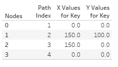
If I put all of the above into a table and make sure that all table calculations are calculated along [Nodes], then I get:
Dragging X, Y and Nodes to the sheet as needed, you get this:

Looking good!
Now I need a line for the upper edge. I just adapted the X calculation above to only include the first two nodes, dragged this to the view, dual axis and some formatting later and I got:
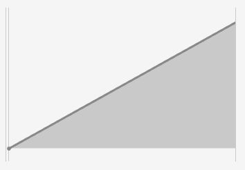
I had to fiddle with the x-axis to only get the dot at the beginning of the line. There are dots on both ends, but the axis on the right was brought in a few points.
Labels were added by simply using annotations.
The Main Charts
There are two versions of this, compact and expanded. I’ll start with the compact version. It should look like this:
The points on the left represent values from 1 to 5, so I’ll simply create a calculation that translates 1 to 0 and 5 to 100:
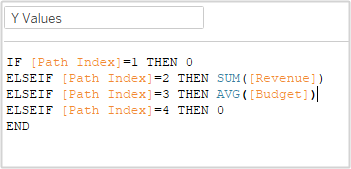
I then need similar calculations to above for x and y, but based on the calculated values. X is as before, but Y now looks like this:
On creating the sheet, I got a big, fat blank. Looking at the data in a table, you can see that data is missing:

This is because only nodes 0 and 3 exist in the data source (from the calculated field [Endpoints for binning])
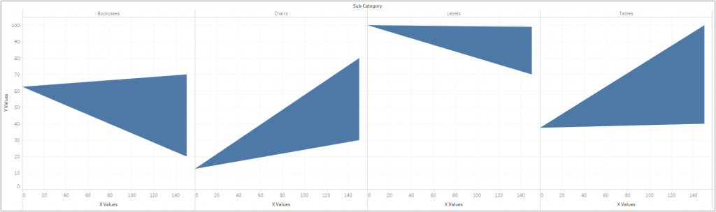
We therefore need densified versions of all of the values above, which gives me:

Attempts to create polygons out of this fail.
Am I being dense?
The problem is that I’m not getting all of my nodes. I go all the way back to basics and can’t even generate the same table that I created above:
I just can’t get the values 1-2 filled out again in by Nodes bin, even though the Path Index is being calculated along Nodes as before.
What am I missing?
After a couple of hours trying to work it out, a lunch break and feeding the fish, I still have zero idea what the problem is. Absolutely clueless.
I created my Endpoints for binning, Nodes bin and Path Index calculations from scratch and it seemed to work:
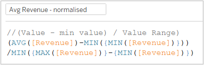
The only problem is that the right-hand side does not match Ivett’s charts. Rather than just guessing what the right-hand side represents, I had quick look at her calculation. It looks like a normalized figure based on:
(Revenue – Minimum Revenue) / Range of Revenue
I recreated my Revenue and Budget calculations accordingly. This meant that they had a range from 0-1, so I also had to adjust the Review calculation accordingly. For example the Revenue Calculation is now:
I added lines as above and formatted to get the desired results.
The labels and tooltips were pretty straightforward.
To expand or not to expand?
In Ivett’s chart, there is a button to enable the user to see the charts separately for each sub-category or stacked on top of each other.
I created a simple boolean parameter to control this.
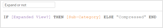
I then placed this in Columns instead of Sub-Category, which I had moved to details.
So now I just need to build the dashboard and add the parameter control.
The dashboard was a tad fiddly to get it to match the challenge, but not too bad.
Action!
I thought this bit would be dead easy, but again no.
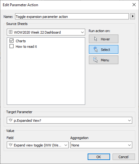
The plan was to use a parameter action to change the value of the parameter like a toggle:
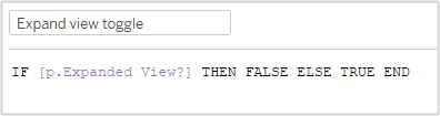
Simply put, if the parameter is true, then on a click it should be made false, and vice versa.
To make the calculated field available for a parameter action, it needs to be in the viz. However, dragging it to Details made the charts and lines disappear. Again, I have no clue why. I spent about an hour going back to basics (again!), checking and rechecking the table calculations. Nada. All worked fine in a table, of course, just not in the viz. Why???
Purely by trial and error, I dragged the field to columns. No complaints. This also had the advantage that, by changing the aliases for True and False to ” ” and “Click to expand”, I got the visible aspect of the control too. Looking at Ivett’s solution, I suspect that she did something similar.
Now I can set up my parameter action:
With that done, I’m all finished!
All in all, a deeply frustrating day. My biggest problems had nothing to do with the object of the exercise, which itself was very straightforward.
Doh!
I reached out to Ivett about the problem I was having getting all of the numbers 1-4 to show:


Ivett kindly came back to me really quickly and pointed out that I had not selected “Show all values” from the drop down menu on the pill:
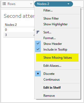
Yes, I feel a tad foolish, but at least I got the solution and I’m really grateful to Ivett for sorting that out for me. Three steps forward, two back and a small shuffle forwards again.
Edit: Added Doh!