Making waves with Fourier Series, Part 2
This is the second in my series about how I built my animated dashboard about Fourier Series:
Making waves with Fourier Series, Part 1
Making waves with Fourier Series, Part 2
Seeing the SINs
The basis and indeed the whole point of the dashboard are the calculations needed for the SIN graph. Here shown for the square wave:
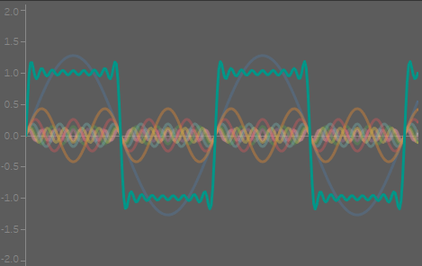
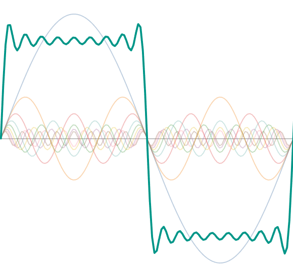
The whole idea with a Fourier series is that different SIN waves, all at different frequencies and amplitudes according to the equation below, add up to form a square wave with an amplitude of 2 (-1 to 1), shown here in green. The more of these harmonics one takes, the closer the end result is to the required wave form.
For a square wave, the formula is:

The representation on the right is simply the first equation written out.
The terms are:
y, the value on the vertical axis
N, n, the harmonics, in this case, the first, third, etc. The first harmonic is also referred to as the fundamental frequency.
t, the values along the x-axis. If the wave was a sound wave, this would represent time.
In words, this would say: “For each value of n, calculate the SIN of the nth harmonic for each value of t (nt), divide this by n, add up all of these terms and then multiply the sum by 4 and divide by π”
Implementing this in Tableau – Getting data out of thin air
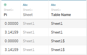
The only data source for this dashboard was a column called Pi with two values, 0 and 3.14159, π to 5 decimal points. The value is unimportant here, but what else was I to use?
I learnt the following trick from Ivett Kovács’s barcodes dashboard, described her blog. I used this technique to create a total of eight sets of values from which I was able to calculate everything I needed. It has been correctly pointed out to me that I could have saved myself a lot of pain by simply generating the numbers I needed in a spreadsheet, but what would be the fun in that?
The steps are:
Step 1: Union the data source to itself
This gives you an extra field “Table Name” that we will need in step 2
Step 2: Create the endpoints
In this case, I want a range from 1 to the number of harmonics that the user has selected in the dashboard, represented by the parameter [p.Number of harmonics]

This creates a table that has two values:
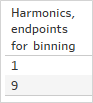
But we want all the values in between, so we need to bin!
Step 3: Create bins from the calculated field
In all but one instance, I needed simple integers and set the bin size to be 1. This could also be a parameter.

Step 4: Show missing values
If I drag Harmonics, Binned to the sheet, I’ll still only get two values 0 and 9 unless I click on the pill and select “Show all values”
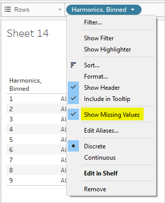
VERY IMPORTANT NOTE (this drove me a bit nuts until I found some obscure comment in a forum post): Show Missing Values is only available for so-called Range Aware pills. This is a pill that has a Max Value, a Min Value and an Interval, typically a date pill or a bin as above.
This is called domain padding and is a specific form of data densification. For more on the various forms of densification, see this excellent post from Jeffrey Shaffer, building on work from Joe Mako and Jonathan Drummey.
The option to show missing values is only available on pills on a shelf. Which is not where I always wanted them. Sometime when I would drag a padded pill to Details, I would lose the padding, sometimes not. I was never able to work out why. If any reader understands why, please let me know!
Step 5: Index your bin, as you can’t use bins in a calculated field
It might look like you have something that you can now use, but not so quick! If you try to use the above in a calculated field, you’ll get an error as you can’t calculate on bins.
Instead, you have to enter the world of table calculations and create an index:
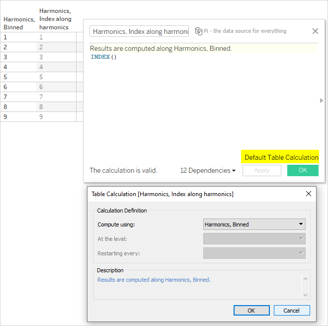
Two things to note here:
- Index always starts at 1 and increments each row by 1. If you need different values, calculate them here from the index.
- It saves A LOT of clicking later if you set the default table calculation to the binned calculated field at this point. If not, you will need to set it every single time you make changes to a sheet that impacts table calculations. Which will be a lot.
For the SIN wave graph, I used this technique to give me the values for the harmonics (n) and t.
So now I can get on with building my SIN graphs.
Building the Fourier Series
The first equation works out the value of the terms for each harmonic and along the t-axis. In this case, that will be 9 values for each point along t:
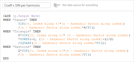
This looks complicated, but if you just look at the case for when the square wave has been selected and compare it with the equation, it’s straightforward:
This only has a table calculation nesting of two:
 |  |
With this, I can plot all of the harmonics:
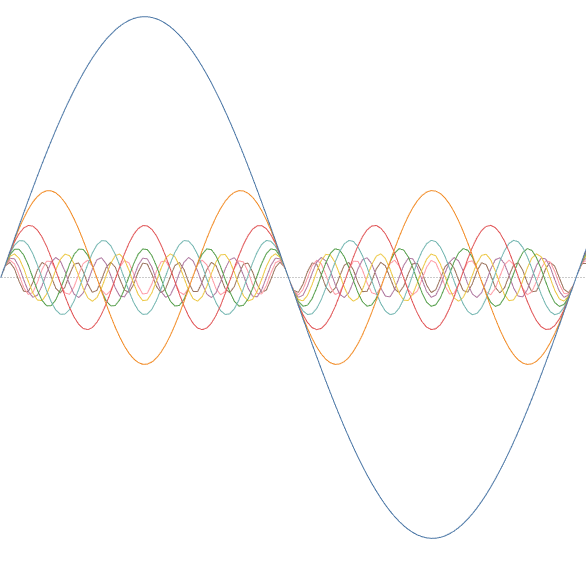
Then I just need to sum these together and multiply the sum by 4/π to generate, in this case, the approximation of a square wave based on 9 harmonics:
[Summation calculation for SIN wave]:
WINDOW_SUM([Coeff x SIN per harmonic])
As this is based on the calculation above, this means a three-level nesting of table calculations. These were as above plus the one for the highest level:
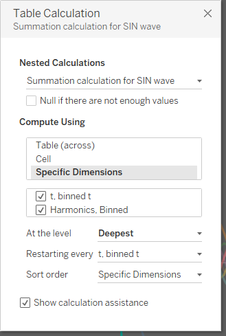
This gives me (the 9th approximation of) my square wave:
Waves over the water fall
Once the SIN wave graph has been sorted out, the waterfall chart is quite straightforward (assuming experience in building waterfall charts!)
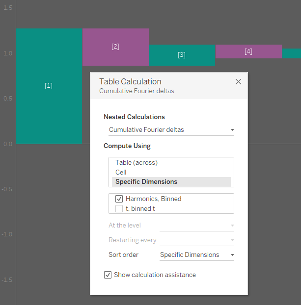
This needed a slightly different table calculation as the terms for each harmonic are added to each other along the waterfall.
[Cumulative Fourier deltas]:
RUNNING_SUM([Coeff x SIN per harmonic])
This is again a three-level nested table calculation with the top level show below:
The next post will be about how I created the spoke and circle graphs, where the table calculations are nested five deep!