Browsed by
Category: Just for fun

Things I’m trying purely to see if I can

Fun with factors, primes and sets

Fun with factors, primes and sets

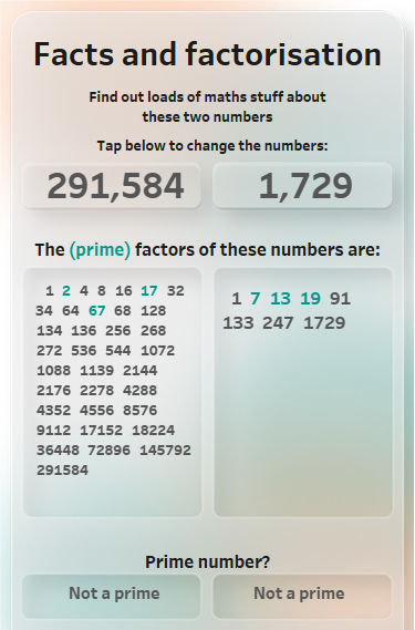
Congratulations if you managed to get past the title! That means that you have at least a passing interest in mathematics. I don’t know where the idea came from, but I thought it would be a nice exercise to work out the prime factors of numbers using sets in Tableau. I had also wanted to experiment with designing for mobile and modern UI trends, so I brought all these ideas together into one dashboard. You can see it here. Techniques…
Read More Read More

Hangman – IronQuest

Hangman – IronQuest

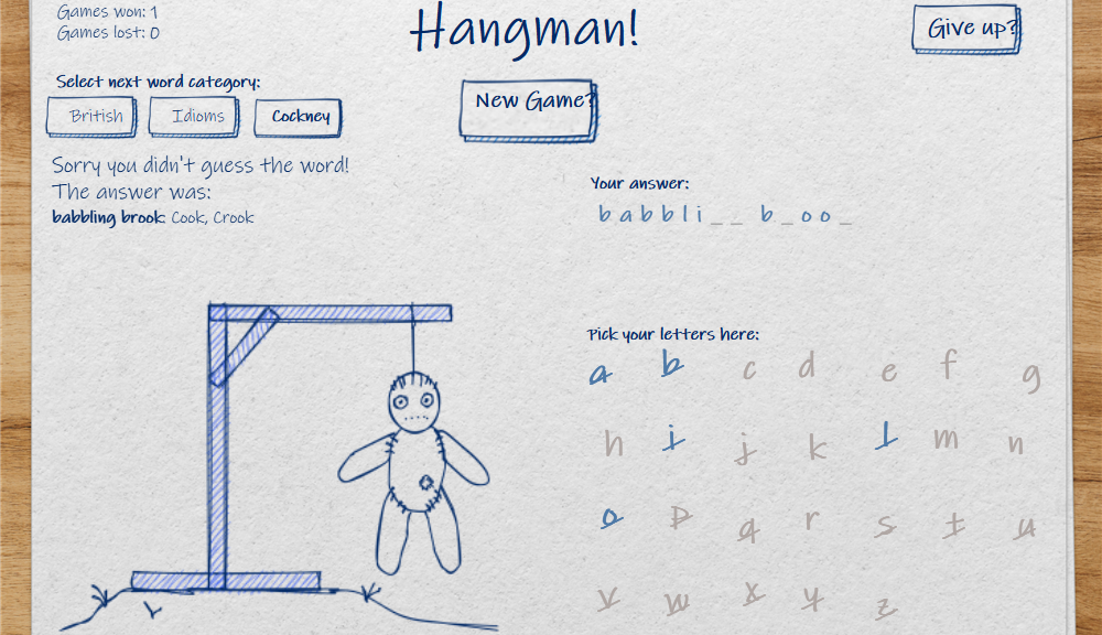
The theme of this month’s IronQuest was games. After my last couple of projects, I had promised myself not to spend too long on this one. I failed miserably! So this will be a story of failures and lessons learnt, plus some highlights of the final dashboard at the end. See the result here Lessons learnt, all about what you can’t do in Tableau Public: ● No access to APIs● No access to any live data● No way to programmatically…

Read More Read More

Perseverance – the Making of a Parachute

Perseverance – the Making of a Parachute

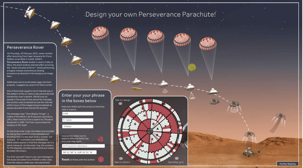
I was inspired to create this dashboard by the amazing videos of NASA’s Perseverance Rover surviving the “Seven Minutes of Terror” during it’s landing on Mars. If you saw it, you probably noticed that the parachute had a rather strange pattern on it. It turns out that that was one of many easter eggs included in the mission. The parachute encoded the Jet Propulsion Lab’s motto “Dare Mighty Things” along with the coordinates of the Lab itself. “Super nerdy”, I…

Read More Read More

How to create a hex spiral unit chart

How to create a hex spiral unit chart

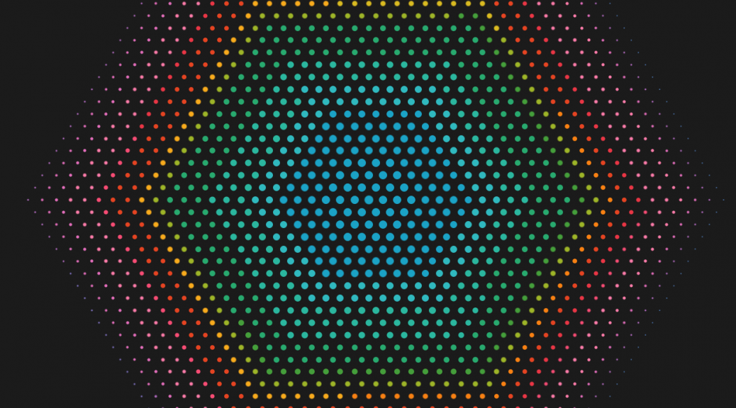
I didn’t manage to finish my “What’ the Harm?” dashboard in time for #IronQuest or with any degree of polish, but I did manage to come up with a new (at least for me) chart type: the hex spiral unit chart. I’m not sure it has that much data visualisation value, but it looks kind of pretty! This article describes how to build one: Background and alternative approaches For my What’s the Harm dashboard, it was critical for me that…

Read More Read More

Making waves with Fourier Series, Part 3

Making waves with Fourier Series, Part 3

This is the third in my series about how I built my animated dashboard about Fourier Series: By the end of the last post, I had built up the SIN wave graph (bottom-right in the dashboard) and the waterfall chart (not visible above). In this post, I’ll go through the steps for creating all of the elements in the main graph at the bottom of the dashboard, which I simply called “Circles”. The components of this can individually be turned…

Read More Read More

Making waves with Fourier Series, Part 2

Making waves with Fourier Series, Part 2

This is the second in my series about how I built my animated dashboard about Fourier Series: Seeing the SINs The basis and indeed the whole point of the dashboard are the calculations needed for the SIN graph. Here shown for the square wave: The whole idea with a Fourier series is that different SIN waves, all at different frequencies and amplitudes according to the equation below, add up to form a square wave with an amplitude of 2 (-1…

Read More Read More

Making waves with Fourier Series, Part 1

Making waves with Fourier Series, Part 1

This is the first entry in this series Making waves with Fourier Series, Part 1 Making waves with Fourier Series, Part 2 As you will have seen from some of my previous posts and dashboards, I rather like combining maths and Tableau. That was the main motivation form the 3d rotating cube. This time I was inspired by a video about visualising how Fourier Series work by Destin Sandin on his Smarter Every Day channel. Click on the screenshot below…

Read More Read More

Creating a rotating 3d cube in Tableau

Creating a rotating 3d cube in Tableau

After all the fun I’ve been having recently with coordinates and polygons, I decided to see if I could take the next step – into the 3rd dimension! (queue dramatic music and crappy 3d glasses). No, I don’t currently see any practical use, but it sounds like fun! In principle, all that we are doing is mapping a 3d object to the 2d x and y coordinates that Tableau handles so well. To keep things as simple as possible, I’m…

Read More Read More