WOW2020 Week 24
Can you compare a 3-day vs. 14-day moving average and describe the latest trend?
Ann’s challenge this week is based on COVID-19 data and is an exercise in table calculations. Excellent! I feel I’m slowly getting to grips with these, so I’m intrigued to see how I get on.
The core challenge is to calculate 3-day and 14 day moving averages and to compare them.
Ann’s challenge on Workout Wednesday
The official solution by Jami Delagrange on Tableau Public
My solution:
I was a bit confused by the data provided as it only went up to 4 June, not 7 June as Ann indicated. I checked on the official solution and saw that I was using the wrong file.
I set a source filter so that the latest date is 7 June so that I can treat the source as live and just use generic calculations.
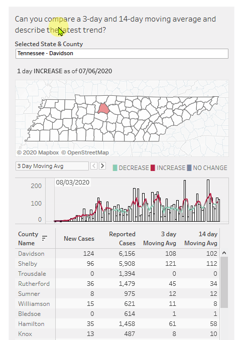
The solution dashboard has three key parts:
- A map showing which county we are looking at. This looks trivial
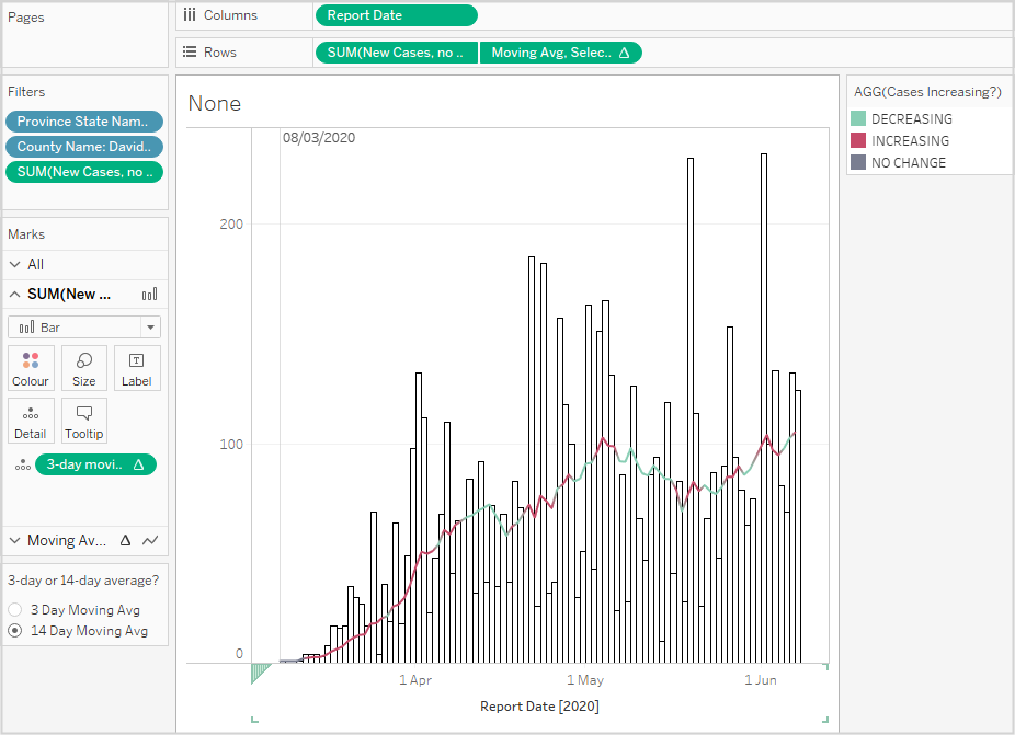
- A combined bar and line chart showing data over time, especially when the 3-day average was over the 14-day average, suggesting an increase in cases
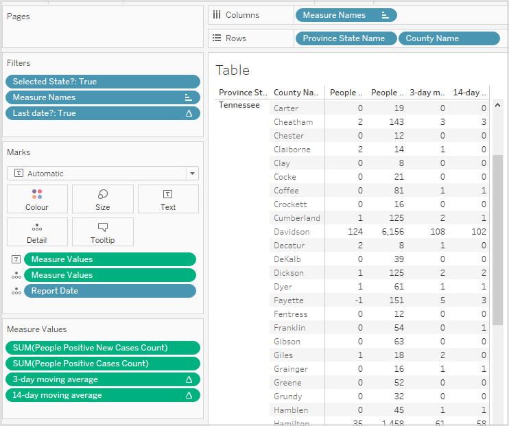
- A table listing all the counties in the selected state and for county showing
- Number of new cases on the last date (data provided)
- The total of reported cases (data provided)
- 3-day moving average of new cases
- 14-day moving average of new cases
At first glance, the table looks most challenging as it needs a table calculation in a table that does not show all the data that is needed for the calculation.
The build
I don’t like the way the state/county is selected in the original as it seems to require a working knowledge of the counties in the states, which I do not. I’ll therefore set up separate filters for State, then County, which will be pre-filtered according to state.
Building the initial bar chart is basic stuff:
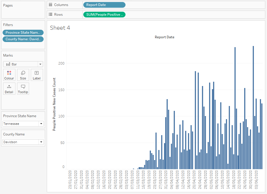
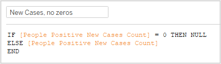
Looking at the original, I see that the zero values at the left and also later has been left out, so I need to add a calculation to turn zeros to nulls:
When I drag this over the previous new cases pill, the view looks the same except for the nulls indicator in the bottom right:

If I click on this, I get the following options and select Filter data:

This gives me the initial bar chart I’m looking for.
The line chart to be displayed over the bar chart should display the 3-day or 14-day moving average as selected by the user.
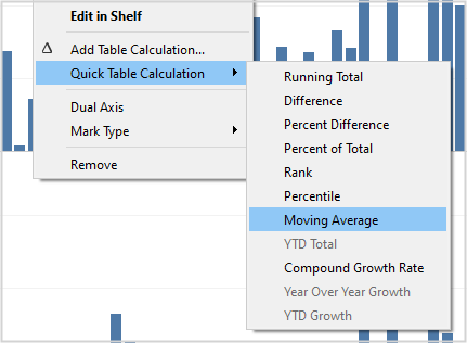
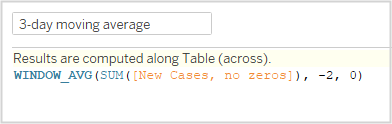
First I plot each in turn to make sure my calculations are correct. I CTRL-drag the green New Cases pill to the right to duplicate it, then select Quick Table Calculation, Moving average:
Then select the pill again to edit the table calculation:

Note that as Current value is selected, we only need two previous values to get the 3-day moving average.
The graph looks correct, so I drag this to the fields shelf to create a calculated field as I’ll need it later. It looks like this:
I duplicate this and edit it to create the 14-day average.
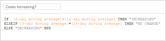
Now i want to know if the 3-day average is more than the 14-day average:
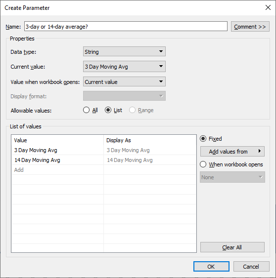
Next a parameter to select whether to show the 3-day or 14-day average:
Drag [Cases Increasing?] to colours for the line chart, work on the formatting. I had to change the date field to continuous and adjust the bar width to be able to control how dates were displayed on the date axis. I also noticed a date in the upper-left corner of the chart in the solution. Looks like a reference line set to the minimum date. This would indicate the first reported case:
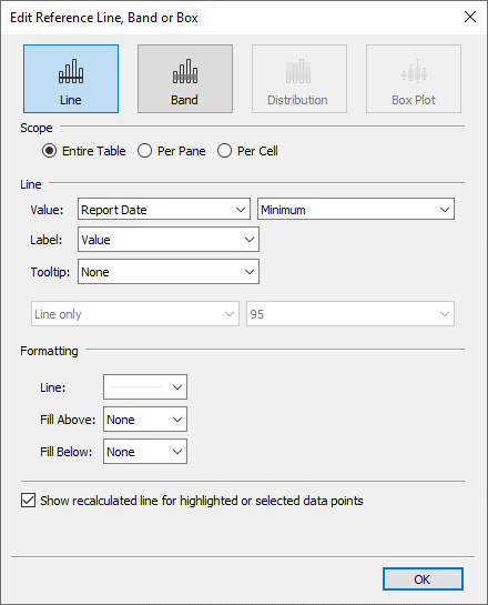
After right-clicking the line and formatting the text to align to top, I had the desired result:
The map is not the territory
The map is to show all counties in the selected state and highlight the selected county. The counties from the surrounding states should be visible, but much lighter. My guess is that this is a dual-axis map. I’ll work on the selected state map first.
Here I hit a problem from having used filters in the first chart. I can’t use them to highlight or filter the state and/or the county without ending up with just one county showing. So, with great regret, I’m going to have to move to a parameter-based solution as per the original. In this context, parameters are pretty limited in terms of making a hierarchical selection (first state, then county). If parameters had “show only relevant values” like filters, then I could achieve what I want.
I created a calculated field, [State-County]: [Province State Name]+” – “+[County Name] and used this to populate a parameter:

I updated the graph to use this parameter and updated the filters accordingly.
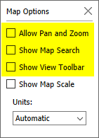
From this parameter, I created two boolean fields, [Selected State?] and [Selected County?]. Dragging the first to filter and the second to colour achieved all that I needed. No dual-axis map needed. I didn’t want the map Toolbar to show when the user mouses over the map, so I turned this and other controls off using Map / Map Options:
The table
This shows the stats for all counties in the selected state along with the stats mentioned above. The challenge is to show the moving averages, which need data not shown in the table.
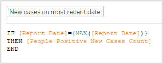
To show only the new cases only for the last day, I used:
To see how to only show the most recent data for the other two columns, I went back to my go-to video about calculated fields. This is Luke’s run through of his solution to WOW2020 Week 9. Watch it from about 14:00 to see how he created his KPIs, which even he said was “a beast”.
By using the LAST()=1 filter trick from Luke’s video, it was pretty straightforward:
All table calculations are simply calculated along date.
The biggest issue I had was that my 14-day average figures weren’t correct when compared to the original solution. In hte end, it was down to how I handled the zero-value dates for the bar graph above. I’m now no longer using the [New Cases, no zeros] field and instead just using a filter for my graph saying [People Positive New Cases Count] must be at least 1.
Perhaps I should have followed Ann’s advice and built the table first!
Trending BANs
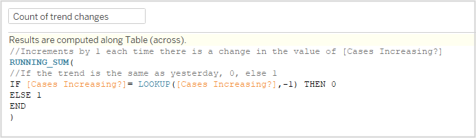
One key requirement for text fields is to include the number of days for which the trend (comparison of 3-day and 14-day averages) has been the same. I expected this to be easy.
I was wrong.
In programming, you can simply add a counter: IF (condition) THEN COUNT = COUNT+1. But this only works if there is a clear sequence, which there isn’t in Tableau. The nearest thing is a table calculation, but there are no standard tally calculations. So it got complicated.
First calculate if today’s trend direction is the same as yesterday’s and if so, then return 0, otherwise return a 1. Summing this along the partition will give you the number of times the trend has changed:
Then, see how many times the value is the same as the last value in the partition. This gives you the number of days in the trend on the last day:

That felt much harder than it needed to be! In standard programming, that would have been a simple “IF <condition> THEN a=a+1 ELSE a=0”
Finishing off
Creating the tooltips and the dashboard were straightforward except for two things.
The legend on the dashboard should be horizontal. There is an option to make a legend horizontal, but the spacing is all wrong, so I h´just created a text panel for this.
I just could not get the date formats correct for the BAN or the tooltips. Anything I tried to do was ignored. Formatting on the pill did nothing, likewise setting the default date format of the field. Googling for a solution didn’t lead to a solution either. I’ll write a question in the WOW forum and update this page if I get to the bottom of the issue.