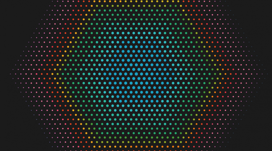
How to create a hex spiral unit chart
I didn’t manage to finish my “What’ the Harm?” dashboard in time for #IronQuest or with any degree of polish, but I did manage to come up with a new (at least for me) chart type: the hex spiral unit chart. I’m not sure it has that much data visualisation value, but it looks kind of pretty! This article describes how to build one: Background and alternative approaches For my What’s the Harm dashboard, it was critical for me that…
