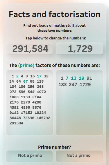
Fun with factors, primes and sets
Congratulations if you managed to get past the title! That means that you have at least a passing interest in mathematics. I don’t know where the idea came from, but I thought it would be a nice exercise to work out the prime factors of numbers using sets in Tableau. I had also wanted to experiment with designing for mobile and modern UI trends, so I brought all these ideas together into one dashboard.
You can see it here.
Techniques and challenges:
● Sets and combines sets
● I wanted to use densified data, but you can’t create a set from this. See below
● Formatting of parameters is completely pony
● Layout of text is completely different between desktop and public. LOTs of time wasted
● Transparent images for buttons, links and interaction blocking
● Text size variation according to number of set members
● Mobile first design
● Glass morphism design using Figma
● Loads of maths nerdery!
To densify or excelify?
To create sets, you need a dimension from which to decide which members are in or out of the set. I had wanted to use data densification for this purpose, but a dataset created in this way cannot be turned into a dimension and as such can’t be used for sets.
I therefore simply created a list of numbers from 1 to 1 million and used that as the data set. The disadvantage is that I need to limit the numbers the user enters. The advantage is that I can limit the numbers the user enters. This will come in handy when trying to fit all the factors of large numbers into a box.
The two numbers that the user enters are simply parameters entered by the user. They are set to a range of integers:

Factorus Prime
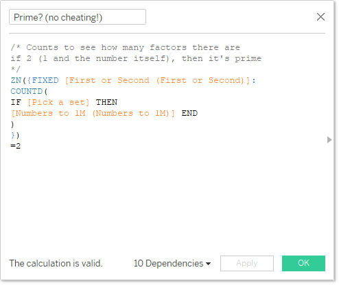
I used sets to find the factors and to discover if a number was a prime based on how many members the set had.
Three main steps:
- Find all factors using sets
- Count the factors to see if the entered number is a prime (where the only factors are 1 and the number itself)
- Find out which of the factors are themselves primes
To create a set of factors, right-click a dimension and select Create/Set. The members may be selected via various methods. I used the condition tab as below:
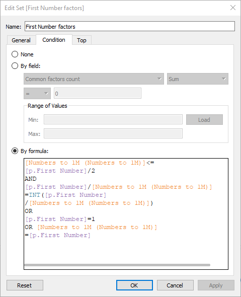
The logic is based on the number selected by the user, [p.First Number], and the list of numbers to 1 million, dimension [Numbers to 1M (Numbers to 1M)] as below:
- Only check numbers less than half of the selected number. By definition, there can be no factor larger than this other than the number itself
- Check if the users number divided by the value of the set member is an integer, if so it’s a factor
- If the member is 1 or the selected number, then it is a factor
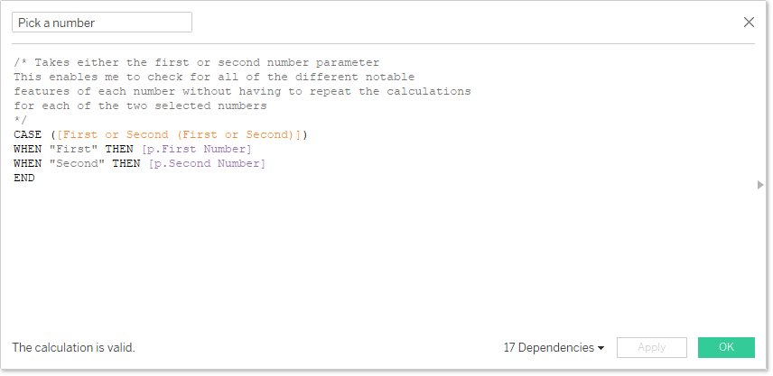
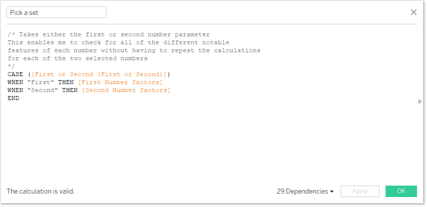
In order to create generalised calculations (i.e. not separate calculations for the first and second number entered), I created a new dimension that simply had “First” and “Second” as members. From this, I created [Pick a number] and [Pick a set]:
Now I have all that in place, I can start using these for calculations to find out fun maths stuff about the two numbers entered. To start with, is it a prime?
I also wanted to see which of the factors were primes. I couldn’t be bothered with an iterative approach here, so I cheated and simply added a list of primes between 2 and 1 million. I’d already proved the principle!
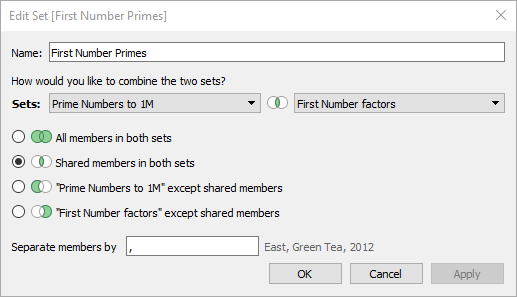
The prime factors were created by combining two sets, the factor set described above and a set of primes based on a calculated field [Numbers to 1M (Numbers to 1M)]=[Primes]. This primes set was:

To be able to combine sets, they must both be based on the same dimension, in this case, [Numbers 1 to 1M]. To create, right click on a set Create/Combined set. You will then be able to select the sets you wish to combine as well as a handy Venn diagram to select which members you’d like:
Lots of lovely logic
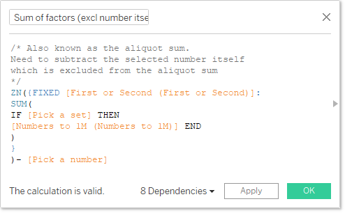
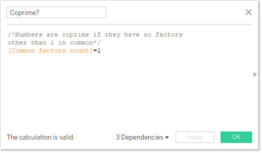
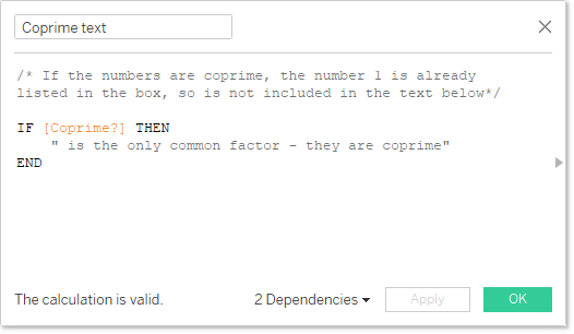
For all of the other maths calculations, there was (mostly) a True/False calculated field which fed a text calculated field for display. Here are a couple of examples, for the sums of factors and Coprimes:

Tests and maths stuff included:
- (Integer) factors and prime factors
- Common factors and common prime factors
- Sum of factors (aliquot number): Perfect, abundant or deficient numbers
- Semiprimes
- Coprime numbers
- Twin primes
- Roots, 1st to 7th order. 1st order in the number itself, 2nd is the square root, et.c
- Spheric numbers
- Fibonacci numbers
- Marsenne primes
- Taxicab numbers
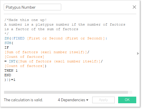
- Platypus numbers, also called monotremes
All of these are described in the help page of the dashboard along with links for further research
WYSIWYG we miss you! Problems with displaying text
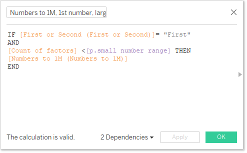
My first problem was displaying the lists of factors. There could be just two to tens of factors. Large text makes the the former look good, but many members of the latter set are missing. When listing set members, scroll bars don’t appear and they’re ugly anyway, so to be avoided where possible.
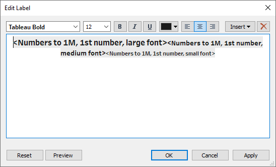
Adding a calculated field to size doesn’t work, as this tries to turn a simple list of numbers into a treemap. The solution I came up with was three size options based on the number of members of each set based on two new parameters to signify when to use small, medium or large fonts:
Three of these were combined to produce:
The next big issue I had was on the help page. The layout, and particularly the space taken by the text was completely different between desktop and public. The only way to get this to look anywhere near acceptable was just trial and error. Make a change, publish, correct, publish, scream, change again, publish ad infinitum.
The real shame was that I wanted to use a handy technique for including links in a page by floating a transparent shape over the text that should include a link and add the link to the shape instead. If you have no clue where your text is going to end up, you have no chance of placing your transparent images. In the end I had to use a much messier solution of a popup container with all of the links written out in full.
Finally, the user needs to be able to enter two numbers as parameters. Unfortunately, not only is parameter formatting a bit basic, but, bizarrely, is completely ignored if you use type in. With 999,999 numbers to choose from, type in was the only option. Purely because of this, I created a second dashboard for the user to enter the numbers.
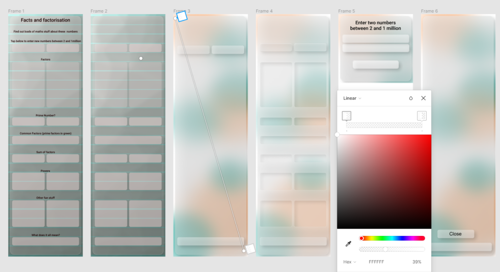
Oh so pretty
I decided to have a play with a trending UI style and decided to give glass morphism a go. I watched a couple of videos about how to produce to with Figma, but in the end, my main guide was this article by Michal Malewicz.
Essentially, the interface is made up of four planes:
- Background graphics. Needed to have an image to be obscured by the upper planes. This was made up simply with a number of very blurred circles of complementary colours
- First glass layer with blurring and drop shadow and subtle edge. 80% linear fill from 39% to 15%, 15% blur, 10% drop shadow. A simple rounded rectangle which frames the main UI. The results of the various test “sit” on this plane.
- Second glass layer. 100% linear fill from 39% to 15%, 15% background blur, 10% drop shadow. I created cut outs in this plane. This is where the dashboard and box titles sat.
- Upper layer. This represented anything with user interactions and were to look as if they were sitting above the second glass layer, kind of like buttons.
Here’s how my Figma page looked by the end, including my “workings out”:
I put a transparent shape over the main dashboard to block any interactions, tooltips, strange highlighting etc.
Any feedback on design, and indeed better use of Figma for this, would be gratefully received!
Mobile first. And last
I wanted to try out designing for mobile. This mostly consisted of the following thoughts:
- Layout is narrow, but tall
- Taller than one page is not a problem as one is used to scrolling on a phone
- Buttons should be big and obvious
- All interactions should be finger-friendly, so no tooltips on hover, for example
- Interactions should be “what one is used to” on a phone, i.e. I tried to follow mobile UI/UX conventions
- Fonts should be big. This was a bit of a challenge and I’m not 100% happy with the results
Tableau has a mobile layout function, but I found this pretty disastrous. Especially if I had started layout without the phone layout and asked Tableau to create it for me. My impression is that I might product acceptable results if you restrict yourself to only using containers (goodbye anything floating and any background images!) I also find precise positioning and sizing a long and tedious process when using containers. Just floating objects and getting their locations and dimensions from Figma is much more satisfying!
My solution was to delete the mobile layout and simply create the main layout to be mobile friendly.
Geek out on numbers
I had lots of fun finding out about the different classifications of numbers, especially based on their factors. I was shocked to discover that there is no special name for numbers where the number of factors is a factor of the sum of factors of a number. So I gave it a suitable name!
For all the other fun stuff, start digging around on these pages and see what you find. Let me know if you want me to add any further tests!
- https://en.wikipedia.org/wiki/Integer_factorization
- https://en.wikipedia.org/wiki/Prime_number
- https://en.wikipedia.org/wiki/Euclid%27s_theorem
- https://en.wikipedia.org/wiki/Semiprime
- https://en.wikipedia.org/wiki/Twin_prime
- https://en.wikipedia.org/wiki/Aliquot_sum
- https://en.wikipedia.org/wiki/Nth_root
- https://en.wikipedia.org/wiki/Sphenic_number
- https://en.wikipedia.org/wiki/Fibonacci_number
- https://en.wikipedia.org/wiki/Mersenne_prime
- https://en.wikipedia.org/wiki/Taxicab_number