WOW2020 Week 34: Can you show all the crimes within X miles of Y Point?
Lorna gave us another challenge today based on the geo calculations in Tableau.
Challenge Page
Lorna’s solution on public
Data for the challenge
My solution on public
The challenge is to create a map of crimes in London and filter and colour them according to their distance from a selected central point, either St. Paul’s Cathedral or Buckingham Palace.
It was mostly pretty straightforward, except for a couple of dumb mistakes I made, which had nothing to do with the crux of the challenge, e.g. putting in the wrong coordinates for St Pauls and Buck House!
Lorna provided data about the crimes including crime ID, Latitude and Longitude of the location of the crime along with the reporting name of the local geographic area (Lower Layer Super Output Area or LSOA). Amongst other data that was not used here. Not all entries in the table included a Crime ID, so I filtered the nulls out in the data source.
Techniques used
● Spacial functions MAKEPOINT and DISTANCE
● Viz in tooltip
● Modulo calculation
Challenges
● Putting the wrong coordinates in for the central points!
● Forgetting that if you don’t unpin a map after zooming or panning, it will no longer automatically zoom in to the selection. This one got me for quite a while.
Get to the point!
The first thing to do is to turn the latitude and longitude of the crime locations into spacial Points so that we can do distance calculations on them.
[Crime location points]:
MAKEPOINT([Latitude],[Longitude])
Tableau then generates two fields for you, [Latitude (Generated)] and [Longitude (Generated)]. It is important to remember to use this later and not the original lat and long fields.
I then created a parameter, [p.Location]. to allow the selection of either Buckingham Palace or St. Paul’s Cathedral. This was a simple text list.
This was used to generate the spacial Points that Tableau can use to calculated the distance to the Points for the crimes.
[Selected Centre]
IF [p.Location] = “Buckingham Palace”
THEN
MAKEPOINT(51.501603, -0.141761)
ELSE
MAKEPOINT(51.514101, -0.098341)
END
Now we can calculate the distance from each of the crime locations to the selected centre point.
[Distance to selected centre]
DISTANCE([Selected Centre],[Crime location points], ‘mi’)
This simply calculates the direct distance between the named points, measured in this case in miles (‘mi’). Other options are metres, kilometres and feet.
You’re so far away!
The distance filter is to be set by the user, so I created a parameter, [p.Within x miles], which was an integer range between 1 and 10 with steps of 1.
The filter then needed a boolean calculation to see if a particular crime location was within the desired radius.
[Distance within range?]:
[Distance to selected centre]<=[p.Within x miles]
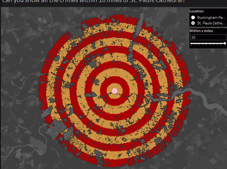
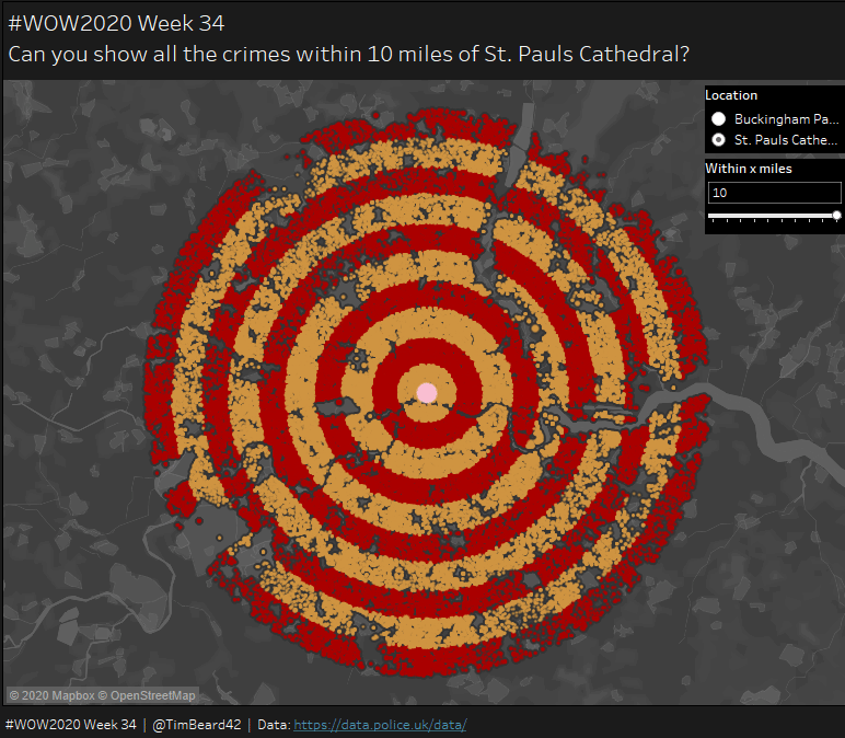
To create the map, double click on [Crime location points] and Tableau adds this to the Details and adds the generated longitude and latitude to columns and rows. Set the background map to “Dark”, drag the filter calculation to filters (only True values), change the washout a bit on under Map/Map Layers and you should see something like this:

The black areas in the middle are just where the outlines of so many points merge. All the points are currently a single mark. Adding [Crime ID] to the details then separates them down to the individual points. This will be important later for the tooltips.
Lorna had used a very attractive rainbow colour scheme for her chart, but as I immediately associated this with the LGBTQ community, I didn’t want to use this for a crime map, so I went another route, using bands of colour, each a mile across.
For this, I needed alternating values of 0 and 1, so I used a modulo calculation based on the integer value of the distances.
[Target Map Ring Colours]:
INT([Distance to selected centre])%2
Adding this calculation to colours, setting the colours and removing the boarders and adjusting the halos of the points gave me:

I created a dual chart by control-dragging the Longitude pill to the right and replacing the crime details with my selected centre details, and selected Dual Axis from one of the pills adds the selected central point to the map

Tool tip charts
There were two charts for Viz in Tooltips. One for the individual crimes (actually, the crime area) and one for the distance-filtered data set to be shown when hovering over the central point.
Both were the the Month vs Count Distinct of the Crime ID, with one having the additional detail of [LSOA Name]. Labels were turned on, but only for min/max values:

Each individual point in the map was to show the graph for the whole of the LSOA, so I needed to do two things. One, add [LSOA Name] to Details and two, change the filter setting in the Viz-in-Tooltip:
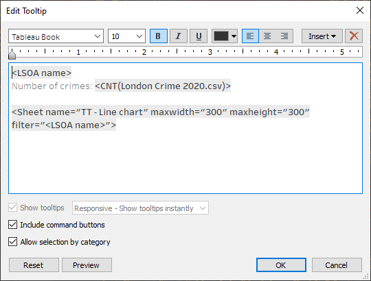
That last part took me a little while to work out.
The rest was just putting the dashboard together, adding tooltip for the central point and minor formatting.