WOW2020 Week 19: Can you build a dynamic date drilling chart?
This week’s Workout Wednesday Challenge was about creating a dynamic visual drilldown of a line chart. It should automatically change from a week view to a day view on selecting a range of dates.
Challenge by Ann
Ann’s solution on public
My solution on public
My Solution:
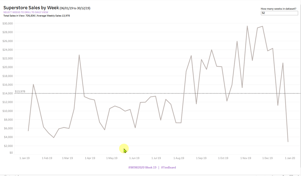
Summary
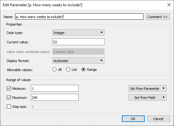
- Create parameter and filter to limit range of the full data set, initially set to 52 weeks
- Create a custom date from [Order Date] based on continuous week in order to create a set from this. This is crucial as the field for the set must be different from the field that is used for plotting the timeline, which is based on the original [Order Date] field. Otherwise circular calculations and madness ensue! This was the biggest challenge this week
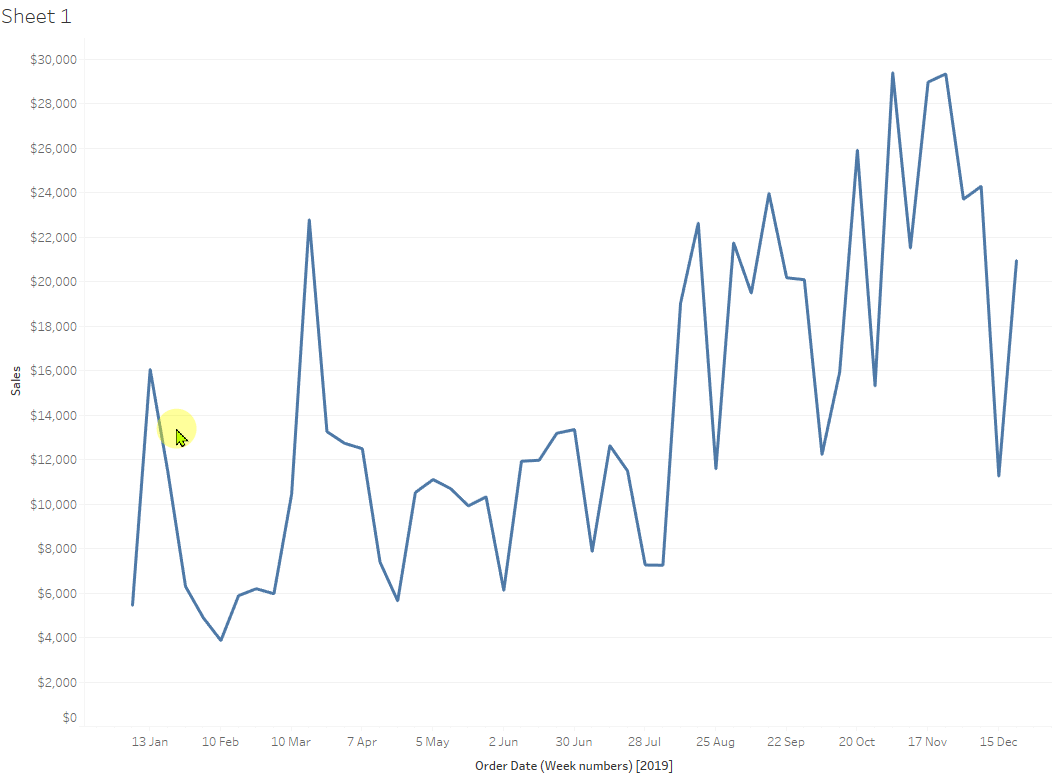
- Plot SUM([Sales]) against [Order Date]
- Create set action to let the user select a date range from the view.
- Note that this is just to pick the earliest and latest dates as if you pick two peaks, all values in between will be missing from the selection.
- Create calculated fields for the max and min dates in the set and use these to filter the results in the view
- Create a calculation to see if the set has the same min and max as the full date set in order to see if a selection has been made.
- Create a calculated field to be “Week” or “Day” depending on the above
- Create a new date calculated field with the appropriate granularity of week or day depending on whether a selection has been made and drag this to the view, replacing the simple [Order Date] axis
- Create a second sheet to act as a button and add a set action on this to add all possible values back to the set, thus clearing the selection above.
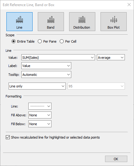
- Drag average line from the Analytics pane
- Add calculations for the title (!!), format and publish!
Main Challenges
- Automating the switch between week and day view as the DATETRUNC function needs a literal or parameter. And I couldn’t work out a way to get a calculated field to set a parameter value.
- The table calculations to get the overall values for under the title. TOTAL(SUM([Sales])) worked where WINDOW_SUM(SUM([Sales])) didn’t.
- Avoiding the mouse over highlight for my Clear Selection button. I couldn’t get rid of this. Bizarrely, it worked just as I wanted on Tableau Online!
The Journey
(The calculations below did not all survive intact until the end of the journey!)
First thoughts: Looks pretty straightforward, especially after last week’s challenge from Luke.
The topic is set actions and I’ve worked with these before, so not expecting too many problems. However, there’s usually a little trap in the Workout Wednesday Challenges, so let’s see. Perhaps the issue of being able to just pick the peaks? I guess min and max date calculations will be needed. Not currently sure how I’ll approach the “Clear Selection” button.
Connect to data, Week Number of Order Date (continuous) to columns, and SUM([Sales]) to Rows gets it started.
Ann said just the last 52 weeks for the main data set. I decided to do this with a parameter:
I added a boolean calculation to filter out anything earlier. I used {MAX([Order Date])} to capture the latest date in the dataset instead of TODAY(), which might normally be used here.
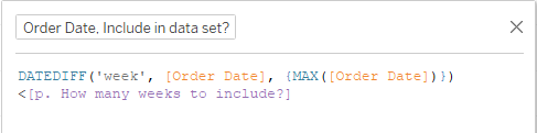
This then needs to be added to context so that the min date calculations below work correctly
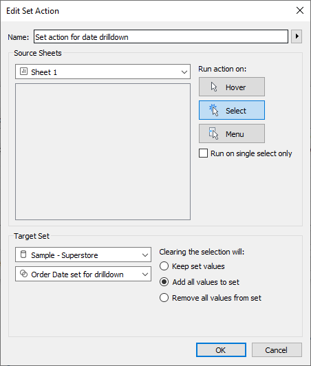
Set Action to select date range
For the set action drill down:
- Create set from Order Date and select Use All
- Add set to filter pane and select In only.
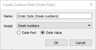
I tried to add a set action to update the Order Date field, but I was told that I needed the field in the worksheet. Strange. I created a custom date from Order Date, used that in the chart and the set, then all was good:
Creating the set action was pretty straightforward:
However, if you just peak a couple of peaks, the values in the middle are missed, as suggested by Ann in the challenge. Hence MIN/MAX calculations will be needed.
I decided to create separate min and max date calculations as these will be needed later for the title.
MAX(IF [Order Date set for drilldown] THEN [Order Date (Week numbers)] END)
MIN(IF [Order Date set for drilldown] THEN [Order Date (Week numbers)] END)
These pick out the min and max order dates within the set. Now for the calculation to filter using these:
([Order Date (Week numbers)])>{[Order Date, Min selected]}
AND
([Order Date (Week numbers)])<{[Order Date, Max selected]}
I needed to add the curly braces around the min and max calculations to make them LODs and thus get around the dreaded “You can’t mix aggregates and non-aggregates” issue.
It works!
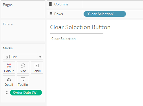
Clear Selection Button
With this setup, clicking on a blank space no longer clears the set selection, hence the need for the “Clear Selection” button.
For a set action I need a dashboard, so I created a simple sheet with the text I wanted for the button. In order to change the set of Order Dates, I need my [Order Date (Week numbers)] field in the worksheet:
Add this and the line chart to a dashboard enables me to create the set action to add all members back into the set: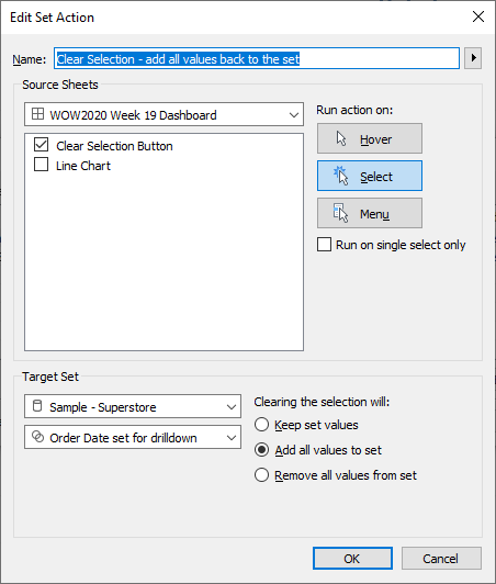
It works! I’ll make the button pretty at the end.
Average Line
From the line chart sheet, select the Analytics tab and drag an average line to the sheet, dropping it on “Table”. Formatted as below:
Dashboard title with date range
You can’t insert calculated fields into a dashboard title or text object. I can’t see why this restriction exists. So the title needs to come from a sheet. Adding a new sheet just for the title would give more positioning flexibility, but Ann said just to use two sheets, therefore I’ll use the tile in my line chart
This needed me to add the min and max fields to the view so that I could insert them into the title. Didn’t work, as I performed my LODs at the wrong places. My min, max and filter calculations are now:
MIN: {MIN(IF [Order Date set for drilldown] THEN [Order Date (Week numbers)] END)}
MAX: {MAX(IF [Order Date set for drilldown] THEN [Order Date (Week numbers)] END)}
Filter:
([Order Date (Week numbers)])>[Order Date, Min selected]
AND
([Order Date (Week numbers)])<[Order Date, Max selected]
I created calculated fields for the sum and average of sales in the view:
SUM: WINDOW_SUM(SUM([Sales]))
AVG: WINDOW_AVG(SUM([Sales]))
The catch!!
I just realised that the view should switch to days if a selection has been made! Should have read more carefully.
This is really easy to do with a parameter. See the approach here as well in WOW2020 Week 12 The problem is that the truncation field in DATETRUNC, i.e. ‘week’, ‘day’, etc can only be straight text or a parameter. Why Tableau, why?
First I need to find out if a selection has been made or not. This is simply to check if the min and max dates in the full data set match the min and max in the selected set:
[Has a selection been made?]:
[Order Date, Min selected]!={MIN([Order Date (Week numbers)])}
AND
[Order Date, Max selected] !={MAX([Order Date (Week numbers)])}
Next I need to plot weeks or days according to the field above. I tried replacing the date field in columns with this:
IF [Has a selection been made?] THEN [Order Date]
ELSE DATETRUNC(‘week’, [Order Date])
END
And then I ran into a whole nightmare of circular references
I needed to separate out what I was using to plot the timeline, [Order Date, Week or Day] based simply on [Order Date]with what I was using to calculate date ranges, sets, etc. ([Order Date (Week numbers)]). Finally got it sorted, though
Sum and average calculations for the title
The table calculations above were killed by the adjustments to get week/day working. Not clear why. When I computed the sum using Specific Dimensions, namely [Order Date, Week or Day] and [Oder Date (Week numbers)], the calculation assistance seemed to show what I wanted, but I just got “none” returned as the result
However, TOTAL(SUM([Sales])) worked where WINDOW_SUM(SUM([Sales])) didn’t. No clue why.
Although the reference line understands what a windows average is, WINDOW_AVG(SUM([Sales])) does not, giving me either a range of values, or “none”. Again, no clue why. Very frustrating.
I assume the time partition is broken up by needing two time fields, but I’m not sure.
Average was then calculated using TOTAL(SUM([Sales]))/TOTAL(COUNTD([Order Date, Week or Day])). Very messy, but at least it agrees with the reference line.
And the rest was just formatting
I used my trusty Colorzilla browser plugin to get the hex for the purple: #B681D3
Getting the button to display nicely was a challenge, but I got there in the end. Strangely, it didn’t work as I wanted within desktop (white highlight of the button on mouseover), but it was OK on public.
Edit: Added main challenges