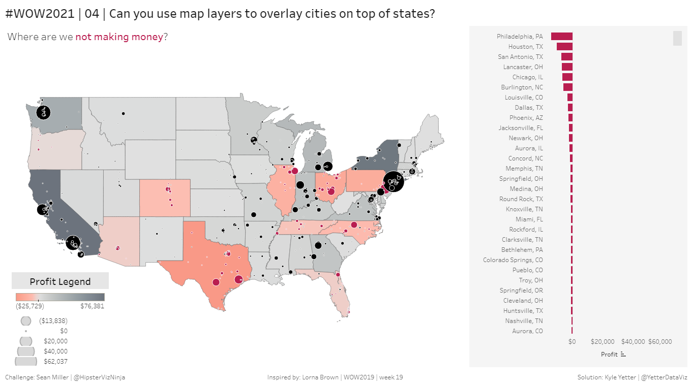
This week’s challenge is a throwback to a challenge from a couple years ago, but with a new functionality wrinkle to try out the new Map Layers in Tableau 2020.4. Seems like Sean is often coming up with challenges to help with learning new functionality in Tableau, which is awesome. The challenge itself was fairly simple, particularly because of the great work from Tableau devs in creating Map Layers.
I started off adding Longitude (generated) to Columns and Latitude (generated) to Rows. Then I added State to Detail for the filled map portion. After that I dragged City into the view, and a nifty new thing popped up:
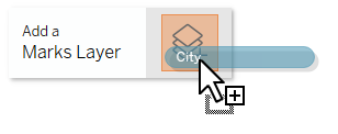
I dropped city on, and now I have two Marks Cards:
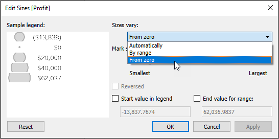
Now, with City and State in the view, I added SUM(Profit) to Orders.State Color, and matched Sean’s Red-Black diverging palette. Then I added SUM(Profit) to Size for Orders.City. But since we’re adding color to show positive/negative profit, we need the scale to start from zero, rather than the smallest number:
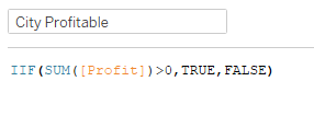
Now I need a calculation to identify whether each city is profitable or not. So I just created a boolean IIF statement:
Then I added that to Color in Orders.City, and matched Sean’s colors, including a white border.
I struggled for a few minutes to figure out how to make the filled states not selectable. I tried turning off the tooltips, but you could still hover on a state and have it highlight the state border, which Sean’s version wasn’t doing. 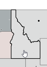
After putzing around for a bit, I came across a dropdown for the layer, that magically had Disable Selection as an item:
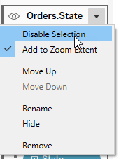
Magic! Next I worked on the bar chart. I noticed that it was showing the City and the State, so I needed a calc to combine the two:
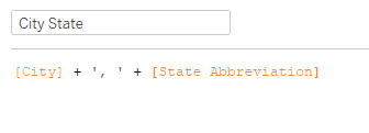
The State Abbreviation here is the calculation Sean shared with us. So then I added City State to Rows, SUM(Profit) to Columns, and City Profitable to Color.
For the tooltip on both the map and the bar chart, I needed a Negative Profit value and a Positive Profit value, in order to make the negative and positive numbers different colors.
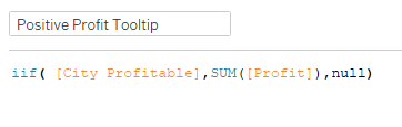
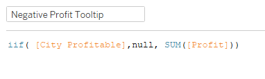
Now I can add these to the tooltip, next to each other without a space between, with the Negative value colored red, and I’ll get one or the other depending on the value for the city:
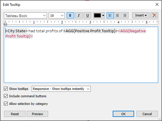
(This is the same tooltip for both worksheets)
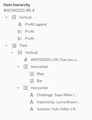
Once I got everything on the dashboard, here’s what that layout looked like with my containers:
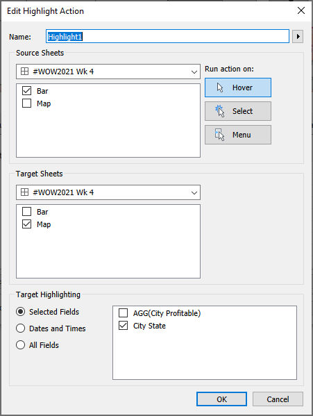
Then I just needed to add the highlight action so when you hover on the bar it highlights the city on the map:
And we’re done! I was truly amazed with how simple and intuitive it was to use map layers, and glad Sean gave us this opportunity to check them out.